Interactive Layouts Using Video and Web Objects
We've all been in that situation: you're mid-way through building a course when your client sends over new content---a scenario, activity, or interaction—that doesn't fit the company-mandated template you were asked to build from.
Are you worried? Do you plead for more development time? Nope. You roll with it, because it'll take less than an hour to build a custom layout for the new content.
That's what makes working in Presenter '09 so great. Because of the design flexibility in PowerPoint, it's easy to try new layout ideas—even during production.
Expanding your template library
But the best time to try out ideas isn't during live production. That's why I try and create quick prototypes or mockups of anything creative or interesting I find. Elearning designers can never have too many templates and in this project I'll show you a creative layout that will surely help you move past a slide full of bullet points.
13 Seconds in August

This is a great multimedia project from the Star Tribune. It's a non-linear, read-only interactive that opens with a dramatic audio slideshow before transitioning into an interactive graphic that features video interviews and text-based stories.
Did your Articulate Guru sensors just go off?
This project combines several essential Guru Techniques:
- User-controlled navigation
- Branching
- Hidden slides
- Video
- Web Objects (HTML, text-based articles)
- Audio slideshows (audio, syncing, animations)
What works
I like this project for many reasons. First, the aerial photo of the bridge provides the big-picture graphic of the event. Next, each car has a labeled graphic that links to individual stories presented in video and HTML formats. Finally, the navigation is open so I can move about and explore the stories that interest me.
While 13 seconds in August wasn't created in Presenter '09, it wouldn't take long to build out a working model. In fact, that's just what we did! Let's have a look.

Tutorial: Building the Interactive Layout
We can build this project in four steps:
- Creating Slide Master and navigation elements
- Add the videos and Web Objects
- Building the intro animations
- Syncing animations and modifying Slide Properties
Overview of the project:
Step 1: Creating the Slide Masters and button navigation
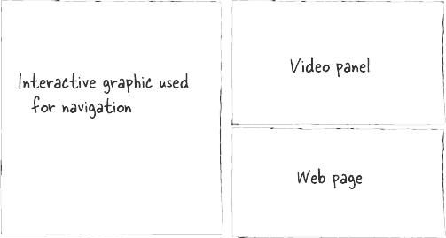
The layout for this project is simple: there's an interactive map on the left, and one or two content pods on the right. In some cases there's only the graphic and web page—the video panel doesn't appear.
Step 2: Adding the video and Web Objects to the slides
With the slide framework now in place, we can begin adding our content. I found some comp videos from iStockPhoto which are good enough for concept design.
I also created some simple HTML pages to use for the Web Objects. Feel free to use these links or your own.
Keep in mind that many web sites will display both horizontal and vertical scrollbars when resized below specific sizes. To avoid that, you may need to create your own or use text files.
Step 3: Animating the introduction slide
Here's where you can have some fun! While the original project used simple fades, there's nothing stopping you from trying some Emphasis Effects—Grow/Shrink, Basic Zoom and Motion Paths are appropriate in this project.
Animating the intro slide continued:
Step 4: Syncing the animations and modifying Slide Properties
Now that our main content slides are in place, we can wrap things up by syncing the animations and setting up our Slide Properties.
What do you think?
Would this layout work? What types of content would you use with this layout?
Download the template and let us know what you think!
Post written by David Anderson
9 Comments