Give Your Quiz Results Slides a Makeover #14
Quiz Results Slide Makeovers #14: Challenge | Recap
Give Learners Feedback in Fresh and Creative Ways
A while back, I shared some tips for designing more engaging and contextual quizzes by simply adding custom background graphics. It was a simple idea but one that really helps visually align your quiz designs to the rest of your content slides.

Yet, even with custom background graphics, the quiz results are often presented in default styles and layouts that don’t align visually with the rest of the content.
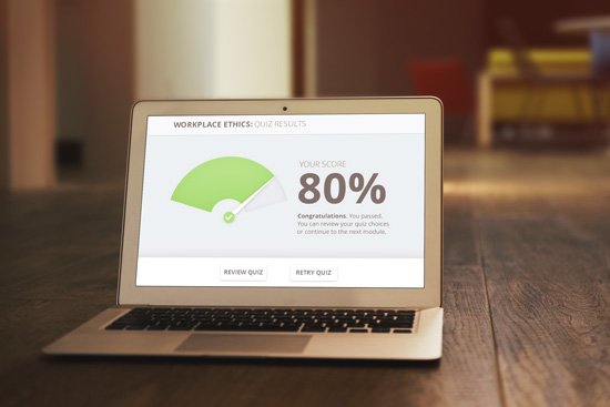
Give your quiz results a makeover
Here’s a quick and easy design tip to get you started: Infographics. Remember our infographics challenge from a few weeks back? We can still pull more from infographics to give our quiz results more impact.
Infographics usually include typographic elements we can apply in our quizzes to communicate scores and percentages, whether our learners passed or failed.
Below is an infographic I found using the search words “financial infographics.” It’s an okay-looking poster. What I really like is the use of typographic emphasis for the percentage:

Pulling loosely from this infographic, I have an idea for how to makeover my default quiz results:

Notice that I didn’t use every option from the default results slide. With the simple, straightforward text below it, the percentage is sometimes enough.
Pretty easy, right? Great! Because that’s what this week's challenge is all about!
Challenge of the week
This week, your challenge is to show us your best, your most creative quiz results designs. Show us as many makeover designs as you can imagine.
Storyline and Quizmaker both offer ways to customize results slides. If you have any questions about how this works, ask in our forums, and one of us will help out.

This challenge is all about visual communication and not about development. This means you don’t have to build out an actual quiz with results. What you should focus on is presenting scores, pass-fail, and other results information to your learners.
Tools
You can use Articulate Storyline, Articulate Studio ’09, Articulate Studio ’13, or PowerPoint to show your slide designs.
Last week’s challenge
To help you produce the most creative results for this week’s challenge, take a look at the results from last week’s interactive timeline challenge.
This was our first challenge where everyone worked from the same starting project. The results were amazing! I know this was a bigger challenge than most, but you guys totally rocked it.
Jeff Kortenbosch once again kicked off the week’s challenge with his interactive timeline. See how much his background choice enhances the whole visual? Nice work, Jeff!
Ana Lucia Barguil really captured the overall design and interactivity in her challenge entry. As always, Ana shares not only her work but her source files. Be sure to give her a virtual high-five next time you see her around.
Paul Alders shared his own interpretation of the interactive timeline in this terrific example. Be sure to visit Paul’s site to download the Storyline source files. Thanks for sharing your source files, Paul!
Kevin Thorn joined the challenge with an amazing recreation of the project. What’s also neat is Kevin’s debrief on the project. He shares his workflow, development challenges, and how he worked around software limitations.
Eimear O'Neill joined the challenge with her awesome timeline example. The harmonious color schemes and presentation of the embedded videos create a visually cohesive piece. Super job, Eimear!
Have a results-driven week, E-Learning Heroes!
63 Comments
While I love the idea of making the results slides more meaningful, I'm not a big fan of using thumbs up and down imagery. I have a few reasons for feeling this way. First, thumbs down imagery has negative connotations (it is used to express dislike on blogs and sites like YouTube) so I am wondering if by using it in our courses we are inadvertently passing judgment on the learners. Second, hand gestures have different meanings in different cultures. The thumbs up gesture is considered offensive in some parts of the world. I won't go into what it means here but you can look it up if you are interested. Finally, strictly from a design perspective I think these gestures are over used and there must be more interesting ways to denote correct and incorrect responses. I'd be intere... Expand
Cultural issues- certainly the hand gesture meaning would impact if thumbs up/down "works". As for judgement- the second you add scoring- you are judging (ranking, rating). So, it's out there. Question- if someone answers a question incorrect on an assessment, how is this indicated (common answers are "red X, green check", "Incorrect"- sometimes in red, etc...). The fact that you add an icon (thumbs down) doesn't seem much more harsh (the second you say "wrong"- or even "0 points" it's out there). For me, the key thing is clarity. Is it clear whether the person "met expectations" or not? I've seen some companies try to be so sensitive about feedback, they diluted the impact of the message so much ("not the best answer") that the learners actually thought the answer provided may... Expand
@Jeff. I wonder if an assessment of your target audience would go deep enough to determine the cultural backgrounds of everyone taking the course? If you were creating a course for an organization in the Middle East, for example, you would know not to use the thumbs up but it might not be so obvious in other situations. @ David, when it comes to scored assessments I agree that you are evaluating the results. I guess my thinking with the thumbs up/down is that you are aren't just evaluating a response - you are criticizing it. I'm not particularly PC so this shouldn't bug me but it does. I agree with you entirely that the outcomes need to be clear and that the best ones should show the consequence of an action. @Nicole - thanks for being a good sport. Your example was nicely done ... Expand