Button suggestions needed
Mar 08, 2013
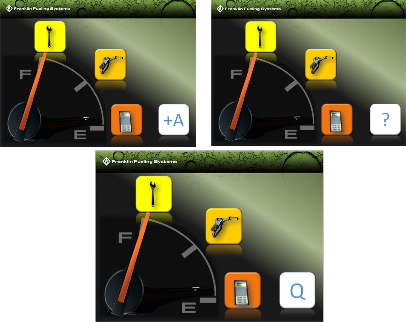
Hello everyone. I am currently working on an interactive techical training course which will be used primarily in Europe and Asia. Most of the menu designs for our eLearning courses allow the user to select their own path through button selections to learn about the product. I have all of my buttons made except one, the Quiz button. I am having a difficult time coming up with an image that relates to a quiz for an international audience. English will be the common language amongst all learners and the voiceover work will be in English as well. Below are some examples I have been workin with. Thanks in advance for any input.
3 Replies
Hi Joshua,
At first, I was going to suggest the question mark, similar to the one you have shown above. The problem I see with this, however, is that some (or maybe even more than some) users may interpret this as "Help". It may still work, but I would personally suggest adding another element to the question mark to give the users a better idea of what they'll see if they select it.
I'm thinking it may be easier to stick with a graphic, rather than a single letter. I do like the "A+", but I'm not quite sure how that will work for an international audience.
Maybe a spiral notebook? Pen and paper? Or even something like eyeglasses and/or a ruler. Maybe a check mark to signify a knowledge check.
Just some thoughts I'm curious to see what you end up using for this!
I just realized that this is probably the wrong forum for this....If possible could someone move it out to the general discussion forum?
Hi Joshua,
Unfortunately, no, we cannot move the message. However, you're certainly welcome to post this over in the Building Better Courses section as well. If you do so, you may want to share a link in this thread (since it's the original), just in case someone sees it here and wants to join the current conversation.
Good luck with the project! I'm curious to see what you end up using for the design.
This discussion is closed. You can start a new discussion or contact Articulate Support.