Strange padding when viewing course on iPhone
Jun 22, 2017
By
Snorre Rubin
Hi everybody
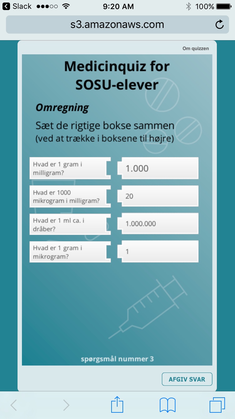
I have build a small, quizbased course for mobile units. It works perfectly on Android, but on some iPhones it looks weird. It is as if there is a lot extra padding on the left edge.
Any ideas as to how to fix this?
8 Replies
Hey Snorre!
That does look unexpected, sorry you're running into it.
Can I take a look at your .story project file to do some testing? You can add it as an attachment right to a comment here like this:
Thanks!
Hi Snorre, thanks for the image! I can help you get this straightened out.
I'd be interested in taking a closer look at your file. Can you share your project file with me? If you'd like to keep it private, use this form instead.
I'm having this same issue on my iphone. I tested it at all 3 browser sizes and both player size options. I published it as HTML5/Flash.
The launch page is fine, but the player is 3-4 x the size of the phone screen (a 6+) I hope you can help with this. Thanks.
I seem to remember that at one time there was an app for the player, but I can't find it in the app store anymore.
Uh-oh, sorry that's happening! Thanks for chiming in to let us know you're seeing this, too. Could we take a peek at your file? You can attach it here.
I think you're thinking of the Articulate Mobile Player, which you would use to view content on an iPad or Android tablet for Storyline 2.
Yes, I'm sure that was it. You don't have a cell phone version for SL3? Is one in the making? It was really nice.
Hi Alyssa
Thank you for your reply.
I am using Storyline 2, and testing on a web server.
Hi there Peggy! Storyline 3’s HTML5 output and new responsive player give learners the best viewing experience on tablets and smartphones, making Articulate Mobile Player (AMP) output unnecessary. The only time you would need to include it is if earners need to download content for offline viewing, or your course includes FLV videos with alpha-channel transparency, both of which are supported in AMP.
Thanks for sharing your file, Snorre. I'll have a look and let you know what I find!
Hi there Snorre, give this link a test on your mobile device. I tested it in Safari on iPhone iOS 10.3.2, and I didn't see any issues with the padding.
Let me know how it turns out!
This discussion is closed. You can start a new discussion or contact Articulate Support.