Blast From the Past: Show Your Earliest Examples of Work
Dec 15, 2014

It's always interesting (and mostly embarrassing) to look back at your earliest examples of work and see how far you've come since then. I was recently giving a presentation on the fundamentals of graphic design, and as part of my introduction, I showed some of my earliest work to demonstrate how bad I really was. I thought it would be fun to do that same here.
So, to kick it off, here's mine: an awareness poster I created while working in retail loss prevention...

I have to be honest, I was so proud of this when I first created it. I thought the eclectic mix of colors, fonts and graphics made this poster engaging and exciting. Looking at it today, I realize that I may have inadvertently used the graphics to block my message. It's full of typos and it breaks almost every graphic design rule known to man. I'm happy to save that I've come a long way since then!
So, do you have an example of your earliest work? If so, share it here and reflect on how you've grown since then.
19 Replies
Tim - what a great topic idea! I laughed when I read this - Love it!
I am thinking some might be a bit * too * embarassed to post old samples? Heheh. Well for me I thought I would share my first ever infographic:
Now it's not terrible (in my opinion) but I look at it now and think of a lot of things I could improve and change. First of all - the spelling and grammar is atrocious (what did I have against proper capitalization?).
Secondly, the color scheme - not my best ever. Now I try to pick 2-3 colors and stick to that throughout for a more consistent approach. If I want to use more than 2-3 colors I use different shades of the colors I picked originally.
My font selection here is also not my best ever. The alignment could use improving and also I think the white background makes it kinda seem "borderless" and lost against the white browser background. Now I would use a very light color instead of white (if I wanted light) and/or a border or stroke around the inside of the infographic.
This has been a nice little exercise in being aware of areas I've improved in! Cool!
To see my infographic skills evolution you can check out this page of my blog Flirting with E-Learning: Infographics.
Would love to see samples and examples from others and their thoughts and comments on how they have grown! Super fun topic, Tim!
Oh man - my first examples were SO COOL...but they were for the military, and sadly I can't share (/don't even have access to)...I'll see what I can dig up that isn't controlled goods later on tonight :P
(I should add that the cool factor was largely due to the team of multimedia developers and programmers we had on staff.)
Here is a screen from a tutorial I did...wait for it... in 1998! It was done with a UNIX-based authoring tool called GainMomentum. While the tool never gained any traction and is long gone, the binary still runs today on my Linux box!
And here is a CD-based tutorial on hazardous materials, built in 2000 with Macromedia Authorware (another authoring tool that is long gone).
Am I embarrassed to show these? Not really. Are they painful to look at? Yep :-)
Wow, great example Michael! It sure looks like something circa 1998!
My first e-learning was a sexual harassment training in 1996. It was created in Trainersoft. Unfortunately it won't run in anything after Windows 98 so I can't get a screenshot. However, a year or so later a new addition of Trainersoft runs. Here is an example from an SPC course. The graphics are weak and the interface is clunky and the "Whazzup" reference definitely dates the material.
Yeah, it is definitely cringe worthy.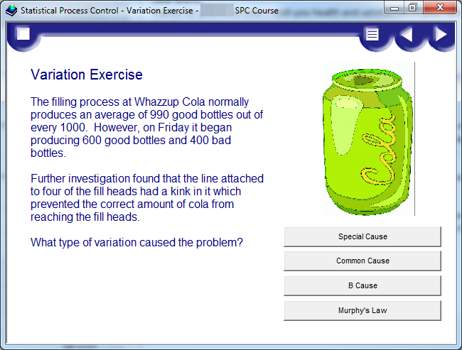
Great example Brent. The embossed menu is certainly cringe worthy!
I think a lot of my bad stuff is already out there, the acute oncology course and Psychological support courses that are in some posts show my inability to choose colours and sort out navigation issues.
I have searched through memory sticks for examples of work I "archived" from my former employees.
Here are a few others
Keyworker course
First real course I built in Studio, think the text over the image is wrong looking at it now.
Verification of Death Course
Second course, think that title is wrong sound like a nurse has died. I also think the glow on that text is so wrong.
That text is so difficult to read, this nurse at one point was the only picture of a UK nurse I could get, she followed me into lots of courses, so I have a soft spot for her, bet she wasn't even a nurse.
Liverpool Care Pathway
This is V2 of this course, the first one I built in Keynote using the export to flash, this is the Studio version of the same course.
Not sure I would use the background if I did this again.
Gold Standards Framework
Not really sure what I was thinking here, that gold is so wrong. and the text has some sort of old halo to it.
So there you go, I would love to find some of the posters I did but will have to continue searching.
Can I chime in and say what a GREAT and resourceful post this is to follow? I'm new to ISD/e-Learning Development and am learning so much from all of you! Thanks @Tim Slade for starting this!
Hi Katie! Thanks for the kind words. I'm glad you find this helpful.
I've attached a screen of my first EVER eLearning course....based on our HR policies and created solely in PowerPoint.
I'm tempted to Storyline it, just to see how different it would look after 3+ years of experience!
Love it, Chris! It looks like you creatively built the progress bar from a table, correct?
It wasn't even that advanced Tim!
The progress bar is literally 5 square shapes, and I would insert another green box on top to show how far along the time line they are.
Very funny, Chris. It's amazing the things we do when we don't know better!
Final one I cannot find my posters
This was my first big project in studio, I built a custom skin
The skin had instructions for engage interactions
To try and tie it all together
But then had some incongruous bits, not sure what I was thinking here
or here
but I did like the glossary
which popped up from the bottom.
really not convinced with the rounded corners over the slide, and do think I over emphasised the player over the content. Was a nightmare to publish as I had to swap out files and move additional folders in.
My first courses where a series of screencasts I did with Adobe Captivate when I got started back in... 2005 ( I think). Basically it's what you get when you do a Storyline step-by-step screencast. It was just a title screen and a screencast for every step you'd make in the specific software tool. Unfortunately no screenshot available.
The first Articulate based course I did in 2009 with Articulate Studio. I was still trying to figure out a corporate template and I used a lot of Engage interactions because the client loved the 'clicking' sound...
My first SL2 course.
Hello Ashi,
Good Day,
I saw you course it is wonderful. Request you to confirm that you gave motion path between slides (moving down and up, right and left)?
Thanks,
Rajesh
Thanks Rajesh, They are actually Slide Transitions available in SL2.
Refer Screenshot for same.
Hello Ashi,
Thanks for the information ! It is amazing.
Thank you,
Rajesh
This post was removed by the author
This discussion is closed. You can start a new discussion or contact Articulate Support.