Navigation instructions for learning game
Feb 24, 2015
I am in the process of building my first learning game. It puts the learner in the position of being the CEO of a water supply company and will teach them about water supply options and balancing different demands.
I have loosely based the mechanics on the play spent online game http://playspent.org/html/
I am struggling with is how to go about providing navigation instructions. My SME wants me introduce everything to the learner up front but I am not sure this is the best approach, especially as there is a strong possibility the learner won't make it to the end of the game and will start again or will want to play again to see if they can do better. Play spent provides no instructions and seems to work really well, however this game does have more functionality and things going on.
The target audience will be school children approx 12-13 years old and the majority will be using tablets so hover over is not an option.
I am thinking that a help button or similar that then explains what everything does may be an ok compromise.
I'd appreciate any other suggestions.
Thanks
8 Replies
Hi Tristan. Your game sounds really cool and I love that you've based your design on Play Spent. I hope you'll share the finished product with us when it's ready to roll.
Kids are surprisingly quick to pick-up navigation, but it sounds like you may end up including a navigation primer to keep your SME happy. The topic of navigation instructions is oft-debated in the ELH community, so I've found a few discussions with some different ideas and examples for integrating navigation instructions in a way that makes sense for your design, your content, and your audience.
More than a Dozen Ways to Navigate an E-Learning Course
Views/Ideas About Adding Instructions to Courses
3 Tips for Clear & Helpful Navigation Instructions
Hope these links are helpful!
Hello Tristan,
Firstly , what a fantastic idea and I already love the concept.
I know you're a fan of the blog but take a look at the post on Shovel Knight available here.
Traditional Nintendo games, like the first Mario involved no user instruction really - all of the information was passed to the learners through clever design. I would focus on how you can really bring out the key concepts to the learner through the gameplay. One other method is to provide supplementary information in the form of roll overs on certain options, this allows the learner to see what this select will mean for their game experience.
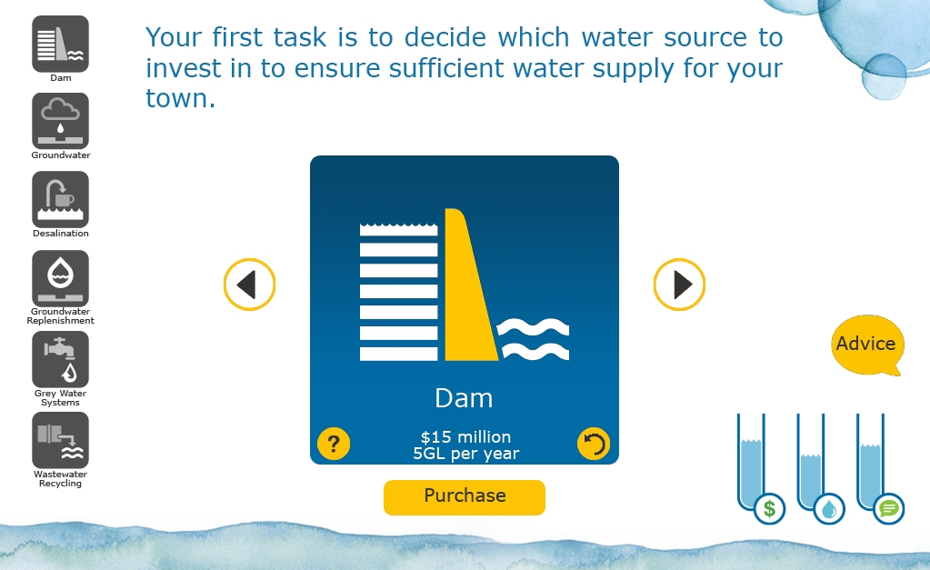
There are also instances where you have arrows on screen to cycle through your options (as illustrated by the screenshot) in my honesty opinion screens like this do not require instructional text. I would argue the age range you are building for will be far more familiar with navigation concepts like this than an older generation (sorry).
I would urge you to try and push back with the SME and show how you can integrate instruction through the design - it's possible, it will just take a little more thought.
Thanks Trina,
I'll definitely share once it's done...
Thanks Joshua,
That's what I am aiming for. Designing the navigation so it's intuitive and easy to understand etc.
The biggest issue is selling it to the people who will review it. My opinion is exactly as you have stated, how they see the course and navigation of it compared to how the intended audience see it will be completely different.
I like the idea of rollovers but the majority of the users will be accessing on tablets with no hover function so I need a one solution fits all approach.
I like where you wrote about slowly introducing the game controls and have taken that on board. I use the yellow arrow as the next button on the lead in slides (they provide a background and information on what the game is about). All navigation is yellow and either common symbols or words.
I think the point needs to be made to the reviewers of the audience involved. Over 50% of children in the UK now have a personal tablet, that doesn't even account for those children who use their parents tablet (and possible spend way too much on in app purchases.) Their navigation is going to be second nature, they are accomplished with navigating an app or a webpage and my philosophy is to design with the largest % in mind.
Tristan, I've written a blog post discussing this topic which I've referenced this point in. I'll get the links sorted today for you.
Just put out the post Tristan asking Do We Need Instructional Text in Games?
Firstly happy birthday for the weekend!
Great article as always. I think I have hit on a sore point for both of us but definitely a great area for discussion and more importantly for generating ideas.
I especially like your comment about what is the consequences of the learner clicking the wrong thing or in my instance just selecting purchase and not interacting with the other functionality first. For my game this will affect the depth of learning and background knowledge (which they may or may not already have) but not the game play or the key learnings. The majority of the learning comes from the decisions made and the feedback they receive from these decisions.
Hello Tristan, thanks for the birthday wishes!
Again, potential thought needs to be given to the way users will interact with this naturally. You've set the scene on what the objectives for the game are, therefore it's in my best interests that if I want to do well I should research what my options are.
This requires some research - perhaps a small sample who would naturally select the '?' icon to find out more information naturally without prompting. I for one, would go looking for more info on each option as I want to do well in the game.
You seem to have thought things out really well as you know where the key learnings come from, potentially a greater visual clue such as a glowing '?' mark will draw the users attention to it further.
This discussion is closed. You can start a new discussion or contact Articulate Support.