Rise Menu Check-off
Jan 16, 2020
By
Tracy Parish
I can't seem to find this or a discussion about it, so my apologies if this is a duplicate thread.
On the menu on the left, I'm noticing a bunch of my users are having an issue seeing some of the "check-offs" to indicate a session is not-complete. Especially the ones at the start.
The grey unfilled circle is hard to see against the white background. Can I change this or is this a product suggestion?
5 Replies
Hi there, Tracy. Currently, the theme color controls the circle and checkmarks once a lesson is in-progress or completed, but there's no way to change the gray circle for unstarted lessons.
Let me bring this feedback up with the team, and we'll let you know here if we make any changes!
Thanks Crystal. I think it is based on the monitor someone is using, but it certainly could pose accessibility issues. Just a slightly darker shade of grey should improve visibility/contrast.
Thanks for passing this on to the team.
Totally agree with Tracy. The circle needs to be darker.
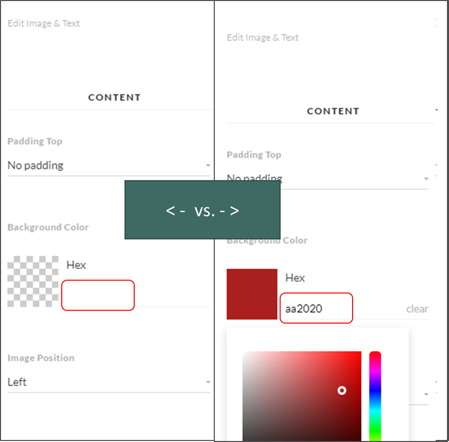
Here is one other thing (from the developer side). When trying to change the background colour of a block in Rise, where you type in the HEX code is almost invisible until you click on the square and then select a random colour. Only then do you really see where you are supposed to type.
Thanks for your feedback, Tracy! I see where you're coming from, and I'll have our team take a closer look at this.
This discussion is closed. You can start a new discussion or contact Articulate Support.