graphic design
19 TopicsUsing Vector Graphics to Design E-Learning Courses #545
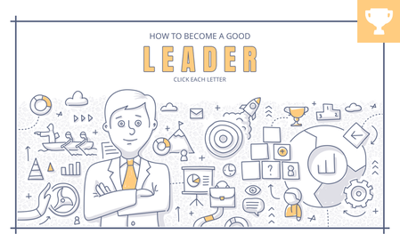
As course designers, you know that coming up with new design ideas can be a challenge. With so many free stock photos, videos, and AI-generated images out there, you'd think things would be easier, right? But the real challenge isn’t finding design assets. It’s using them in a way that doesn’t look like every other cookie-cutter course out there. This is where setting some creative limits or constraints can actually help. For example, you could use a single vector illustration as the foundation for your entire course. It might sound impossible, but it can lead to some surprisingly creative results. Let me show you an example so you can see how it works. How to Become a Good Leader Andrzej's example is one of my favorite examples of this technique. Using a stock illustration, he built a six-slide course template from the individual elements. Take a look at the following example to see how his final project turned out. View project | Download | Andrzej Jabłoński Ex Uno Plura At first glance, you might see just one image, not the many smaller pieces that make up the illustration. To work with these parts, open the file in a graphics program like PowerPoint or Illustrator. Open the vector file (.ai, .eps, or .svg) and ungroup it to select the individual shapes you want to use. Depending on how complex the illustration is, you might see a lot of layers. I like starting with the smaller elements since they’re easier to select. You can then select, group, and export these elements to use in your course design. Now you have everything you need to create the visual elements for your e-learning template. 🏆 Challenge of the Week This week, your challenge is to build a simple interaction or course starter template in Rise or Storyline using just one illustration. Be sure to include a screenshot or a link to the stock graphic you used, so others can learn from your example. 🙌 Share Your E-Learning Work You put in the effort, now make sure your work gets seen: Personal blog: If you have a blog, please write about your example from this week’s challenge and share the link with your submission. Social media: Please share your examples on LinkedIn and mention both David & Articulate using the #ElearningChallenge tags so we can help promote your work. Support your peers: With the new submission format, you can comment directly on each example. Try leaving helpful feedback on at least three projects this week. Community forums: Feel free to cross-post in the forums to give your work even more visibility. 🙌 Last Week’s Challenge: Before you break apart this week’s challenge, check out the accordion examples your fellow challengers shared over the past week: Accordion Interactions for FAQs in E-Learning #544: Challenge | Recap 👋 New to the E-Learning Challenges? The weekly e-learning challenges are ongoing opportunities to learn, share, and build your e-learning portfolios. You can jump into any or all of the previous challenges anytime you want. I’ll update the recap posts to include your demos. Learn more about the challenges in this Q&A post and why and how to participate in this helpful article.1.7KViews1like1CommentMeet The Leaders
Hello! For this week's challenge, I used Suno to create four Beatles-inspired tracks as a novel way to introduce a fictional leadership team. I took four regular photographic characters from Storyline and used Nano Banana in Pixlr to alter their poses to mimic the cover of the album HELP! by the Beatles. And don't worry if you've never used a record player before. In the live version of this demo there are also full instructions. The record player tonearm is actually a dial, and there's some JavaScript in the background that adjusts its position as each track plays. If you move the needle too quickly, you may make the record skip. That's not a bug, it's a feature. 😄 If you have any more questions about this build, please ask! Rock out here: https://bit.ly/elhc548 399Views5likes4Comments
Design Like an Art Director
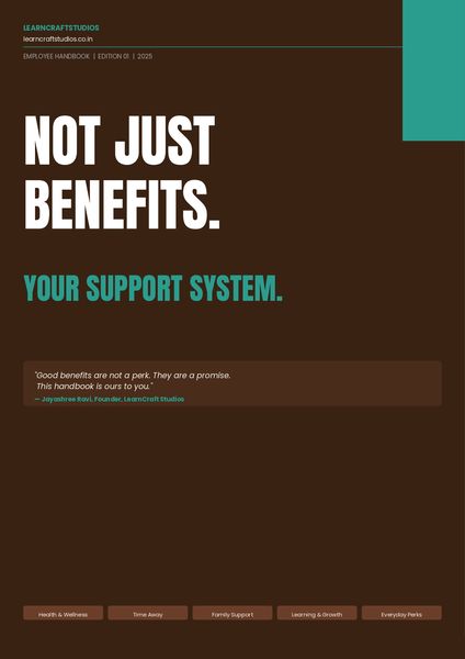
This week's challenge got me thinking about the contrast David set up so well, the fit-it-in mindset versus the editorial designer mindset. So I built both. Review here. The PDF is the fit-it-in version, a fully designed benefits employee handbook. Clean, structured, readable. This is available on the resources tab of the published file. A few Screenshots below. The art director's version takes the exact same content and reimagines it as a cinematic experience, where every frame carries one idea, typography does the heavy lifting, and nothing ever looks like a list. Would love to hear which approach you think lands harder.Stop Designing Courses. Start Designing Performance. (Yes, I Made a Whole Magazine About It.)
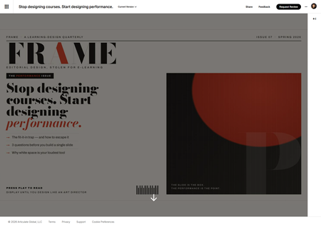
This week's challenge asked us to build a magazine-inspired layout for an e-learning course. A reasonable person reaches for a nice hero image, a pull quote, and calls it a day. I, apparently incapable of restraint, invented an entire fictional learning-design magazine — masthead, barcode, snooty cover price, the works — and then nearly lost a fistfight with my own cover image. Reader, meet FRAME. One magazine. One issue. Big opinions. FRAME has exactly one issue so far: The Performance Issue. And the cover story is, fittingly, "Stop designing courses. Start designing performance." Here's why that's not just a cute headline. The challenge quietly nails something I think about constantly: editorial design and performance design are the same move. The fit-it-in designer asks, "How do I cram all this onto the slide?" The art director asks, "What does the reader actually need to feel — and what's the one thing that matters most?" Swap "reader" for "learner" and that is the whole philosophy. So instead of slapping a magazine layout onto random content, I made the content about the thing the layout is demonstrating. The article practices what it preaches. Very normal, very healthy behavior on my part. The build (a.k.a. drop caps in an e-learning course) It's all running in a Rise Code Block — custom HTML, CSS, and JavaScript — with a real editorial type system doing the heavy lifting: Bodoni Moda for the dramatic, fashion-magazine masthead and headline Newsreader for the body copy (because magazines use serifs and we should be allowed to have nice things) Archivo for the kickers, labels, and page furniture Paper-and-vermilion palette. A proper drop cap. A pull quote sitting on a solid ink slab. A sidebar with "Three questions to ask before you build a single slide." A "By the Numbers" strip. I put a drop cap in an e-learning course, friends. We are officially through the looking glass. The cover that fought back The artwork was done. All I needed was the right size. Simple. Here is the complete, humbling timeline: Me, with total confidence: "It's 16:9." I did not look this up. I simply declared it. Claude — agreeable to a fault — went "sounds right!" and built it. Two professionals, vibing, zero sources between us. Beautiful, really. Then I actually Googled it. Google, with equal confidence, told me 1000 × 3000 — a portrait strip the proportions of a CVS receipt. (Reader, I had it backwards.) "Okay, 3000 × 1000 — a wide banner." We rebuilt the entire cover sideways to fit. It looked great. I felt productive and correct. Plot twist. At this point Claude finally checked Articulate's own docs, which calmly state that cover photos want… 16:9. My original, evidence-free guess. The one we abandoned to go chase a number Google was suspiciously sure about. We had traveled in a complete circle and ended up exactly where I started, just with more files. And Rise cropped it anyway. Because Rise dynamically crops covers, so no "correct" dimension was ever going to stop my masthead from quietly walking off-screen. The thing that actually won? I dropped the image onto a rectangle in PowerPoint, shrank it, centered it, exported a PNG. Fixed instantly. I have a whole interactive-design toolkit, and the hero of this story is a PowerPoint rectangle. I solved it like it's 2009. No notes. (I did later bake the padding in properly, so Future Me never has to do the PowerPoint Shuffle again — but the Shuffle is what got me to the deadline.) Did I use AI? Loudly, yes. I co-built this with Claude — the HTML/CSS/JS, the editorial copy, and yes, even the fake barcode. Credit where credit is due. It's a genuinely great way to go from "I have a weird idea about a fake magazine" to "the fake magazine is real and has a barcode" in an afternoon. The takeaway The information never changes. The packaging — and who you design it for — changes everything. FRAME, Issue 07. The Performance Issue. Newsstand price: press play. Display until you design like an art director. If you published a learning-design magazine, what's the cover story? 🏆 Stop Designing Courses. Start Designing Performance.Magazine-inspired design for Onboarding course cover slide
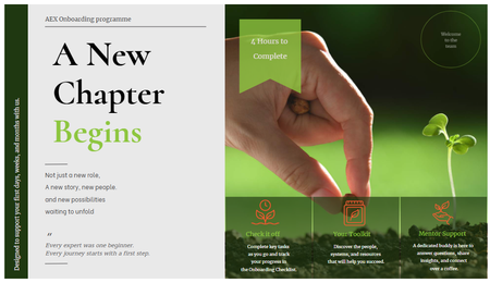
Hi, this week challenge is so timing and inspiring to me, especially when it comes to renovating my onboarding programme. So I thought Why not give it a try! It was my first time to explore Custom Blocks, especially trying different Typo, shapes, lines and everything else. P/s: With this design I hope the onboarding experience to feel more like opening a digital editorial publication than a typical corporate training course. Would love to hear any room for development.
Watercolor style / vintage illustrations
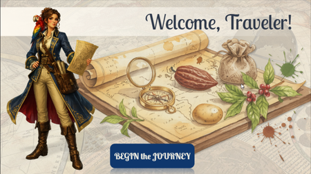
Hi, ELH community! I'd like to share a preview of my newest Storyline project, currently still a work in progress. The Secret Life of Food is an interactive learning experience that explores how everyday foods such as chocolate, potatoes, tea, coffee, and spices have influenced trade, exploration, culture, and world history. For this project, I wanted to move away from a traditional corporate look and experiment with a more immersive visual approach. I chose an old explorer's atlas aesthetic, combining watercolor botanical illustrations, vintage maps, and historically inspired characters to create the feeling of traveling through a living journal of discoveries. Learners are guided by Catarina de Silva, a fictional naturalist and explorer, as they uncover the surprising journeys behind some of the world's most familiar foods. The project is still under development, but I'd love to hear your thoughts on the visual style and overall direction. Thanks for taking a look! PROMPTS: (used for creating images in Chat GPT, Storyline AI) General style: "Vintage explorer journal aesthetic, watercolor and gouache illustration, warm parchment textures, hand-painted botanical details, historical cartography elements, museum exhibit quality, Age of Exploration atmosphere, elegant educational artwork, rich earthy palette, antique paper, subtle ink sketches, highly detailed, soft painterly rendering, casual realistic character design, storybook realism, professional educational illustration, Articulate Storyline course artwork, clean composition, high quality digital painting, National Geographic educational style, transparent background when applicable" Characters: "Full-body character illustration, casual realistic style, hand-painted digital artwork, realistic proportions, expressive face, educational museum-quality illustration, inspired by historical exploration journals, detailed clothing and accessories, subtle watercolor textures, soft brushwork, warm natural lighting, elegant pose, believable anatomy, high level of detail, not cartoon, not anime, not photorealistic, transparent background PNG." Backgrounds: "Vintage illustrated background, explorer journal aesthetic, watercolor map textures, antique parchment, botanical details, warm earthy colors, educational exhibit design, historical atmosphere, hand-painted digital artwork, highly detailed environment, immersive storytelling scene, suitable for eLearning course background, subtle depth, readable composition."199Views3likes6Comments