how to
149 TopicsLabs: Explore, Experiment, and Help Shape What’s Next
The best features we build don’t come from us alone. They come from you! From the courses you build to the creative ways you push our tools, your ideas shape what we create next. And while we’ve always listened through surveys, interviews, and community conversations, we wanted a way to work with you even more closely. So we started looking for a way to build more collaboratively, bringing you into the process while ideas are still evolving, not just before or after they ship. That’s how Labs came to be. With Labs, you can opt in to try early features and explore new ideas in the context of your real work. Instead of relying on retrospective feedback, Labs gives us a chance to learn alongside you in real time. Most experiments include built-in ways to share feedback, so what you’re experiencing can immediately inform what we improve next. It also helps us connect with creators who want to be more involved in the process. If you’re exploring an experiment, there’s a good chance we’ll reach out to hear more about your experience and keep the conversation going. Some experiments will be a success. Others will help us pivot in a new direction. Either way, they help us move faster and build better tools for you. Not every feature will go through Labs, but when something is available, you’ll find all the details in the Labs community group. That includes what the feature does, any current limitations, and the type of feedback we’re looking for. Following the group is the best way to stay up to date on new experiments. Labs isn’t a replacement for the ways we’ve always worked with you. It’s an extension of that relationship and a new way to shape the future of the authoring experience together. Explore Labs, try out what’s new, and let us know what you think. Go to Labs *All features on Articulate Labs and are subject to change. These features are experimental and may be modified or removed at any time. Beta Services Terms apply.371Views2likes0CommentsHow I Built This: How I Vibe-Coded a People Manager Simulation
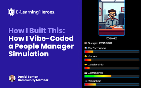
When the new Rise 360 Code Block (Beta) feature launched, I wanted to see just how far it could be pushed. Could you build something more than static content? That’s how the People Manager Simulation came to life – a fully playable, story-driven experience built entirely inside a single Rise code block, using only HTML, CSS, and JavaScript. In this video, I explain how it was created and how you can repurpose this approach in your own projects. Why I Made This In my day job, I design learning experiences for real teams, often around leadership, people management, and workplace decision-making. I wanted to create something that shows how these kinds of soft-skills topics can be transformed into immersive simulations without needing heavy development tools. The result is a game where you step into the shoes of a brand-new team leader, navigating real-world decisions that impact morale, performance, retention, and stress. Each choice has a trade-off, and yes, you can get “sacked” if you mismanage your stats. In the video, I mention that this project was built gradually, late evenings, after work, once my son was asleep. There were plenty of failed tests, odd bugs, and “why won’t this work” moments along the way. I did consider going back and documenting every single prompt and adjustment… but honestly, that would read like an increasingly impatient diary of me negotiating with ChatGPT! So instead, I wanted to share a simpler, more practical way for you to repurpose what already works. How I Built It Rather than starting from scratch, the method I show in the walkthrough involves: Uploading the existing working code of the simulation. Giving ChatGPT a single clear prompt that explains: This is for Rise 360’s custom code block. It should learn the structure and logic of the original simulation. It should rewrite the theme, dialogue, and characters for a new scenario. In the video, I demonstrate how to use the current People Manager Simulation code as context; use the download attached below. 📁 Download: People Manager Simulation HTML; attached below. You then give this to your LLM of choice as an attachment and provide your repurposing prompt; the one I used can also be downloaded below. 📁 Download: GPT Prompt for Repurposing Existing Demo; attached below. Key Takeaways Start from a working simulation instead of a blank page. Use a single, focused prompt to repurpose the entire code and story. Attach your full code as context so the model understands structure and logic. Re-use this workflow to adapt learning scenarios quickly—no coding expertise required. The Result Here’s the outcome of my own repurposing test from the walkthrough: a completely new narrative built using the same base code and single prompt. Is it perfect? No. But it’s a solid foundation—and all this came together in about ten minutes. 📁 Download: The Result — Full New HTML Code; attached below. Final Thought The best part of this approach is accessibility: you don’t need to be a coder to build something that feels custom. By starting with a working framework and iterating through clear, focused prompts, you can turn any learning scenario into a playable, data-driven experience. Whether it’s leadership, compliance, or customer service, this structure gives you the foundation to explore how choices shape outcomes, all inside Rise 360. My final ask is: please repurpose and improve on any of the ideas shared in this article. Let me and the wider community know how you get on. 💬 Ask Me Anything! I’d love to hear your feedback and answer any questions about the build. Drop your thoughts in the comments below—I’ll be checking in and responding! Want to Share Your Build? Do you have a project you’d love to share with the community? We’re always looking for more How I Built This stories. Whether it’s a game, interaction, or unique design, we’d love to feature your process. Drop a note in the comments or reach out to the community team if you’re interested!3.5KViews19likes7Comments5 Ways You Can Advocate for Your Value to the Business as a Course Creator
In an ideal world, leadership would always have a clear view of the impact of your e-learning projects and your unique value to the organization. But that view can be much foggier in real life than we’d like it to be. When our company or leadership doesn’t get what course creators like us do or how it benefits them, we can end up on shaky ground. That lack of understanding makes it hard for us to push back against training cuts. It makes it tricky to get budget increases for tech investments or team expansion. And it can even lead to the mistaken belief that we can easily be replaced by new technology or people without e-learning expertise. Thankfully, many of these issues stem from an easy-to-address source—a lack of awareness. Tipping the balance back in your favor is often as easy as advocating for your work and yourself. Not sure how to do that? Here are a few good places to start. 1. Find your champions It’s possible to do this self-advocacy work on your own. But you’ll probably reach more ears and shift perceptions faster if other people are talking up your work too. Think of it like how you might decide where to eat when traveling to a new city. Intriguing social media posts from a restaurant might get your attention. But chances are a trusted friend telling you about their favorite dining spot in town is more likely to influence your decision. Who might step up to champion your work or team? Consider tapping into people like: Subject matter experts (SMEs) that you have a strong working relationship with. Learners who’ve given your e-learning glowing reviews. Stakeholders who’ve seen the impact your past projects made on the business. Trusted coworkers who know how great your work is—and why it should matter to others. If you’re feeling awkward about asking people to praise your work, just keep your requests small at first. For instance, if an SME emails you a compliment about how easy you’ve been to work with, ask them to forward it to your manager as well. 2. Be loud and proud about your successes We sometimes get siloed off in learning and development. As a result, other teams may have no idea what we’re working on and why it’s so important to the company. If you’re feeling a bit invisible, a good solution is to put on your marketing hat and pursue opportunities to share what you’re doing. This is a great time to tap into your manager and champions to help you find ways to share your work. Large-scale efforts—like presenting at a department meeting, sharing an eye-catching infographic about the impact of a course, or making a year-in-review video highlighting your team’s biggest wins—can all help. But even smaller actions—like asking someone who gave a glowing review of your course to tell their team why they should take it too—can get the word out there. While you’re doing this promo work, don’t just focus on the final project. Also talk up the unique skills and ideas you and your team contributed to make it succeed. That way people don’t just get excited about the finished content—they’ll also get excited about what you and your team bring to the table. 3. Share how what you do connects to broader business goals The people we work with may have a vague sense that e-learning benefits the company in some way. But they may not know precisely how. Or sometimes they understand the surface benefits of our e-learning—like how compliance training checks off a legal requirement—but may not see the deeper, more meaningful impacts it makes in the long run. The best way to turn this situation around is to help these colleagues make those connections. Look for opportunities to call out the specific ways your projects contribute to key company goals. For instance, maybe that compliance course also helped reduce workplace injuries or prevented costly fines. And be sure to be direct about these links so there’s no ambiguity about the impact of your work. 4. Talk to your audience in terms they care about While you’re talking up what you do, also think about how you’re framing that information. When you’re chatting with other learning professionals, eyes will often light up when you share how a project met your learning objectives, used a development tool in a creative way, or tied into learning research. But that likely won’t mean as much—or sometimes anything—to people outside our field. Instead, promote your work in ways that will speak to your audience. For instance, if they’ve complained to you about the boring and useless e-learning at their last job, tell them about all the ways you're making your courses interesting and practical. If your project can help with their team’s goals, tell them how it does that. Or, if you know they’re constantly feeling crunched for time, play up the key ways you’re streamlining your projects. That way, they’ll know you’re making a difference on things that matter to them personally. 5. Do the math to connect your successes to the bottom line Want a measure of success that’s easy to get people excited about? Focus on money. In some cases, financial numbers are easy to uncover—for instance, if you launched training on upselling a new product and the sales numbers immediately went up. Other times, though, you might need to break out your calculator to convert one kind of win into a financial one. For example, if you shaved ten minutes off of your company’s annual compliance training, that may not initially sound like a big deal. But if you have 60,000 employees that have to take it, that’s 10,000 hours of saved work time. If your company’s average hourly salary is $25, that ten-minute trim saved the company $250,000. And those are numbers that can impress! Have a situation where your training wasn’t the only factor at play? You can still frame the final savings or profits as something your work contributed to. That way, you’re acknowledging the other factors but not downplaying that your work had an important part to play in the mix. Wrap-Up Advocating for yourself and your work may not solve all the challenges you face in your professional life. But it’s a good first step toward boosting your visibility and ensuring your organization knows just how much you have to offer. Not only that, but it can even open doors for your career that you didn’t know were possible. Want more ideas on building buy-in for you and your work? Check out these articles: 2 Ways To Show the Value of Online Training Here’s How To Prove the Value of Training to Your Organization Use KPIs To Demonstrate the Value of E-Learning Subscribe to our newsletter to get the latest e-learning inspiration and insights directly in your inbox. You can also find us on LinkedIn and X (formerly Twitter). And if you have questions, please share them in the comments.395Views1like0CommentsHow I Built This Dial-Driven Map Activity in Storyline 360 (With Help from ChatGPT)
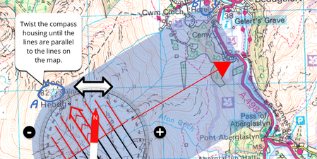
Despite our increasingly ‘touchscreen’ and ‘hands-free’ world, dials are still a big part of everyday life. If you need to emulate a dial in your e-learning experience, this feature can make your interaction more realistic, tactile, and relevant for the learner. For the Using Interactive Dials E-Learning Challenge, I created a Storyline 360 example that used dials as a sort of drag-and-drop. Along the way, I tried out some creative techniques that helped this project work in unexpected ways—including using the dial feature to animate an object and an unconventional approach to enable the dial to spin in both directions. Here’s a behind-the-scenes look at how this project works. Project Overview This demo project teaches people some simple map navigation techniques. You can try it out for yourself here and download the Storyline 360 project file here. To complete the activity, you end up interacting with three ‘picture as dial’ controls: To start the course, you need to turn the compass so its edge connects Point A and Point B Then, you have to turn the compass housing to the correct orientation to get your bearing While you’re doing this, the compass needle—which is also a dial locked in a disabled state—will oscillate slightly Creating my dial graphics I created the compass in PowerPoint and exported it as a large, hi-res PNG image. I doubled its height using Pixlr and used Storyline’s Convert to Dial feature to create a custom dial. Using the dial as a drag-and-drop This dial has four states, which are triggered by changes to the associated Compass_Base variable: Changes to the same variable also trigger events within the demo, effectively making this a drag-and-drop activity, but with a fixed axis. Unlike most drag-and-drops, though, it is accessible via the keyboard. Allowing the dial to turn in both directions In its default setting, a dial can only make one complete turn, which is limiting when you are trying to mimic a real-life object that can turn in both directions. To overcome this, the second dial in my demo has a 1440° rotation and its starting position is 687°—about halfway, just left of center—to match the appearance of the compass base. This dial can turn clockwise or counterclockwise for two rotations in each direction before coming to a stop. But that does make it quite tricky to use its position to calculate a bearing, as positions 0, 360, 720, 1080, and 1440 all point north. To compensate for this, I asked ChatGPT to write some custom JavaScript for me: // Function to calculate the heading function calculateHeading(compass) { // Calculate the heading with special handling for multiples of 360 var heading = 360 - (compass % 360); // Adjust heading for cases where it's 360 but should be 0 if (heading === 360) { heading = 0; } return heading; } // Function to adjust heading to 0 whenever it becomes 360 function adjustHeading(heading) { if (heading === 360) { heading = 0; } return heading; } // Get the value of the Storyline variable Compass and calculate Heading var Compass = player.GetVar("Compass"); // Assuming "Compass" is the name of your Storyline variable var Heading = calculateHeading(Compass); // Adjust Heading to 0 whenever it becomes 360 Heading = adjustHeading(Heading); // Set the Storyline variable "Heading" to the adjusted value player.SetVar("Heading", Heading); // Assuming "Heading" is the name of your Storyline variable And this is the result: With this code, I can tell if the compass housing is upside down even if it has been turned more than once. Pointing the compass housing south is a common mistake for novice navigators, but my demo will spot this and provide correction. Using animation to enhance the dial experience The third dial is purely for decoration. During the second part of the activity, I wanted the compass needle to move gently as you were turning the compass housing—just as it does in real life. This dial has a more limited rotation and range: I used ChatGPT again to create some custom JavaScript that makes the compass needle oscillate each time the compass housing is turned: // Function to randomly adjust Compass_Needle between 8 and 15, returning to 11 within 0.50 seconds function adjustCompassNeedle() { var randomValue = Math.floor(Math.random() * 8) + 8; // Generates a random number between 8 and 15 player.SetVar("Compass_Needle", randomValue); setTimeout(function() { player.SetVar("Compass_Needle", 11); // Return Compass_Needle to 11 after 0.50 seconds }, 500); } // Variable to store the previous value of Compass var previousCompassValue; // Function to handle changes in the Compass variable function handleCompassChange() { var currentCompassValue = player.GetVar("Compass"); // Get the current value of the Compass variable // Check if the Compass value has changed if (currentCompassValue !== previousCompassValue) { // Call the function to adjust Compass_Needle adjustCompassNeedle(); // Update the previous value of Compass previousCompassValue = currentCompassValue; } } And here’s a close-up of the result: Wrap-Up As you can see, there are lots of creative ways to use dials to produce all sorts of fascinating interactions! And I hope these insights about my project creation process give you ideas to try in your own work. As you might imagine, there’s quite a bit more going on in this demo beyond just dials—notably some Jump to Time–powered animations and an approach for controlling a Zoom panel with pause/play timeline triggers. So be sure to check out the project Storyline 360 file to see how the whole experience comes together. And please dial me up if you have any more questions! Want to try something you learned here, but don’t have Articulate 360? Start a free 30-day trial. And subscribe to our newsletter to get the latest product updates, e-learning examples, and expert advice directly in your inbox. If you have questions, please share them in the comments.964Views0likes4Comments3 Steps for Creating Your First Rise 360 Course
Everything you need to create modern, engaging e-learning is at your fingertips with Rise 360. Not sure where to start? This handy guide will help you create your very first microlearning or full-length course in three easy steps. Let’s get started! 1. Choose the type of learning experience you want to create: microlearning or a full-length course Start by choosing whether you want microlearning or a full-length course. Your choice will depend on the content you want to share with learners. Microlearning courses aren’t just short courses. They’re bite-size pieces of content focused on a single learning objective. They’re approachable, bingeable, and easy for users to review and apply. Microlearning courses are also great for learners on the go because they’re easy to consume on phones or tablets. Full-length courses give you the opportunity to go in-depth on a certain topic. Made up of multiple lessons and knowledge checks, courses may include multiple learning objectives and, as a result, take longer for the learner to experience. Learners almost always use a computer to access full-length courses. So how do you know which format to use for your course? When choosing between the two, ask yourself: How many learning objectives do I have? If you only have one, a microlearning course is the clear option. If you have more than one, could each one stand alone or are they interdependent? If they could be split up, you could create a series of microlearning courses. If they’re interdependent, then a full-length course is the best option. Once you’ve made your decision, go to your Rise 360 dashboard. Click Create New and choose Course or Microlearning. 2. Search for a template or start from scratch It's always a good idea to look at templates and see if there’s already material you can use or adapt to your learning objectives. Articulate offers two types of templates: placeholder and real content: Placeholder templates include guidance and ideas to help you create a fully customized course. Real content templates have pre-written content you can adapt to fit your learning objectives. After choosing the type of e-learning you’d like to develop, you’ll see all available templates. Select Preview to explore a template before you choose it. You can use the search bar to find templates by keyword. And for full-length courses, you can use the left-hand panel to explore templates by category. When you’re ready to use a template, click Select This Course. If you don’t find exactly what you need, don’t worry: You can always customize a template or even start from scratch. Just click +Blank Course/Microlearning to begin. 3. Add your content Once you’ve chosen a template or started from scratch, you can add in your content using blocks. Blocks give you different ways of formatting your content in a lesson or microlesson. There are many types of blocks: text blocks, image blocks, interactive blocks, knowledge check blocks, and more. You can use different block types to make your content unique and engaging. Clicking All Blocks or the + sign in your lesson or microlesson will open a list of block types in a left-hand panel. If you change your mind about the type of block, you can easily choose a different block from the same category by clicking the dropdown menu in the top-left corner of the block. For example, the paragraph block gives you the option of reformatting your content into different types of paragraphs, headings, statements, and a note. Not sure how to pick the right block? Think about what your learner needs. For example, if you have a lot of content that may be overwhelming as a text block, consider using a tabs block to break up the text. Or, if you want learners to compare and contrast different chunks of information, consider using an accordion or flashcard block. As the course author, this is your opportunity to get creative! Here are some articles for inspiration: 6 Rise 360 Blocks to Use Instead of Bullet Points 7 Creative Ways to Use Images in Rise 360 Courses 6 Rise 360 Block Types to Use to Compare and Contrast Concepts 5 Different Ways to Create Scenarios in Rise 360 3 Creative Ways to Incorporate Your Logo into a Rise 360 Course More Resources Creating microlearning or full-length courses in Rise 360 is superfast and easy. In just three steps, you’ve already started putting together an elegant course customized for your learners. And when you’re done drafting your course, you can share and review your content with stakeholders easily thanks to Review 360. Here’s more information on how to use Review 360: Getting Started with Review 360 Rise 360: Publish Content to Review 360 Your Most Asked Review 360 Questions Once they’ve been approved, you can easily publish from your Articulate 360 dashboard. Here are some guides to get you started: Rise 360: Share Content with Learners How to Share E-Learning Courses with Learners Want to try creating your first course in Rise 360, but don’t have Articulate 360? Start a free 30-day trial. And subscribe to our newsletter to stay up-to-date on the latest e-learning examples.3.2KViews0likes3CommentsAccessible E-Learning Checklist
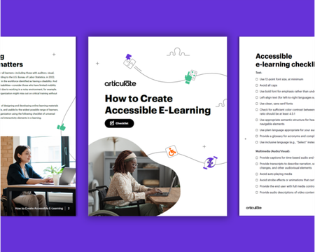
Did you know that some of the people in your organization might be missing out on critical training simply because your e-learning courses aren’t accessible? Now you can download and use this checklist to ensure your online learning materials and experiences are inclusive, accessible, and usable by the widest possible range of learners.7.5KViews0likes17CommentsQuick Tips & Tricks
Storyline 360 Quick Tips Tutorials: Reset Incorrect Drop Choices in Storyline 360 (w/ VIDEO) Tutorials: How to Start & Stop a Zoom Region in Storyline 360 Tutorials: Create a 3 Second Press & Hold Interaction Tutorials: Unrestricting Navigation in Storyline 360 Tutorials: How to Create a Smoother Interaction with Multiple Mouseovers in Storyline Tutorials: Working with Slide Layer Properties Tutorials: Require Learners to Click All Buttons in Accordion Interactions Tutorials: How to Toggle Hidden & Disabled States in Storyline 360 Tutorials: How to Combine Hover & Selected States in Storyline 360 Tutorials: Working with Audio and Interactive Markers in Storyline 360 Tutorials: How to Give Visual Feedback with Drag-and-Drop States Tutorials: Show Quiz Attempts with Hints in Drag-and-Drop Interactions Tutorials: Animate Drag Items as They're Dropped on Targets Tutorials: Show Feedback for Each Step in Sequence Drag-and-Drops Tutorials: Unlimited Drag Items from a Single Object in Articulate Storyline 360 Tutorials: Three Ways Learners Can Skip Slide Animations & Other Content in Storyline 360 Tutorials: How to Customize Interactive Markers in Storyline 360 Tutorials: Create Custom Drag & Drop Exit Animations in Storyline 360 Tutorials: How to Maintain Consistent Character Sizes in Storyline 360 Tutorials: Here's a Hidden Animation Effect for Storyline 360 (Free Template) Tutorials: Avoiding Overlapping Audio & Text Layers in Storyline 360 Tutorials: Production Tips for Mobile Only Courses in Storyline 360 Tutorials: How to Create a Progressive Scavenger Hunt with 360° Images in Storyline 360 Tutorials: How to Create Badges for a Gamified Scavenger Hunt Using 360° Images Tutorials: Use the Translation Feature for Quick Text Edits in Storyline 360 Tutorials: How to Customize the Design Theme Colors in Storyline 360 Rise 360 Quick Tips Tutorials: Media Production Tips for Rise 360 Tutorials: Creating Dividers for Rise 360 Tutorials: Creating Graphics in Google Slides for Rise 360 Tutorials: Embedding Content in Rise 360 Tutorials: Create a Meet the Team Interaction with a Quote Carousel Block General E-Learning Tutorials: Cut Long Audio Into Shorter Audio Tracks with Articulate 360 Tutorials: Using Subtle Textures & Patterns for Slide Backgrounds Tutorials: Enabling SVG When Using Cloudberry Explorer to Share Courses Tutorials: Quick and Easy Background Makeovers for E-Learning Courses Reach 360 Reach 360: Import Third-Party Training Content 6 Ways to View & Export Reports in Articulate Reach 360 Using the Activity Reports in Articulate Reach 360 Using the Learning Path Reports in Articulate Reach 360 Using the Active Learner Usage Reports in Articulate Reach 360 Using the Course Reports in Articulate Reach 360 Using the Group Reports in Articulate Reach 360 Using the Learner Reports in Articulate Reach 360 Reach 360: Publishing a Storyline 360 Course to Reach 360 Reach 360: Publishing a Rise 360 Course to Reach 360 Reach 360: Library Visibility Reach 360: Creating and Managing Custom Libraries1.2KViews0likes0CommentsHow I Built This Recycling Parallax Interaction in Storyline 360
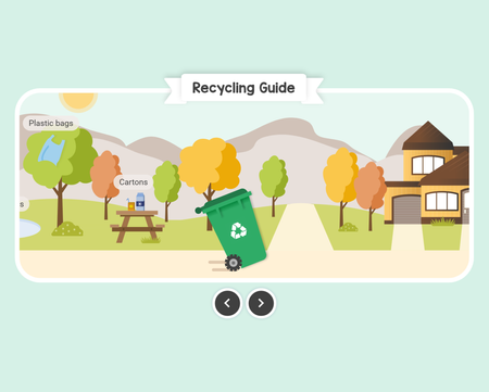
If you’ve ever been on a road trip and gazed out the side window (hopefully only as a passenger 😉), you’ve probably noticed that objects close to you—like trees—appear to zip by really fast, while objects further in the distance—such as mountains—seem to barely move. This phenomenon is known as motion parallax. In the digital world, the parallax effect gives the illusion of depth and movement. Combine that with a realistic learning scenario—like in this Recycling Guide example—and you’ve got yourself a truly engaging interaction. View | Download Let’s take a look at how to create this interactive parallax example in Storyline 360! Create layered components To create a parallax effect you need several layered components that move at different speeds. So, the first thing I did was create all my slide elements with the different layers in mind. Using a combination of shapes in Storyline 360 and Content Library 360 assets, I ended up with six layered components. Component 1: Recycling bin For this example, I wanted the recycling bin to be the main focus—after all, that’s what the course is all about. Since I planned to tilt the bin and make the wheels spin, having it front and center would give the optical illusion that the bin was rolling as the background moved. Component 2: Park Next, I needed to create the main interactive piece—the park. This is the only component that learners engage with to reveal additional content, so I was very intentional about how I designed the space. Since the graphics were going to move horizontally, I made sure to extend those designs past the slide size. I carefully placed each object—such as buttons and litter—in different parts of the park and in a specific order to help guide the experience. And because I used only Content Library 360 icons/illustrations and simple shapes, it was easy to move things around and reposition them as needed. Pro tip: Before duplicating a button, create all the states beforehand so they copy over. Big time-saver! Component 3: Mountains (light) To add a sense of depth and movement, I included mountains in the background. I combined several different mountain-shaped icons to create the extra-wide graphic. I made the first mountain layer a light tan color since objects up close are generally lighter in color. Component 4: Mountains (dark) Behind the lightly colored mountains, I added a darker version for contrast. To save time, I copied and pasted some of the shapes from the lighter mountain. Since not all mountains look alike, I flipped and resized some of the shapes so that when they moved, they didn’t line up exactly the same. Component 5: Sky The scene wouldn’t be complete without a sky! I added a sun for reference. I mostly kept this component simple to save time and to keep the main focus on content. Component 6: Frame (optional) Okay, so this is where it gets a little tricky. I could’ve made things easier by extending the sky and ground to fill the slide. That way, I wouldn’t need a frame and objects could freely animate on and off the rectangular slide. But I really wanted to create a unique learning experience. To give this course a custom look and feel I designed a frame to show content within a unique shape. The frame is comprised of the title, a white border, arrow buttons, a background, and two side shapes to match so that the other components only show inside the unique shape. Pro tip: To make the slide look seamless with the player background, go to your Player settings and change the background color to match. And here’s how it all looks together. Save static objects Once I created all the components, I realized there were a lot of objects on my slide. So, I decided to make my file easier to manage by saving some of the layered components that had a lot of objects—such as the Park, Mountains (Light), and Mountains (Dark)—as their own image and then replacing them with a scalable vector graphic (SVG) to keep image quality. For example, I selected all the objects in the Mountains (Dark) component, right-clicked, and selected Export Shape as Picture. I saved the shapes as a PNG. For the best image quality, I simply opened that PNG file in Adobe Illustrator and saved it as an SVG. I went back to my Storyline 360 project, inserted and resized my SVG to match the objects on the slide, and then deleted all of the Mountains (Dark) objects. I repeated this process with the Mountains (Light) component. For the Park component, I took a few extra steps before exporting it as a picture since it had a lot of interactive elements and I only wanted to save the static parts of the image. On the timeline, I clicked the eye icon to hide objects with states, animations, and text so I could still edit them or assign triggers at any time. Here are all of the static components I exported as a shape to save as an SVG. And for context, here are all the elements I did not include in the export. After inserting and resizing the Park SVG, I moved it beneath the hidden park objects on the timeline. I selected the eye icons to make all the Park components visible again where they remained in the same location as designed. Then, I grouped them and renamed the group “Park.” Saving some of the components as an SVG really sped up my workflow. With fewer objects on my timeline, it was easier to select the ones I wanted to edit or add triggers to. It also reduced the file size so content could load faster. To learn more about scalable vector graphics (SVG), check out this article: Storyline 360: SVG Support. Get things moving With all the graphics on the base layer in place, I created several additional layers to reveal content and help tell the story. Now it was time to connect everything with movement. To explain how to create the parallax effect, let’s roll through the example.😊 Background When you move right, the background moves left, making it look like the recycling bin is rolling forward. If you move left, those same background components move right, making it look like the recycling bin is rolling backward. To create this parallax effect, I added motion path animations to move some of the background components—Park, Mountains (Light), and Mountains (Dark). And in case you didn’t already know, you can add more than one motion path to the same object. That feature really came in handy here. For each component, I added a Left and Right line motion path. Since I wanted the components to all move at the same pace, I edited the easing direction to None for each motion path. I also selected Relative Start Point to ensure each component always moved from its current position. Next, I changed the duration of the paths to one second. I chose this duration because I planned to have the recycling bin roll left or right for one second as well. That way, all the animations would stop and start at the same time. To make it easier to manage triggers later on, I also renamed the motion paths to include the component name and the direction of the path. For example, I named the motion path that moves the park group right “Park Right.” Next, I changed the length of the paths. This is where it differs for each component. Since I wanted the background objects to move at a slower speed than the foreground objects, I edited the left and right motion path lengths for each component to the following. Park: 180 px Mountains (Light): 90 px Mountains (Dark): 40 px Using these settings, the furthest-away component, Mountains (Dark), would only move left and right 40 px during the one-second duration. Whereas, Mountains (Light) would move about twice the distance, at 90 px, during that same time. And that was it for the motion path settings! Now it was time to add triggers to make these components move in the right direction. By default, when you add a motion path animation to an object, a trigger is automatically created. Since I wanted the components to move based on the user selecting Right or Left, I deleted those triggers from the base layer and instead added them to the Bin Right and Bin Left layers. On the Bin Left layer, I added triggers to move the components right when the timeline starts. And on the Bin Right layer, I added triggers to move the components left when the timeline starts. Now, when the learner selects Left or Right, they’ll see the background move accordingly. Recycling bin Now for the recycling bin. I put it front and center to make it appear like it was rolling when the background moved. When you go right, the bin tilts and rolls forward. When you move left, it tilts and moves backward. After one second, the animations stop and the recycling bin returns to its upright position. To create this optical illusion, on the Bin Right and Bin Left layers I hid the recycling bin that was on the base layer so it was no longer visible. In its place, I added a tilted bin with dirt paths depending on the direction it was going to move. Bin left layer Bin right layer Next, I added a Spin entrance animation to the wheels. Just like a regular wheel, if you go left, the wheel’s direction moves counterclockwise. If you go right, the wheel’s direction moves clockwise. As for the amount it spins in each direction, I landed on a quarter spin since that looked the most accurate. To emphasize the direction the recycling bin was moving, I included dirt paths and added Wipe and Fade animations. And because both the duration of the background components and the timeline on these layers are set to only one second, all the animations come to a stop at the same time. To ensure the recycling bin returned to its original upright position, I added a trigger to hide whichever layer you’re on—Bin Left or Bin Right—when the timeline ends. The learner automatically returns to the base layer, where they can continue the learning journey. Set boundaries With the freedom to move the recycling bin left and right as you please, you may be wondering how I stopped the background components from moving too far. If you go left at the very beginning, you’ll see a little tortoise and a deactivated Left button so you can’t move any further. To keep learners from navigating outside of the main area, I needed to set some boundaries. To achieve this, I added a Deactivated button over the Left button that only shows when you navigate to that side of the screen. To make the button visible, I added a transparent shape and pasted it inside the existing group, “Park.” When you navigate left, the Park group moves right, causing the bin and the transparent shape to intersect, which changes the Deactivated button to Normal (visible). When you navigate away, it stops intersecting and returns to its original hidden state. I used this same technique at the end of the learning experience. When the recycling bin intersects with the transparent shape next to the house, it shows the final layer. This allowed me to end the parallax learning experience at the end of the graphic. Wrap-Up And that’s all there is to it! Using the parallax effect can create an engaging learning experience that truly brings your content to life. If you haven’t already, download this Recycling Guide project to take a closer look at how I built it. For more advice on working with motion paths, head on over to this article: 7 Pro Tips for Working With Motion Path Animations in Storyline 360. If you want to see more ways to create a motion effect, check out this webinar: Create Parallax Effects With Sliders in Storyline 360. Want to try to create your own parallax example, but don’t have Articulate 360? Start a free 30-day trial, and come back to E-Learning Heroes regularly for more helpful advice on everything related to e-learning. If you have any questions, please share them in the comments.2.9KViews1like22CommentsMake Over Your Rise 360 Course in 4 Easy Steps With Themes
Rise 360 has always been a fantastic tool for creating courses fast. And with the templates and other flexible options, even people without graphic design experience can feel confident that their Rise 360 projects will always look polished and professional. That’s why we’re so excited about Rise 360 themes. Themes give you even more ways to put your unique spin on the look and feel of your Rise 360 courses. And just like everything else about Rise 360, the themes feature makes creating beautifully designed courses easy—no graphic design skills needed. So let’s take a closer look at four easy steps you can follow to refresh your overall course design with a new theme, pique your learners’ interest with cover pages and lesson headers, reinforce your branding, and customize the course navigation experience. Step 1: Update the Overall Course Design With a New Theme The easiest way to give your course’s visual design a little facelift is to choose from the three prebuilt themes included in Rise 360. These themes are great for setting the overall look and feel of your project in one fell swoop. Let’s look at how to choose a theme and the available theme options, below. Choosing a Theme Start by opening any existing Rise 360 course on your Rise 360 dashboard. Select Theme in the upper right corner, and then click Change Theme. Rise 360 includes three professionally designed, ultra-stylish themes—Rise, the classic theme you’ve come to know (but with a few more customization options), plus two brand-new ones: Apex and Horizon. Following is a quick overview of each theme. Rise Our original theme, Rise, always looks modern and clean—a tried-and-true design choice that never goes out of style. Apex For a bold, contemporary, and striking design with angular finishes, choose Apex. Horizon When you want to give your course an elegant, sharp, and stylish makeover—complete with understated flourishes—Horizon is a great choice. They’re all so beautiful, right? Not sure which theme works best for your content? We’ve got you covered! Check out 3 Ways to Use Themes to Tailor Your Rise 360 Projects for some pro pointers. Once you’ve decided on a theme for your project, click to select it and you’ll see it applied to your project in the adjacent preview pane. Being able to preview your theme choice is handy because if you’re not in love with it, you can simply click another one. And if it’s love at first sight, click Save to apply it to your project. While you can use each theme as is, you also have loads of options for customizing key theme elements such as the cover page, lesson headers, and other features of the user interface, like colors, fonts, and navigation. We’ll explore some of these customization options in the next few steps. Step 2: Grab Learners’ Attention With a Custom Cover Page and Lesson Headers A cover page is your first opportunity to grab a learner’s attention, so why not customize it to fit the course topic or your company branding and really make it count? Select Cover Page from the menu and pick a stylish layout. If you’re opting to add a course image to your cover page, you can upload your own image or browse the wide selection images available in Content Library 360, which is built right into Rise 360. Pro Tip: You can also crop images directly in Rise 360. That means no hassling with a separate image editing app to tailor your course images to your project. To make your theme branded, upload your logo too. Customizing the Lesson Header option is another nice way to draw learners in and direct their attention to your content. You can choose from a variety of header designs or customize them with your own color or image. You can even adjust lesson headers to make them taller or shorter to create more or less white space, as you can see in the GIF above. Step 3: Reinforce Your Brand Identity With Custom Colors and Fonts The design choices we’ve walked through so far are quick but powerful ways to transform your course, but they’re really just the tip of the creative iceberg! You can also brand your course with custom colors and fonts to make sure it more fully aligns with your brand guidelines. Colors You can choose the Colors option to customize course accents like the menu and progress bar. Rise 360 makes picking eye-catching colors easy with curated options you can apply with a single click. But what if you need to bring in your official brand shades? No problem. Choose the Custom feature and select any color you’d like. Fonts Another easy way to brand your Rise 360 projects is to customize the fonts. Choose the Fonts option to find the perfect typeface for your project. Not sure where to start? Try the Recommended pairings—a fast way to make sure your headings and body fonts go together perfectly. For even more flexibility, click More to browse a selection of pre-installed options. And if you want to use your official brand fonts, just click Manage Custom Fonts to upload the ones you need and use them throughout your course. Step 4: Complete the Transformation With Custom Navigation and Button Styles You’ve got the cover page, lesson headers, colors and fonts fine-tuned. The final step in making over your Rise 360 course is to customize course navigation and button styles. Navigation In Rise 360, you’ve always had the option to show, hide, or disable the sidebar navigation. And now we’ve added more ways to customize course navigation so you can create the perfect experience for your learners. To start exploring your options, choose Navigation. Both Compact and Overlay navigation are great for making your content the star of the show. Choose Compact navigation to tuck your lesson menu away in a corner, where it can be quickly expanded with a click when learners need it. Another great option is Overlay navigation. When learners need to view the menu, they simply click the ☰ (hamburger) icon and the menu overlays the lesson, filling the screen. Love keeping things familiar? The always reliable Sidebar menu is a great choice with more options to choose from. Don’t want to include a navigation menu at all? No problem. You can remove it entirely—just as you’ve always been able to do in Rise 360. Buttons Want to continue customizing your course? Don’t forget about button options! Pick the button color that’s right for your course or branding. You can even refine your Previous and Next buttons by making them full width or floating—or you can remove them entirely. It’s totally up to you! Want to see how themes and custom settings can be combined for different effects? Check out the following example course. We present the same content three different ways and with minimal customizations so you can see for yourself. Explore Horizon Explore Apex Explore Rise Customizations: compact navigation, large header height Customizations: overlay navigation, small header height, custom color Customizations: sidebar navigation, medium header height, custom color Wrap-Up Not only does the themes feature give you a host of new ways to express yourself, wow your learners, and brand your Rise 360 content, it’s also streamlined the course creation process by consolidating theme settings all in one place—right at the top of the authoring environment in Rise 360. With so many options to customize your project's look and feel, you can rest assured knowing that whichever professionally designed theme you choose, your course will look fantastic on any device. And all of these thoughtful features and enhancements mean Rise 360 just keeps making it easier to create stunningly unique and stylish courses your learners will love. For more tips and inspiration on how you can start using themes in your e-learning, check out these helpful resources: Quickly Create Uniquely Stunning Courses with Rise 360 Themes 3 Ways to Use Rise 360 Themes to Tailor Your Projects How to Brand Your Rise 360 Course Want to try the new Rise 360 themes but don’t have Articulate 360? Start a free 30-day trial! And come back to E-Learning Heroes regularly for more helpful advice on everything related to e-learning. If you have any questions, please share them in the comments.1.7KViews0likes0Comments3 Ways to Use Rise 360 Themes to Tailor Your Projects
Rise 360 is the perfect authoring app for quickly creating beautiful, inherently responsive, and engaging courses. And it just got even better, thanks to Rise 360 themes. You can now choose from a variety of gorgeous new looks created by award-winning designers to give your existing Rise 360 projects a brand-new look and feel if you’d like, and make your new Rise 360 projects feel more custom. With options for cover pages, navigation, lesson headers, colors, fonts, buttons, and more, Rise 360 themes give you loads of creative possibilities for making a course feel unique. You can customize courses for your topic, help learners focus on content by controlling the navigation experience, reinforce your company’s brand identity, and so much more. To give you a peek at some of the many ways you can use Rise 360 themes to transform your projects, I’m sharing three ideas you can steal for your Rise 360 projects—but there are almost infinite possibilities! 1. Quickly customize Rise 360 course templates I love saving myself some time by using the real-content templates included in Rise 360. Since they’re ready-to-go courses, most of the time I use them as is. But with Rise 360 themes it’s easy to give real-content templates a whole new look and feel in just a few clicks. Before After Before After I think this Sexual Harassment Prevention Training template already sets the right tone, thanks to its course cover photo, which hints at the gravity of this weighty workplace topic. But with Rise 360 themes, I was able to easily customize the appearance of this template to give it my own, sleeker look while still aligning with the seriousness of the subject matter. I transformed the course cover page with a split right image layout using the Rise theme, added a dark gray accent color to keep things grounded and neutral, and then selected a fresh font—Be Vietnam—to give it a modern edge. And by choosing smaller lesson headers with a background color to match the course accent color, I gave the lessons a uniform appearance that pushes the content front and center. I love how these small but mighty changes make this template feel more custom—and it only took a few tweaks to make it my own. 2. Focus learners’ attention with compact navigation When it comes to sharing critical information, it’s helpful to minimize distractions so learners can focus entirely on the content. This Emergency Response Plan course shares crucial details with employees about preparing for and responding to life-threatening workplace events. Before After Before After The course does an excellent job of parsing information into easy-to-understand, bite-sized pieces with the accordion block, so learners aren’t overwhelmed with too much content. But I wanted to focus learners’ attention on this critical content even more. To do that, I selected a split right image layout using the Apex theme for the cover page. To further enhance the course’s appearance, I also switched things up to a bold and easy-to-read font—Poppins. Within the course, I wanted to make sure that learners weren’t distracted by too many elements on the screen, so I chose the overlay navigation menu that learners can view only when needed. I also went with smaller headers and hid the lesson count labels. Once again, little changes like these can add up to a lot more visual space within each lesson. This means learners can focus their attention on the most important elements of the course. 3. Make your courses look more on-brand Most companies have style or brand guidelines—the consistent design choices they use to reflect their unique persona. In many organizations, the style guide also applies to internal content, including e-learning courses. And in this Style Guide course, learners are introduced to the essential design elements they should use when creating content to represent the organization. Before After Before After Because there are so many theme customization options available in Rise 360, you can design a course that fits right in—no matter how specific your branding guidelines. To transform the course cover and bring this style guide to life, I chose a centered image layout using the Horizon theme, a green accent color, and an on-brand font pairing—Oswald & DM Sans. I wanted to further reflect the brand guidelines once learners dive into each lesson, so I added a branded sidebar navigation menu, floating navigation buttons with an accent tint, and designed lesson headers using an image reflective of the organization. Thanks to these choices, I’m not just telling learners how to properly reflect the organization’s unique style in their content, I’m also showing them. Wrap-Up Hopefully, these examples made you as excited about Rise 360 themes as I am! Being able to customize templates to match course topics, improve the learner experience, and reinforce brand identity are just a few of the many ways Rise 360 themes can help you transform your Rise 360 projects—but there are tons more options to explore. How do you see yourself using Rise 360 themes in your organization? Share your ideas in a comment below. To learn more about customizing your course’s design, check out these articles: Make Over Your Rise 360 Course in 4 Easy Steps With Themes Why & How to Tailor Content to Different Audiences The Color Effect: How Your Palette Affects Learners Does Your E-Learning Course Need a Menu? Finding Fonts That Fit Your E-Learning Want to try out Rise 360 themes, but don’t have Articulate 360? Start a free 30-day trial, and come back to E-Learning Heroes regularly for more helpful advice on everything related to e-learning. If you have any questions, please share them in the comments.493Views0likes0Comments