interaction
13 TopicsHow to Build This Feelings Slider Interaction
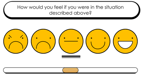
Giving learners time to reflect is a great way to help them engage with the course content on a deeper level. Let’s say you’ve walked learners through a scenario and you want them to imagine how they’d feel if something similar happened to them. You could create a simple slider interaction to give them time to pause and think about it. In this article, I’ll show you how to do that step by step. 1. Insert Icons Start by inserting a blank slide and adding icons that represent your learner’s emotions. I used these emoji icons, but you could insert other icons from Content Library 360, grab some from the Downloads hub here on E-Learning Heroes, or even create your own directly in Storyline 360 using shapes. 2. Add States For each icon, add a custom state—which you can call Highlight, for example—and change the formatting so it looks visually different. In this example, I added a rectangle underneath the selected emoji. 3. Set Initial State Set the initial state for the icon you want to appear when the slide starts to Highlight. In this example, I chose to show the middle icon first, but it’s up to you to decide what makes the most sense. 4. Insert Slider Open the Insert tab, select the slider you want to insert, and format it as needed to match the design of your course. If you like the style of the slider I used here, grab this button set from the Downloads hub to skip the formatting step. 5. Set Slider Properties Select the slider to open the Design tab and adjust the properties depending on the number of stops you need. Since there are five emojis here and I wanted the middle one to appear selected first, I set the initial step to 2 and the end value to 4. Before moving on to the next step, head over to the Update dropdown and choose While Slider Is Dragged so the slider value updates as the learner moves it. 6. Add Triggers Finally, add two triggers to each icon to change the state of the objects when they’re selected. Trigger 1 Action: Change State of Object: Icon State: Highlight (choose the name of your custom state) When: Slider Moves Conditions: If the slider value is equal to (step number) Trigger 2 Action: Change State of Object: Icon State: Highlight (choose the name of your custom state) When: Slider Moves Conditions: If the slider value is not equal to (step number) Wrap-Up And you’re all set! In just a few minutes, you’ve created an interaction that’ll help your learners take a step back and reflect on how they’re feeling. Explore the finished project and download the template here. Want to learn more about working with sliders? Check out these helpful articles: Storyline 360: Working with Sliders 4 Pro Tips for Working with Sliders And if you’re interested in seeing some other creative ways to use sliders in your courses, hop on over to this article: 3 Ways to Use Sliders to Elevate Your Next Storyline 360 Course. Want to try building your own feelings slider, but don’t have Storyline 360? Start a free 30-day trial of Articulate 360, and come back to E-Learning Heroes regularly for more helpful advice on everything related to e-learning. If you have any questions, please share them in the comments.410Views0likes0CommentsHow to Build a Simple Slide-to-Reveal Interaction
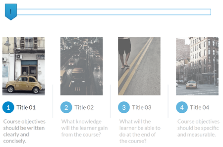
Displaying content in chunks makes it easier to read and less overwhelming—especially when there’s lots of information. Many instructional designers do this using a tabs or click-and-reveal interaction, but have you ever thought about using a slider instead? In this tutorial, I’ll walk you through how to do just that—step by step. Here we go! 1. Insert Slide Content Start by creating your slide and adding your content. To save time, I opened up Content Library 360 and chose one of the slide templates, but you can also create your own from scratch if you prefer. From there, add a semitransparent rectangle over each content section. When you’re done, this rectangle will help the learner see which of the sections is selected. 2. Set Initial State Now, set the initial state of the first rectangle to hidden. That way, when the slide starts the first image will appear “lit up” as compared to the others—since they’re covered by the rectangles—indicating to the learner that it’s selected. 3. Insert Slider Then, open the Insert tab, select the slider you want to add to your project, and format it however you’d like. 4. Set Slider Properties From there, select the slider to open the Design tab and adjust the properties. Change the end value depending on the number of stopping points you need. In this case, since there are four total sections, I selected 3 as the end value. Then, before moving onto the next step, choose While Slider Is Dragged from the Update drop-down menu so the slider updates as the learner moves it. 5. Add Triggers To make the rectangles we added earlier appear and disappear based on what’s currently selected, head over to the trigger panel and add two triggers to each shape. Trigger 1 Action: Change State of Object: Rectangle To State: Hidden When: Slider Moves Conditions: If the slider’s value is equal to (step number minus one since the start value is 0) Trigger 2 Action: Change State of Object: Rectangle To State: Normal When: Slider Moves Conditions: If the slider’s value is not equal to (step number minus one since the start value is 0) Wrap-Up And that’s all there is to it! In just a few minutes, you have an engaging way to split up your content for learners. Explore the finished project and download the template here. Interested in learning more about working with sliders? Check out these helpful articles: Storyline 360: Working with Sliders 4 Pro Tips for Working with Sliders And if you want to see some other creative ways to use sliders in your courses, hop on over to this article: 3 Ways to Use Sliders to Elevate Your Next Storyline 360 Course. Want to try building your own slide-to-reveal, but don’t have Storyline 360? Start a free 30-day trial of Articulate 360, and come back to E-Learning Heroes regularly for more helpful advice on everything related to e-learning. If you have any questions, please share them in the comments.908Views0likes0Comments3 Ways to Use Sliders to Elevate Your Next Storyline 360 Course
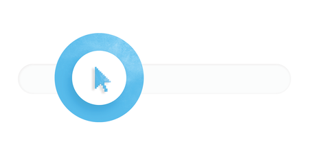
Sliders are a great way to give learners the opportunity to manipulate data and gain a better understanding of the relationships between topics. Take the interaction below, for example. Do you see how much more meaningful it is when you can actually interact with the percentages instead of simply displaying a static version on the slide? Explore this example But that’s not all sliders are good for! They have many other creative uses. In this article, I’ll walk you through three of my favorites. 1. Show Course Progression Using a slider is a great way to give learners a visual representation of where they’re at in the course. It helps learners plan their time by viewing what they’ve completed and what they have left. Here’s an example of what that might look like: Explore this example and download the template Thanks to the slide numbers feature in Storyline 360, this is super easy to set up. Just follow the steps outlined in this tutorial: How I Made This Progress Meter in Storyline 360. 2. Chunk Related Content Displaying content in chunks makes it easier to read and less overwhelming—especially when there’s lots of information. One common way to do this is by using tabs or click-and-reveal interactions, but another option is to use a slider. Here’s an example I created using a Content Library 360 template: Explore this example and download the template Want to build something like this for your course? It’s super easy! Just follow the step-by-step instructions in this article. 3. Help Learners Reflect Giving learners time to reflect is a great way to help them engage with the course content on a deeper level. Let’s say you’ve walked learners through a scenario and you want them to imagine how they’d feel if something similar happened to them. You could create a simple interaction like the one below: Explore this example and download the template Sound like something you could use in your project? Find out how to create it in this tutorial. Wrap-Up These are just three ways to incorporate sliders in your course, but there are plenty of others. Have you thought of any creative uses for sliders? If so, I’d love to hear about it in the comments below! If you’ve never worked with sliders before, here are some articles that will help you get started: Storyline 360: Working with Sliders 4 Pro Tips for Working with Sliders And if you’re looking for more ways to improve your courses with Storyline 360, be sure to check out the following articles: 7 Tips for Creating Immersive Learning Experiences with Interactive 360° Images 5 Tips for Creating Effective Software Simulations with Storyline 360 4 Ways to Improve the Learning Experience by Customizing the Storyline 360 Course Player Want to try building sliders in Storyline 360, but don’t have Articulate 360? Start a free 30-day trial, and come back to E-Learning Heroes regularly for more helpful advice on everything related to e-learning.620Views0likes0CommentsHow I Designed This Immersive Scenario on Prioritizing Tasks
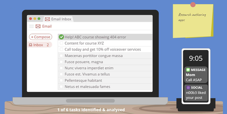
Recently my fellow instructional designers Sarah Hodge and Madison McCartney and I teamed up to prove that there’s always more than one way to present course content. Each of us created a mini-course on prioritizing tasks, using the Eisenhower Decision Matrix as our starting point. In this article, I’m going to walk you through how I got from this: … to this: View interactive version | Download template Without further ado, let’s get into it! Setting the Scene Since I created this project as an example, there’s no real target audience, much less learning objectives. But to make it feel realistic I set some basic parameters to guide my design thinking. Here’s what I came up with: Audience: Novice e-learning project managers Learning objective: Be able to identify tasks, classify them as important and/or urgent, and prioritize them accordingly Coming Up with the Concept Over the years, I’ve seen a lot of great e-learning examples in the E-Learning Heroes community, but a few really stand out to me. One in particular is this time management game by Phil Eagles. I love the way he took a series of simple multiple choice questions and made them into a scenario that feels real and meaningful. And since time management is so closely related to task prioritization, it’s the first thing I thought of when I started brainstorming ideas for my project. I wanted to create something similar—but put my own spin on it. Because I wanted to create a totally custom and immersive scenario, Storyline 360 was the perfect choice for this project. I decided to simulate a desk and let learners identify tasks and prioritize items for themselves. The idea behind this was to emulate real life—where learners have to identify tasks and decide which ones to do first—while also following one of the key principles of adult learning by giving them control over their learning experience. Refining the Scenario Once I had a general idea of what I wanted to do, it was time to iron out the scenario details. I wanted to give learners enough opportunities to practice prioritizing tasks without it feeling repetitive. I included a few different types of tasks—since that’s what it’s like in real life. In the end, I settled on a total of six tasks, including a few emails, a couple of text messages, and a Post-it. As I started to build out my scenario, I ran into some challenges. One of the main issues was that my slide was getting overcrowded. To overcome this challenge and help learners focus on one thing at a time, I divided the process of task prioritization into two parts: Step 1: identify and analyze the tasks to determine how urgent/important they are Step 2: prioritize the tasks based on their level of urgency/importance For step one, I used a series of toggles so the learner can decide if each task is urgent and/or important. Based on their answer, I provide custom feedback. This is how that turned out: For step two, I made a simple drag-and-drop interaction so the learner can decide where each task belongs on their to-do list based on its level of urgency and importance. Here’s what that ended up looking like: Because this project was intended for adults who may have previous experience with the Eisenhower Decision Matrix, I made the explanation walk-through optional, as shown in the screenshot below: Is this how I initially envisioned my project? Absolutely not. To be honest, I don’t think I really had a clear mental picture of what it would look like. Some people can map out their entire project before they even open up the authoring app, while others do better jumping straight into building and get inspired along the way. Both methods are totally fine as long as you always keep your learners’ needs at the center of your design. Designing the Graphics As someone with no formal graphic design training, I can be challenged to come up with ideas for the look and feel of my courses. To find inspiration, I usually start by checking out the examples and templates on E-Learning Heroes as well as the Content Library 360 templates. Even if I don’t find exactly what I need, I usually come across something I can use as a starting point. Personally, I find that starting with a template is less intimidating than starting from a blank slide. And even if the final result ends up looking completely different than the original template, having something to start with helps me channel my ideas and inch closer to a place I feel good about. So, once I knew that I wanted to create an immersive scenario, I headed straight to E-Learning Heroes to look for templates I could use as a springboard for my design. A quick search for “desk” led me to this template, which I thought was perfect: Download Template After opening the template, I made some adjustments and played around with different color options. Here’s what my first version looked like: There’s nothing wrong with the way this looks, but—as I mentioned earlier in this article—it was at this point I realized there wasn’t enough room on the slide to allow learners to both identify and prioritize tasks in one spot. Splitting the activity up into two parts gave me more screen real estate to work with. Around this time, I also decided I wasn’t sure about the mint green wall and wanted to give white a try . . . . . . but I wasn’t totally sold on that either. I also felt lukewarm about the way the desk looked and decided to incorporate some texture. This is what the next version looked like: Wondering how I created the wood texture? I did a Google search for “flat design wood,” inserted one of the images I found onto my slide master, and then used the curve tool and shapes in Storyline 360 to achieve a similar effect. This is what it looks like behind the scenes: I was pretty happy with the way this looked, but when I started adding other objects to the screen, I realized they didn’t stand out enough against the dark blue background. That’s when I settled on the design you see in the final version: I went through a similar process for the other slides in my project, so I thought I’d share the different versions with you as well. . . . and here’s the final version. You’ll notice that in the final version I pulled in the computer screen from the previous slide to tie it together a bit more. I also changed the size of the boxes to make it all fit on the screen. As I was working on my core content slides, I also started to pull together my title slide. Since my other two slides used a flat design style, I wanted to stick with something similar. I found this simple slide template in Content Library 360 and used it as a starting point: I didn’t want to include characters, so I deleted those and changed the color of the background to match the dark blue I was using at the time. After taking out the characters and changing the color, I felt like the slide was too minimal. It was missing something, so I sat and thought about how I could incorporate more visual interest. That’s when I had an idea: what if the title slide was a view of the desk from above? And since we’re talking about prioritizing tasks—and many people write their to-do lists in a notebook—I thought that might make sense and look nice. So I went back to E-Learning Heroes for some inspiration and ended up finding this spiral notebook template: Download I imported it into Storyline 360 and made a few adjustments to make it all come together. Here’s what it ended up looking like: As you can see, graphic design isn’t always a straightforward process. It doesn’t necessarily go from zero to perfect in one fell swoop. In many cases it’s an iterative process involving incremental changes until you’re happy with what you’ve got. So the next time you’re feeling stuck and unsure about your design, try doing what I did and search E-Learning Heroes or Content Library 360 for a template you can use as a starting point. Then, make small changes here and there. Eventually you’ll get to a place where you feel good about your design. More Resources Hopefully you’ve found this inside look at my design process interesting and insightful! Remember, it’s okay if your first draft isn’t perfect. Design (whether it’s instructional or graphic) is a process, and it often takes trial and error to get it to where it needs to be. And there’s absolutely nothing wrong with that! If you enjoyed this article and are looking for more insight into what goes on in the minds of instructional designers as they’re creating courses, be sure to check out these articles: How I Designed This Personalized Decision Matrix How I Designed This Interactive Dial Matrix A Behind-the-Scenes Look at How I Designed This Gamified Quiz Want to try building your own immersive scenario in Storyline 360, but don’t have Articulate 360? Start a free 30-day trial, and come back to E-Learning Heroes regularly for more helpful advice on everything related to e-learning. If you have any questions, please share them in the comments.1.1KViews1like6Comments4 Examples of Foreign Language Training That Will Get Your Learners Talking
Learning a foreign language on your own can be challenging. Foreign language e-learning helps create a dynamic experience for learners that’s both interactive and engaging. Course developers can include a variety of e-learning interactions like scenarios, games, audio, interviews, and quizzes to create projects that enhance the language learning experience. But don’t take our word for it—take a look at these four foreign language examples created by the always inspiring members of the E-Learning Heroes community. Check ’em out! This simple but effective course by Nancy Woinoski teaches learners basic German phrases using images and audio. Creatively combine images and audio to design a language learner course that’s truly memorable. This artsy Latin language course by Helen Greetham is a great example. The best way to help learners absorb a new language is to quiz them! Take a cue from this course by Annabelle Grew; it includes a knowledge check that gives learners immediate feedback. This Spanish language course by Anastasia Laur uses clean and modern flashcards to help learners quickly pick up helpful phrases with no distractions. Ready to try your hand at creating a foreign language e-learning project of your own? Join the E-Learning Challenge and submit your work—we’d love to see it. And if you’re craving more course design inspiration, go visit the Building Better Courses forum; it’s a lovely community full of talented e-learning pros.252Views0likes0CommentsA Beginner’s Guide to Designing Effective Tabs Interactions
When you think about the types of interactions most often used in e-learning, the good old tabs interaction is probably on the top of your list. That’s no big surprise. Tabs interactions are versatile and a great way to intuitively lay out related content, save screen real estate, and invite your learners to dig in and absorb information at their own pace. On top of their versatility, tabs interactions are quick and easy to build. In Rise 360, creating a tabs interaction is super-simple. Just insert a tabs block (from the interactive blocks menu) into your lesson and then pop in your content. Voilà! Instant tab-ification! Over in Storyline 360, you can grab a Content Library 360 template that has a beautiful prebuilt tabs interaction (like this one) and then customize it to your heart’s content, or you can create a custom tabs interaction in under five minutes. When your project requires a custom tabs interaction built from scratch in Storyline 360 and you’re brand new to creating such things and/or feel (very!) intimidated at the prospect, how can you be sure you’re making a tabs interaction that looks professional AND will be intuitive for learners? Should you even use a tabs interaction at all? These are the questions we’ll tackle in this article. I’m breaking down a few easy design considerations for building effective tabs interactions by highlighting some simple functional and visual design guidelines almost anyone can follow. Consider your content Tabs are a great option for presenting related content, like a collection of tips, steps in a process, or ideas that might otherwise end up as a list of bullet points or text spread out over multiple slides. For example, this free tabs download from Montse uses a familiar notebook theme to group related content. Montse's project looks so vibrant and inviting that you might ask yourself, Should I just use a tabs interaction for everything? The short answer is no. But here are a few questions to consider to see if a tabs interaction is the best fit for your content: Is the information I’m sharing all logically related? If the information can’t be chunked together in a logical way, using a tabs interaction might end up being confusing to learners. Will my learners need to compare any information side by side? If the point of sharing this information with learners is to help them understand the differences and similarities between products, for instance, a tabs interaction isn’t the best choice since they’ll only be able to see the content on one tab at a time. To help learners draw comparisons, try a side-by-side or table layout instead. Can I make this information more concise? Sometimes streamlining lots of content—even if it is all related—just isn’t ideal. If streamlining content means you’ll sacrifice reading comprehension or gloss over an important message, cramming it into a tabs interaction isn’t the answer. In general, if you find yourself reducing the font size to make everything fit, consider that a sign that your content might not work for a tabs interaction. In some cases that content may work better as a sub-menu that branches to separate slides so you have more screen real estate to work with. Use straightforward tab labels The beauty of a tabs interaction is that it groups related information in a way that’s intuitive to navigate. One of the ways these types of interactions are made so intuitive is through the use of labels. Tab labels should be short and sweet and reflect the type of content you’re sharing. Tab labels can take many different forms, including numbers or letters (that may convey order or priority), words or short phrases, icons or images—and even a combination of these things. Below are a few free downloads featuring some different ways of labeling tabs. Tabs Labeled with Numbers or Letters Tabs Labeled with Words or Phrases Tabs Labeled with Icons or Images Consider tab placement Crafting clear labels is just the first step in ensuring your tabs interaction is easy to navigate. It’s equally important to arrange your tabs on the screen in a way that makes sense. So how should you position your tabs for an effective interaction? Ideally, tabs should be aligned vertically or horizontally on the screen, spaced evenly and closely—but not so close that it’s hard for learners to click on individual tabs. Below is a quick comparison of two tabs designs. DO DON'T Notice how the tab design on the left is intuitive to use because the tabs are grouped together in a single vertical line? When you look at the design on the right it’s a bit harder to parse what’s going on because the tabs aren't spaced evenly and it’s not clear if they’re separate or related. Making sure the tab size, spacing, and alignment are consistent will go a long way in making your interaction easy to navigate. Make your tabs look clickable Once you’ve arranged your tabs you need a way for folks to know that they’re clickable. That’s where object states come into the picture. In Storyline 360, object states allow you to change the appearance of an object when a learner performs an action, like hovering or clicking on it. It’s a simple concept, but a powerful way to make any slide’s design more user-friendly. For instance, applying a simple hover state to your tabs signals to your learners that there’s more to see and explore. In Storyline 360, it’s easy to assign different states to the objects on your screen, like tabs, buttons, characters, text—pretty much anything. By applying a selected state to a tab, you can signal to your learners that they’re viewing the content associated with the tab they clicked on. You can also add a visited state to your tab so learners know that they’ve already reviewed the information in a given tab. Using all of these states is an even better idea. When used together these states highlight and emphasize how to navigate your tabs. There’s more to learn They say the devil is in the details, and that certainly holds true for designing interactive e-learning. It’s exciting to think about all the little considerations that go into making even something as unassuming as a tabs interaction more beautiful and intuitive. Hopefully the guidelines I’ve shared here have you feeling more confident about designing all sorts of interactions in your Storyline projects, including tabs. Want to learn more about building effective tabs interactions in Storyline 360? Check out the following articles for more ideas, tips, and inspiration. The Most Straightforward Way to Build a Tabs Interaction for Storyline Everything You Need to Know About States in Storyline 360 A Great Storyline Time Saver: Button Sets Create a Tabs Interaction with Storyline in 5 Short Minutes Follow us on Twitter and come back to E-Learning Heroes regularly for more helpful advice on everything related to e-learning. If you have any questions, please share them in the comments. Want to try building something similar in Storyline 360, but don’t have Articulate 360? Start a free 30-day trial.1.2KViews0likes4CommentsHow to Customize This Storyline 360 Countdown Quiz Game Template
A few weeks ago I decided to create this Storyline 360 gamified quiz template: Click here to view the interactive version and download the template. If you’re curious about my thought process in creating this example, jump over to this article: A Behind-the-Scenes Look at How I Designed This Gamified Quiz. If you’ve downloaded this template and want to adapt it, keep reading! In this article, I’m going to walk you through the top-four FAQs about adapting this template: How do I change the passing score? How do I change the number of questions in each level? How do I change the amount of time in each level? How do I change the number of levels? This template uses Storyline 360 features like question banks, states, variables, trigger conditions, and slide masters. If you’re not comfortable with how those work, you might want to check out the linked tutorials before continuing. Alright, here we go! How do I change the passing score? By default, I’ve set the passing score to 50 percent. However, depending on the project, you may need learners to get a higher percentage of correct answers to pass. Good news: making this update is super easy! Simply open each result slide, click on Edit Result Slide, and change the percent required to pass, as shown in the GIF below: Note that if you update the passing score, you might decide you also want to update the scores required to earn one, two, or three stars. See the next section of this article to learn how to do that. How do I change the number of questions in each level? By default, each question bank in this template includes 20 questions. If you want to increase or decrease the number of questions, in addition to adding or deleting those questions in the question banks, there are a few other things to update. Let’s walk through each of them. Update the Instructions Slide If you update the number of questions, it’s important to update the on-screen instructions so learners understand how the course works. To update the instruction text, go to your timeline and click on the eye icon to hide the objects that you don’t need to edit. After you’re done making edits, remember to show all the objects again. Update the Question Slide Master Another place you’ll want to update the on-screen text is on the question slide master. Next to the variable that keeps track of the question number you’re currently on, you’ll see it shows the total number of questions—which in this case is 20. Once again, this is a pretty quick fix. Simply replace the number after the slash with the total number of questions in your project. Update the Result Slide for Each Level On the Success layer of the result slide for each level, learners see how many stars they earned as well as a message that explains what those stars mean. Both the number of stars and the message displayed are personalized depending on their score. By default, it’s set up so that: If learners get 10-14 questions right, they’ll see one star and a message saying they got at least 10 questions right. If learners get 15-19 questions right, they’ll see two stars and a message saying they got at least 15 questions right. If learners get a perfect score, they’ll see three stars and a message saying they answered all 20 questions correctly. To make this happen, I’ve added states to both the stars and the feedback textbox. I also added triggers to show the state that corresponds to the learner’s score. Here’s what those triggers look like: If you change the number of questions in each level, you’ll need to update these triggers. But before you do that, you’ll need to calculate the scores that learners need to get to earn one, two, or three stars. For example, let’s say you want to reduce the number of questions per level from 20 to 10. You decide that to earn one star learners need to get five questions right, to earn two stars they need to get seven, and to earn three stars they need to get a perfect score. Assuming that each question is still worth 10 points, here’s what that calculation would look like: 1 star: 5 questions x 10 points each = 50 points 2 stars: 7 questions x 10 points each = 70 points 3 stars: 10 questions x 10 points each = 100 points Since technically learners will earn one star if they get five or six right answers, and two stars if they get seven, eight, or nine right answers, the triggers associated with those stars and the associated feedback messages will need to cover a range of points, unlike the ones associated with three stars. Here’s what those values look like if we use the example above: 1 star: between 50 and 69 points 2 stars: between 70 and 99 points 3 stars: equal to 100 points Thanks to the new trigger panel, it’s quick and easy to make those edits, as you can see in the GIF below: Finally, remember to update the text in the feedback message states to reflect the number of questions learners need to get right to earn one, two, or three stars, as shown in the GIF below: Update the Gameboard Slide The number of points earned—which, as we saw in the previous section, changes when you adjust the number of questions in each level—also impacts two things on the gameboard slide: The number of stars that learners earn The layer that appears when a learner unlocks a new level Updating these triggers looks very similar to what you just did on the result slides. Here’s a GIF that shows me updating those triggers for Level Two: You’ll need to repeat the above process for Levels Three to Five. The good news is that even though there are a bunch of triggers to update here, it’s super-fast since you can do it directly in the trigger panel. And those are all the updates you’ll need to make if you want to change the number of questions in each level. You did it! How do I change the amount of time in each level? By default, learners get one minute to complete each level. For every correct answer, they get an extra five seconds added to their time. If you want to change the amount of time learners start off with, you’ll need to do a few things. Let’s walk through the steps together. Update the Default Value of the Time Variable Start by adjusting the X variable, which counts the total amount of time remaining in seconds. In my template, I set the default value to 60—to give learners one minute to complete each level: If you want to give your learners more or less time, you’ll need to adjust the default value of this variable. Extend the Timer Past Two Minutes (Skip If Decreasing Time) If you’re decreasing the amount of time learners have to complete a level, you can skip this step. However, if you’re increasing it, you’ll want to pay close attention. In my template, a variable called M displays the number of minutes remaining. Even if learners get all the questions right, it’s not set up to work for anything above two minutes. If you decide to give learners extra time, you’ll need to make a couple of adjustments. The minuter-counter functionality is set up on the top-level slide master, on the Slide Loop layer: To figure out how many triggers you’ll need to add, start by calculating the maximum number of minutes that learners could end up with if they got all the questions right. For example, let’s say you decide to give learners two minutes (or 120 seconds) to start out with. To figure out how much total time they could end up with if they get all 20 questions right—and receive a five-second bonus for each—you’d end up with this calculation: 120 + (5 x 20) = 220 seconds. To find the number of minutes, simply divide that number by 60. In this case, the answer is three minutes. To make the timer work for this scenario, you’ll need to: Update the trigger that sets the number of minutes, in this case two, to include a range rather than anything above 120. In other words, you want to set M to 2 if X is between 120 and 179, instead of if it’s equal to or greater than 120. Add a new trigger to set M to 3 if X is greater than or equal to 180. Note that these triggers appear twice—once when the timeline starts and again when the timeline ends—so you’ll need to update them twice. Here’s a GIF that shows me updating them: Update the Reset Triggers Since the timer needs to start over whenever learners begin a new level, you’ll need to update the triggers that reset the starting value of the X variable—which controls the time remaining—in a few spots: On the gameboard slide: On the retry buttons located on the Success and Failure layers of the result slides for each level: Remember to do this on the Success and Failure layers for every single level, or the timer will automatically reset to 60, since that’s the amount of time I set the template up for initially. And you’re done! You’ve successfully updated the amount of time learners have to complete each level. How do I change the number of levels? If you want to split your quizzes up by topic, but you have more or fewer levels than are included in the template, no problem! In this section, I’ll walk you through how to customize the number of levels. If you want to decrease the number of levels, all you need to do is delete the associated scenes as well as the buttons and layers on the gameboard slide. Easy-peasy! However, if you want to add an extra level, there are a few additional steps. Let’s take a closer look. Create a New Level To create a new level, start by inserting a new scene. From there, duplicate one of the existing question banks and insert a new draw into your scene. If you’ve never used question banks before, check out this tutorial: Understanding Question Banks. Next, copy one of the existing result slides and paste it into the new scene, after the question bank draw. If you want, you can update the color of the buttons learners use to select their answers. In my template, I used a different color for each level—to match the color of the button leading to that level on the gameboard slide. Update the Gameboard Slide On the gameboard slide, decide where to insert the button for the new level. As you can see in the screenshot below, there’s a good amount of space between Levels Four and Five, so that may be a good place to put it. To create the Level Six button, duplicate the Level Five button and the associated stars. Then, update the button’s fill color so that it’s different from all the other levels. Next, move the Level Five button to the left, making sure to delete a few of the circles on the path to make space for the new button. Then, update the level number on the duplicated button to 06: Remember to update the fill color and level number in both the Normal and Disabled states, so that they appear correctly whether the level is locked or unlocked. For more tips on working with states, check out this tutorial: Adding and Editing States. Each level has its own layer on the gameboard slide. On each layer, you’ll notice that the path animates to lead up to the button for that level. An arrow and an instruction also appear so learners know which button to click. Finally, the button state changes, effectively unlocking the level. If you’re adding one new level, here are the updates you’ll need to make. On the Level Five layer, delete the part of the path that leads to Level Six and move the arrow and text so that they point to the Level Five button: Then, on the Level Six layer, get rid of the animations—without deleting the circles themselves—on the part of the path that leads to Level Five, and delete the circles that overlap with the Level Five button. Next, update the instruction text to say “Level Six” and update the button that the trigger points to. When you duplicated the level button earlier, the triggers associated with the level button were also duplicated. However, you still need to update a few things: The value of the variable that’s updated when the user clicks to indicate the level the user is currently working on The result slide the button resets The quiz slide the button jumps to Here’s a GIF that shows how to update those triggers: Update the Question Slide Master On the question slide master, duplicate the Level Five variable trigger. Then, change the value to 6 and update the slide it points to, as shown in the GIF below: Update the New Level’s Result Slide On the Level Six result slide, update the triggers on the Try Again buttons on both the Success and Failure layers: Update the Cumulative Result Slide Finally, on the cumulative result slide, check the box to include the result slide for the new level in the cumulative result calculation: Hopefully, this tutorial will help you customize this template to fit your needs! If you run into any issues or if you’d like to update this template in a way that’s not covered in this tutorial, please leave me a comment below. Looking for more gamified course templates? Here are few of my favorites: Randomized Board Game Dice Quiz Game E-Learning Battleship Game Crossword Puzzle Game Want to try something you learned here, but don’t have Articulate 360? Start a free 30-day trial, and come back to E-Learning Heroes regularly for more helpful advice on everything related to e-learning. If you have any questions, please share them in the comments.2.6KViews1like20CommentsA Behind-the-Scenes Look at How I Designed This Gamified Quiz
Have you ever wanted to create a gamified quiz, but didn’t know where to start? Or maybe you had a few ideas, but felt a little intimidated and decided to save it for a rainy day...that never came? I feel you. I’ve been there. But guess what? I went for it! Here’s how it turned out: Click here to view the interactive version and download the template. And if I can do it, you can too! In this article, I’m going to walk you through my design process so you can see how I got from an idea to a finished product. Let’s dive in! Coming Up with the Concept One of the hardest parts of gamifying your e-learning course is deciding which game elements to add. There are so many options it can be hard to decide which ones to focus on. There’s no right or wrong answer, but, as always, it’s important to keep your learning objectives and target audience in mind. Since I didn’t have an actual project to tackle, I tried to imagine a situation in which it may be beneficial to gamify a course. Then it came to me! What if I created a quiz for learners who need to memorize a bunch of information—vocabulary words, for example? When it comes to memorization, one thing that can be helpful is repetition. That’s why people use flashcards, so they can run through them over and over, remembering more and more each time. But repetition can also be boring, so why not make it fun? With that in mind, I decided to incorporate the following things: Question banks. I wanted to help commit the answers to long-term memory by randomizing and spacing out the questions and not simply using short-term memory to recall the order. A countdown timer. I wanted to create a sense of urgency and excitement, but also to encourage learners to trust their gut and go with their first instinct rather than overthinking it. Extra time. I added extra time to the clock to reward learners for correct answers and to give them more time to think about subsequent questions. An incentive to try again. Instead of forcing learners to get a perfect score to move forward, I wanted to entice learners to beat their previous score, so I set up a system of stars. Learners only need one star (or 10 correct answers) to pass, but if they want to earn two, they need to get 15 correct answers, and to earn all three stars, they have to get a perfect score. The hope is that learners who only get one star will want to try again until they get two or three stars. Levels. I broke the game up into levels that unlock as they go to give learners a sense of achievement. Sound effects. I embellished the game with sound effects to give it a more playful feel. Now that you have some insight into the ideation process, let’s take a look at how I decided on the design. Designing the Graphics Since my gamified quiz is intended to be a template, I wanted to stick to a simple design that could be used for a broad range of topics and could easily be adapted to fit any company’s brand guidelines. I decided to go with a bright, colorful palette to give it a fun vibe. Initially, I wasn’t sure if I wanted to use a background image or not, so I just left the background white. Here’s what my first draft looked like: But I wasn’t 100 percent satisfied with this first version. The font didn’t feel “fun” enough and all the gray made for visuals that were a little too “blah,” so I started brainstorming ways to improve upon my design. When I’m looking for inspiration, I often try searching Content Library 360 to see if anything jumps out at me. And sure enough, I stumbled upon an illustration of a sky with a big cloud and it just clicked—that’s it! What better way to give my game a lighthearted vibe? After I added the background, things started falling into place. I swapped out the gray for a darker shade of blue, to match the sky, and replaced the boring font with this fun, game-inspired one. Now I was getting somewhere! Here’s what my second version looked like: But something still didn’t feel right. I decided to see what it would look like if the pathway followed the outline of the clouds, to give it a more integrated, cohesive look. Once I was happy with the main menu slide, I created the question slides along the same lines, changing the colors for each level. At this point, I was feeling pretty good about my graphics, so I started thinking about sound effects. Choosing Sound Effects To really give my quiz a game-like feel, I decided to add some sound effects. I was careful not to go overboard, which would distract from the learning experience. Here’s what I landed on: A theme song. I wanted something to play at the beginning and end of the game as well as on the results slide to set the tone for the course. I wasn’t sure exactly what I wanted it to sound like, but I was imagining something a little retro to fit with the graphic style I chose. Correct/incorrect sounds. I thought it would be nice to find sound effects to signal to learners whether they’ve answered a question correctly or incorrectly. I wanted something that was short—so it didn’t get annoying—and unambiguous—so learners wouldn’t be left wondering what it meant. A “time’s up” sound. Finally, I wanted to find another short tone to signal when the time runs out on the clock—like an alarm or a buzzer. With that decided, I started my search. First, I headed over to this list of websites with free sound effects. After looking at a few options, I concentrated my efforts on freesound.org since it’s easy to navigate and the licensing terms for each download are clearly laid out. From there, I started trying out a few keywords—like game, theme song, right, wrong, alarm, buzzer—and gave each one a listen. To include my sound effects in my template, I made sure to choose sound effects that were licensed under Creative Commons 0—so I could use and redistribute them freely. That narrowed down my options, which actually made it easier to choose. If you’ve never used sound effects in your courses before, check out this article for advice on using them effectively: Tips for Using Sound Effects in E-Learning. More Resources Hopefully you found this sneak peek into my design process useful! If you downloaded the template and need some help customizing it, be sure to check out this how-to article, where I walk through how to do that: How To Customize This Storyline 360 Countdown Quiz Game Template. If you want to dig deeper into the concept of gamification and how to apply it to your e-learning courses, check out these helpful articles: Gamification Techniques: How to Apply Them to E-Learning Gamification: How and Why Does It Relate to E-Learning? 5 Visual Design Tips for Gamified E-Learning And here are a couple of gamified course templates in case you’re short on time: Randomized Board Game Dice Quiz Game E-Learning Battleship Game Crossword Puzzle Game Not finding what you’re looking for? There are tons more where these came from! Hop on over to the downloads hub to browse all the Storyline templates. Subscribe to our newsletter to get the latest e-learning inspiration and insights directly in your inbox. You can also find us on LinkedIn and X (Formerly Twitter).2.6KViews0likes14CommentsDrag and Drop
Drag and drops are a common type of interactivity used in e-learning. A drag and drop interaction typically consists of drag items (the objects that are dragged) and drop targets (the zones the drag items are dropped on). A drag and drop interaction involves moving the cursor over a drag item, selecting it, and moving it to a drop target. Drag and drops also work on mobile devices by using a finger to move the drag items. Learn More: 3 Design Tips for Creating Effective Drag-and-Drop Activities 3 Ways to Create Drag and Drops With Storyline 360 How to Create Freeform Drag-and-Drop Interactions in Storyline 3602.1KViews0likes0Comments3 Design Tips for Creating Effective Drag-and-Drop Activities
Drag-and-drops are a great way to add interactivity to your next e-learning project. From matching items to sequencing the steps in a process to placing objects where they belong on a slide, drag-and-drops are a surefire way to make your learners stop, think, and engage with the content. Designing a clear and effective drag-and-drop requires some careful thought and consideration; with that in mind, here are three design tips to consider next time you develop this type of interactivity. Know that these tips may not apply to each project—it depends on the specifics of the interactivity you’re creating. Consider Making Drag Items Appear One a Time When designing e-learning courses, we have to work with the limited amount of space that’s available on a slide. This means that, depending on the amount of objects included in your drag-and-drop interactivity, you may not have space on your slide to make all of your drag items appear at once. If it’s a really tight squeeze, you might want to consider revealing your drag items one a time. Here’s an example of a drag-and-drop that reveals the drag items one at a time: View Example This can be achieved with freeform drag-and-drops by adjusting the Drag & Drop options. Select “Reveal drag items one at a time” to reveal drag items one by one You’ll want to select the “Reveal drag items one at a time” option. Storyline even provides you with the option to select the order in which the drag items are revealed. Keep in mind that in certain cases it’s not really fair to the learner to reveal drag items one at time; sometimes it’s better for the learner to know all the options before they start placing the drag items. There’s no hard-and-fast rule, though, so this depends on the specifics of your interactivity. Provide Learners with Feedback In certain cases, you’ll want to provide your learners with feedback on which drag items were placed correctly and which were placed incorrectly. This is easy to do using Storyline’s Drop Correct and Drop Incorrect states. Here’s an example of a drag-and-drop interaction that uses Drop Correct and Drop Incorrect states: View Example Storyline even gives you the ability to decide if you want the states to appear immediately upon dropping the drag item on the target, or only once the learner has clicked the Submit button. You can also create a “Drag Over” state. This is a state that appears when the drag item is dragged over a drop target. These options are available under the Drag & Drop options window. These are a great way to provide learners with feedback on how they did, versus leaving them guessing. Use Dashed Strokes for Drag Item Shadows and Drop Targets In terms of visual design, a fun trick I love to use is a dashed stroke. I like to use a dashed stroke around the drop target, and also as a “shadow” behind the drag items. I place a shadow behind the drag items so you can see where the drag items were placed before they were dragged, instead of leaving a big empty space. Here’s an example of a drag-and-drop interaction that uses a stroked outline around the drop target and on the drag item shadows: View Example It adds a nice professional and visual design touch. These are three simple tips you can keep in mind next time you design a drag-and-drop interaction. It’s important to remember that the options you choose for your interaction depend on the specific activity you’re creating: there’s no one right or wrong way! Do you have any visual or instructional design tips you like to use when you create drag-and-drops? If you do, please let me know in the comments. Want to try something you learned here, but don’t have Articulate 360? Start a free 30-day trial, and come back to E-Learning Heroes regularly for more helpful advice on everything related to e-learning. If you have any questions, please share them in the comments.1.1KViews0likes6Comments