onboarding
6 TopicsYou're Hired!
Rather than make a series of clickable objects, I tried to create a more dynamic experience where the user can actually meet fellow employees, each with their own personality, voice, and knowledge base. In this example, the user can select a team member, meet them in their office, and through an AI interface, ask them real-time questions just as they would in a live onboarding session. I tried to give each character their own personality that comes through in their responses, so feel free to ask whatever you want -- you should get a coherent response. The ultimate goal is to create an onboarding experience feels more "human" and engaging, but is also scalable, with avatars that can be retrained as company knowledge grows. Link: You're Hired!Magazine-inspired design for Onboarding course cover slide
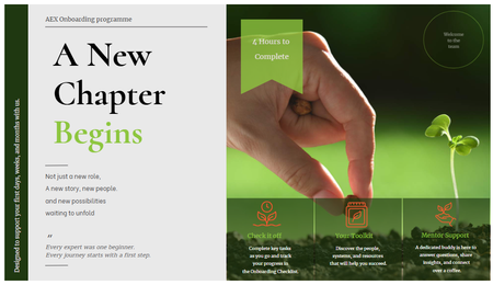
Hi, this week challenge is so timing and inspiring to me, especially when it comes to renovating my onboarding programme. So I thought Why not give it a try! It was my first time to explore Custom Blocks, especially trying different Typo, shapes, lines and everything else. P/s: With this design I hope the onboarding experience to feel more like opening a digital editorial publication than a typical corporate training course. Would love to hear any room for development.Visual Hierarchy
In this Storyline 360 example, I demonstrated the importance of by organizing content to guide learners' attention toward the most critical information first. Rather than presenting multiple concepts on a single slide, I broke the content into a series of focused slides, allowing learners to process information in manageable chunks. This approach reduces cognitive overload, improves clarity, and creates a more engaging learning experience by ensuring each element has a clear purpose and place within the overall design. View Below is an image of mailers that I receive and get lost in all the noise of too many items to look at.New "about us" for accounting firm
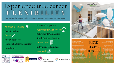
For this challenge, I tried to punch up my company's "about us" page (see original here). I prefer to design things in Canva, so I used that to create the background, and then copied the page and deleted the text to create "covers" for each section so it was easy to cut them out. That way, I didn't have to worry about sizing them correctly. That worked pretty well! My next hurdle was including the links for the specialties pages...I considered putting buttons in using Articulate instead of putting them in static from Canva, but they didn't have the same font available, and I didn't feel like investigating whether I could upload it somehow. So I just used hotspots, and that worked okay--it still gave users a "hand" so they knew they could click there. Maybe not as intuitive as a button that could do a hover state, but I think it'll work. I liked having the covers disappear when you hovered over the different sections--I think it creates more focus than just having a wall of text. But I couldn't get the triggers to cover it back up again once they hovered out. I'm guessing it was just too big of a space for that, because it kept flickering like it was trying to revert, but then sensed more hovering. Here's the final result! https://360.articulate.com/review/content/03776236-d147-4708-a9a4-fbb3431f5516/review