Community Challenge #2 - Final Entries
Jul 15, 2013
Keep it short and Sweet
The Challenge : For this next challenge, I want to tap into a common problem we all may have experienced in our jobs. Information Overload; when a SME provides too much information and we as Instructional Designers have to cut away all the fat to get to the good bits. For this challenge, pick a story from a movie, novel, fairy tale, etc and choose the most important points and tell it within 5 slides. Make it fun and interactive, but remember the goal is to keep it short, but still “get the whole picture”.
The official turn in date has passed, but don't be afraid to turn it in. Just PM me a link or post it in this thread and I'll add it to the main post.
Entry 1 - The Island

Entry 2 Untitled

Entry 3 Gremlins

Entry 4 The Bible

Entry 5 12 Angry Men

25 Replies
We need more entries!
sorry my plan for the Highlander never materialised, too much work to do.
Can we vote yet?
I hate to be negative because I usually try to be really encouraging, but I don't get the point of the first one at all. I guess you need to have seen the show(?)/ movie(?)
Second one, has a lot of promise, but the words disappear way too fast. Maybe whoever did it would like to resubmit with the words slowed down. I told my kids to join me and we'd look at the entries together - my 7yo couldn't read remotely fast enough to get through the words before they vanished, so I started reading them aloud, and couldn't get through them either unless I spoke really, really fast, and then I was speaking too fast to actually make sense of what I was reading. Sorry again to be negative but I think this is a really important point about words that disappear of their own accord. I had some like that in a recent story I did, and I made sure I got a few other people to check the speed because once you know yourself what you've written you automatically read them super fast.
So definitely number 3 for my vote. It is cute.
But if there are more entries can I come back and vote again?
Sorry Jerson too much work this time. I might try and put something together later but this challenge takes a lot more thinking then the first one because you really have to edit down the story to its bare bones and still get the message across to viewers who are not familiar with the original story and you have to present the story in a visually interesting way.
I think the Gremlin entry did a good job of this because I was not familiar with the story at all but it had the narrative arc that is required in all good story telling so I was able to walk away understanding the plot.
As for entry 1, I think you did a good job of setting up the story and describing the characters but I did not get a clear sense of what the main conflict was or how it was resolved.
Entry 3 - The visuals were very nice in this one but agree with Fiona that the text moved too fast so I would suggest either slowing down the pace or having the reader click on something to proceed.
btw Jerson.... where is your entry
This challenge got away from me too. I had two approaches in mind, but ultimately couldn't get them to look and function well enough for judgement. :(
@Nancy,
I did Gremlins, It was sort of rushed (I've been feverlishly working on my illustrated characters) so I didn't get a chance to do anything fancy.
@Fiona,
Don't worry about being negative as long as it's contructive. These challenges are meant to develop your skills and try new things. As for voting, I'm still working on a method that will work here. I've been looking at surveymonkey.com and seeing if it will work.
Howdy, all
I, too, regrettably missed this Community Challenge -- and the previous one! (Combination of lots of work -- which is good! -- and a few weeks holiday -- which is ALSO good!)
Anyway, I've written up some feedback on the three official entries: "The Island", "Untitled" and "Gremlins".
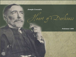
When I originally saw this challenge listed, I immediately thought of "Heart of Darkness", which has always been one of my favourite stories. If I've got time on Sunday evening, I might give it a crack.
But in the meantime, here are my thoughts, for what they're worth on the three entries so far...
Leslie
P.S. Jerson, I think this is a WONDERFUL initiative and I hope to learn a lot from the amazing talent we're fortunate to have on this forum. Good on you for making it happen!
P.P.S. I'm going to have to break this up into several posts because of the per-post character limit.
====================================================
THE ISLAND
====================================================
>>>>> General Comments/Criticisms/Suggestions:
* Visually: absolutely beautiful!
* However, I still don't really have an understanding of the story. Some of the challenges of the individual (main) characters, yes; but the central themes and/or plot-points of the story, no.
* Font: Fantastic choice; it's energetic, youthful, exuberant... but... variation needed. One for title, one for characters, one for author (which can also be the font for the text throughout because you probably don't want more than three fonts; four max). Using the same font throughout is overkill and erases the required contrast. We're only left to go on the relative sizes of the headings and the body copy.
Also, because of the quirky nature of this font (which is one of its strengths), it makes for hard work over extended lengths of texts. This is a decorative font, probably best retained for main headlines only.
* Sound effect: Peaceful. I don't know if this matches the story or not. though.
* Hover effect on title slide is quite nice -- although "Tess & Barrett" overlaps the title, drawing unnecessary attention to this clash
* Instructions on title slide disappear too quickly and you can't get them back (without revisiting)
* The questions at the end of each description. This helps to create a sense of intrigue. Will these questions be answered by reading about the others?
* The [Page 1] button text confused me. I think it would be better as "Learn about someone else" (or something like that -- only shorter!)
* Top margin for text boxes on character slides in inconsistent. I'd suggest setting a uniform margin (top/right/bottom/left) and then as you move the text box to suit the photograph, you can always be sure that the placement is consistent in its proximity to the outer border.
====================================================
UNTITLED
====================================================
>>>>> General Comments/Criticisms/Suggestions:
* This seems like about a dozen slides rather than 5.
* The images are FANTASTIC! The parchment bg is quite nice (although I'd probably up the transparency because it's a bit strong in places; effectively "competing with the main narrative images). I also like that only selected elements of the characters, etc. have been coloured; this produces a really nice contrast and draws the eye to specific elements. Colours have obviously been chosen quite deliberately to echo elements of the story, too, which is clever (e.g. sunset under tree, green of brothers and red of victim, etc.)
* As others have mentioned, the text moves too quickly and there aren't any navigation controls (other than the Pause button). This will be very frustrating to a lot of viewers/learners.
* Again, as has been mentioned... a lot of typos. A recurring example in a very large contingent of the population's work is "it's" being used when "its" is called for. Some grammatical inconsistencies as well will time-references in the verb.
* Font: While really nice thematically, it seems to not like apostrophes, causing some problems for clarity (exacerbated by the speed of the text)
* Editorial convention: Numbers below 10 are spelled out (e.g. "...three sons", "...dreamed of two traitors"). [Note: There are some stylistic exceptions to this guideline/convention.]
* The music bed is rousing, but the volume is a bit high. It overpowers the story itself. (And there's no volume control on the Player)
* Narrative panels: Slight transparency works well.
As do the fly-in animations.
Timing of text needs to be tweaked in a couple of places to ensure the illusion of [panel + text] as one unit isn't broken.
Padding inconsistent. No problem with panels being different sizes, dictated by the tranche of text selected to go in each one, but I'd suggest making sure that the degree of padding is the same. Some seem to have huge areas of padding while on others, the text is really cramped.
Also, considering the shape selected for the panels, I'd suggest experimenting with align-right for the panels overlapping left border... and vice-versa.
There are some panels where it's VERY easy to miss a big chunk of text because there are other animations catching your eye while the narrative panel stays in place but changes the text! I think it would be better -- given the number of simultaneous entry/exit animations (which work REALLY well, by the way) to have every narrative panel animate in from a different location. This would "reset" the viewer each time and ensure no part of the story gets missed.
Similarly, at the start of the story the text is NOT in panels. I'd go with (again) consistency.
====================================================
GREMLINS
====================================================
>>>>> General Comments/Criticisms/Suggestions:
* Big black next button
This seems rather out of place. Not just its location, which doesn't seem discernibly aligned with any other element(s), but the size of the icon, the colours, and its very "button-ness-ness". I'd suggest using an icon of, say, a book or parchment (or something thematic which could be repeated across Slide 1-4, e.g. the Barbie car ???).
Also, text to pull the viewer/learner in a bit -- using a complimentary font to the title and possibly the same red (if not too strong; otherwise white).
For Slide 1, the text could read something enticing like "Do you dare?"
For Slide 2, it could read "Rules for AVOIDING Gremlins..." (I wanted to say "...for the upkeep of your Mogwai, but at this stage the viewer/learner doesn't know that Gizmo is called a Mogwai in his cute-as-a-button form). So if the text were altered on Slide 2 to add, say, "...called a Mogwai. The boy named him Gizmo."
For Slide 3, "What do you think happened?"
Slide 4, "But then..."
Or something like that, y'know.
* Why no "back" button/controls?
* Matching the player default font to the GREMLINS font is a nice touch!
====================================================
*** Title Slide ***
>>> Rockin'
* bg excellent replication of radial gradient (light from inside box) on movie poster (used in Slide #2)
* shadow effect of Mogwai + Gremlin = AWESOME! The timing and staging of the animations REALLY has a punch (fly in left; fly in right; fade in from same location)
>>> Suggestions...
* A grid that's built around the content slides and to which this one then conforms as well.
====================================================
*** Slide #1: Intro Screen ***
>>> Rockin'
* Gizmo fade-in IN box. Lovely!
>>> Suggestions...
* Animation on caption/narration box is set to "from bottom". I think it should follow the left/right of the title screen. It should also have the same colour-scheme (e.g. red/green/white) and font at the title (or a complimentary one if that's too much in extended passages, which I suspect it might be).
====================================================
*** Slide #2: The Rules ***
>>> Rockin'
* The shapes: Simple yet strong and elegant.
* Foreshadowing with the phrase "All he had to do was..."
>>> Suggestions...
* Rules to enter left, left, left... or... left, right, left (for consistency with Title screen and my suggestion for Slide #1)
* Colour scheme of the circles to match title colours: green border and red fill (for "important" or "bad").
* Balance of text: Line-break after "feeding", "get" and "expose"
* Image of the old Chinese guy in bg ??? (For those not familiar, he's the one who explains the rules very clearly)
====================================================
*** Slide #3: Rules Broken ***
>>> Rockin'
* The "drop away/ reveal" is really cool! (But... see "Suggestions", below)
>>> Suggestions...
* If I wasn't familiar with this movie, I'd have forgotten what the two broken rules were (and there's no way to go back)! So you could do a hover effect on the images where the image gets the "vaseline on the lens" effect and the text stating the rule appears again.
* Similarly, I wouldn't know what feeding him after midnight and/or getting him wet involves. The second picture (with the teeming mass of ready-to-run-amok Mogwai gives an indication, but it's not clear enough if you haven't seen the flick).
You could move the (1), (2), (3) elements to the left on this slide (or LAYER as I suspect is the case) as well as on the previous one. This would give room for the Chinese man to the right. And... you'd also have some room to the right where you could insert, say, a 10-sec video clip of the RESULTS of breaking these rules...or a short explanation.
* Extra-slow fade in of gremlin silhouette in bg (with opacity decreased so it's quite subtle)
====================================================
*** Slide #4: Result ***
>>> Rockin'
* GREAT pictures! I also like that they seem to fly in randomly, underscoring the chaotic nature. If all the other entry animations had been uniform (e.g. fly-in from left), then by NOT using that effect here (e.g. diagonal entry + from right, bottom, etc.) it would really contrast and "Bzzzz~~~t!" the viewer.
>>> Suggestions...
* The smaller "bg" imgs, all line up too neatly- creating a kind of "inner border" that conflicts with the big black next button (see below) and, more importantly, undermines the energy and anarchy you're portraying here. Set them off centre, overlapping, rotated akimbo, etc.
* When large image of Spike fades in, put an object behind that photo (filling entire screen) with white fill and transparency set to about 40%. Additionally, put thick border around that image. And where the four "bg" images fade in medium, fade that one in "fast" or "very fast". Combined with the thick border, contrast with bg (courtesy of white screen) and the relative size, this will give it a bit more jolt, which is what you're going for, I assume.
* Text gets "eaten" by the business of the images. Perhaps you could fade the text in by itself first and then fade out AS the four "bg" images fade in. ??? By positioning the images as suggested, you'd probably have enough dark blue at the top to get away with the text going up there and staying there.
* Placement of the big black next button (as noted earlier) highlighted here by the obvious clash with "internal" border (created by the four "bg" imgs)
====================================================
*** Slide #5: Resolution ***
>>> Rockin'
* Gizmo zoom out then zoom in is a nice dynamic touch for the climax.
>>> Suggestions...
* Again, for someone not familiar with the story, the reference to "road rage" doesn't really explain/reveal anything. Sure, we understand that Gizmo saves the day, but how does he do this driving a car? Could we not see some of the RESULTS of his zipping about the WalMart as, say, polaroids appearing around the border (at differing rotations) of the in-car shot ????
* Also, typography: line-break after, say, "Develops" (which doesn't need to be capitalised, incidentally)
For what it is worth...I also ran out of time, but here is the first 2 slides of "The Bible".
I have tried to be respectful, but a bit fun too.
There's no voiceover on Slide 2, and to be honest it WOULD have only been 5 slides but you said NOTHING about layers
Some of the layer timings are too long, but hey...on the plus side.....Moses' cane glows to part the Red Sea :)
http://www.pperf.co.uk/bible/story.html
love this Bruce - can't wait to wait to see what you do with the book of revelation.
@Nancy - thanks
Yes....there were some areas that were going to somewhat "challenging" to get right - but I would to get around to finishing this one day.
Bruce
Here is my entry 12 Angry Men movie - A bit late but here you go ..5 slides ..with layers and triggers.
Looking forward to your feedback for improvement. P.S> I am not a Pro narrator by any means..
https://dl.dropboxusercontent.com/u/43052953/12AngryMen%20output/story.html
>> The Island - loved, loved the big bright images and the background sound of the waves and funky font - really set the tone!!..it pulled me in..I don't know this movie/show ..I felt like I got the first bit of the story (character & their challenge) but not what happens next? When is part 2 coming out?..
>> The tale entry - I found the imagery beautiful and nicely partially colored! I agree I often was caught out by the fast appearing words. The music was very appropriate. A little loud and there was no audio control on player. BTW What is the name of this story? Lovely one to share with kids.
>>Gremlins..ah yeah those adorable little fuzzballs.. well told and great pictures! Fab effects - Gremlin in box and dropping the text boxes to reveal the images. I think more text/story detail could have been added. I wasn't sure when to press the black NEXT button out of fear I would miss a wee fuzzy gremlin..maybe make it appear after all the animations on the slide are done perhaps?!.
Thanks guys, I had fun watching all 3!!
Added two more entries.
@Burgaluva
Appreciate the feedback.
Community Challenge #3 will be announced on the 1st. Trying to get some things lined up.
Hey Eimear - First just wanted say that I loved your entry. The use of the film reel as a background was inspired and so was the interactivity (putting us in the shoes of the jury - very nice). The only suggestion that I would make for improvement is that I didn't think the use of the cartoon characters fit in with the overall look and feel of the module.
As for the second story - I think it is one of the tales from Aesop's Fables.
What fun! This is a great outlet for all of those things I would love to do that don't fit in projects at work. I just discovered this thread and am interested in how to know when the next challenge is posted, and how long between announcement of challenge and entry deadlines.
Thanks,
Hi Hilary, here is the link to the results of the first challenge if you are interested.
http://community.articulate.com/forums/p/31509/172773.aspx#172773
@ Hilary
I'm the one spearheading the community challenge. I started the first two in the middle of the month. I'll announce the next one on the 1st of August. I'm trying to line up a few things before I announce the next challenge. I'm going to try to have one at least every month. If you have any questions about let me know. I'll be glad to see your entry in the next challenge.
Jerson,
Hold the door on this one, mate! I did, indeed, start on Heart of Darkness on Sunday night. It's only a hundred and something pages, but (of course! *groan*) the project has turned into a monster (no pun intended).
I'll see if I can get it wrapped up this evening. Probably tomorrow evening, though.
Leslie
@ Nancy.
Thank you for your complimentary words . I totally agree with the cartoon characters not fitting in .. will have to find more appropriate characters but using presentermedia.com was a good placeholder for now.
Looking forward to the next challenge!
@Leslie
Looking forward to it, just PM me a link and I'll post it up.
Gee whiz, it's been a while between drinks here. Apart from a brief rant about Master Slides doing stupid things, I've hardly visited and haven't posted on these boards since my post above... which I'm a bit alarmed to notice is dated JULY. Eek!
Busy bee.
(In that time, I see David Anderson has taken on the Community Challenge AND it's now a WEEKLY challenge, to boot! I also see you've got your site up, Jerson; selling those characters you were working on. Nice one.)
------------------
Anyway, I finally got around to completing the (much bigger than anticipated!) challenge I set for myself above: Heart of Darkness In Five Slides.
I cheated a little bit and I crammed some extra layers in where they really should have been separate slides, but I finally got around to finishing it the other night. You can check it out here:
* Blurb/Background/Notes
http://www.educationbreakthrough.com/my-work/heart-of-darkness/
* The story itself
http://www.educationbreakthrough.com/demo-heart-of-darkness/
Let me know what you think. Feedback appreciated.
Cheers,
Leslie
New to e-learnings and going through old challenges - here's mine for The Little Mermaid http://atozwithtracy.com/portfolio_page/shortandsweet/ click for demo
This discussion is closed. You can start a new discussion or contact Articulate Support.