Make sure that PowerPoint is closed when you install them. I always have to close out of PowerPoint, install the font and then re-open PowerPoint. It won't show up otherwise (kind of a refresh I guess). Maybe that will do it for you..
Does anyone know a way to add a chalk texture to text in a non-chalkboard-type font? I'm trying to use a "European" looking font on a chalkboard, but I can't figure out how to get the grainy texture of chalk and it just doesn't look right otherwise.
What I usually end up doing is to create my text and then save it as a picture (PNG). Then insert the picture and use the PowerPoint artistic effects on it. There are a few good effects in there to do what you are looking for and then of course you can up the effect to make it more or less grain in the effect properties.
Amy - using Gina's idea, below is a quick sample where the text is Arial black and has been reinserted on the slide as a PNG instead of a textbox (to do this, you can right click the textbox and choose Save As Picture, and use the png format ... then use Insert > Picture to insert the png onto your slide).
Once the text is inserted as a png, you can go to the Format tab, choose Artistic Effects, and click Artistic Effects Options, which brings up a window where you can select and fine-tune your options. I used the artistic effect called Pencil Sketch, and chose 10% transparency and a pressure of 1.
Sorry I did not give more information, I was answering from my phone sitting in a movie theatre last night (waiting for the movie to start)!! haha...
Here is my example. I used a thick text in white, saved it as a png using the right click method and then when I brought the image back in to PowerPoint, I used the Glass Effect and turned it all the way up to 100%.
Thanks, Gina and Jeanette! I discovered "text fill" as well, which gives me a similar effect when I use the "newsprint" fill. (Attached; the font is Coming Home (http://www.kimberlygeswein.com/?p=334) italicized, if anyone's curious. After all that, the person I'm working with thought the European font I found was too hard to read...and she was probably right, even though it looked cool!)
P.S. That's Tom's chalkboard template from the Downloads section
Great tip on the Text Fill...I think it looks great! I like the European font too, but I have also been told by others reviewing my slides in the past that ALL CAPS font all the way through is too hard to read. It's ok for titles, but if they have to read more than a sentence like that, then it makes it difficult.
Sorry about the craving, Jeannette! Aren't you glad I didn't include the crêpe menu?
Gina - I agree about the all-caps, especially with the convention that caps = yelling. In this case, these won't be used in a WBT but rather as 8.5x11 standalone menu signs at our upcoming Paris-themed annual employee party.
19 Replies
This one is kinda nice.
Thanks Jeanette, that is close enough, I only need it for one slide, so didnt really want to have to buy it
Thanks
This is the one I use:
Thank you Gina
Jeanette
I downloaded the fonts that you had, but I am having trouble getting them to show up in PowerPoint. What do I need to do??
Make sure that PowerPoint is closed when you install them. I always have to close out of PowerPoint, install the font and then re-open PowerPoint. It won't show up otherwise (kind of a refresh I guess). Maybe that will do it for you..
That was just what I needed to do ... Thanks
no problem! I got so frustrated one day until I figured that out! haha..
I like Another as a font for a chalk look as well.
I've used Chalkdust for a while. It's similar to the Chalkduster Mac font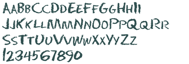 .
.
Thanks guys, we went with the one Jeanette gave, but will install all of these as well
thanks
Phil
Hi all,
Does anyone know a way to add a chalk texture to text in a non-chalkboard-type font? I'm trying to use a "European" looking font on a chalkboard, but I can't figure out how to get the grainy texture of chalk and it just doesn't look right otherwise.
Thanks!
What I usually end up doing is to create my text and then save it as a picture (PNG). Then insert the picture and use the PowerPoint artistic effects on it. There are a few good effects in there to do what you are looking for and then of course you can up the effect to make it more or less grain in the effect properties.
Great tip, Gina!!
Amy - using Gina's idea, below is a quick sample where the text is Arial black and has been reinserted on the slide as a PNG instead of a textbox (to do this, you can right click the textbox and choose Save As Picture, and use the png format ... then use Insert > Picture to insert the png onto your slide).
Once the text is inserted as a png, you can go to the Format tab, choose Artistic Effects, and click Artistic Effects Options, which brings up a window where you can select and fine-tune your options. I used the artistic effect called Pencil Sketch, and chose 10% transparency and a pressure of 1.
Sorry I did not give more information, I was answering from my phone sitting in a movie theatre last night (waiting for the movie to start)!! haha...
Here is my example. I used a thick text in white, saved it as a png using the right click method and then when I brought the image back in to PowerPoint, I used the Glass Effect and turned it all the way up to 100%.
Hope that helps!
Thanks, Gina and Jeanette! I discovered "text fill" as well, which gives me a similar effect when I use the "newsprint" fill. (Attached; the font is Coming Home (http://www.kimberlygeswein.com/?p=334) italicized, if anyone's curious. After all that, the person I'm working with thought the European font I found was too hard to read...and she was probably right, even though it looked cool!)
P.S. That's Tom's chalkboard template from the Downloads section
Cool, that example looks great! I really like Gina's example as well.
And thanks, after looking at your attachment I now I have a craving for mini burgers and sweet potato fries.
Great tip on the Text Fill...I think it looks great! I like the European font too, but I have also been told by others reviewing my slides in the past that ALL CAPS font all the way through is too hard to read. It's ok for titles, but if they have to read more than a sentence like that, then it makes it difficult.
Sorry about the craving, Jeannette! Aren't you glad I didn't include the crêpe menu?
Gina - I agree about the all-caps, especially with the convention that caps = yelling. In this case, these won't be used in a WBT but rather as 8.5x11 standalone menu signs at our upcoming Paris-themed annual employee party.
Here are two European fonts if anyone's looking for one - I was back and forth between the two: http://www.dafont.com/philippe.font and http://www.dafont.com/valerie.font.
This discussion is closed. You can start a new discussion or contact Articulate Support.