Forum Discussion

New in Labs: Responsive Custom Blocks
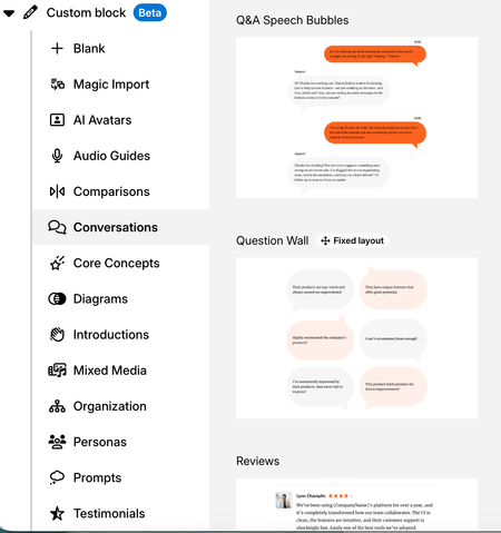
This sounds awesome "With Responsive Custom Blocks enabled, your custom blocks will adapt to any screen size," BUT also need it with all blocks. At my company, we have a lot of people on the road and using cellphones is key. I've realized it's tricky when taking training modules on their phones vs computers due to screen size and content.

Hi Sarah!
Thanks for sharing this use case! I can see how important the mobile experience is when you have learners completing training while they’re on the road and relying on their phones.
Responsive Custom Blocks is specifically focused on giving custom blocks more flexibility across different screen sizes. Your feedback about wanting that same level of control across other blocks, especially for mobile-first training, is helpful context for the team as we continue evaluating the experiment.
That being said, Rise standard blocks are already responsive and should adapt to phone screen sizes automatically. Is there a specific block type that is not reflowing the way you'd expect on a mobile device?
- SarahLichy1 month agoCommunity Member
The matching block is not great under "knowledge check" for mobile experience. I barely have any words and it's very squished. They can't see the other options without scrolling. I don't like using fill in the blank knowledge checks because you need to type exactly how someone else may type the answer out, otherwise it's wrong.
This also cut off some of the words.
The spacing is weird here, not sure how to fix the 1, 2 , 3 for mobile view.
- ClaraKahng1 month agoStaff
Hi Sarah, thank you for the additional details and screenshots, this really helps. Ok you are referring to the Knowledge Check and Interactive blocks. We appreciate the feedback and will look further into it.