Forum Discussion

New in Labs: Responsive Custom Blocks
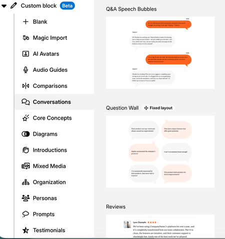

Firstly, I really like the direction of the recent improvements to Rise. The additional flexibility being introduced is making it much easier to create more polished layouts while still working within Rise's responsive framework. The more detailed padding options are a good example of this and give designers much better control over layouts without needing workarounds.
One additional win that would give us much more flexibility when creating responsive, branded designs would be the ability to upload our own custom shapes, for example as SVGs.
Rise's existing shapes can sit within or behind a container, which makes it possible to create overlapping layouts while still allowing the surrounding content to respond. It would be great if uploaded SVGs could behave in the same way as these native shapes rather than being treated as standard images.
For our organisation, curved speech bubbles and droplet shapes are part of our brand design language, so we need to retain those specific shapes rather than approximating them with rectangles or the existing shape options.
I've attached examples of the types of layouts we'd like to be able to create responsively. At the moment, achieving these effects means relying on non-responsive custom blocks that don't translate well across screen sizes.
A related improvement would be visibility controls by device or breakpoint. For example, allowing us to hide a purely decorative image on mobile while retaining it on desktop.
Sometimes an image adds value to the desktop composition but creates awkward stacking, excessive scrolling or poor use of space on a smaller screen. In those situations, the image isn't providing essential learning content, so being able to remove it from the mobile layout would actually allow us to create a cleaner responsive experience.
Even simple controls such as:
- Show/Hide on desktop
- Show/Hide on tablet
- Show/Hide on mobile
would give designers much more control while still allowing Rise to handle the responsive layout.
Overall, I'm really encouraged by the increased design flexibility being added to Rise. These two additions would help us take advantage of that flexibility while maintaining our brand identity and creating layouts that work well across different screen sizes.