custom blocks
1 TopicUsing Responsive Custom Blocks in Rise #565
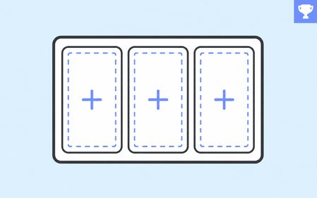
Rise 360 blocks have always adapted to whatever screen a learner opens them on. Custom blocks gave you something different: a blank canvas, and the freedom to put anything anywhere on it. Now you get both. Responsive Custom Blocks are now available as a Labs experiment in Rise 360. Turn the experiment on, and the custom blocks you build reflow across desktop, tablet, and mobile the way the rest of your Rise blocks already do. What Changes You stop placing objects at fixed coordinates and start building with containers. Containers are columns and rows that hold your content and rearrange it as the screen resizes. Each object gets sizing behavior instead of a position: Fixed, Hug, or Fill. That's the shift. You're not positioning objects anymore. You're describing relationships between them. The part worth playing with is Direction. Each device gets its own layout settings, so a two-column layout on desktop can become two stacked rows on mobile. Same content, restructured for the screen. Check outClara's post where she walks you through containers, position settings, and device previews in detail. 🏆 Challenge of the Week This week, your challenge is to build a custom block that works at every screen size. Design it for desktop first, then edit the block for tablet and mobile. A few directions to consider: Take a fixed custom block you've already built and rebuild it responsively Start from a prebuilt template and change the container direction for mobile Build something that genuinely couldn't work as a fixed layout Your Feedback Matters This is a Labs feature, which means it's still being actively developed and shaped by what people tell us. So as you build this week, tell us what you run into: Controls: Are the labels clear? Could you do everything you wanted to? Bugs: Did an object or template reflow in a way you didn't expect? Gaps: What's still missing before you'd use this in real projects? You can share feedback in the Labs forum or use the feedback form inside the feature. Start Here Turn on the Responsive Custom Block experiment in Labs. Open the block library in your training and insert a custom block. Pick a template or start from Blank. Two things to know going in: your existing custom blocks won't change, and most prebuilt templates are now responsive. A few templates aren't responsive and they carry a Fixed Layout badge. 🙌 Share your work You put in the effort. Now make sure your work gets seen: Personal blog: If you have a blog, write about your example from this week's challenge and share the link with your submission. Social media: Share your examples on LinkedIn and mention both David and Articulate using the #ElearningChallenge tag so we can help promote your work. Peer feedback: Try leaving helpful feedback on at least three projects this week. Community forums: Cross-post in the forums to give your work even more visibility. 🙌 Last Week’s Challenge: Before you respond to this week’s challenge, take a look back at how the community branded their courses with style guides: Branding E-Learning Courses with Style Guides #564: Challenge | Recap 👋 New to the E-Learning Challenges? The weekly e-learning challenges are ongoing opportunities to learn, share, and build your e-learning portfolios. You can jump into any or all of the previous challenges anytime you want. I’ll update the recap posts to include your demos. Learn more about the challenges in this Q&A post and why and how to participate in this helpful article.1.6KViews1like0Comments