Mixing types of Images
May 28, 2013
By
Hailey Allen
Hello,
I was wondering if anybody has given any thought to mixing types of images, and how that affects the look of an e-course. For example, if I was using a background that is an actual photograph mixed with illustrated characters and images on top of that background. In my opionion, you should refrain from mixing too much, but some of my teammates disagree. Just wanted to see what the general public (aka, you) thought about it. Below is a simple example of mixing a real background and illustrated objects.
Thanks for reading this!
Hailey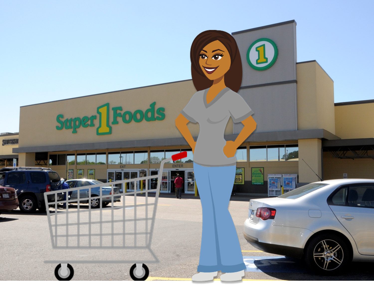
21 Replies
In my opinion I think its ok to mix images, but that the type of images stays the same. For example, if you are going to use realistic backgrounds, stick with this throughout the course, and if you are going to use illustrated characters, always use illustrated characters. Don't use illustrated backgrounds and then jump to realistic backgrounds in the same course.
I agree with Jerson. Mixing styles can really be creative but there has to be some logic to the image selection. If you are mixing photos and illustrations make sure the you are using illustrations that all have the same style. Same with photographs.
Oh and you might want to watch the scale of the characters in comparison to the background. That is one giant lady. She could crush that little car
Hi Hailey,
I am not sure....
I feel that you should use either one style or another, however, I do appreciate that it is really hard to find the right images - when you need a background and a character.
A technique I use a lot is to have a stock image as the backdrop, and then either set the Transparency to 50% or drop a semi-transparent rectangle over the top, so that the visual focus is on the character/front image.
As mentioned - mind the scale, (she is HUGE!).
Also (and I appreciate it is just an example...) - you need to ensure shadows are congruent (not sure whether those are shadows on her shoes or just a lighter area, but if shadows they are in a different orientation to the car shadow...), and the trolley is completely flat and 2-dimensional.
Hope that helps explain some of the options and pitfalls, and I appreciate that it completely sidesteps, albeit gracefully...any type of concrete answer
Bruce
Bruce, I really like the idea of using a transparency effect on a photograph to shift the focus to the characters. Great stuff. I do also appreciate the comment about shadows, can't say I've put a whole lot of thought into that.
Jerson and Nancy, I also appreciate the comments about keeping the images (mixed or not) congruent throughout the course.
Thanks for responding. In no way can I defend my proportions. All I can say is I just slapped that together because I wasn't sure if I was explaining myself well enough, and thought you might need a visual. And maybe, in Texas, our people are just ginormous, ok??
...forgot to mention that I normally also make the image B&W, so that the "feeling" of the image remains.
Bruce
I think that when you put 2 types of images together like this, you create a new, distinct style. I like the idea of altering the background image a bit, whether it's with a transparency or a filter effect of some sort. This can help increase the contrast and bring the character out more. Whatever it may be, if it's consistent throughout as Jerson said and the design is clearly intentional, you can totally make it work.
A few quick options along these lines...
Personally, I don't mix pictures with illustrations. However, Bruce and Natalia won me over with the transparency thing.
Natalia, love love love your examples and using the different filters to give the photo a more cartooney look. Did you do that in Photoshop?
Nice work, Natalia. And Nicole, from what I can tell the filters she's using are all PowerPoint.
I have used some of the storyline avatar's in slides with a backdrop of our college campus and it seemed to work well.
I was just going to suggest what you did Natalia. I've used photos I've taken around our organization, blurred them, gave them an oil brush effect, etc. Then lay the clipart image on top. It takes away from the harsh contrast the two mediums can have.
Hey guys! Sorry for the delay. I've been on vacation (where I completely unplugged). I'm glad you liked the examples. And Daniel was right- it was all in PowerPoint. Photoshop certainly has more options but 99% of the time I can get what I need from PPT.
I've become a huge fan of using Google SketchUp8 to create my backdrops. I think it works with either illustrated or photographic characters, plus it's free. I'm just getting started using this program, but I've already had a chance to develop a couple different modules integrating SketchUp images with success. I created the graphic with the lady in front of the supermarket in less than 5 minutes. With a little work adding vehicles and details it could look pretty realistic. I'm just grabbing images out of the Google 3D Warehouse and then moving my camera angle to where I want it before exporting it as a 2D .png image. All the tutorials you'll need to get started on are YouTube. Just adding a different perspective to the conversation.
Hey Kyle - this is a really nice effect.
Not free for commercial work unfortunately :(
I almost got excited there for a minute...
Bruce
Rats
True my use of Sketchup is strictly non-commercial but I'm sure there are others out there that might be operating in the same capacity that could utilize this tool.
Although I am a little confused by SketchUp's terms of use....I also utilize another program, Reallusion's iClone for the same purpose + animations and they allow you to import images easily from Google's 3D warehouse and people use iClone for commercial purposes all the time. I guess once you utilize an image from Sketchup it's no longer allowed to be for commercial use, even though they don't market iClone that way.
Sorry to get your hopes up Nancy & Bruce! Here's another shot from a different module I created using Sketchup for the background.
I've only mixed images on one course I've worked on, but it proved to be a valuable (and fun) way to do things. The main reason was because there were no stock photos of exactly the settings I needed, so had to go take the photos myself. Same with the characters - no stock photos for the poses I needed, so drew them myself. The mixing of the two seemed to work out pretty well and folks seemed to like it.
Here's an example of one scene where they are mixed:
My suggestion would be to keep the character and setting perspective correct, as well a size proportionate. I think that *might* help sell it a little bit more. In your original photo, the woman looks huge next to the car, so it looks a bit odd to me. But I think it can look fine and is perfectly acceptable if blended the right way.
Nice shadows!
Colleagues, I would be very very wary of mixing different types of images. At least for explanatory schemes such mixing is highly undesirable. You need to sit down and redraw the pictures in a single style. In the situation of the people and locations it will help the sense of style a graphic designer. Example of a bad diagram below.
This discussion is closed. You can start a new discussion or contact Articulate Support.