One thing I love about Articulate Storyline is how easy it is to demonstrate complex concepts with engaging interactions. Some of the interactions I enjoy creating most are interactive charts. So when I set out to enter the 2015 Guru contest, I decided to wow everybody with an interactive chart.
I’m glad to share an inside peek into how I created this Guru award-winning demo.
Step 1: Choose a Topic
Presenting data in an interactive way is a challenge for many e-learning developers. To create a stand-out example for the Guru challenge, I decided to look for a complex data set and come up with a way to bring it to life. With Ebola in the news, I had my compelling data set; I just needed to figure out an equally compelling infographic to direct attention to this global tragedy.
Step 2: Develop a Design
Once I had a handle on the data, I started to think about the best way to portray it visually. I wanted to design an infographic that was contained on a single screen, so I turned to my trusty infographic reference books for inspiration. My current favorite is Understanding the World: The Atlas of Infographics.
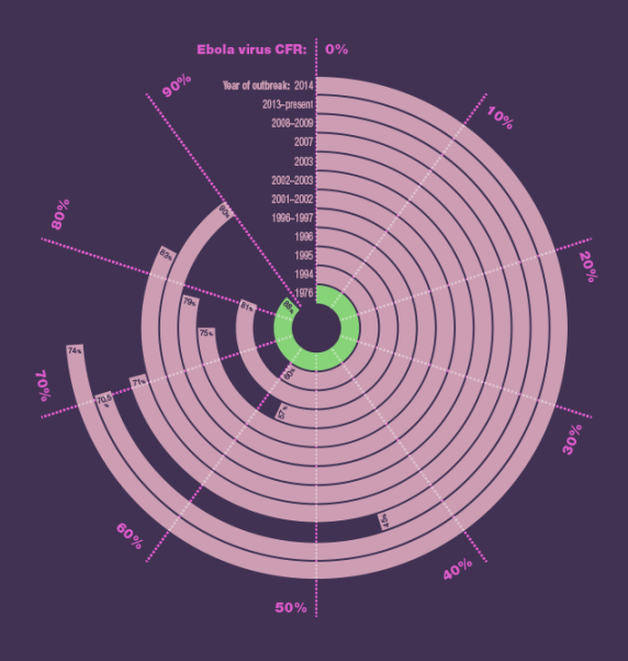
In one of my early versions, I wanted to show each major Ebola Virus outbreak alongside the impact of that outbreak. I used the white outer circles to represent the total number of cases and the inner blue circles to represent the case fatality rate for that year. Take a look:
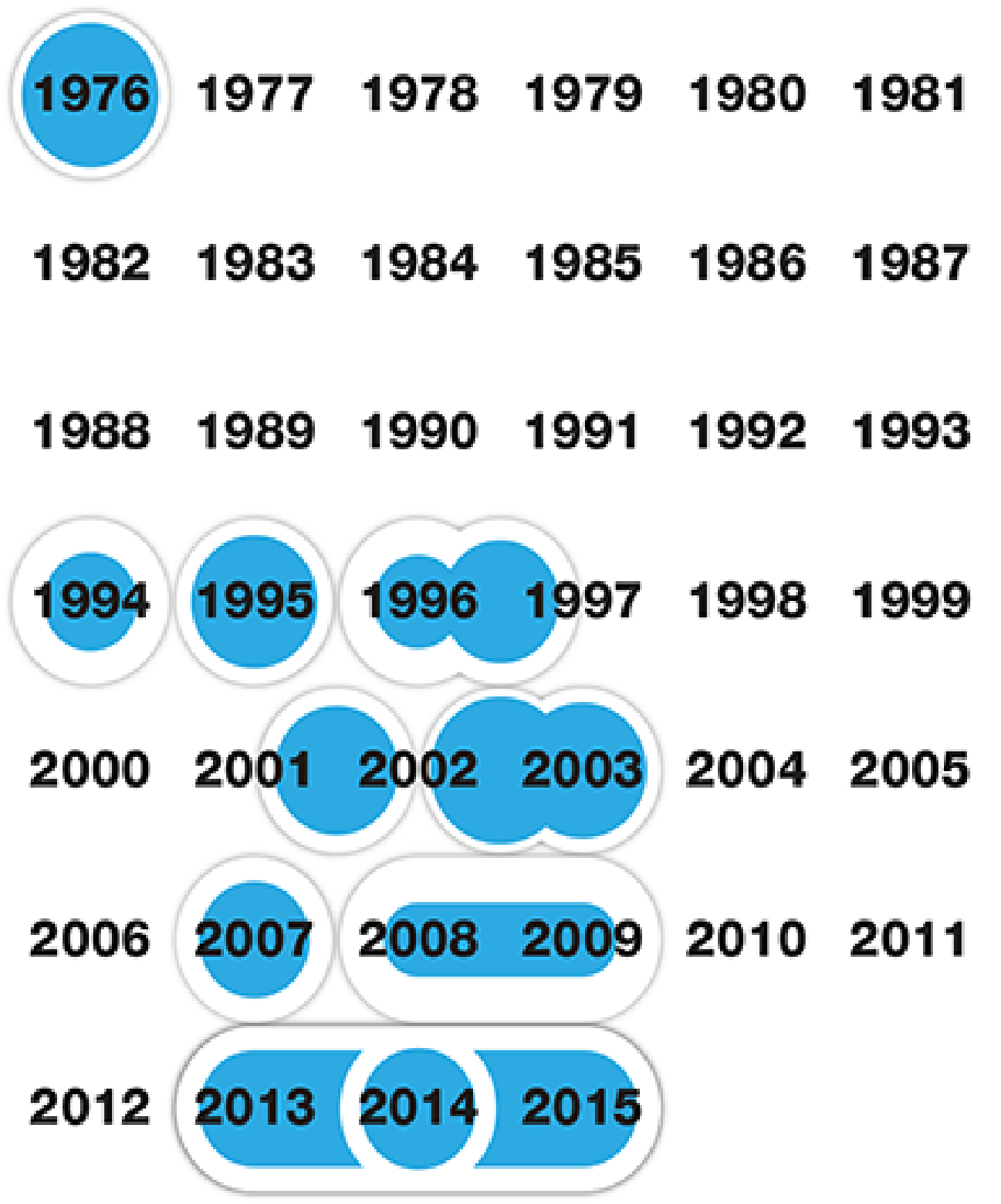
One thing that struck me with this version of the infographic was the number of years where there weren’t any major Ebola outbreaks. When I’m designing infographics, one of my main criteria is to use the limited screen real estate efficiently. As soon as it became clear that almost two-thirds of the dates shown didn’t have any data associated with them, I knew I needed to get back to the drawing board.
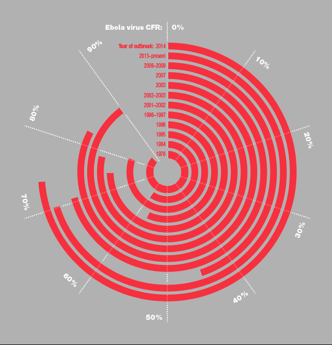
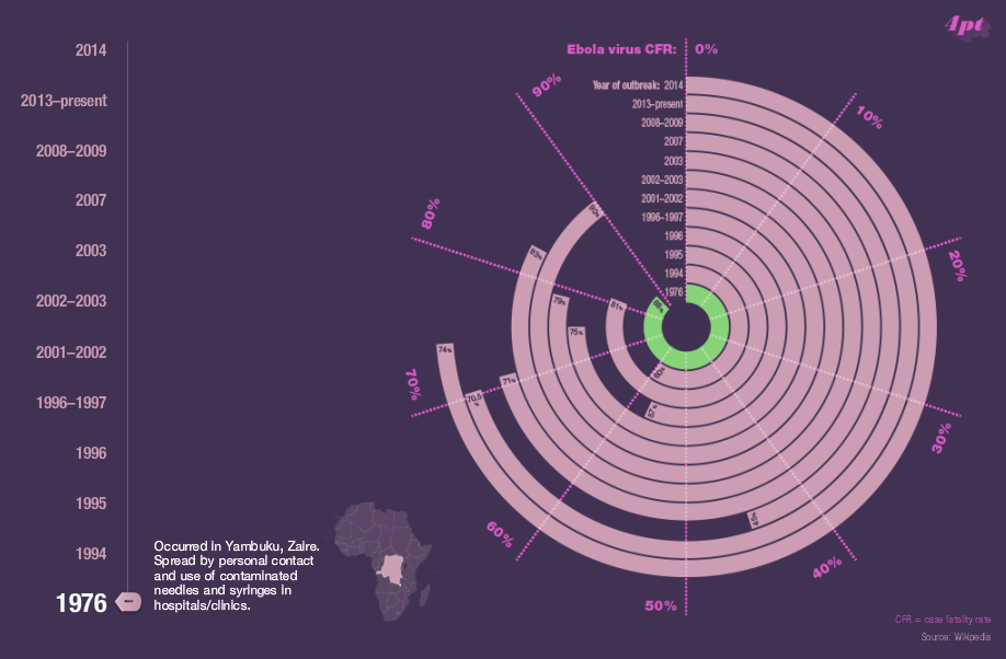
Once I’d stripped out the dates where there weren’t any outbreaks, the graphic looked a bit empty. I decided to create a pie chart for each individual outbreak and from here I experimented with layouts. I was interested to see if I could stack the pie charts on top of each other, which was the genesis of the idea of the rings. What you see in the final infographic is essentially twelve pie charts all stacked on top of one another.
Now that I had a design that showed the data more clearly, I was ready to apply a color scheme.

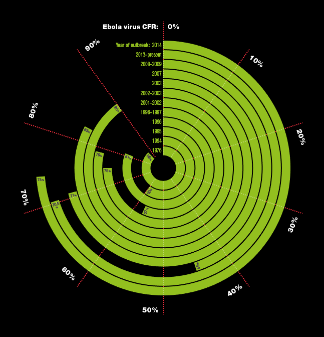
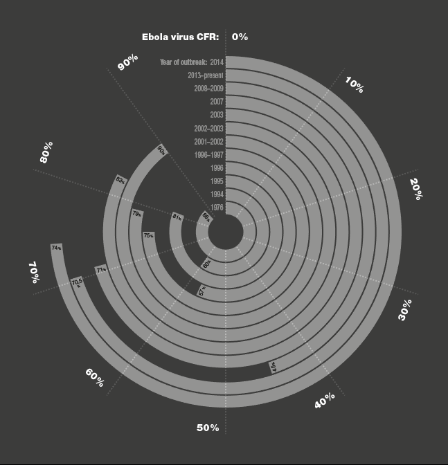
I tried a handful of variants before settling on a beautiful Russian Poster Art swatch set from Adobe Illustrator’s swatch library for the pinks and purples and a gorgeous pale green for the highlight.
Step 3: Build in Storyline
The next step in my process was to transfer the design to Storyline. To bridge Illustrator to Storyline, I created a blank Photoshop file and copied and pasted in each individual element that I wanted to animate. I was left with 29 separate layers for the main diagram. I exported each layer as a PNG file and reconstructed my design in Storyline.
At the outset I knew I wanted the interactive chart to be visually appealing. One way to achieve this is by using animation. I was delighted with how well the One Spoke Wheel effect worked for the rings on the initial build animation. For something so simple, I really think it grabs your attention and makes you want to explore the data.
I was taken with the slider feature as soon as it was added to Storyline 2 and was confident that it would add the right level of interactivity to my infographic. I used a combination of triggers and variables to reveal the data about each specific Ebola outbreak and I used states to highlight the rings in the diagram.
Thanks to the effort I put in at the design stage, the entire build process only took a couple of hours to complete.
Putting It All Together
The key to creating my project was developing a clear, beautiful design that made the data easy to understand—and then using Storyline to add interactivity to the various elements of my design. I love how the completed interaction makes it easy for learners to understand complex data and how it changes over time.
I encourage you to give this kind of imaginative project a try! It’s fun and challenging to see if you can stretch your design and development skills.