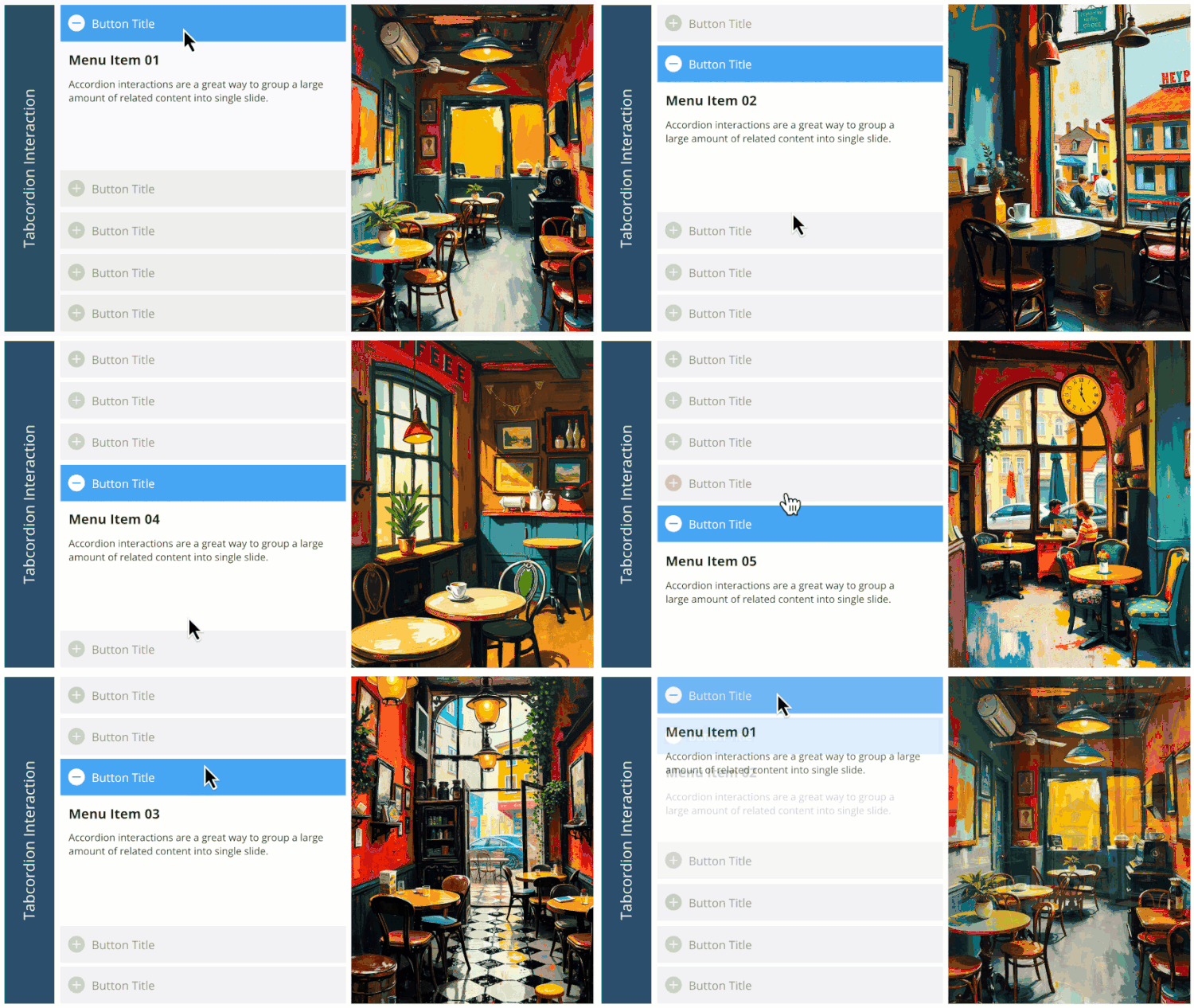
I love this, Montse, thanks for sharing! Hope it's okay if I edit the Animation for each layer's salmon/Active object to be "Float In/Up," so that it behaves a little more like the corresponding Accordion interaction in Rise. I like to try to keep the behaviors of interactions fairly similar from one course to another for a given client, so learners experience consistency instead of differences and "surprises."
I figured out the "how to rename button ##" question posed above (as did Angela) by editing the text on each of its states, so my primary and most imporant question is: *Why* is this renaming behavior the case only for the "Active" or salmon-colored button on each layer, and why is it selectable in the timeline yet not on the slide itself -- as opposed to the other, gray buttons, which can be selected in the "normal" way and their text more easily renamed ... ?
The button isn't locked or hidden on the timeline, and I can't spot anything in slide/layer properties, shape format, triggers, variables, states, etc. which seem to be causing this behavior. I'd like to use this in the future, but I want to fully understand what it's doing and why, not simply "trust the magic." ;)
A secondary and less-important question: I've noticed that you and some other Storyline designers include a "Background" rectangle behind text boxes, which seems to be invisible and serves no purpose -- while others do not. Is there a specific, technical reason related to a buggy Storyline behavior which could occur, if one does not have such a Background -- or is it simply a design standard some developers learned early on, and so they just continue doing it?

