Forum Discussion

Navigation pane formatting in Rise 360
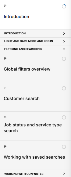
- 4 months ago
JD3 it appears you are using the theme called Apex, which is rarely used due to design issues like this. I'll recommend switching back to the theme called 'Rise' if this styling is an issue for you. It's also curious that StevenBenassi doesn't recognize the design of the Apex theme. Rise 360 has just 3 themes- Rise, Apex, and Horizon. And its more of a template system, than a legit theme system.


Hi JD3,
I see what you mean!
In Rise, section title font should not appear that large. Rise doesn't offer a setting to modify font sizes within that menu, so the issue is likely stemming from somewhere else. I have some follow-up questions to help us troubleshoot this better:
- Are you seeing this behavior across all Rise courses with menu sections, or just one specifically?
- Does this issue occur among all publishing formats, such as Review 360, LMS, or the Web?
- Can you replicate the same issue within all supported browsers, and does clearing your browser's cache make an improvement?
Looking forward to hearing from you
- JD34 months agoCommunity Member
Hi Steve,
Thanks for getting back to me.I'm only seeing it in one course at the moment, but in my previous job (just started at this company) it also occurred. In those cases I could publish without menu so it I didn't log it as an issue, however the current course I'm working on, I need the menu.
I'm seeing it from theme / navigation setup, and preview, even before publishing. Seen in Review 360, and when published to the web (haven't tried in the LMS).
I'm seeing the same behaviour in Chrome and Edge. Clearing browser has no effect.
Please let me know if you need any additional information.Thanks
Julie
Related Content
- 4 months ago
- 10 months ago