Example

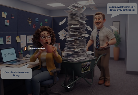
Need to Know? Sorting Doug's 200 Slides 📄😱

Hello SMcNicol . May I call you S? 😀
This time, I’m learning… not enough, despite your description
(I NEVER work on Rise because I NEVER get any requests, so I’m a little behind.)
If I understand correctly, this very successful activity is a 100% JS creation by Claude (and YOU as well, of course—I’m not going to repeat the same clarification I made 15 days ago). Because there’s no slider tool in Rise (I’ve looked but can’t find one), right? So this is an activity that simulates a slider, not a slider used in a way different from its native behavior (this isn’t a criticism). That’s probably what Rise is missing.
And in the case of JS code, I’m curious to know: how long did it take to build it? How many iterations of the proposed code were needed to finalize it? What keywords were used in the prompt(s) to ensure it would work in Rise?
Depending on your answers, I’ll probably have more questions 😅. Thanks.
Thierry
- SMcNicol1 day agoCommunity Member
Hi Thierry! S works for me 😄And great questions, you read it exactly right.
Is it a real slider?
This lives in a Rise Code Block and is built entirely with HTML, CSS and JavaScript. I'd push back on "simulates" a little, though. Under the hood it’s built like a real slider: screen readers announce it as a slider, it reports which zone the slide is in, and it works with arrow keys. So it isn’t just something that looks like one. The fun part is the same trick Aman used: the slide card rides along with the slider, so it feels like drag and drop.
How long did it take?
About two hours from idea to final version.
How many iterations?
Two major versions, plus a handful of small tweaks:
First draft:
I gave it my prompt which in hindsight wasn't as detailed as it could have been (I am learning). It produced a vertical slider on a dark background. It worked, but it wasn't quite the vibe I was looking for. 😖
Second draft:
I mocked up the exact layout along with the changes I wanted and handed it to Claude. This was a game changer (yes I will be doing this going forward, saved me a ton of time). 🎯
What keywords did I use? Honestly, none! 😄 I talked to Claude in plain language. What made the difference was what I showed it: the challenge description, my general idea and a mockup of the layout I wanted.
The Rise-specific stuff lives in my saved preferences in Claude, so I don’t have to repeat it every build. Here are just a few:
- Use my company’s brand colors and fonts. Everything looks like it belongs in our courses from the first draft.
- Keep all text at 14 pt or larger. Code Blocks can shrink on smaller screens, and tiny text is hard to read.
- Watch out for copy buttons. In Rise, they’ve jumped around the screen and not actually copied anything for me, so I flag that up front.
- Make it accessible. Keyboard friendly, screen reader labels, and good color contrast. That’s how this slider ended up working with arrow keys. ♿
- Add player controls to videos, including closed captions. Learners can play, pause, and turn on CC, so every video works for everyone. 🎬
Images like Doug’s face are embedded right in the file, so it’s one tidy zip to upload. 📦
Want to try it yourself? 🚀 Check out Vibe Coding in Rise 360. It walks through how to vibe code from start to finish, from the first prompt to dropping a working Code Block into your course. It’s a great place to start if you’ve never built in Rise before.
Hope this helps. Fire away with more questions anytime!



Getting Started with the E-Learning Challenges
Find practical answers to common questions about the E-Learning Challenges, a weekly event that helps you build skills, create your portfolio, and grow as an e-learning professional.