code block
65 TopicsCoded Interactions
I've recently been experimenting with coded interactions in Rise 360 to see how far I can push the interactivity beyond the standard blocks. I've been using GPT to help produce and refine the code, then tweaking and personalising the interactions to meet specific brand guidelines and learning requirements. I'm really happy with the results so far, and it's opened up a lot of possibilities for creating more bespoke learning experiences directly within Rise. There are some limitations I've noticed during testing, particularly around incorporating audio effectively within the interactions and ensuring they remain fully responsive across different screen sizes and mobile devices. I'd be interested to hear from other eLearning developers who are experimenting with coded interactions: What limitations have you come across? How have you approached responsiveness and accessibility? Do you see coded interactions becoming a bigger part of how we build bespoke experiences in Rise? Here's an example I've been working on: https://360.articulate.com/review/content/42e03dcc-6233-4bf0-908e-64d5543c0c7c/review312Views3likes4CommentsStop Paying for AI Twice: The Chatbot Workaround Your Learners Already Have
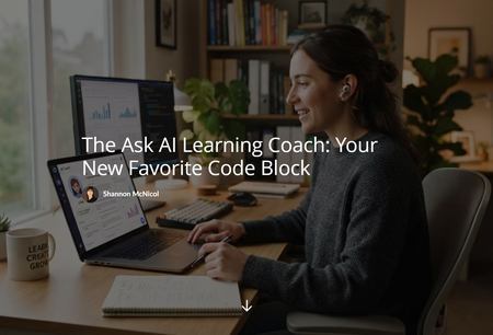
Here's something nobody tells you when you start building AI into your courses: every time a learner uses it, it costs you (or your company) real money. Credits, tokens, API calls, whatever you want to call it, it all adds up. And the more your course gets used, the more it costs. That's a weird incentive for something we're supposed to want learners using more, not less. 💸 So I started asking a different question. What if I didn't build the AI into the course at all? What if I just pointed learners toward the AI they already have? The Realization My learners already have access to ChatGPT, Copilot, or our own internal AI tool. They use these tools every day at work. So instead of wiring up a custom chatbot that racks up a bill with every click, I built something much simpler: a page that hands learners five ready to copy prompts and tells them to paste them into whatever AI assistant they already use. No API key. No per-use cost. No new tool to learn. Just prompts that work with what's already sitting in their browser. Meet the Ask AI Learning Coach It's a Code Block I drop into a lesson (or the end of a course) that gives learners five prompts: Summarize the lesson Explain it simply Give me a real world example Build a study guide Quiz me They copy the one they want, paste it into whichever AI assistant they already use, and get a personalized response on the spot. The trick that makes this actually work: I also give them a PDF of the lesson content to upload first. Without it, the AI is just guessing at what "this lesson" even means. With it, the response is grounded in what you actually taught. That one small step is the difference between a gimmick and something genuinely useful. The Part I Didn't Expect I built this to save money. What I didn't expect is that it also teaches something. Every time a learner uses one of these prompts, they're practicing a real skill: how to hand an AI assistant some context and ask for exactly what they need. That's not a throwaway skill. That's the same skill they need for literally everything else AI touches at work right now. So this one little Code Block ends up doing two jobs at once. It saves the training budget, and it quietly builds AI literacy on the side. I didn't plan for both of those to happen from the same idea, but I'll take it. 🙌 Built to Reuse, Not Rebuild The whole thing is zero code to drop in and reuse. Swap in a new lesson PDF, keep the same HTML file, and it works in a Rise 360 Code Block or a Storyline 360 Web Object. Same five minutes of setup, every single course. One Gotcha Worth Knowing If you build this in Rise, here's one that got me. Rise 360's Code Block runs in a locked down sandbox that blocks file downloads triggered from inside it, even a PDF sitting in the same zip. It worked fine in Storyline's Web Object, just not in Rise, and it took a little digging to figure out why. The fix ended up being simple. Instead of bundling the lesson PDF inside the Code Block, I drop it right below as its own Attachment Block (Rise has one built in, under Multimedia). Learners still grab the file, it just lives next to the block instead of inside it. Small change, but the kind of thing you only find out by testing both platforms yourself. Consider this your shortcut. 😄 I built this one with Claude, from the first draft of the page through working out the PDF grounding trick, the responsive layout, and the little details like equal size cards and a custom video wrapper for the intro. I turned the whole thing into a microlearning course, so everything you need is in one place: the HTML file, a course/lesson template, and step by step instructions. Check it out! 😉 The Ask AI Learning Coach: Your New Favorite Code Block What's your workaround for AI costs in your courses? I'd love to hear what other are doing.75Views1like2CommentsI Built a Japanese Course So I Can Find a Bathroom in Osaka
My son moved to Japan. We visit in March, and I did not want to be the woman standing in a train station pointing at things and hoping. So I did what we all do with a personal problem. I turned it into a course. 🙃 It is five Code Blocks and forty-five phrases, and I want to be honest about the scope: this is not a Japanese course. You will not be fluent. You will not be having conversations. You will still be pointing at things sometimes. What you get is enough to find a bathroom, get on the right train, order food, and be polite while you do it. Survival Guide to Japanese271Views5likes4CommentsAsk Ada the AI Matchmaker
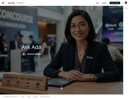
I just published an article about comparing Claude, ChatGPT, Gemini and Copilot for learning design work on which one to reach for depending on whether you're drafting assessments, coding a custom interaction, or wrangling a stakeholder deck by 4pm. After I hit publish, I thought to myself, this would be a great microlearning! So what did I do? Of course I created one. 😄 Meet Ada — an AI concierge who runs a "Matchmaker Desk." Tell her what you're actually working on (drafting assessments, coding a custom interaction, wrangling a stakeholder deck by 4pm) and she matches you to the right tool from the article above, reasoning included. Two of the eight tasks are honest ties between tools, so she says both names instead of faking a clean winner just to keep things simple. And yes, I noticed the irony before you did: the article ranks Claude as the strongest coding partner of the four, and Claude is exactly what I built Ask Ada with. I didn't plan that as a bit, it just turned out to be the most honest way to stress-test my own conclusion. It held up. 🙂 Go ask her something real: Ask Ada291Views9likes6CommentsMy Custom Rise Block Component Library
Hi everyone! I wanted to share a custom library of Rise-compatible interactive components I’ve been building and experimenting with for eLearning projects. The library includes custom-designed blocks and interactions intended to help make Rise courses more engaging, flexible, and visually dynamic beyond the default block set. You can explore the library here: https://cognitoblox.netlify.app/ This is an ongoing project, and I’d genuinely love feedback from the community: Which components do you find most useful? What kinds of interactions would you like to see added? Any ideas for improving usability or accessibility? Happy to connect with fellow developers who are experimenting with custom Rise code blocks as well! Thanks for checking it out1KViews21likes19CommentsHow About a Progress Bar?
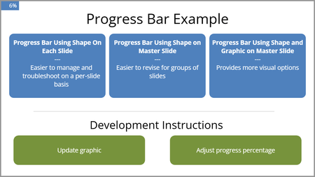
We needed a progress bar for several projects, so I created one that would be no too intrusive, easy to modify, and easy to implement. There are three versions in this file. The progress bar is thin until you hover over it. It uses Java to do the math, round up to whole numbers, and move the progress bar. It uses a true false variable toggle to keep the bar visible. You will have to add the toggle to each layer where you want the progress bar. This example is very bare bones but includes instructions. Please let me know if you might find it useful or how it might be improved. Here is the review link: https://360.articulate.com/review/content/18499632-155c-4461-b75f-fd0450ca01f5/review163Views1like2Comments“Are You Sure?” in E-Learning #555
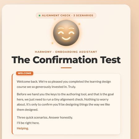
This week, I wanted to lean into the spirit of the confirmation prompt, that moment of pause, of reconsideration, and ask: what if that pause wasn't entirely on your side? The scenario: you're an internal team member who's just come back from a learning design course. You have the master learning design authoring tool. Before you're allowed near the authoring tool, the org's AI guide HARMONY needs to run a quick "Confirmation Test." Three scenarios. Shouldn't take long. HARMONY is very helpful. The "Are you sure?" mechanic does something a little different here. I'll leave it at that. 🙂 A few craft notes for anyone interested in the build: The confirmation prompt UX is deliberately asymmetric; the buttons don't behave the same way depending on which answer you're leaning toward HARMONY has two states that shift based on your choices throughout Three different endings based on your answer tally The fake "analysis" stage has a silent jury. You'll see. I have a lot of fun with Claude Design, Code and all things Claude Would love to know which ending you hit, and whether any of the scenarios felt a little too close to home. 👀 Are you a conformist or a rebel? Find out here Confirmation Test Let me know how many little "interesting" interactions you spot Thanks to DavidAnderson and the Articulate 360 Account Management team for the prompt; this one was a lot of fun. #ElearningChallenge287Views3likes4CommentsSelf Assessment Builder
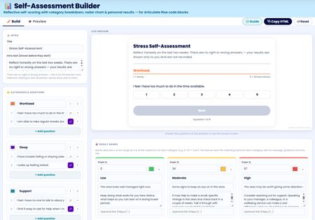
I've built a free self assessment builder tool you can use right inside Rise. You can use this to build your custom self assessments to use in your Rise courses. After completing the assessment users can view, save or print their results. I'll be adding this to my Rise Canvas tool in the next update. Any feedback to add features or improve is welcomed. Self Assessment Builder Tools used: Canva, Gemini and Rise Canvas475Views4likes1CommentThe AI Shift
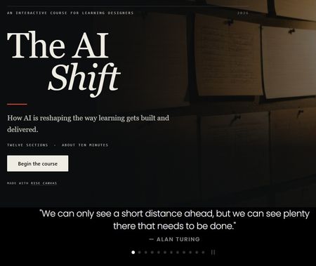
Most people use AI the way they use a search bar. Type something vague, take what comes back. That's how poor course content gets made. This course is about using it deliberately. You'll practise briefing an AI properly, interrogating what it gives you, and deciding what your own expertise still has to supply. The AI Shift Tools used: Canva, Gemini and Rise Canvas560Views4likes3CommentsThe Discount Decoder
A short, interactive course for school-age learners on percentage change, discounts and tax. Did you know a price cut of 20% followed by a rise of 20% leaves you worse off than you started? Traps like that catch adults every day. Fully accessible — keyboard nav, swipe, ARIA states, reduced-motion opt-out, mute toggle for the narration. The Discount Decoder For those interested, here's how it was built. The short answer: it's a single self-contained HTML file dropped into a Rise code block. The longer answer is that "single HTML file" hides a fair few learning-design decisions I've refined across these builds. Here are the ones I think travel best. The whole thing is one file No frameworks, no build step, no CDN. One index.html, two background JPGs, nine short MP3s. Drop the folder into a Rise code block and it works. Vanilla HTML/CSS/JS is boringly reliable! Each screen is a "scene", and only one is on at a time Every section is a <section class="scene"> stacked absolutely on top of the others. A single class, .on, controls which one is visible. Navigating fades the old scene out and the new one in, entering from a slightly different starting position depending on whether you're going forward or back. It's the same pattern as a native iOS or Android app: a stack of screens, one active. Learners find it intuitive because they've been using apps built this way for a decade. The nav rail is deliberately simple A row of small pill segments, one per section, with persistent Next and Previous arrows. Learners can jump anywhere by clicking a segment, arrow-key through, or swipe on mobile. The Next arrow pulses the whole time it's active, because I noticed in testing that it wasn't obvious there was a way forward unless you were shown. The rail counts up: 01 / 10, 02 / 10. That number does more work than you'd expect. It answers "how much of this am I in for?" at a glance, without a progress bar dominating the screen. One interactive idea per section Each section gets a single main interactive. The temptation is always to pile more onto a screen; I've learned to resist it. A learner can only attend to one thing at a time, and one interaction done properly beats three done half-heartedly. Learners drive the pace Nothing auto-advances. Every reveal, animation and transition waits for a click, tap, key press or swipe. This matters more for maths than for, say, policy training. Someone reading a data protection policy can skim. Someone learning the multiplier trick needs a moment to actually think, and if the screen has already moved on, you've lost them. What I'd tell someone starting out Copy the pattern rather than the code: scenes, a rail, one idea per section, learner-paced reveals, tolerant feedback, accessible controls. It's worked for me on safety courses and product-style content as well as this maths lesson. And push past click-to-reveal. The interactions that seem to land are the ones where the learner changes a number and watches the result, commits to an answer before seeing the explanation, or makes a mistake and gets told why it was tempting. Keep it short, too. This lesson is 10 sections, roughly 8 minutes. Nobody was dragged through it. Happy to answer specific questions in the thread. If enough of you want a follow-up on any particular piece, shout! Tools used: Canva, Gemini and Rise Canvas248Views2likes0Comments