interaction
117 TopicsTravel Alberta Slider Game
https://360.articulate.com/review/content/53628b3e-d00e-4c31-aca4-6d4d9ac6c704/review My entry for the Using Sliders for Accessible Drag-and-Drop Interactions weekly challenge. Using the slider you can go north or south across the province of Alberta and click on some of the cities to answer trivia. THE BUILD. A total of 8 sliders make this up. Each of the 6 icons on the map is its own slider that is linked to the main slider so they all move in unison. Of course, the map itself is a slider as well, and once again attached to the main slider. That's all there really is to it. The hard part was adjusting the size of the map as a thumb so that is fit properly on the slide.Level Up a Scenario: Add Characters and Emotions
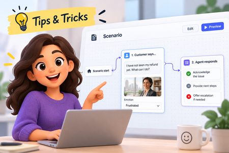
Our recent platform updates brought some exciting new content types. Scenarios specifically have been a lot of fun to explore. In this tip, you'll learn how to add your own characters and see the magic of automatic emotion generation! Watch the video to see how!263Views2likes0CommentsClick. Explore. Stay Secure. – Cybersecurity Awareness Made Simple
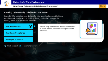
This interactive eLearning module uses a tab-based design to help corporate employees understand essential cybersecurity policies and procedures in a clear, engaging way. Click the link to explore cybersecurity awareness the smart way: https://www.swiftelearningservices.com/cybersecurity-awareness-course-elearning-challenge-517/How to Show & Hide an Object by Toggling States
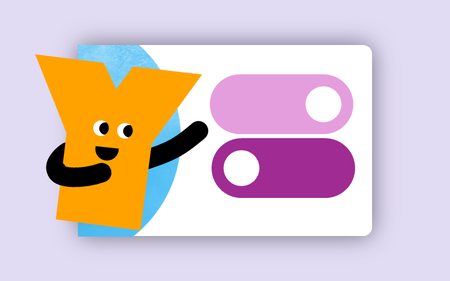
This tip comes from our certified training partner, Yukon Learning. When you use triggers to change states of objects, the trigger wizard adjusts the language to "Set State". But did you know this option can be adjusted to "Toggle"? The Toggle allows you to switch an object from normal to hidden or from normal to disabled with a single button action. In this video, you'll learn: How to change an object state How to adjust the "set" state option to toggle How to toggle an object without using variables Resources: Yukon Learning YouTube Channel Sign Up for Facilitated Certified Training311Views4likes0CommentsMost accessible interactions
Hello everyone! I've received some feedback about a recent elearning that I created that drag and drop interactions aren't very accessible. I've read through a lot of the help documents about what makes learning content accessible, but I can't find much detail on designing accessible interactions. Would anyone have any information about what I should steer away from? And any ideas for interactions that I can use apart from click and reveal type interactions? Thank you so much!Solved1.8KViews1like13CommentsAdvanced Storyline? Creative Way to Use Button Sets w/ Quizzes
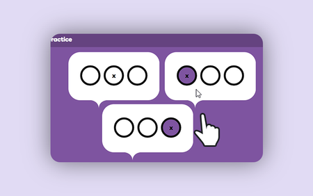
Discover how advanced Articulate Storyline skills aren’t limited to complex variables or JavaScript. In this tutorial, you'll learn a clever technique using button sets in Articulate Storyline 360 to create multiple quiz questions on a single slide.1.1KViews5likes0CommentsDesigning for Everyone
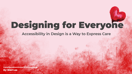
Link to course: Designing for Everyone: Accessibility in Design is a Way to Express Care This was more challenging (learning opportunities) than expected for a number of reasons. Test revealed just how much more I have to learn. I look forward to feedback on ways to make it better and more accessible. I designed this experience to be useable with a keyboard and with a screen reader to align with the perceivable and operable principles of POUR (Perceivable, Operable, Understandable, Robust), established by the Web Content Accessibility Guidelines (WCAG). It is a work in progress, not finished, because I learned a lot that needs to be considered and done for better accessibility. What was accomplished No content relies on color alone, animation alone, or a mouse alone. The slide content includes: Interactive elements with real controls Messages are available as text Focus Order follows visual layout (use the info icon on each slide to view the Focus Order) Accessibility is more than checking the boxes. It is about considering whether your design still works when the assumptions about users are removed. It is about Designing for Everyone. The Goal This project was designed to show how accessibility performs in the real world. The project aims to demonstrate outcomes, the same message, experienced through different access needs. It focuses on peoples’ experience with digital content. The Problem Many “accessible” examples stop at checklists. Here the focus is on how design decisions affect real users. This experience intentionally attempts to show both failure states and equivalent, accessible solutions. Key Design Decisions Screen reader friendly structure: Reading order is manually controlled. The message is real text. Alt text is used only when it adds meaning, decorative visuals are marked as decorative. Keyboard only interaction: Every interactive element is reachable using Tab, Enter, and Space. Visible focus states are always present. If content can’t be experienced without a mouse, we revisit before releasing.177Views1like0CommentsCreate Your Personalized Valentine eCard Now ❤️
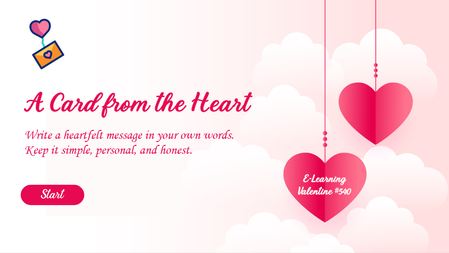
Want to see how interactivity transforms engagement? Explore this Valentine-themed eLearning module featuring: Personalized messaging Digital card creation Interactive design elements A simple example of how custom eLearning development enhances user experience. Try It Now to Create Your Personalized Message. https://www.brilliantteams.com.au/personalized-valentine-ecard-custom-elearning-design/175Views0likes0Comments