Example
Hitchcock Icon Set
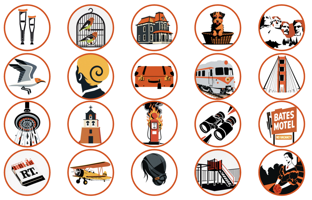 ICON SET FOR "A Quiz to Die For"
I don't have a "go to" prompt.
I start with a creative concept, and I let the concept lead the way in the prompting. I spent many years working in brand management and advertising, so I approach AI Image generators as if I am writing a creative brief to an agency team or a graphic designer. I feel like it is my responsibility to provide direction on what I want if I have a specific outcome in mind.
I appreciate all the feedback and questions I received for "A Quiz to Die For" (ELC #555), so here's how I approached this project:
- My goal was to create an activity with a look and feel based on the style of Saul Bass, who developed many of Alfred Hitchcock's title sequences. I really liked the titles for "Vertigo" and "North by Northwest", so that was my inspiration.
- I needed at least 20 images/icons that looked like a set and had some continuity, so I needed a prompt that could be applied across a variety of visuals (e.g., seagulls, Mt. Rushmore, binoculars) and a "host" who resembled Hitchcock.
- For this project I used Grok Imagine. It seems to be very responsive to movie making lingo. I don't have a favorite image generator. Sometimes one is just nails my concept and I go with it.
- I asked Grok to help me fine tune the prompt--I start with my idea and ask for help on it.
- Here it is:
Mid-century modern poster art inspired by classic thriller title design, inspired by Saul Bass' style. Bold asymmetrical layouts, abstract geometric forms, cut-paper shapes, diagonal movement, and strong visual rhythm. Flat vector illustration Color palette limited exclusively to black and orange, isolated on white background. No additional colors, no gradients, no shadows, no realistic rendering, no photography, no 3D effects. The composition should evoke the energy and elegance of a late-1950s suspense film opening.
- I attached a reference image and achieved the style I wanted.
- Then I just repeated applying the style across different images. (My reference images are below.)
- Learned the hard way: It is helpful if all your images are the same aspect ratio. I didn't realize that some of these image generators take the aspect ratio of the source image. If you want a certain aspect ratio, make sure you use the same size for efficiency.
- Once my images were in place, I found a font that complemented the visuals.
- And the audio and copy had to match. I tried to make all these elements fit together.
I look forward to seeing how everyone else approaches this!
4 Replies
Appreciate your detailed write-up on your approach.
Your point about verifying the prompt will carry across 20+ images is so important. Often a prompt works great for one type of image but doesn't transfer well to another setting.
When I built my prompt library, I didn't worry about testing the prompts across multiple images because my focus is on getting one good image that captures the essence of the style I want.
So in my case, I use the same image description for every prompt so I can easily compare/contrast the style. I default to "day at the beach" or "camping in the southwest desert" because outdoor images tend to emphasize the style better.
But that doesn't mean the prompt will work for an indoor image or even an entire course until I do what you described by applying to multiple images.
And finally, I've always enjoyed Saul Bass and used to copy a lot of his work when I first learned Adobe Illustrator.
My prompts were put together over a year ago before AI recognized reference images. If I wanted something specific today, I'd relly more on the reference image than the prompt.
- JodiSansoneCommunity Member
Thanks for sharing your examples! I'm glad I'm not the only movie title geek out there. There's one movie I was thinking of playing with because it still is etched in my memory 20 years later. It is the title sequence for Casino Royale, where Daniel Craig was introduced as 007. I loved that it came after that gritty, grainy black and white sequence, and then just burst into color with Chris Cornell singing "You Know My Name". I remember sitting in the movie theater thinking, "Oh, this is going to be fun!" You just gave me something to play with for a demo. :) What are the chances I can find this font?
- JodiSansoneCommunity Member
I answered my own question in one click.
- CherylMacLeod-8Community Member
Very very cool! Love those Hitchcock movies - except for Birds.


Getting Started with the E-Learning Challenges
Find practical answers to common questions about the E-Learning Challenges, a weekly event that helps you build skills, create your portfolio, and grow as an e-learning professional.