Example
Why Wellness Matters: Interactive Slider Comparison
Description
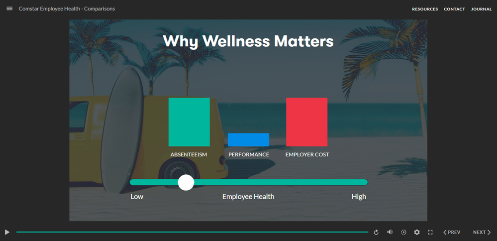
Here’s my demo for this week’s challenge. It’s an interactive graphic from a fictional employee health and wellness course. For the comparison, I focused on why wellness matters, using three bar charts and a slider to show the relationship between employee health and key business outcomes.
🎨 Design Concept
I went with a darker look for this one—something a little more polished and modern. I used a background graphic and a simple, clean layout to keep the focus on the data and interaction.
⚙️ How It Works
As you drag the slider, the bar charts update to show how employee health affects three areas: absenteeism, performance, and employer cost.
- Lower employee health = higher absenteeism and cost, lower performance
- Higher employee health = better performance, reduced absenteeism and cost
The absenteeism and cost charts use the same graphic, just with mirrored values to create an inverse relationship.
Once I set up the first trigger to change a graphic’s state based on the slider value, I was able to duplicate it and adjust the value for each step. That made it easy to build and maintain without having to start from scratch each time.
💡 Production Tips
This type of interaction requires a lot of object states to get the animations working smoothly.
The inverse relationship between performance and absenteeism/cost tripped me up a bit.
Once I figured out a formula for the states, it was much easier to keep things consistent—and even easier to rebuild when I needed to tweak things later on.
💬Feedback?
I’d love to hear what you think! Any comments, questions, or ideas for improvement are always welcome.
About Me


Getting Started with the E-Learning Challenges
Find practical answers to common questions about the E-Learning Challenges, a weekly event that helps you build skills, create your portfolio, and grow as an e-learning professional.