icons
35 Topics"Wait, SVGs are just code?"
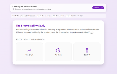
Hi everyone, I have to admit something embarrassing. I was today years old (well, 44 years old to be exact) when I properly realised that SVG files are just code. I always thought of them as "images" you have to save, host, and link to. But no, they're just text! 🤦♂️ That realisation sent me down a rabbit hole, and the result is this: a Visual Narrative Selection Tool that is completely self-contained. No external image files, no hosting headaches, just one single HTML file doing everything. 🔍 What it is: It’s a scenario-based training interaction where learners have to pick the right chart type (e.g., "Is a Pie Chart okay for time-series data?"). If they get it wrong, the feedback doesn't just say "Incorrect"—it actually shows them why using a custom SVG graph generated right there in the browser. ✨ Why I'm sharing it: This is a pure "Zero-Asset" experiment. Because the icons and graphs are all SVG code written directly into the HTML: It's impossible to break: You can't "lose" the image files because they live inside the code. It's lightweight: The whole thing is tiny. It's accessible: Fully navigable via keyboard (Tab/Enter). AI-enabled: with a strong enough visual cue, no other files are required I've shared the source code below. It’s fully commented (with my contact info hidden in a professional comment block at the top) Feel free to download, break it, and tell me what you think. And please tell me I'm not the only one who didn't realise SVGs were this powerful? RISE READY HERE519Views3likes3CommentsCooking Game (Jeopardy style + Gamifiation)
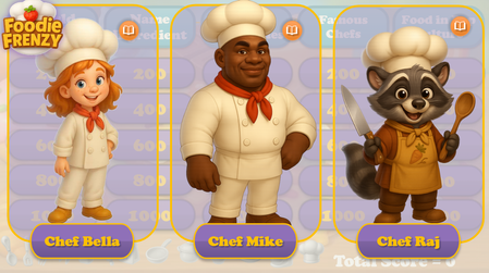
Hello Articulate Heroes! I'm excited to share my second personal project with you — a cooking-themed, Jeopardy-style game! Cooking Frienzy This project was inspired by two fantastic webinar series shared here: How to Create A Jeopardy! Style Game Gamification series I started with the "Jeopardy!" template and added the following custom features: Cooking-themed questions and answers — 5 questions across 5 categories Custom visuals — including characters, backgrounds, UI, and tokens The ability to choose one of three characters at the start of the game (and replay with a different chef assistant!) Personalized feedback and questions — with character-specific images and voiceovers A 20-second Pomodoro-style timer with a “wiped” animation Tokens awarded when the user completes a certain number of questions The characters were created using AI. Thank you for taking the time to check out the game! I’d love to hear your thoughts — feel free to share any comments or suggestions! You can check-out the game by this link: Cooking FrienzySolved2.4KViews8likes21CommentsShowcase: 3D Molecular Visualiser/Manipulator
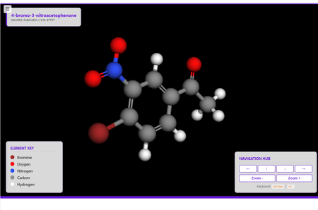
Hi everyone! I wanted to share a project I’ve been working on a 3D molecular visualiser for 4-bromo-3-nitroacetophenone for a Level 6 HE Applied Chem course, and it’s been a bit of a journey in balancing high-end aesthetics with rock-solid performance. The "Why" Behind the Build We’ve all been there: you embed a cool 3D element, and it either looks tiny on the screen or feels like you're steering a tank when you try to rotate it. For this asset (S0501b), I wanted to see if I could create a digital laboratory experience that felt "snappy" and scientifically grounded, even when tucked inside an iFrame. The Technical "Secret Sauce" I spent quite a bit of time under the hood on this one, and here are the bits I’m most excited about: Scientific Grounding: No manual models here! The engine pulls raw SDF coordinates directly from PubChem (CID 87737), so every atom and bond is exactly where it should be. Fixing the "Input Lag": If you’ve ever used WebGL, you know the keyboard can sometimes feel laggy. I built a custom Input State Filter (a little JS buffer) that syncs movement to the browser’s refresh rate. It completely killed the "overshoot" and made keyboard navigation feel instant. The "Cyber-Flora" Look: I moved away from the standard black background for a softer, pastellised #691eda (Purple) theme. It’s easier on the eyes and makes the Jmol colour-coded atoms really pop. Features at a Glance Adaptive Scaling: No more "tiny molecule" syndrome. The engine forces a zoom and a strict 700px height to keep the UI stable. Accessibility First: It’s fully navigable via mouse, touch, or keyboard (tuned with a high rotStep for precision). Performance Tweak: I used Level of Detail (LOD) geometry to make sure it runs at a smooth 60fps, even on older hardware. I'd Love Your Feedback! I’m really looking to see how this holds up across different environments. If you have a moment, I’d love for you to review and evaluate the interaction. Does the rotation feel smooth on your setup? How does the scale look in your specific VLE? Please feel free to reach out if you’re working on something similar or want to chat about the code logic behind the input filtering. I’m more than happy to share what I’ve learned! Review360368Views4likes5CommentsPractice: Visualizing Policy with Rise360
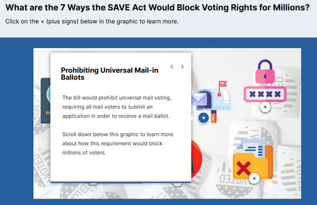
Hi there, I'm Leslie! I built this microlearning module in Rise360 because I wanted to practice creating a short, visual story with interactive elements from a text-only public policy source. 7 Ways the SAVE Act Would Block Voting Rights Government and think tank materials are text-heavy and focus on the process to create the policy or proposal, rather than who the policy impacts and what they either have the opportunity to do, or are now responsible for. I wanted to select a topic and source material that I didn't know anything about to keep my decision making to a minimum. I think visual storytelling would help people process policies and decide faster if they want to complete the call-to-action. I used Flaticons for the icon/ vectors. I created two different source attribution pages at the end of the module - one for the source material and one for the icon/ vectors used I'm unsure how to create a .story file for download. But happy to share anything I can. Thank you in advance for your feedback and comments on the design, flow, etc. While I believe in this topic and the research behind it, I realize it is political, so I hope I haven't violated and posting rules. Best, Leslie1.1KViews3likes10CommentsClaude Shannon Explainer – Interactive Overview of the Father of Information
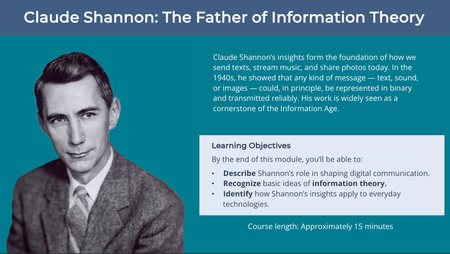
Hi everyone, This interactive module offers a short introduction to Claude Shannon’s key ideas and how they shaped modern computing and communication. The module is part of my portfolio and was designed to demonstrate accessible design, custom illustration, and learner-driven interaction in Storyline. I’d appreciate your feedback on: Navigation and overall flow Accessibility (especially for screen readers) Visual design and pacing Any suggestions for improving engagement or polish Here’s the link: Claude Shannon Explainer Thanks for taking the time to have a look. I’m new to the community and would welcome any thoughts or suggestions.570Views3likes4CommentsUp-Updated "Reveal" codes
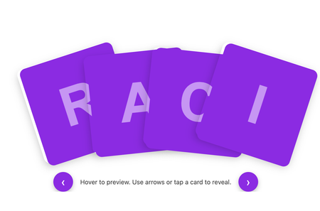
I’ve been experimenting with the original HTML code blocks included in Articulate 360’s built-in examples and wanted to share how far you can extend that base structure using GenAI to iterate and refine interactions. Starting with the default image-reveal index provided by Articulate, I used GenAI to progressively develop three new versions. I supplied my own images, created meaningful alternative text for screen readers, and introduced additional UX and accessibility improvements. Every version is fully tailorable if you want to adapt the formatting, colours, spacing or behaviour. The three examples are: Enhanced Image Reveal Grid Uses the original Articulate structure. Adds a hover zoom, a click-to-zoom state, and high-contrast purple letter tiles for accessibility. Fanned “Deck of Cards” Flip Interaction A dynamic fanned layout, more like a real card hand. Cards lift and reveal their letter on hover, flip on click, and reset if clicked again. Includes chevron navigation for easier cycling. Plain Flip Grid with Navigation A clean, accessible flip-card grid with navigation chevrons. Mirrors the deck behaviour but with a simplified layout. NOW WITH MORE EXAMPLES of what reveal styles can imagine! If you have suggestions, improvements or alternative approaches, I’d really love the feedback. And if you’d like to use or remix any part of this, feel free — I’d love to see what you create with it. Review3602KViews14likes13CommentsStoryline Instant ToolTip
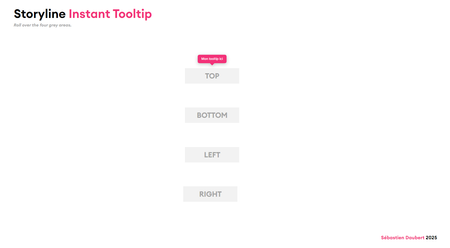
Hi everyone! I'm sharing a script to add tooltips in Storyline. Just one reference object, a quick copy-paste, and it's ready. You could use a native rollover state, but this gives you full control over the animation. Position, colors, shadow: all configurable in 10 seconds. No JavaScript skills needed, the script is designed to be easy to use and maintain.566Views5likes3CommentsRise Course - 4 Parts - Story Narrative - Emotion Led
https://share.articulate.com/vostzJopZeKS567yNeR7f https://share.articulate.com/8x8DCVPCJ7uHPzrmf3AiK https://share.articulate.com/BHsxfLKPtTbKmqJNx0w3U https://share.articulate.com/Ad5ECo3j5Gr08URisxRAy Let me know your thoughts! Thanks639Views1like1Comment