mobile
23 TopicsSnapshot graphics + click-and-reveal = engaging cybersecurity learning
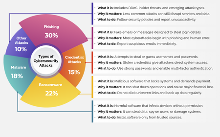
For this week’s challenge, we used snapshot graphics and a click-and-reveal interaction to help learners quickly recognize common cyber attacks—without overwhelming them. View the activity using the link below. https://www.swiftelearningservices.com/custom-elearning-snapshot-graphics-click-reveal-cyber-security-attacks/245Views2likes0CommentsTip of the Iceberg
Happy New Year! When I take part in a Challenge, I'm often asked, "How long did it take you to build that demo, Jon?" The answer can vary, depending on whether I'm experimenting with a new feature, revisiting an earlier concept, or building something completely new. What you see is just "the tip of the iceberg". The next question is: "Is the juice worth the squeeze?" Maybe. Maybe not. Depends on the project, your audience, and the subject matter. Remember, interaction doesn't always aid knowledge transfer. But by regularly practicing with your tools, you can bring your development time down, and make interactions like this one more viable on a real project. Click below to test the demo for yourself, and let me know what you think. https://bit.ly/elhc536 352Views3likes2Comments
Spookily Accruate
Hello! For this challenge, I reused a character I created way back in 2020, for Challenge #292 (Using Variables). In case you wondered, Zardoz is a cross between Sean Connery and the Zoltan machine from Big. I've upgraded Zardoz with a few tricks I've learned in the meantime, including live polling, a speech animation cycle, and some sneaky Javascript. If Zardoz doesn't successfully read your mind, he can still surprise you with what he does know about you. Does Zardoz know what you're thinking? TRY IT OUT HERE
Can We Be Friends?
Hello! Everyone hates icebreakers, right? With that in mind, I've created this mobile-optimized Storyline interaction to help you make new friends. Are we cool? There are 30 different feedback options, which are selected at random by Javascript. If you have any other questions, please ask. We're all friends here!
Multi-Device E-Learning
Multi-device e-learning is a type of online course that works on computers, tablets, and smartphones. Learn more: Multi-Device E-Learning: What, Why, How? Getting Started with Multi-Device E-Learning 8 Questions You Need to Ask to See If Your Organization Is Ready for Multi-Device E-Learning78Views0likes0CommentsMulti-Device E-Learning: What, Why, How?
Every day, more and more people rely on smartphones and tablets in their work and personal lives. Did you know that, on average, mobile users check their phones about 150 times a day? 1 Not only that, but 90 percent of full-time employees in the U.S. use mobile devices for work. 2 So it comes as no surprise that today’s learners expect their training content to be as portable as their devices. But does this mean you should abandon computer-based e-learning courses in favor of mobile ones? Not exactly. This article will help you understand the what, why, and how of multi-device e-learning. What Is Multi-Device E-Learning? When smartphones and tablets first started gaining popularity, e-learning designers wanted to create e-learning courses specially for these mobile devices. They called this e-learning spin-off “mobile learning” or “m-learning.” But after awhile, course developers realized that learners don’t need computer-only or mobile-only content. They switch from a smartphone to a tablet to a laptop and back again without blinking an eye. This reality about the way learners consume content is how multi-device learning—or online training that works on any device—was born! Why Should You Build Multi-Device E-Learning? Today’s learners don’t just want courses that work on smartphones, tablets, and computers. They expect it. They’re used to finding the information they need when they need it—whether they’re at home, at the office, or on the go. Creating multi-device e-learning is a great way to improve performance by expanding the reach of your training and empowering your learners to seek out the professional skills they’re lacking at the moment of need—just like they do in their personal lives. How Do You Create Multi-Device E-Learning? Lucky for you, modern authoring tools have evolved to the point where making multi-device e-learning is no more challenging than making computer-only e-learning. However, every app handles multi-device e-learning a little differently, so it’s important to do some research before committing. Apps like Rise 360 and Storyline 360, for example, allow you to keep building courses like you always have, taking care of cross-device compatibility for you in the background automagically. With Rise 360, you can create inherently responsive e-learning courses quickly and easily—no manual tweaking required! And with Storyline, you can author your slide-based course once, publish it, and it’ll automatically look great on any device. Be aware that some slide-based apps will require you to manually tweak each slide of your course to makes sure it works correctly on smaller devices—which can be a real time-suck. To help you evaluate the different multi-device authoring tools on the market, we created this comparison worksheet with the three main criteria you should consider. You may also want to check out this article for some additional, more general, things to think about when selecting e-learning software: Top 9 Considerations for Choosing the Right E-Learning Authoring Tool. Additional Resources After this introduction to multi-device e-learning, you may be feeling thirsty for more detailed information! If that’s the case, here are some other resources to help you take your knowledge to the next level: Articles Getting Started with Multi-Device E-Learning 4 Tips for Making Your E-Learning Course Content Mobile-Friendly What Is Responsive E-Learning and Why Does It Matter? Why Rise 360 Is a Kick-Butt Multi-Device Authoring Tool Comparing the Storyline 360 Responsive Player with Adobe Captivate’s Responsive Solution E-Book The Definitive Guide to Multi-Device E-Learning And remember to follow us on Twitter and come back to E-Learning Heroes regularly for more helpful advice on everything related to e-learning. If you have any questions, please share them in the comments.227Views0likes0CommentsEverything You Need to Know About Creating Mobile Learning with Articulate 360
Articulate 360 has everything an e-learning professional needs to quickly and easily develop courses for desktop computers, tablets, and smartphones. It includes industry-leading mobile technology that frees course developers from endlessly tweaking their courses for every device a learner might use. Let’s take a closer look at Articulate 360's technology—and how it makes developing mobile learning so much easier. Publish Storyline 360 and Studio 360 Courses to a Responsive Player Articulate 360 includes our award-winning authoring apps Storyline 360 and Studio 360. Create any interactive e-learning imaginable with Storyline 360. And Studio 360 makes it easy to transform PowerPoint presentations into engaging e-learning. Both of these apps use our responsive mobile course player, which adapts course content for any device. Here’s how it works: When a learner opens a Storyline 360 or Studio 360 course on their mobile device, the responsive player automatically adapts to make the most of the screen real estate while preserving course content. There’s no need for e-learning developers to tweak courses for different devices or aspect ratios. They simply publish content and the technology does the rest. See the player in action in this video. To provide a seamless experience for learners on the go, our responsive mobile player automatically provides intuitive mobile navigation and supports mobile gestures such as swipe and pinch-to-zoom. Explore this example on your mobile device to see what we mean! Create Truly Responsive E-Learning with Rise 360 In addition to the responsive player in Storyline 360 and Studio 360, Articulate 360 includes Rise 360—a web-based app that was built with mobile in mind. Rise 360 lets course creators build inherently responsive e-learning right in their web browser. They can kickstart course creation by customizing a pre-built course template or create a completely custom course by adding lessons and blocks. Because it’s Rise, all course content adapts beautifully to any device. Take a look at this example on your mobile device to see what we mean. You’ll notice how course content reflows and looks great no matter the device size or orientation (try looking at the example in both portrait and landscape modes). Rise is responsive e-learning the way it should be—totally effortless! More Resources for Learning About Mobile E-Learning E-Learning Heroes is chock-full of resources that’ll help you create m-learning easily. The Definitive Guide to Multi-Device E-Learning: This comprehensive e-book will walk you through everything you need to know to create multi-device e-learning. Why Rise 360 Is a Kick-Butt Multi-Device Authoring Tool: Learn more about creating responsive e-learning with Rise 360. Comparing the Storyline 360 Responsive Player with Adobe Captivate’s Responsive Solution: See how the responsive player in Storyline 360 differs from Captivate’s responsive approach. 4 Tips for Making Your E-Learning Course Content Mobile-Friendly: Learn more about optimizing your e-learning for learners using mobile devices. Take Articulate 360 for a Spin Interested in learning more about Articulate 360? Get a free, 30-day trial to try your hand at creating multi-device learning today.2.4KViews0likes70Comments