recap
64 TopicsThe unlikely return of Jobsworth
Hello! For this week's challenge, I used the 'Upload Character' tool in the new AI Avatar feature to resurrect Jobsworth, my robotic compliance officer from Challenge #412. It took only a few minutes to generate the voiceover and video. I have to say, the results are pretty impressive! Looks like my days of animating characters using state changes might be numbered. Check it out for yourself here: The unlikely return of Jobsworth 237Views2likes5Comments
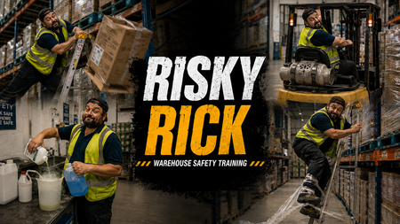
RISKY RICK
Click here to check it out. For this OSHA eLearning Challenge, I wanted to move away from a traditional “click-next” compliance experience and explore a more cinematic, behaviour-driven approach to warehouse safety training. Rather than focusing purely on rules and hazard identification, I built the concept around a character called “Risky Rick”, an experienced warehouse operative whose confidence and familiarity with the environment lead to unsafe decisions and shortcuts. The experience begins with a fast-paced montage sequence showing Rick carrying out increasingly risky behaviours across a warehouse setting, including: overreaching from a ladder dropping boxes using a forklift without checking the environment properly creating trip hazards with pallet wrap mixing chemicals carelessly The intention was to make the learner feel like an observer watching unsafe behaviour escalate in real time, rather than simply being told what not to do. After the montage, the experience rewinds and breaks each scenario down using freeze-frame analysis interactions. Instead of using standard multiple-choice questions, I focused on three reflective lenses: OBSERVE: the behaviour or warning sign INTERVENE: the point where action should happen CULTURE SIGNAL: what the behaviour suggests about wider workplace norms and accepted risk Visually, I leaned heavily into a gritty, cinematic warehouse style using bold typography, industrial textures, high-contrast colour palettes, and dynamic OSHA-inspired graphics. The “Risky Rick” branding was designed to feel more like a behavioural safety campaign than a standard training course. From an instructional design perspective, the project explores how storytelling, character-driven scenarios, rewind analysis, and progressive reflection can create a more immersive and memorable learning experience around workplace safety and risk awareness. Click here to check it out.864Views22likes12CommentsBuilding a Responsive Custom Block with the New Labs Feature
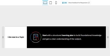
For this week's challenge, I experimented with the new Responsive Custom Blocks feature in Labs and used it to create a custom block that automatically adapts to desktop, tablet, and mobile views. The new container-based layout made it easy to reorganize content across breakpoints while keeping the design clean and consistent. A key objective was preserving icon quality, and the responsive controls allowed the layout to resize without stretching or distorting visual elements. The device previews and flexible container settings made testing and fine-tuning very straightforward. Overall, I found the feature intuitive and surprisingly powerful. It significantly simplifies the creation of device-friendly custom blocks, and I think it would be a fantastic addition to Rise 360 if it becomes an official feature. Great work by the Articulate team, and I'm looking forward to seeing how this feature evolves!ELH Challenge #564 - Branding E-Learning Courses with Style Guides - for Product Knowledge Training
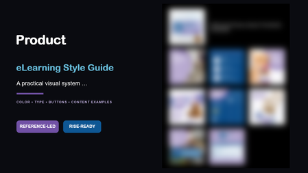
"Count me in!" This challenge arrived at the perfect time. My organization is gearing up for a new product launch, and I've been eager to experiment with a fresh approach to product knowledge training. Marketing Assets As launch dates approach, marketing usually shares product imagery and promotional materials. What I rarely receive, however, is a dedicated visual guide for the product itself. This time, I turned to Copilot to help bridge that gap. Using only the available product images, it generated a style guide that helped establish a clear visual identity and provided a strong foundation for the course design. The Outcome What began as a small collection of marketing assets quickly grew into a complete visual design framework, and influenced a visually different approach to creating training for our customer service team members. Early feedback from a pilot group has been encouraging, and I'm looking forward to rolling the experience out to more than 200 customer service agents and seeing how it resonates with a larger audience. See the results Click here to experience the course demo (scrubbed, but you'll see the style guide's influence). The style guide is embedded in the course as images, and the PDF is attached for those who prefer that format.Copy The File
Hello! This is a twist on the classic 'tab interaction that looks like a file of papers', which uses a Drag and Drop interaction instead of traditional Click To Reveal. But I've built in fallback controls to make it more accesible, of course. This was also a chance to play around with Rise's new AI Avatar feature, and extend that footage using Google Flow to create the two 'cut scenes' that bookend this experience. Check it out here: Copy The File | EngageBrainTrain.com 381Views2likes5Comments
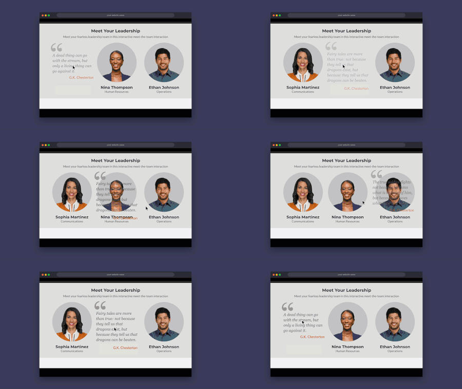
Meet the Team: Hover Quotes for Storyline
Here's an example of how I've used quotes for meet-the-team type interactions. I've always been a fan of using quotes in my trainings and try to include a few in every course. Rise has some good options for quote blocks but quotes are rare in Storyline courses. View the example (download included)Are you sure?
Hello! Personally, I've always found confirmation prompts like "Are you sure?" to be a little ominous and creepy. This week's demo is inspired by the hit horror movie, #Backrooms. This was another chance for me to practice with branching video scenarios, modal screens, and pairing footage created using Rise's new AI avatar feature with environments built in Google Flow. There are seven individual videos, which are shown/hidden depending on your choices. I found the AI text-to-speech in Storyline to be very versatile - the more you go round in circles, the more desperate the protagonist of the story sounds. There are four different routes through the demo. Be warned, two of the routes end in jump scares. You only have a 66% chance of making it through to the 'good' ending on one of the routes. Fancy your chances in the Backrooms? CLICK HERE
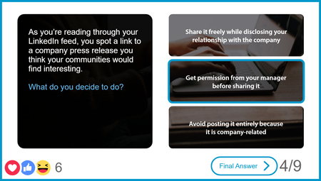
Social Media Quiz Final Answer
This was the knowledge check for a larger social media policy course where the knowledge check functioned as a test-out and learners received "likes" for each correct answer. During the quiz, instead of a "Submit" button on the screen, once a learner selects an answer, the "Final Answer" button appears. If you are wondering about the hearts and faces emojis on the feedback layers, they are just images with float in (up) and float out (up) entrance and exit animations! Explore this project.OSHA Course Starter Template
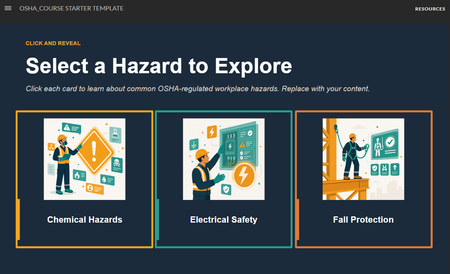
The safety slides got a glow-up: OSHA Course Starter Template Safety training doesn't have to be a snooze-fest. This is a simple starter pack built around a character-driven illustration theme. The source file is available for download on the Resources tab. Grab it, riff on it, make it yours. OSHA turning 55 felt like the right moment to sit this one out. #ELHChallengeThe Last Impression
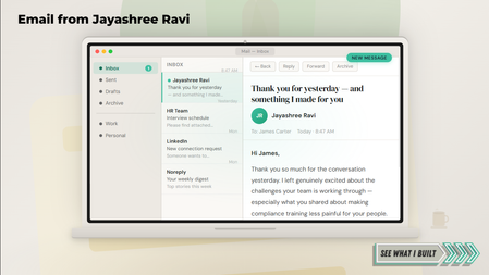
Check it out here! First impressions get you in the room. But what happens after you leave? Most candidates send a thank-you email and hope for the best. This entry makes the thank-you the portfolio piece. I may have made a guest appearance in a hiring manager's inbox for this one. The experience opens as an email mockup, unfolds into a four-tab interactive, and walks the hiring manager through the conversation, a microlearning sample, the design thinking, and a warm close. Because first impressions get you in the room. The last impression gets you the offer. If you turn every touchpoint into a design opportunity, let's connect — Jayashree Ravi