visual design
53 Topics10 Most Popular E-Learning Heroes Articles of 2023
As we wrap up 2023 and look ahead to all the things to come in 2024, now is the perfect time to catch up on the most popular content shared in the E-Learning Heroes Community in 2023. To save you time, we’ve rounded up the best of the best for your review. Check them out: 4 AI Basics Every E-Learning Creator Needs To Know in 2023. Get up to speed on artificial intelligence with this quick introductory article. Introducing the Articulate Beta Program. Learn about this new opportunity to share your feedback on our latest features. 4 Impactful E-Learning Trends for 2023. See how you can shape the future of learning by following these strategies in your workplace. 8 Business Use Cases for Microlearning. Discover how to leverage short-form courses for these common workplace situations (and get creating faster with customizable examples!). 4 Ways To Choose an E-Learning Color Palette. Check out these tips for curating the perfect hues for your next project. How To Write Alt Text for the 4 Most Common Types of Images in E-Learning. Explore alternative text best practices for handling the most common image types in e-learning. 6 Ways the E-Learning Heroes Community Makes Your Job Easier. Learn more about all the resources, discussions, articles, and connections this site offers to help you work faster and create more innovative projects. 4 Advantages of Microlearning. Discover the main reasons e-learning designers and learners are loving this bite-size approach to training. 3 Ways To Boost Your Articulate 360 Skills. Whether you’re a total newbie or you’ve dabbled in our apps before, these tips will help you get to the next level. 3 Things That Can Make or Break Your E-Learning Design. Craft beautiful and effective online training from the start with these helpful ideas. We hope you find these articles helpful! If we missed any other E-Learning Heroes articles you liked in 2023, comment below and let us know. Subscribe to our newsletter to get the latest e-learning inspiration and insights directly in your inbox. You can also find us on LinkedIn and X (formerly Twitter). And if you have questions, please share them in the comments.332Views0likes0CommentsQuickly Create Stunning Courses With Rise 360 Themes
If you need to quickly create beautiful, responsive e-learning, Rise 360 is the authoring app for you. With stunning prebuilt themes and countless options for personalization, it’s never been easier to create unique, cohesive learning experiences. In this article, we’ll walk you through how to make your online courses look gorgeous and professional. 1. Choose a Theme In Rise 360, you’ll find three beautiful, prebuilt themes created by award-winning designers that you can apply to your courses in just a few clicks. Let’s take a look at each option. Rise Live Preview of Rise Our original theme—Rise—is modern and clean. It’s extremely versatile and works for all subject matters. Apex Live Preview of Apex If you’re looking for a bold, contemporary theme, Apex is a great option. Your learners will love its striking, angular finishes. Horizon Live Preview of Horizon For something a little more elegant, look no further than the Horizon theme. Its sharp and stylish feel with understated flourishes can set the right tone. To apply one of these themes to your next project, simply open a Rise 360 course, go to the Theme menu, and select the style you want. 2. Select Customization Options Once you’ve chosen a theme, you can further customize the look and feel of your Rise 360 courses to ensure they’re on brand. Let’s take a closer look at some of the options available. Cover Page Layouts Each theme includes a variety of stunning cover page layouts to make a strong first impression on your learners. You can use the same one for every course, or switch it up to keep things fresh for your learners. Here’s a peek at the different cover layouts you’ll find for each theme. Rise Apex Horizon As you can see, there are tons of possibilities! So you’re sure to find one that works well for your project. Navigation Types Another thing you can customize is the course navigation type. Let’s take a peek at each option. Sidebar The sidebar navigation option is tried and true. It allows learners to access the course menu and content simultaneously, while also giving them the option to hide it when they want to focus on learning. This versatility makes it a great option for any course. Compact Like the sidebar, compact navigation lets your learners decide to either view both the menu and content or minimize the menu for fewer distractions. The main difference here is that even when learners hide the menu, they can still see where they’re at in the flow of the course—allowing them to continue monitoring their progress. Overlay If you want to give your learners a more immersive experience, where they’re only focusing on one thing at a time, overlay navigation is a good option. When they open the menu, they’ll be able to give your course outline their full attention. And when they close it, the content will be the sole focal point. Button Styles You can also customize the look and feel of the buttons that guide learners from one lesson to the next. In addition to a few different color options, you can choose whether you want them to be full width like in this screenshot … … or floating, like in this one … Or you can remove them entirely. It’s up to you! Lesson Headers There are also a number of options for personalizing the lesson headers. For starters, you can choose whether or not you want one. If you decide you do, you can customize the background color or image. Then you can select the height option you prefer: low, medium, or high. And finally, you can opt to show or hide the lesson number and author avatar. Colors When it comes to colors, you can choose one of our default theme colors or select your own by using the color browser or inputting a Hex code. Once you’ve selected your theme color, it’ll be applied throughout your course automatically. Font Pairings Rise 360 gives you a variety of professionally selected font pairings, so your course text looks polished. Of course, you also have the option to create your own by mixing and matching default fonts or uploading your own for a truly personalized look. And that’s just the beginning! With all these customization options—and more—the possibilities are truly endless. Wrap-Up With Rise 360, it's easy to create cohesive, professional-looking learning experiences—even with no prior training or design experience. Ready to try it out for yourself? Simply head to your Rise 360 dashboard, create a new course—or open an existing one—and click on the Theme tab to check out the customization options. It’s that easy! Don’t have Rise 360? Start your free 30-day trial of Articulate 360 now. For tips and inspiration on how to use themes to create beautiful, branded e-learning, check out these helpful resources: Make Over Your Rise 360 Courses in 4 Easy Steps with Themes 3 Ways to Use Rise 360 Themes to Tailor Your Projects How to Brand Your Rise 360 Course And if you found this article helpful, be sure to subscribe to our newsletter to stay up-to-date on the latest product updates, e-learning examples, and expert advice directly in your inbox. If you have questions, please share them in the comments.1.1KViews0likes1CommentQuick Makeover Ideas to Improve Awkward Color Schemes
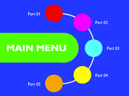
Colors can grab attention and set the tone for a project. But you don’t want to catch people’s eyes for the wrong reasons. For example, this design uses a color scheme from an actual sign I saw recently. Do you like the way it looks? Chances are you had the same reaction I did. The image grabs your attention, but not in a good way! In this article, we’ll examine why the design above doesn’t work. Then, we’ll look at a few surprisingly easy ways to improve a project like this by changing just one thing—the colors. Why Does It Hurt to Look at That Example? Most people find color schemes like the one in the example above painful. And that’s not just them being dramatic—the colors are legitimately hard on the eyes. That’s because they’re highly saturated. Let’s dive into some basic color theory to explain. The simplest way to identify a color is by its hue—think of the main colors in a rainbow, like “blue,” “green,” or “orange.” Pure hues are incredibly saturated and vibrant, as you can see here. A pure hue’s intensity can attract attention, direct the eye, and make things stand out. But using too many pure hues makes it hard for our brains to decide what to look at first. What’s more, if you stare too long at the color bar above, you’ll likely notice how these bright colors also cause eye strain. Pure hues are the design equivalent of screaming, so using a lot of them together—like in our slide example—is visually exhausting. To fix the example, we need to move to a color palette that isn’t composed of only pure hues. There are an almost infinite number of color combinations, but here are a few stress-free approaches for picking attractive ones. Quick Fix 1: Desaturate the Colors One way to make colors less intense is to adjust their saturation. Pure hues are highly saturated colors, so desaturating them makes them less intense and grayer. The hue in the color bar above doesn’t change (it’s still orange), but it’s more saturated on the far left and progressively less so as you move farther right. If you’re a fan of vivid colors, not to worry. Just a touch of desaturation can calm down pure hues. That means you can maintain a bright color’s liveliness while making it easier on the eyes. Here, I took the original design and slightly desaturated each color. The image still has a friendly, colorful feel, but it’s less aggressive than the original. You might also notice that the new design feels less chaotic. That’s because it has fewer colors. The menu label is now white, rather than its original vivid green. White simplifies the color palette and reduces the visual disorder of the original design. Accessibility note: While we’ve addressed the eye strain challenges, there’s still not enough color contrast between some circles and the background to meet accessibility standards. To fix that, we’d need to continue tweaking the colors further with the help of a color contrast checker like this one. Quick Fix 2: Use Part of the Rainbow Our original colors were intense, but they also seemed randomly chosen. You can make your design feel more harmonious by using color combinations with a unifying theme. At first glance, this redesign has the same bright, friendly feel as the previous solution. But take a closer look, and you’ll notice that some circles have changed color. They’re also arranged much like the colors in a rainbow, with magenta shifting to orange—and orange shifting to yellow, green, and blue. That layout creates a subtle visual pattern that makes the colors look like they belong together. Quick Fix 3: Go Monochromatic Want a color palette that’s hard to get wrong? Try a monochromatic one. In this redesign, all the circles are lighter or darker versions of the same hue, so they immediately feel like they belong together. Also, the slow progression from light to dark subconsciously reinforces the idea of moving through a multi-part course. Accessibility note: It can be tough to find a background color that contrasts enough with both the lightest tints and darkest shades in a monochromatic color scheme. This redesign shares one solution—using a high-contrast outline around each color. Quick Fix 4: Look Online for a Color Palette If you’re uncomfortable putting together your own color combinations or feeling stumped for ideas, the internet is here to help! Try doing a quick Google or Pinterest search for “curated color schemes” for some eye-catching ideas. Or, check out the trending palettes on Coolors—which is what I did for the redesign above. In this redesign, the new color grouping didn’t pop as much on the original dark blue background. So I swapped it out for a more low-key off-white. When in doubt, a white background is another design choice that’s hard to mess up. Quick Fix 5: Use a Random Color Palette Generator Coloors has another valuable feature for creating polished combinations: a color palette generator. I used it to pick the colors in this redesign. Searching online will reveal numerous color scheme generators. These sites create attractive color combinations by using algorithms or pulling the dominant colors from an inspiration photo of your choice. While your results may need some tweaking to get things just right, they’ll get you started with a solid foundation. Plus, it’s pretty cool how well these sites can pull together attractive color combinations on their own! Quick Fix 6: Simplify and Make Things Smaller The previous solutions are handy when you have a lot of say in your color choices. But what if you’re stuck with an awkward set of colors because of brand requirements or stakeholder preferences? The first thing to do in those situations is to simplify how many colors you include on a single slide. In this redesign, I used the indigo blue sparingly and skipped the green entirely. That reduced how many design elements were competing for a viewer’s attention. I also simplified the background. Rather than sticking with the highly saturated indigo blue from the original design, I swapped it to a less-intense off-white. That gave the remaining colors more space to stand out—and white is rarely considered off-brand. Then, I took the remaining high-contrast circles and made them smaller, further reducing the design’s intensity. Shrinking the circles also put more white space between each vibrant color—another good trick for keeping pure hues from feeling overwhelming. Is the final result something I’d put together if given free rein on a project? Not really. I still find the colors a bit grating to look at. But the outcome is a good compromise solution when you can’t change the color palette at all. Wrap-Up Some color schemes are painfully awful to look at. But thankfully, even the worst of them can be delightfully simple to fix. You can get ideas for more attractive color combinations by thinking strategically about saturation, harmony, and the number of colors you use. And if you need a bit of assistance, pre-created sets and color palette generators can give you tons of inspiration. Looking for more tips on using color in your projects? Be sure to give these articles a read! 5 Popular E-Learning Color Schemes Storyline: 5 Accessible Color Themes Storyline 360: Theme Colors Follow us on Twitter and come back to E-Learning Heroes regularly for more helpful advice on everything related to e-learning. And be sure to share any recommendations you have for working with color in the comments below.289Views0likes0Comments5 Inspiring Font Pairings for Your Next E-Learning Project
Look at any e-learning project and one of the first things you’ll notice are the fonts. Theme fonts set the stage. They establish a project’s tone—and they make a big difference in helping learners read content more easily. But, with so many options to choose from, how can you possibly pick? Thankfully, you don’t have to search online for the perfect heading and body fonts. You can simply mix and match the built-in Storyline 360 fonts and system typefaces to make your content look polished and legible. Curious to see which fonts work well together? Take a look at these five pairings you can start using right away! 1. Montserrat Medium & Montserrat Want to combine similar fonts without falling into the “it’s boring” trap? Try pairing Montserrat Medium with Montserrat. These two fonts have the same base—just with different line thicknesses. The result is an engaging, easy-on-the-eye contrast. Together, these fonts create a sense of strength and tranquility. And because of their versatility and geometric lettering, the fonts are generally safe for any project. 2. Georgia & Verdana Pairing different fonts can sometimes feel daunting. How do you know which ones to mix and match? What if you end up combining fonts that conflict instead of contrast? Choose Georgia and Verdana and you can put those worries aside, as these two fonts were designed to work together. The elegant simplicity of Georgia combined with the clear and legible Verdana font makes this classic combo a nice choice for your projects. 3. Trebuchet MS & Garamond Need a fresh look? Sometimes combining the old with the new can give a sense of unique familiarity. To capture that balance, try Trebuchet MS and Garamond. The modern Trebuchet MS paired with Garamond—one of the oldest fonts—emits a friendly and sophisticated tone, giving you the best of both worlds. 4. Oswald & Open Sans The best font pairings have visual contrast—but that contrast can't look disjointed. After all, we still need to maintain cohesiveness. Use Oswald and Open Sans to create that ideal match. Oswald’s slightly elongated characteristics combine beautifully with many fonts. Match it with the neutral and friendly Open Sans and you’ll have a distinct and professional pairing that’s instantly pleasing to the eye. 5. Raleway & Roboto Light Need to add some personality to your projects? Look no further than the dynamic Raleway and Roboto Light duo. This sleek and modern font combination is the perfect mix! Raleway works great as a heading because its subtle, artistic look attracts just the right amount of attention. Roboto Light body text completes the picture because it’s versatile and easy to read. Wrap-Up Using any of these font combinations can help your courses look captivating, professional, and readable. And since anyone using Storyline 360 already has these fonts installed, you can easily share your file and rest assured knowing the text formatting will stay intact! Of course, these are just a few pairing options; we’re sure you have many other creative ideas up your sleeve. We’d love to hear them! Which built-in fonts are your go-tos for headings and body text? For more typography tips, check out these articles: 8 Questions to Ask When Choosing Fonts & Formatting Text Insider Tips for Working with Fonts in Storyline 360 How to Use Typography to Improve Your E-Learning Storyline 360: Working with Theme Fonts Follow us on Twitter and come back to E-Learning Heroes regularly for more helpful advice on everything related to e-learning. If you have any questions, please share them in the comments.2.6KViews0likes0CommentsThe Art of Combining Illustrations and Photos in E-Learning
When you see illustrations and photos mixed together beautifully in a single design, the end result can seem effortless. And it’s hard not to be excited about how much easier your search for images gets when you can pick from both image types. But when you’re new to it, it’s not uncommon to feel a bit stumped on how to bring these very different styles together in a way that looks polished. If you don’t have the right strategy, your final design can look mismatched and cobbled together. Does that mean you need years of graphic design experience to get this combination to work? Not necessarily! It’s just a matter of knowing which approaches are more likely to look nice together. Let’s check out a few creative ideas for mixing illustrations and photos in your e-learning courses. Choose one style for the background and another for the foreground You’ve likely seen this technique used a lot in e-learning courses. And it’s not hard to understand why. Landscape photos or images from different locations are easy to find in Content Library 360 or on stock photo sites. And if you can’t find one you like, you can always use a photo you’ve taken yourself. Either way, using photos as a backdrop and adding illustrated characters at the forefront can make for a really unique design. The Mori’s Journey interaction by Samara Reyneke highlights one of the most important things that makes this combination work seamlessly: consistency! The backgrounds are all photos. The characters and items in the foreground are all illustrations. Not only that, the illustration styles are all similar. Consistency throughout the entire project helps this look like a purposeful design choice, instead of just a bunch of random image styles. You can also do the opposite and use illustrations in the background and images in the foreground. Molly Fisher’s Grammar Practice Fill-in-the-Blank example uses the charming combination of an illustrated TV with real video programming. Use image filters to make everything look like an illustration The challenge of mixing photos and illustrations mostly comes down to how different they look. But what if there was a way to make them work together? That’s completely possible with the help of the photo filters in stand-alone filter apps or photo-editing software. These filters make changes to the look and feel of your images, like simplifying the colors or adding outlines. And because those changes are applied consistently to your photos and illustrations, it helps them look like they belong together. A good example of how this can work is Tracy Carroll’s project Jonathan’s Story. In it, she used a tool called Colorcinch to make her images look like hand-drawn comic book frames. While this project just used photos, you still get a sense of how you could take this same technique and mix different image types for a cohesive look. Use illustrations that look realistic There are many different styles of illustrations. They can range from simple and sketchy all the way to looking like actual photos. And it’s those photo-realistic illustrations that help you with this approach. Combining realistic illustrations with a photo background helps make your course design look seamless. A cool example of this is Sarah Hodge’s How to Fight a Bear course. She used 3D models of bears instead of photos, allowing her to create an interaction where learners can rotate them to show their identifying features. But because those models were designed to look realistic, they blend in smoothly with the photo background. Use illustrations as annotations or accents Have you ever watched sports commentators draw on a still shot from a game to explain a play? Well, that approach can also work in e-learning! Your photo becomes your base image, and then you use illustrations to provide additional information. You can see how useful this approach can be in this x-ray example by Preethi Ravisankar. Helpful illustrations displayed on top of the photo give you a peek at the inner workings of a person’s skeleton. Because of the way it’s designed, the illustrations work with the photos and don’t seem out of place. You may have also seen advertisements, websites, or book covers that use a combination of photos with doodle-like illustrations. This technique has become more popular in recent years and can give your project a friendly, mixed-media feel. You can see it at work in this interaction example by Samuel Apata, where a hand-drawn sketchnote weaves in a photo character who seems like they’re pondering the topics. Learn More While these approaches are a good place to start when you want to blend photos and illustrations, they’re not the only way to use the two styles harmoniously. So, keep an eye out for other designs that do this effectively and let them inspire your course designs. Want more ideas on how you can use images in your courses? Check out these resources. 34 Mixing Photo and Illustration Examples in E-Learning Design #312 4 Fast & Easy Changes That Will Make Your Old Storyline Courses Look New Again 7 Creative Ways to Use Images in Rise 360 Courses 5 Ways to Use Animated GIFs in Your E-Learning Follow us on Twitter and come back to E-Learning Heroes regularly for more helpful advice on everything related to e-learning. If you have any questions, please share them in the comments.1.6KViews0likes3CommentsDesign Standards to Follow When Creating a Custom UI in Storyline 360
One of the great things about Storyline 360 is you can create a fully custom experience for your learners—right down to the user interface (UI). But like they say: with great power comes great responsibility. And when it comes to UI design, it’s your responsibility as the designer to ensure it’s easy and intuitive to use for all learners. If you haven’t read this article on UI design, I recommend doing that before you continue. When you’re done, come back here and dive into this detailed list of design standards to help you provide an optimal experience for your learners. Are you ready? Here we go! Color Do Don’t Choose background, button, and text colors that contrast sufficiently with one another. Learn more about contrast ratios and how to measure them in this article: Contrast Considerations for Accessible E-Learning. Don’t use color alone to convey information. Doing so will make it difficult or impossible for people with color vision deficiency to understand your content. Instead of simply highlighting an answer in red when it’s incorrect, include visual and textual messages that convey it’s incorrect as well. For example, a red X along with the word Incorrect would be ideal. Text Do Don’t Limit yourself to 2-3 fonts: 1 for headings 1 for body 1 for calls to action (buttons) Choose fonts that work in multiple languages if you plan to translate your course. Check the font information to make sure. Use size 12 font or higher for all on-screen text to ensure readability. Don’t choose fancy, hard-to-read fonts. Don’t center or justify your text. This makes it harder to read. Don’t underline text unless it’s a hyperlink. For more tips on ensuring your text is legible, check out these articles: 8 Questions to Ask When Choosing Fonts & Formatting Text 5 Formatting Tips for Creating Dyslexia-Friendly E-Learning Images Do Don’t Add alternative (alt) text to informative images so that screenreader users get the same information as sighted learners. Don’t add alternative (alt) text to decorative images. This just adds noise for screenreader users. Unsure if an image is decorative or informative? Ask yourself if the image includes information that helps the learner better understand the content. If so, then it’s an informative image. If not, then it’s likely a decorative image. Buttons Do Don’t Use rectangular (with round or square edges) shapes for buttons. It can be helpful to add a drop shadow to make them look clickable. If you prefer flat design, make sure your buttons stand out in other ways, for example, using a bold color. For more tips on designing buttons, check out this article: Tips for Designing Buttons That Scream “Click Me!” Make buttons a minimum of 44 pixels x 44 pixels. This ensures they’re easily clickable by most learners. See the WCAG 2.5.5 guideline for more information. Ensure all buttons have a contrast ratio of at least 3:1 to both the background and anything next to them. Learn more about contrast ratios and how to measure them in this article: Contrast Considerations for Accessible E-Learning. Add states to buttons so they respond (by changing colors or format) when hovered over or clicked. Ensure the focus order of your buttons (and other on-screen objects) makes sense. Use radio buttons for quizzes with only one correct answer. Use checkboxes for quizzes with multiple correct answers. Limit the number of options for quizzes to avoid cognitive overload. Don’t make disabled buttons gray. Instead, try making them translucent. Find out why here: Why You Shouldn’t Gray Out Disabled Buttons. Icons Do Don’t Use icons that are clearly recognizable. For example, a house icon for the home page. Accompany icons with a label (below or on hover) for increased clarity. Don’t use ambiguous icons. If no easily identifiable icon exists, use words instead of or in addition to your icon. Layout Do Don’t Use white space effectively. Learn how here: 3 Tips for Using White Space in Your E-Learning Designs. Put the exit button in the upper right corner. If designing for mobile, put the most frequently used buttons near the bottom. That way learners can easily access them with their thumbs when holding their phone with one hand. Don’t cram too much text on a slide. This can be overwhelming to learners. Instead, stick to one idea per slide. Here’s an article that will help you streamline your slides: 5 Ways to Avoid Overloading Your Slides. Features Do Don’t Provide help features like instructions and a glossary. Don’t skip over help features. You might think your course navigation is super-clear or that your learners already know all the terms in your course, but chances are you’ll have at least a few learners who will benefit from some extra help—so build it into your course! Wrap-Up This isn’t an exhaustive list, just a few simple guidelines to keep in mind. Unfortunately, there’s no official UI handbook, because the best practices depend a lot on your specific situation. If you’re struggling with how to present something, do a quick search to see how other designers have approached it. If it feels intuitive to you, apply the same principles to your course. If you’re looking for more tips on designing great learning experiences, here are some articles you’ll want to dig into: What Are UX and UI Design and How Do They Apply to E-Learning? How to Design a Better Learner Experience Remember to follow us on Twitter and come back to E-Learning Heroes regularly for more helpful advice on everything related to e-learning. If you have any comments about UI design and e-learning, please share them below.930Views0likes4CommentsContrast Considerations for Accessible E-Learning
E-learning is a visual medium. Whether you’re creating a fun, game-based scenario or a basic quiz, the visual design of e-learning sets the tone for the experience. When designing accessible e-learning, there are some additional considerations to keep in mind to ensure your course design is accessible. One of those considerations is contrast. In this article, we’ll talk about what contrast is, why it’s important, who it impacts, how to measure it, and how to ensure your e-learning courses have the optimal levels. What Is Contrast? When we talk about contrast in the context of accessibility, we mean the difference in brightness between two colors. To describe this difference, we use ratios. For example, white text on a white background would have the lowest possible contrast ratio—1 to 1 (1:1)—since there’s no difference between the background and the foreground. On the other hand, black text on a white background has the highest possible contrast ratio—21 to 1 (21:1). As you may have gathered, the bigger the first number, the more contrast there is between the two colors, and vice versa. Why Should You Care? If the contrast levels between your text or buttons and the background are too low, some of your learners might struggle to see—and therefore understand and interact with—your content. And since that’s the whole point of the course you’re designing, that’s a big problem. Not to mention, depending on your country and organization, you may be legally required to follow contrast guidelines. Failure to stick to these guidelines could result in a lawsuit. For information about the applicable laws in your country, check out this resource: Web Accessibility Laws & Policies. Who Benefits When You Optimize Contrast? People often think accessibility features like optimal contrast only benefit a small group of people. They wonder if it’s worth putting in the extra effort for just a few learners. But the reality is the range of people who find these features helpful is quite large. Optimal contrast doesn’t only benefit people who were born with low-vision impairments. It’s also great for people whose vision is getting worse with age, and those who are viewing your content outside on a sunny day or in low light. And even people with no visual disabilities in perfect lighting conditions appreciate designs with optimal contrast. They’re just easier on the eyes. Look at the images below, for example: Do you see how much harder it is to read the text on the left? That’s because the contrast ratio is too low, so the text blends into the background. Accessibility features like optimal contrast benefit not only those who need them to access your content—they benefit everyone. What’s the Ideal Contrast Ratio? When it comes to accessibility, higher contrast is generally better. However, it’s best to avoid the absolute highest level of contrast—for example, black text on a white background, or vice versa (21:1)—because it’s too harsh and can cause eye strain. Instead, try swapping the black out for dark gray to make it a little easier on the eyes. Take a look at this side-by-side comparison to see for yourself what a difference this small change makes: Obviously, there will be times when you want or need to use colors other than white and dark gray. For those times, you should aim for a minimum contrast ratio of 4.5:1. How do you know if you’re meeting that contrast ratio? Keep reading to find out! Measuring the Contrast Ratio It’s important to measure the contrast ratio using a dedicated tool—and not just trust your own perception. After all, everyone perceives things differently depending on a variety of factors, including our vision and lighting. Take a look at the example below: To me, the contrast ratio for this slide seemed pretty good! The white text appeared to stand out well against the dark pink background. But when I put the colors into my contrast checker, I was surprised to see that the contrast ratio wasn’t quite high enough. As you can see in the screenshot, these colors have a contrast ratio of 3.36:1, which is below our target of 4.5:1. Luckily, my contrast checker also suggested an alternative color that does meet the target contrast ratio, making it super easy for me to adjust my design. Here’s what it looked like after I applied the suggested color: When you compare these images side by side, it’s easier to tell the second version is better, but it’s still not obvious. That’s why it’s essential to use a contrast checker. The good news is that there are tons of free tools out there that allow you to measure contrast. All of them have slightly different features and use cases. Here are some of my favorites: Polypane is a web app that not only tells you if your contrast ratio is high enough, it gives you some options if it’s not. The only downside is that you have to input HEX codes instead of simply using an eyedropper. Colour Contrast Checker is a Chrome extension that allows you to check the contrast ratio using a handy eyedropper tool. Color Contrast Analyser is similar to Colour Contrast Checker, except that it’s a desktop app. It works on both PCs and Macs. Material Design Color Tool is a web app that allows you to play around with color schemes while making sure the contrast ratio is on point. It’s a great tool to start with if you haven’t decided on colors yet. There are tons of other free color contrast apps out there. If you’re not satisfied with these, do a quick search and see what else you find. Design Considerations The Web Content Accessibility Guidelines (WCAG) for contrast* can feel overwhelming. That’s because each criterion outlines not only the main guideline, but also several exceptions. The good news is, if you hold yourself to the main guidelines—and ignore the exceptions—it’s easier for you to remember what to do, and makes your course better for your learners. With that in mind, when you’re designing courses there are four main things to remember when it comes to contrast: All text should be at least size 12. All text should have a contrast ratio of at least 4.5:1** to the background. All parts of the interface (i.e., buttons) and graphics required to understand the content should have a contrast ratio of at least 3:1 to both the background and anything touching them. Graphics that are purely aesthetic and don’t contain text or convey meaning don’t have any contrast requirements. If you stick to these rules, you should be all set from a contrast perspective. Let’s take a look at an example. This is a menu slide, so each of these squares are clickable and therefore considered to be part of the interface. That means that not only does the text need to be sufficiently contrasted against the button color (4.5:1), but the buttons themselves need to be sufficiently contrasted against the background color (3.1). If the buttons were touching, they would also need to be sufficiently contrasted from one another (3:1). Since there’s a space in between, that’s not necessary. To help you take contrast into account from the very start, use this color scheme design template or an accessible color palette builder app like this one. Wrap-Up Designing your course with contrast guidelines in mind is about more than just checking a box on your long list of accessibility requirements. It’s about making sure all learners can read and understand your content. What could be more important than that? Follow the tips outlined in this article and be confident that you’re set when it comes to contrast. However, if you want to dig into the details of the related WCAG guidelines, check out this WebAim article or the criteria links in the footer of this article. If you’re looking for more advice on designing accessible e-learning courses, be sure to check out these helpful resources: All About Accessibility. Subscribe to our newsletter to get the latest e-learning inspiration and insights directly in your inbox. You can also find us on LinkedIn and X (Formerly Twitter). *WCAG 2.0 Guidelines for Contrast: 1.4.3 Contrast (Minimum) 1.4.6 Contrast (Enhanced) 1.4.11 Non-Text Contrast **According to the guidelines, large-scale text can have a contrast ratio as low as 3:1, but we simplified it here to make it easier to remember and because a higher contrast is better.1.9KViews0likes0CommentsEverything You Need to Know About Sourcing Fonts
Most of today’s computers come with a library of installed fonts, known as system fonts. These are typically fine for most things—like email, spreadsheets, and documents—but when it comes to creative work, like e-learning, you might need to look beyond system fonts for something with a little more personality. Let’s say you’ve got a special project coming up and you’d like a font that works with the subject matter. Where do you start? The internet, of course! Finding fonts on the web is super-easy, but how can you tell which ones are safe to use? Let’s take a closer look. Free Fonts Free fonts are obviously the easiest on the old pocketbook, and they’re great when you’re looking to prototype different visual design options. However, free fonts do come with some limitations. For instance, it’s common for font designers to offer a free version of their font in only one stroke weight—like bold, light, or regular. All of the other stroke weights may cost money. Also, with free fonts, you tend to get what you pay for. Font designers might not invest as much time on the finer details with a font they’re giving away. They might cut corners on things like proper kerning—the spacing between characters—or they might choose to leave out special characters entirely. Fonts that aren’t properly kerned can be hard to read and might not render or scale well on different devices. And missing special characters can force you to use a mish-mash of similar fonts to try and maintain some visual cohesion in your design. A final drawback with free fonts is that they are often just stolen licensed fonts, repackaged with the copyright removed. This means you could end up using a “free” front illegally. Yikes! How can you play it safe with free fonts? Well, just as you would with any other asset, always check the licensing to make sure it’s free for commercial use. When you download the font file, look for a “readme” text file in the zip folder. These generally contain the licensing terms and conditions. If the downloaded “free” font doesn’t have these terms and conditions spelled out … be cautious. There are many great sources for free, high-quality fonts on the web that you can trust. My go-to is Google Fonts, a library of more than a thousand free and open-source font families. I use a ton of them in my Storyline 360 projects. Google Fonts always look great and provide a complete set of special characters to work with, and I love the variety of styles. One last note about free fonts: Although some pre-installed Windows Fonts can be published to the web without purchasing an additional license, others, like Arial, are owned by Monotype and are subject to a web font license. Personally, I’ve found Open Sans, Lato, and Source Sans Pro—free web fonts installed with Storyline 360—to be good substitutes for Arial. But if you’re already using a lot of Arial in your e-learning, you’ll want to learn more about Monotype licensing here. Paid Fonts If you have the budget for assets, why hassle with finding free fonts when you can just purchase the exact font you need for your project? Fonts for purchase tend to be higher quality and are more likely to give you access to a full assortment of stroke weights and special characters. Many people decide to purchase a font to mitigate any legal concerns over licensing. However, paid font licensing can still be a little tricky. Some font designers require separate payments for print and web versions of the font. As such, it always pays to read the fine print to make sure you’re allowed to use your purchased font the way you intend. Wrap-Up We’ve covered a lot of turf here, so I thought I’d leave you with a handy pros and cons table to wrap it all up with a nice little bow: Pros Cons Free Fonts They’re free! They might only come in one stroke weight. They might not come with a full set of characters. The kerning (space between letters) might not be consistent. It can be hard to be 100% sure you can use a font legally. Paid Fonts Often (but not always) higher quality. Often (but not always) come in multiple stroke weights. Often (but not always) include a more complete set of characters. They’re not free. Paid font licensing can be complex, so it’s best to read the fine print to ensure you’re using it legally. Now that you know the pros and cons of free versus paid fonts, you might be wondering how to decide which fonts to use. Great question! The following articles will help you make the call: Finding Fonts That Fit Your E-Learning 8 Questions to Ask When Choosing Fonts & Formatting Text for E-Learning Have any tips you want to share? Leave a comment below. I’d love to hear from you! And remember to follow us on Twitter and come back to E-Learning Heroes regularly for more helpful advice on everything related to e-learning. If you have any questions, please share them in the comments.383Views0likes2CommentsHow I Designed This Immersive Scenario on Prioritizing Tasks
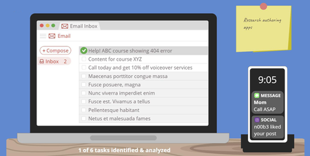
Recently my fellow instructional designers Sarah Hodge and Madison McCartney and I teamed up to prove that there’s always more than one way to present course content. Each of us created a mini-course on prioritizing tasks, using the Eisenhower Decision Matrix as our starting point. In this article, I’m going to walk you through how I got from this: … to this: View interactive version | Download template Without further ado, let’s get into it! Setting the Scene Since I created this project as an example, there’s no real target audience, much less learning objectives. But to make it feel realistic I set some basic parameters to guide my design thinking. Here’s what I came up with: Audience: Novice e-learning project managers Learning objective: Be able to identify tasks, classify them as important and/or urgent, and prioritize them accordingly Coming Up with the Concept Over the years, I’ve seen a lot of great e-learning examples in the E-Learning Heroes community, but a few really stand out to me. One in particular is this time management game by Phil Eagles. I love the way he took a series of simple multiple choice questions and made them into a scenario that feels real and meaningful. And since time management is so closely related to task prioritization, it’s the first thing I thought of when I started brainstorming ideas for my project. I wanted to create something similar—but put my own spin on it. Because I wanted to create a totally custom and immersive scenario, Storyline 360 was the perfect choice for this project. I decided to simulate a desk and let learners identify tasks and prioritize items for themselves. The idea behind this was to emulate real life—where learners have to identify tasks and decide which ones to do first—while also following one of the key principles of adult learning by giving them control over their learning experience. Refining the Scenario Once I had a general idea of what I wanted to do, it was time to iron out the scenario details. I wanted to give learners enough opportunities to practice prioritizing tasks without it feeling repetitive. I included a few different types of tasks—since that’s what it’s like in real life. In the end, I settled on a total of six tasks, including a few emails, a couple of text messages, and a Post-it. As I started to build out my scenario, I ran into some challenges. One of the main issues was that my slide was getting overcrowded. To overcome this challenge and help learners focus on one thing at a time, I divided the process of task prioritization into two parts: Step 1: identify and analyze the tasks to determine how urgent/important they are Step 2: prioritize the tasks based on their level of urgency/importance For step one, I used a series of toggles so the learner can decide if each task is urgent and/or important. Based on their answer, I provide custom feedback. This is how that turned out: For step two, I made a simple drag-and-drop interaction so the learner can decide where each task belongs on their to-do list based on its level of urgency and importance. Here’s what that ended up looking like: Because this project was intended for adults who may have previous experience with the Eisenhower Decision Matrix, I made the explanation walk-through optional, as shown in the screenshot below: Is this how I initially envisioned my project? Absolutely not. To be honest, I don’t think I really had a clear mental picture of what it would look like. Some people can map out their entire project before they even open up the authoring app, while others do better jumping straight into building and get inspired along the way. Both methods are totally fine as long as you always keep your learners’ needs at the center of your design. Designing the Graphics As someone with no formal graphic design training, I can be challenged to come up with ideas for the look and feel of my courses. To find inspiration, I usually start by checking out the examples and templates on E-Learning Heroes as well as the Content Library 360 templates. Even if I don’t find exactly what I need, I usually come across something I can use as a starting point. Personally, I find that starting with a template is less intimidating than starting from a blank slide. And even if the final result ends up looking completely different than the original template, having something to start with helps me channel my ideas and inch closer to a place I feel good about. So, once I knew that I wanted to create an immersive scenario, I headed straight to E-Learning Heroes to look for templates I could use as a springboard for my design. A quick search for “desk” led me to this template, which I thought was perfect: Download Template After opening the template, I made some adjustments and played around with different color options. Here’s what my first version looked like: There’s nothing wrong with the way this looks, but—as I mentioned earlier in this article—it was at this point I realized there wasn’t enough room on the slide to allow learners to both identify and prioritize tasks in one spot. Splitting the activity up into two parts gave me more screen real estate to work with. Around this time, I also decided I wasn’t sure about the mint green wall and wanted to give white a try . . . . . . but I wasn’t totally sold on that either. I also felt lukewarm about the way the desk looked and decided to incorporate some texture. This is what the next version looked like: Wondering how I created the wood texture? I did a Google search for “flat design wood,” inserted one of the images I found onto my slide master, and then used the curve tool and shapes in Storyline 360 to achieve a similar effect. This is what it looks like behind the scenes: I was pretty happy with the way this looked, but when I started adding other objects to the screen, I realized they didn’t stand out enough against the dark blue background. That’s when I settled on the design you see in the final version: I went through a similar process for the other slides in my project, so I thought I’d share the different versions with you as well. . . . and here’s the final version. You’ll notice that in the final version I pulled in the computer screen from the previous slide to tie it together a bit more. I also changed the size of the boxes to make it all fit on the screen. As I was working on my core content slides, I also started to pull together my title slide. Since my other two slides used a flat design style, I wanted to stick with something similar. I found this simple slide template in Content Library 360 and used it as a starting point: I didn’t want to include characters, so I deleted those and changed the color of the background to match the dark blue I was using at the time. After taking out the characters and changing the color, I felt like the slide was too minimal. It was missing something, so I sat and thought about how I could incorporate more visual interest. That’s when I had an idea: what if the title slide was a view of the desk from above? And since we’re talking about prioritizing tasks—and many people write their to-do lists in a notebook—I thought that might make sense and look nice. So I went back to E-Learning Heroes for some inspiration and ended up finding this spiral notebook template: Download I imported it into Storyline 360 and made a few adjustments to make it all come together. Here’s what it ended up looking like: As you can see, graphic design isn’t always a straightforward process. It doesn’t necessarily go from zero to perfect in one fell swoop. In many cases it’s an iterative process involving incremental changes until you’re happy with what you’ve got. So the next time you’re feeling stuck and unsure about your design, try doing what I did and search E-Learning Heroes or Content Library 360 for a template you can use as a starting point. Then, make small changes here and there. Eventually you’ll get to a place where you feel good about your design. More Resources Hopefully you’ve found this inside look at my design process interesting and insightful! Remember, it’s okay if your first draft isn’t perfect. Design (whether it’s instructional or graphic) is a process, and it often takes trial and error to get it to where it needs to be. And there’s absolutely nothing wrong with that! If you enjoyed this article and are looking for more insight into what goes on in the minds of instructional designers as they’re creating courses, be sure to check out these articles: How I Designed This Personalized Decision Matrix How I Designed This Interactive Dial Matrix A Behind-the-Scenes Look at How I Designed This Gamified Quiz Want to try building your own immersive scenario in Storyline 360, but don’t have Articulate 360? Start a free 30-day trial, and come back to E-Learning Heroes regularly for more helpful advice on everything related to e-learning. If you have any questions, please share them in the comments.1.1KViews1like6CommentsFinding Fonts That Fit Your E-Learning
Fonts matter. As a content creator, that shouldn’t come as a surprise to you, but have you ever taken the time to think about how much font matters? The font is the gateway to your content. It sets the mood before your learners even start reading. In less than a second, subconsciously your readers are preparing themselves to get serious or be entertained. When there’s a mismatch between your font choice and your content, it causes cognitive whiplash that can distract or, worse, lose your audience entirely. Font Sets the Tone Let’s take a look at an example of what I mean using a couple of well-known movie posters. ALIEN and The Little Mermaid couldn’t be more different, and their posters reflect that. No one is going to pick ALIEN and expect a lighthearted romp. Conversely, viewers of The Little Mermaid wouldn’t sit down expecting creeping dread and horror. But what if things were different? With nothing more than a font swap, the expectations for these two films are … well, maybe not changed completely, but certainly confused. The ornamental Little Mermaid font doesn’t pair at all with the stark graphics of the ALIEN poster. And ALIEN’s wide-spaced Helvetica Black is incongruous given the pastel colors and uplifting tagline of The Little Mermaid. But that’s movie posters, you say. Of course font matters when it’s the focus of the design. This is true, but that doesn’t mean you have to use Times New Roman for all your courses either. It’s possible to get creative with your font choice without sacrificing your content or readability. You just need to keep the following guidelines in mind. Let the Subject Matter Be Your Guide While you can just start creating with the default font for any tool, it’s usually the default font because it’s decidedly neutral. It’s not going to clash with your content, but it’s not going to highlight it either. How can font choice highlight your content? Let’s look at a couple of examples to see what I mean. This image is taken from a course created in Rise 360 using the built-in font Raleway. Now, Raleway isn’t a bad font by any stretch. But does it convey the gravity that the subject matter necessitates? Between the ornamental capital W, the relatively light line weight, and the overall softness of the curves, its touches of whimsy are a bit like a lawyer using a kitten filter in a virtual legal disposition. The information might get across, but readers could be distracted by the font choice, or at worst, question the credibility of you or the content. Let’s switch up the font and see how that changes things. Here’s the same content presented with a title and header that uses Open Sans. The two fonts, Raleway and Open Sans, are both sans serif fonts. So what makes Open Sans a better fit? It’s a much weightier, no-nonsense font that’s perfect for conveying serious information in an easy-to-read way. Use Ornamental Fonts Sparingly Decorative typefaces are an easy way to provide immediate impact to your content. It’s why you don’t see Times New Roman selected for movie posters—the text is meant to have an emotional impact even before it’s read. That’s why you should only use ornamental fonts sparingly, preferably for a title screen or at the beginning of a new section, so they don’t distract your learner. It’s also important to remember that ... Font Choice Can Impact Clarity Ornamental fonts impede understanding. If your learner has to try and decipher what’s written, then you’ve already pulled their focus away from your content. Plus, over-stylized fonts are difficult for those with dyslexia to read. Let’s Recap Font choice helps your readers engage with your content before they’ve even started reading. Think of it as the marquee movie poster that draws them in and prepares them for what’s next. When choosing a font, however, you’ll need to keep a few things in mind. Let the content guide your font choice. Using an overly ornamental font for serious content or a plain font for more whimsical projects can be jarring and cause dissonance for your learner. Ornamental fonts are OK, but only if you use them with a light touch. Your font choice impacts readability. When in doubt, use a sans serif font to maximize accessibility. More Resources Did you find these tips helpful? If so, we have lots more to share. Here are a few more items to add to your reading list: All About Accessibility Top Writing Tips for E-Learning How to Use Typography to Improve Your E-Learning E-Book Follow us on Twitter and come back to E-Learning Heroes regularly for more helpful advice on everything related to e-learning. If you have any questions, please share them in the comments.531Views0likes0Comments