Forum Discussion
Inconsistent font in flipcards in Rise
- 1 year ago
Apparently its not a bug but a development choice. I've now raised suggestions to make this editable - both for buttons and flip cards. Marking this as resolved now. Thanks all.
Here is a screenshot...
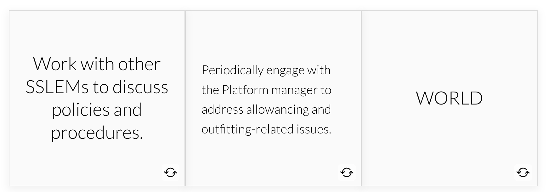
One on the right is correct
Hi CarlNieweld,
Thanks for reaching out and including a screenshot!
This is the intended design, but we appreciate you expressing your concerns. I've submitted your feedback to our developers as they continue to track this request. We'll let you know here if anything changes!
- CarlNieweld1 year agoCommunity Member
Hi Kelly,
I am not sure I understand. There are two different fonts, line spacing, and alignment. I don't think that is the intended design??? If so, which one is the intended design? How do I fix it, so they are consistent?
Thank you!
- CarlNieweld1 year agoCommunity Member
Hi Kelly,
We might not be on the same page. I should have explained a little better. The screen shot displays the backs (flip sides) of both cards, not front and back. Maybe that helps.
- JoseTansengco1 year agoStaff
Hi CarlNieweld,
The text automatically adjusts depending on the number of characters entered, and there isn't a way right now to modify this appearance. The best way to get consistent formatting across all cards is to enter text that has fewer than or closely matches the number of words and characters of each card. In this example, you can see that the third card has fewer words than the second; therefore, the formatting is nearly identical to the first card.
I understand that this is not ideal and restrictive. My colleague Kelly has already shared the feedback gathered in this thread with our product team, and we'll let you know if changes to the behavior make it to our product roadmap!
- CarlNieweld1 year agoCommunity Member
Jose,
I appreciate the information, but it still is not the answer to the issue I am having. That pertains to the FRONT of the cards (where they will adjust in size), but not the back.
Here is a screenshot of the BACKS of the cards... Notice the left alignment versus center alignment on the lower two cards. And, when checking font size, they both state 14 points. The top right card has a scroll for a longer text, while the top left text is about the same text length as the lower left. The lower left is the culprit - why is it different? All of the other cards do NOT auto size and move center alignment on their own. I have deleted it numerous times and still get the same result.
Please help. I can certainly walk someone through this and show them exactly what is happening. Unfortunately, due to security clearance I cannot share the entire file.
Thank you!
- RachelleFurney1 year agoCommunity Member
Yes! more flip customization would be amazing! It makes my eye twitch when I can't make them the same size! lol
Related Content
- 4 months ago
- 9 months ago