e-learning essentials
93 TopicsLearning Articulate - how to gain skills
I would love to hear from anyone and everyone-- I am a self-taught user of Articulate- I originally began my E-Learning journey using a competitor and when the organization I was working for decided to go with Articulate- I had to learn it quickly. I feel like I can and do create the content, I need to for my organization, but there is so much functionality with this software that I am sure I am missing out on, due to lack of my knowledge. So, my question is, how did/do you learn about the vast functionality of Articulate? Did you take classes, if so - where/with what company? Are there additional resources outside of this amazing group to learn more? I appreciate all feedback!35Views2likes3CommentsHow to Build a Rotating Video Carousel in Articulate Storyline
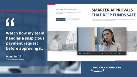
2 min read Three videos. Click a side tile and the whole set glides across, the outer tiles scaling and blurring back into depth. It loops in both directions and never dead-ends. Try the live demo first. Then here is how it goes together. The videos stay in Storyline They sit on three slide layers, Vid01, Vid02 and Vid03, as ordinary Storyline video. That matters. You keep your seekbar, your accessibility settings and your normal publish pipeline. Swapping in your own footage is just right click, Change Media. The carousel is a web object A small folder of HTML, CSS and JavaScript sits on top and draws the three tiles. The front tile lines up exactly behind the real video, so what learners click is Storyline, not a picture of Storyline. The look and motion live in one file Open config.js in Notepad. Tile size, swing distance, tilt, blur, fade, speed, play button colour and background are each one line with a plain-English comment. Change a number, save. There is no code to write. The folder rule nobody expects This is the step that may trip up almost everyone. Storyline copies the web object folder when you insert it, so pointing it back at the same folder shows you the old version no matter how many times you save. Rename the folder, repoint the web object at the new name, then publish. Why it looks blank in Preview Web objects do not render in Storyline Preview. You have to publish to see the carousel run. This is normal Storyline behaviour and nothing is broken. See it running Open the live carousel demo and click the side tiles to feel how the motion reads. Watch the full tutorial on YouTube for the complete build.66Views1like2CommentsReview360 User Guide
Hello, Does anyone have a simple template or guide they use with SMEs when asking them to review content in Review 360? Would love to be able to attach something simple my review requests so SMEs know what they are looking for, and how to provide feedback. What I have found online tends to be more aimed at a developer audience. Thanks!305Views1like11CommentsAn eLearning Course May Be Teaching More Than You Intended
After many years in instructional design and eLearning, I’ve come to question something we often take for granted about learning. We tend to think of it in simple terms: The learner learned it. The learner didn’t. The course worked. The course failed. But I don’t think learning works that way. People always learn something. The more important question is: What are they learning? Consider a poorly designed eLearning course. An employee attends a course because they genuinely want to learn. But the content is difficult to follow, the activities feel disconnected, and the experience becomes frustrating. The course doesn’t help with the problems they actually face at work. We might conclude that the learner simply didn’t get much out of it. But they may have learned something very different from what we intended: “I could have spent this time getting my work done.” Or “eLearning is a waste of time.” That is still learning. It’s just not the learning outcome we intended. And if that happens repeatedly, something else happens. We spend a great deal of effort trying to motivate learners, get them interested, and hook them into the learning experience. But several poor learning experiences can work in the opposite direction. Learners may become more guarded and less receptive, even when they are later required to learn. There is an interesting example in Taiwan. The government has invested heavily in eLearning for public servants, offering a large number of courses across different topics and allowing employees to choose based on their needs and interests. There are many good courses among them, but the quality is mixed. In 2018, a proposal was submitted on Taiwan’s Public Policy Participation Platform calling for the abolition of the eLearning program for public servants. One of the complaints was that requiring 20 to 40 hours of eLearning each year was a waste of time with little effect. The proposal received nearly 8,000 endorsements in just three days. What interests me is not whether the program was good or bad. It’s this: If people repeatedly experience learning that feels ineffective, what are they learning about learning itself? Maybe: “This isn’t worth my time.” And that may be a bigger problem than one ineffective course. A poor course doesn’t simply fail to teach what we intended. It may teach learners to distrust the learning experience itself. So perhaps we need to ask a different question when we talk about learning effectiveness: Not just, “Did they learn what we wanted them to learn?” But: “What else did they learn from the experience?”50Views2likes0CommentsID Toolbox
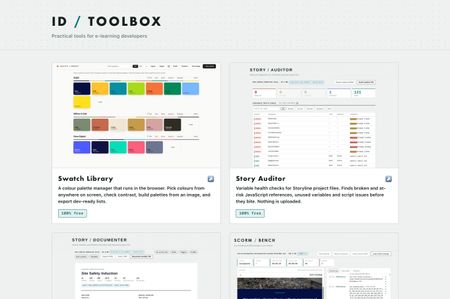
Practical tools for e-learning developers… Over the past several months I've built a set of browser tools for the bits of Storyline and Rise that used to cost me hours. Eleven of them, all completely free, no signup, no accounts, nothing to install. They run entirely in your browser. Nothing is uploaded anywhere, which for me was the whole point, I wasn't keen on posting client content to a website just to check something… ID Toolbox238Views10likes3CommentsThe Red Pen
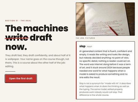
AI drafts fast, confidently, and about half of it is wallpaper. This course teaches you to edit it, spot the six tells, fix them without swapping one kind of slop for another, and check the numbers a model will invent with a straight face. The Red Pen | Rise Tools used: Canva, Gemini and Rise Canvas33Views1like0CommentsWhat tools do you use?
What are your go to tools you use everyday and wouldn't be without in your authoring process? Here's mine. There's one thing they all have in common, and for me it's the important bit, nothing gets uploaded. They're plain HTML and JavaScript running in your browser. When you drop a .story file, an image or a SCORM zip on one of these, it gets read in memory on your own machine and that's the end of it. No server, no account, no sign up. Most of what I work on is client material and I'd rather not be posting it to a third party site. I suspect I'm not alone in that. They're all completely free, no trial, no limits, no nonsense! Story Auditor Variable health checks Storyline project files. Finds broken and at risk JavaScript references, unused variables and script issues before you ship. Story Documenter A complete written specification from a .story file. Every slide, every trigger in plain English, every quiz answer etc, ready to print or share with clients. Great for creating storyboards. Image Press Resize, compress and convert images in the browser. E-learning size presets, a target file size, batch zip download, and image metadata stripped on output. Great free tool for managing images for projects. SCORM Bench Run a SCORM package against a logging LMS runtime, without uploading it. Every API call visible, live data model, the manifest checked. Works with SCORM 1.2 and 2004. And a quick question; what's the thing in your workflow that still doesn't have a tool? These only existed because I moaned about something enough and then got annoyed enough to fix it!149Views2likes1CommentSwatch Library
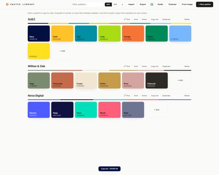
A recent post by randykepple inspired me to share this. Randy's solution is also great so check that out! With Swatch Library you can create a palette per brand or project, and every swatch is one click to copy, in hex or RGB. Nothing to install, no sign-up, and nothing stored on a server. Your colours save automatically in your own browser. Type or paste a code, bulk-paste a whole list at once or, in Chrome/Edge, use the eyedropper to pick colours from anywhere on your screen, a client's website, a brand PDF, a Storyline slide. You can drop a logo or brand asset onto the tool and it will pull the dominant colours out and build a palette from them. Everything happens in the browser, nothing is uploaded anywhere. You untick any strays, name it, and it is done. I find this the quickest way to get a client palette in. Beyond that there is a WCAG 2.2 contrast checker built in, set a foreground and background colour, get the ratio, and see pass/fail for AA and AAA body text, large text and non-text elements like icons and focus indicators. That is useful enough on its own, but the thing I am most pleased with is the contrast grid. Each palette has a Grid button that opens a matrix of every colour pair in that palette, painted with the actual pair so you can see at a glance which combinations work for text and which do not. One click on any cell opens the full checker for that pair. If you have ever wondered whether your brand colours are actually safe to use together, this answers it quickly. There is also a colour vision preview. A Vision button on each palette shows it as it appears to people with protanopia, deuteranopia and tritanopia, plus a greyscale row for print. It automatically flags any pairs that become hard to tell apart, named with their perceptual distance score. Each swatch has a tints and shades button that opens a nine-step ramp from light to dark, and you can click any step to copy it or add it to the palette. Useful for hover states and backgrounds. You can drag swatches to reorder or move them between palettes, filter palettes once your library grows, and use Export/Import to back everything up or share a brand palette file with your team so everyone's working from the same set. There's a built-in guide for the full tour. It can be used directly in the linked Rise course, or used online via the link. All free, no downloads, no signup, no nonsense! Swatch Library - Rise Swatch Library Online191Views4likes9CommentsA Way to Organize Color Swatches
I'm a big fan of organization and efficiency when it comes to production eLearning development. One of the biggest challenges is keeping track of hexadecimal colors that I use on a daily basis. I used to use Adobe Kuler, which was a fantastic way to explore color combinations and a swatch panel that I used to organize all the colors I used for various projects. Well, they've recently changed to Adobe Color and have basically ruined what wasn't broken and now its requires Adobe Express in order to edit and save color palettes, so I started researching other options. Frustratingly, nearly all the options I found required a subscription. What I ended up doing is create an html document that I keep on my desktop and it's been absolutely wonderful and I wanted to share with this community as I have received so much help and assistance from this amazing, creative community of professionals. Open and edit the html document with Text Edit, or Notepad and you'll see the section where you can add your own color swatches, or update what's there. You can name them whatever you want and add in the hexadecimal color code. When you open the document in a web browser, you simply click on the color you want to use and it copies the hexadecimal code to your clipboard. My next push will be to create another one that is all pastel color combinations. This has ended up being one of my favorite new resources and best of all it's free and super easy to customize. Enjoy and continued success!Solved148Views2likes5CommentsNewbie starting eLearning series; Templates
I am leading an effort to do the following: Create a style guide for eLearning design and development for training on and salesforce and subsequent implementation. (done) Create three types of eLearning templates in Storyline to create: demo try it test it Getting started is the hardest! I have a semi-template design idea and we have our guidelines, but are there best practices to creating standard templates that will be replicated for the many 'steps/processes' our learners will need to learn, do and test out. We will have end-users who will use these eLearnings as pre-work. They have to test out to move onto the next eLearning and then the in-person training. Thank you for helping get us started!65Views1like1Comment