project management
65 TopicsCommunity Insights: Preparing and Planning your visual design for Articulate Rise
The beauty of Articulate Rise is that when it comes to development, you don’t always have to plan everything. You can jump into the blank canvas, easily add and delete blocks, play with interactions and figure out what works as you go. The ease in which you can chop and change things is often what draws people to rapid authoring tools. Being able to bring your ideas to life in the click of a button, without any complex programming or coding. Whilst this method of ‘figuring things out’ as you go can often work well for building out ideas, when it comes to visual design, sometimes a little bit of planning can go a long way! The blank canvas that Rise brings can offer scope to be as creative as you wish with the visual identity of your course, but naturally this can also feel just a tad overwhelming. This sometimes then leads to two outcomes. We have those who love the freedom of a blank canvas but try to shoehorn in too many styles at once. Or those who just don’t know where to start, so play it safe and end up with a boring, blocky, black and white build. The good news is with proper planning you can avoid both those eventualities and craft a beautiful, accessible build without needing to be a graphic designer! Consistency is key So, what is the point in planning your visual design before jumping into development? Well, it’s not about creating something overly complex, or spending hours crafting a character that you’ll only use once in the course. No. It’s about ensuring consistency. Consistency plays a big role in how our learners are going to perceive the eLearning. Good design will go unnoticed, but bad design sticks out like a sore thumb! Even something as simple as having different icon styles or suddenly switching from using photography to illustrations, can be jarring to a learner. This results in the focus being drawn away from the content and can actually have a negative impact on a learner’s perception of the quality of the content too. Think about it, have you ever visited a website and been immediately put off because of the way it looks? Did you buy the product or access that service? Probably not. Quality of design and consistency of design can have a significant impact on perceived quality and cognitive load. We want our design choices to enhance and support the user experience, not detract from it. Making design decisions before jumping into your authoring tool can help support consistency and leave you with a Rise build that feels polished and professional! So how do you start planning and what do you need to include or consider? Let’s take a look! Create a blank moodboard space. This can be in whichever tool you prefer using. I like PowerPoint or Miro as I can quickly copy and paste things into the slide space. The key thing is that you can access this moodboard easily and have enough page or slide space to jot down your ideas. This will become a bit of working document that you can add to during the initial scoping of your project. Add in any existing brand assets. If you’re working within an organization or with a client, it is likely they will already have some brand guidelines for you to work with. This could include font choices, colour schemes and even suggestions for photography styles. Often these come in very large PDF documents, so take half an hour to read through and pull out any information that could be useful for you. Within your mood board add a title for ‘fonts’ and make a note of the chosen font for both your body text and headers. Sometimes I even add a little paragraph of dummy text so I can see how the font will look. At this stage you can also decide on font sizing too and make a note of this. Next, begin to pull together your colour scheme from the brand guidelines. I like to create a few rectangles within my moodboard and fill them with my chosen colours. Next to each swatch I add the HEX or RGB code so that I can easily copy this over when I get to development. It’s also a good idea to label your colour swatches with their intended use, for example header text, body text and accent colours (colours used for icons, graphs etc.). Sometimes brand guidelines will contain multiple different colour palettes for different uses. This is where it may be worth a chat with your Stakeholders to ask them to decide on just four or five colours. Too many can become overly busy and distracting! Check for accessibility Now that you have fonts and a colour scheme decided, it’s important to check for accessibility. I like to have at least two accessible colour pairings within my colour palette. This means that the contrast between the two colours is great enough to pass accessibility standards. There are lots of helpful websites out there that can allow you to check the contrast of two colours and will let you know if it passes accessibility standards. On your moodboard create a separate section that says ‘accessible colour pairings’ and include swatches of the pairings that can be used. This is particularly important for text and background colour pairings. It’s important to consider the accessibility of fonts too. It can be tempting to go for an elaborate or decorative curly font. As a header with font size 44pt, this may be absolutely fine. But as 16pt body text, could be completely unreadable. Standard fonts such as Poppins, Arial and Open Sans tend to work really well for body text and offer bold / black alternatives for headings too. Decide on an illustration, photo and icon style It may seem pedantic, but sudden changes in icon style can be really noticeable. So next up on your moodboard add the title ‘icons’ and provide a couple of icon examples in a consistent style. Sites like Flaticon are fantastic for sourcing icons of a particular look and feel. Consider whether you want icons coloured or just an outline and how detailed you wish them to be. Play around with a few different styles until you find something that you like. I sometimes find it useful to visit my client’s website and get inspiration from the icons used there. Once you have decided on a style and the colours in which your icons should be, add your examples to your moodboard. If you want to go one step further, why not create a folder in your documents called ‘icons’ and quickly gather a bank of icons that you feel you’re likely to use in your course. When you start the development, you can just grab and go! Make sure you don’t forget to jot down where you sourced your icons from too. This will make it much quicker to find others in the same style at a later date. When it comes to photography and illustrations, the likelihood is your client / Stakeholders may already have guidance on what is appropriate to use. Whether you go down the route of characters, or stock imagery, it’s important to keep this consistent throughout. Head over to a royalty free site and search for a range of images based on the content or subject matter of your eLearning. In the case of photography, search for consistencies in backgrounds, shot type (close up versus wide screen), colours and poses. As a rule of thumb, I tend to avoid overly staged imagery where the person is staring directly into the camera. More subtle stagings where people appear to be interacting more naturally with each other can feel a bit more pleasant and less uncanny valley! Look for diversity in your images too, try to ensure a range of ethnicities, races and genders. Once again, add the title ‘imagery’ to your moodboard and provide a handful of examples you can refer back to later. When using characters or illustrations it can be slightly more tricky to ensure consistency in the style. However, royalty free sites such as Storyset allow you to search through a bank of illustrations all created in the same look and feel. You can even recolour them on the website without needing any graphic design software too! Gather inspiration for layouts and interactivity Did you know website designs can offer a great source of inspiration for Rise? Due to the continuous, one-page, nature of Rise it functions in a similar way to a website. Whilst you may not be able to replicate the functionality or interactivity of a website, you can translate some of the design choices! Head over to Google or Pinterest and type in ‘UI website design inspiration’. Here you will be able to find flatlay images of websites. Consider how the text is segmented, how colour and shape is used, and how images are presented. It can help spark ideas for dividers, background styles and more! Gather your reference images and drop them into your moodboard with the title 'layout inspiration'. Check everything fits together Great, you’ve finished gathering the pieces for your visual design puzzle. But now the most important step, looking at everything together and making sure it fits nicely. So, what do I mean by this? Essentially it means looking at everything as a whole and considering if it is conveying the message you want. For example, moodboard containing a colour palette with sunshine yellow and bright orange and photography of people smiling, may be a rogue choice for a fraud eLearning. This can also include looking for any contradictory elements to your moodboard too, for example a bubbly, rounded font but imagery that is serious and corporate. 🌟 All elements need to feel cohesive and intentional. Consider if you can explain the decision making behind your choices, if you’re finding you can’t really express why you’ve chosen a particular font, or colour, or image style, it’s probably not the right fit! And you’re done! You have your completed moodboard now ready to present to your client, share with colleagues, or to use as your reference to begin developing your Rise build. Remember, this doesn’t need to be a polished document, it should support you in maintaining consistency throughout your build and provide a point of inspiration to help you create Rise courses that break free from being boring and blocky. Once finished, why not share an example of a moodboard you’ve created? Share the tool you used and where you sourced any assets. 💡 Keep Learning Explore more member spotlight articles to discover how other learning designers are building their skills—and shaping the future of learning. Community Insights: Peer Guide Spotlight | E-Learning Heroes Community Insights: How Support Takes You Far | E-Learning Heroes720Views10likes5CommentsMake Working with SMEs a Breeze with These 3 Downloads
One of my favorite things about being an e-learning designer is creating courses on a wide variety of topics. I’ve learned so much over the years! When I look back on it, it’s almost like I had to become an expert in every subject in order to create the most effective learning experience. And while some of my knowledge came from my own research, more often than not it was gleaned from the content provided by my project’s Subject Matter Experts (SMEs). Subject Matter Experts play a critical role in course design. They have the knowledge, experience, and insight to help you create the most impactful training. Despite their importance to your projects, working with SMEs can also be challenging. From different perspectives around how content should be presented to old-fashioned beliefs around how people learn, many e-learning pros find themselves in a battle of wills with their SMEs when all they really want is a productive partnership. This problem can be especially vexing when creating custom e-learning in a powerful app like Storyline 360. With so many creative possibilities, there are countless ways to present content. So how do you help your SMEs visualize different treatments and bridge gaps in understanding, all while building positive relationships with your SMEs? Here are three documents I’ve found essential for communicating clearly and aligning expectations from the start. Document 1: Project Kickoff Questions Before meeting with your project’s SMEs, it pays to do a little prep work. If you already have some source content pulled together, study it to get a basic understanding of the material. And if you don’t have content, research the topic or the company to make the most of your time with your SMEs. As you study, prepare a list of questions to help guide the conversation and show the SME how much you value their time. Need to kick-start your thinking? Download and customize this Project Kickoff Questionnaire for your needs. Download With all of your prep work done, you’re ready to set up a meeting with your SME to discuss the project. Make sure to bring your list of questions, and then listen actively and take notes. This is your time to build trust with your SMEs and identify knowledge and performance gaps to determine the right solution. Document 2: Project Plan After you determine the right solution, it’s time to put the details in writing so you’re all on the same page. A project plan can be a great way to align expectations. In the project plan, you can include the project background, course information, deliverables, timelines, and any other important details. Once you’re done preparing the project plan, have the SME review it and confirm its accuracy before moving forward with design. Need help creating a project plan? I’ve got you covered! Download this free project plan template. Download Document 3: Storyboard Now that you and the SME are on the same page, it’s time to start designing the project. If you’re using a slide-based authoring app like Storyline 360, the best way to make sure you have a solid foundation for development is to create a storyboard. A storyboard is the blueprint for a course that outlines the content screen by screen. Storyboards help your SMEs visualize how the content will flow and allows them to make edits before you start development in your authoring app. Note: If you’re using a web-based authoring app like Rise 360, you can skip the storyboarding phase and go straight to development since it’s easy to use and quick to make changes. Need help getting started? Then download and customize this storyboard template with your content. Download What Next? After the storyboard is finalized, you can feel confident knowing you have a solid foundation to start building your course. Taking the time to develop project kickoff questions, create a clear project plan, and storyboard the content before you start developing it in your authoring app will set you, the SME, and the learners up for success. For more ideas on working with SMEs, check out this series on Everything You Need to Know About Working with SMEs. Follow us on Twitter and come back to E-Learning Heroes regularly for more helpful advice on everything related to e-learning. If you have any questions, please share them in the comments.6.9KViews4likes2Comments9 Steps to Better E-Learning Project Management
For e-learning creators, the success of any e-learning project often hinges on how it’s planned and managed. You can have a fantastic idea, design it to perfection, and even line up awesome tools to build your course. But without a solid project management plan, you might find yourself facing some frustrating—and unnecessary—challenges. This e-book walks you through the steps you need to manage your e-learning course projects effectively, from start to finish. You’ll find effective tips, resources, and strategies to help you create and deliver an e-learning course that meets everyone’s expectations. This nine-step guide will show you how to: Get the right people on board Set goals and expectations with your team—and execute on them Find the best solution to meet your project goals Create success metrics and a service level agreement Develop a project plan that shows who’s doing what and by when Avoid common pitfalls that can derail a project Build a foolproof rollout and implementation plan Measure your course’s success3.2KViews2likes0CommentsE-Learning Project Plan
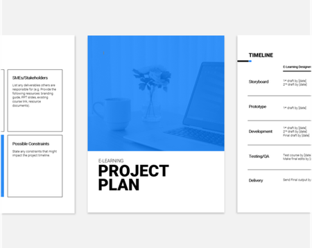
Set clear expectations from the start with this E-Learning Project Plan. Download and customize this Microsoft Word document to help you and your Subject Matter Experts get on the same page. If you found this document helpful, then check out: Make Working With SMEs a Breeze with These 3 Downloads5.6KViews2likes14CommentsBasic Project Management Plan in Word
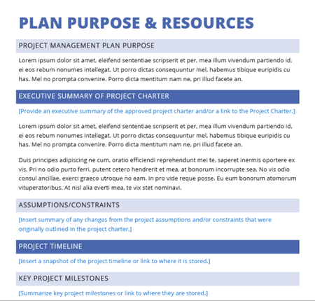
Project management plans come in many shapes and sizes, but this simple one I pulled together in MS Word serves as a sign-off/approval mechanism for your project, as well as a handy way to gather all related project planning documents, such as the project charter, the project timeline, and the accountability matrix. Enjoy!2.2KViews2likes7CommentsAn Introduction to SAM for Instructional Designers
The ADDIE model is probably the most well-known approach for mapping out the course design process. But it isn’t the only game in town these days. One popular alternative is SAM: the Successive Approximation Model. Created by Allen Interactions, SAM offers an instructional design approach consisting of a few steps that you repeat as many times as necessary. These iterations address common instructional design pain points like meeting timelines, staying on budget, and collaborating with Subject Matter Experts (SMEs). So what is SAM? And how is it different from ADDIE? Is one better than the other? Let’s dig in and uncover some answers to these questions. What’s the difference between ADDIE and SAM? ADDIE and SAM are two different approaches for crafting learning solutions that share some similar language. To better see where they differ, it’s helpful to understand how each of them works. Let’s start with ADDIE. ADDIE ADDIE stands for Analyze, Design, Develop, Implement, and Evaluate. It’s a linear approach—like a production line—with each step depending on the successful completion of the previous one. To borrow some terminology from project managers, ADDIE is a “waterfall approach.” And in a traditional waterfall method, analysis, design, development, implementation, and evaluation are all treated as ordered steps in the overall development process. While this model is preferred in many organizations, some folks say this sequential approach contributes to many of the challenges faced by instructional designers, including: Prolonged development cycles: Have you ever had your project come to a screeching halt in the development phase? It’s not uncommon for new training or technology requirements to emerge in the project development phase, bogging down your productivity with re-work. Communication challenges with SMEs and stakeholders: Even the most thorough explanations and storyboards are still open to interpretation. And with a sequential approach, SMEs and stakeholders typically don’t get to try a hands-on version of the project until well into the development phase. This can mean it’s not until you’re near the end of the project—when you’re out of time and money—that you discover your vision doesn’t match theirs. No time for testing: When projects run out of time or money, what’s the phase of the process we tend to skimp on? In my experience, it’s testing. Shortchanging this step may save you time, but with risky downsides like a training product that doesn’t work—or work effectively—to address a critical performance gap. Successive Approximation Model (SAM) SAM, on the other hand, is considered to be an “agile approach” that can be scaled from basic (SAM1) to extended (SAM2) to suit your needs. Both SAM models use iterative cycles to create the end product right from the start—all while continually analyzing and refining your work as it’s being produced. Proponents of using agile methods for creating e-learning claim that models like SAM can alleviate many of the challenges discussed above—in particular, improving the project team’s visibility into the instructional design process and reducing development time frames. The basic process—SAM1—can be a good fit for smaller projects or teams. This flavor of SAM is a simple model with three iterations of the familiar instructional design steps of evaluation, design, and development. Using this approach, everyone’s ideas and assumptions can be discussed, prototyped, and tested early on, bringing you closer to a usable product more quickly. And what if your project is more complex? That’s where SAM2 comes into play. SAM2 is an extended take on SAM1. It consists of eight iterative instructional design steps spread across three project phases: Preparation, Iterative Design, and Iterative Development. In addition to the incremental cycles, another notable feature of the SAM2 model is the preparation phase. It consists of two steps to help you prepare for your design and development work fast: gathering information and then holding a brainstorming and prototyping meeting known as a “Savvy Start.” Which is better—ADDIE or SAM? When it comes to evaluating which design model is a better fit for you and your team, it really boils down to what you’re trying to achieve and what your work environment will support. When applied in the right situations and fully committed to by everyone involved, SAM’s flexibility can get you to a successful final course fast. Its iterative approach both helps you use prototypes to get stakeholder buy-in quickly and also makes it easy to pivot should your course requirements change. However, many instructional designers work in organizations that have embraced agility in theory but not so much in practice. Applying an agile approach like SAM can be difficult when your environment doesn’t encourage rapid feedback or flexible processes. In those cases, ADDIE’s waterfall model may be a better choice. Because ADDIE is a waterfall method that’s been used for years, it might make clients, stakeholders, and even team members more comfortable. And while it’s still not as flexible as SAM, many people find an adapted version of ADDIE that includes some iterative loops does a good job of splitting the difference between both methods. More Learning Whatever design model you follow—whether it’s ADDIE, SAM, or another one entirely—weighing your options for more thoughtful, responsive development practices can be a great way to build collaboration and grease the wheels for smoother training rollouts. Start by digging into these related articles from the archives. An Introduction to ADDIE for Instructional Designers What’s the PADDIE Model of Instructional Design? Best Practices for Effective E-Learning Project Management How to Manage E-Learning Project Scope Creep What design model is closest to how you really work? What are your thoughts on ADDIE vs. SAM? We love hearing from you, so share your thoughts in a comment. Follow us on Twitter and come back to E-Learning Heroes regularly for more helpful advice on everything related to e-learning.19KViews2likes19CommentsMade by Members: On-boarding New Team Members
This month we’re spotlighting submissions across several eLearning Challenges that, when combined together, make an onboarding experience. These examples show how a variety of techniques can create memorable and easily referenced guides to simplify the fire hose of information that accompanies onboarding. Mix and match these examples for your specific use case if you’d like to give it a try, and be sure to comment below with what inspired you! A Blueprint for Day One and Beyond by SMcNicol Designed as a leave behind for after an interview, this course shows not only what an interviewee could use as a pitch for their first months in a job, but a clean and organized method for general 30/60/90 day plans. 💡Inspiration to take: How to use what Shannon describes as an “AI assisted workflow” to tailor plans and content Layered descriptions of not only what a process looks like, but concrete tactics for success Who is behind the scenes? By Kate_Golomshtok A bright example of vector image use, this submission shows a quick and memorable way to introduce different team roles. This approach makes it easy to understand the division of responsibilities in complex teams or projects. 💡Inspiration to take: Vector images that clarify tool use and positions for projects that could be confusing at first glance An “insider” approach to content presentation that includes field specific lingo Data Security Training by BrilliantTeams Submitted as part of the accordion interaction challenge, this submission shows how to make compliance training into an easily referenceable tool. New team members can easily dig down into more detail, while keeping high level information such as common initialisms above the fold. 💡Inspiration to take: Compliance training is notoriously a slog, so use engaging interactions to break up detail heavy content Stack information with the rationale behind it to help contextualize the “why” of procedures Meet the Team by AsweniGD Just what it says on the tin, this team introduction is a new team members’ dream for understanding organizational flow, titles, and personalities. Between the color coded org chart and detail on responsibilities this would help new hires understand who to ask what, when. 💡Inspiration to take: The morph transition makes for a clean transition from contextualized visuals to greater detail information Embrace color coded visuals to leave more room for what Ash describes as “human centered” introductions 🏅 Want to Be Featured Next? We’re always looking to highlight inspiring examples from the community, and your work could be next! Here's what we look for in a standout submission: A downloadable .story file or link to your Rise course so others can explore, adapt, and learn from your build. A clear explanation of what you built, how it works, and what makes it unique. Behind-the-scenes insight into your process, techniques, tools, or challenges you tackled. Purposeful design, whether it’s solving a problem, teaching a concept, or experimenting with a new approach. Bonus: Share your ideas for how your design is widely applicable beyond the specific example. Got something cool to share? Post it in Share Examples, and you might see it featured in an upcoming roundup!671Views1like0Comments