rise 360
154 TopicsI Built an AI Role Play With No AI (and Claude Was a Very Good Sport About It) 🤖🚫
Last week at an ATD conference, I watched a demo where learners talked to an AI avatar client, asked questions, and got real feedback at the end. My first thought: I need this. My second thought: my budget cannot afford this. 💸 So I did what any reasonable designer would do. I opened Claude and asked it to help me build an AI simulation... without any AI. Asking an AI to fake being an AI is a little like asking a chef to make you a microwave dinner. I half expected some pushback. Instead it said “totally doable” and then flagged everything wrong with my mockup and outline. Haha. Rude. Also correct. 😅 Meet Jordan Blake Jordan is an Operations Manager whose routing errors have tripled, and she wants a 45 minute mandatory course for 300 people. By Friday. You know her. We’ve all met Jordan. 🙃 The learner’s job is to run a discovery conversation and figure out if training is really the answer. (Spoiler: an IT update in September might be involved. Shhh.) So how do you fake a smart conversation? A big table. Like, a really big table. Every topic Jordan knows about (the errors, what changed, who’s affected, the data) has a long list of trigger words. When the learner types, the code scores their message against every topic and picks the best match. It’s the same basic idea as Copilot pulling from resources, minus the part where it actually understands you. 😂 Then we layered on the stuff that makes it feel real: Follow ups. Say “tell me more” or “why?” and Jordan goes deeper on whatever you just asked. Two questions at once. “Who’s affected and when did it start?” gets both answers. Typos. “Has anythign chnaged?” still works. Bless. Personality. Small talk, thank yous, and yes, if you ask “Are you a bot?” she tells you she’s a very real manager with a very real deadline. The right panel does the coaching Jordan’s Mood shifts live, from Open to Defensive. Meeting Clock counts down every turn, so rambling costs you. Case Notes fill in as you uncover clues, so learners can see their discovery building. At the end, a scorecard rates Discovery, Root Cause, Relationship, and Recommendation, with specific coaching for each one. The honest part It’s not AI, and I tell learners that on the Tips page. Jordan responds to key words, and if she misses, the suggested questions keep things moving. I’d rather be upfront than have someone think the “AI” is broken. Trust matters, even with a fake client. 😄 Want to build your own? Start with the real performance problem, then work backward to the clues. Write triggers the way people actually talk, then test with someone who didn’t build it. Let the twists react to learner choices, not turn numbers. Built in a Rise 360 Code Block, uploaded as a zip, zero API keys required. 🎉 Give Jordan a try and tell me what you’d ask her first! Is Training Really the Answer?144Views0likes8CommentsMy New “Missed Questions Only” Quiz Format for Rise 360.
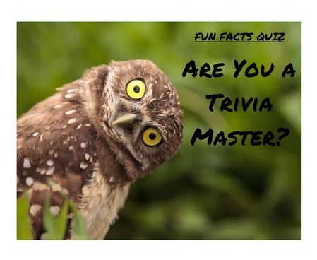
One quiz. Many chances. Zero wasted time Ever wished you could skip the boring parts of a quiz and just focus on what you got wrong? Well, now you can. I’ve created a “Missed Questions Only” quiz — a smarter, faster way to learn. Instead of starting from scratch, you get a second chance only at the questions you missed. No wasted time, no repeating what you already know — just targeted practice that helps you master the tricky stuff and hit that perfect score. It’s like a quiz with a built-in comeback round — your mistakes become your roadmap to success. Ready to turn wrong answers into wins? Give it a try and see how well you know your fun facts. 🔗 Rise Link: https://360.articulate.com/review/content/7126ec89-ff0c-4595-bac3-a0fe5e2c6a26/review 🖥️ Code Block: Copy the code below. 📄 Template: See an example of my template for organizing images, questions, answers, and each JS snippet. <div id="quiz-app"> <div class="quiz-card"> <div class="quiz-header"> <div> <div class="quiz-label">Fun Facts Quiz</div> <h2 id="quiz-title">Quiz</h2> </div> <div class="quiz-status"> <span id="round-badge">Round 1</span> <span id="progress-text">Question 1 of 1</span> </div> </div> <div id="scorebar" class="scorebar"> <div>Correct: <strong id="correct-count">0</strong></div> <div>Incorrect: <strong id="incorrect-count">0</strong></div> <div>Remaining in Round: <strong id="remaining-count">0</strong></div> </div> <div id="question-container"> <img id="question-image" src="" alt="Question Image" style="max-width:100%; border-radius:12px; margin-bottom:16px; display:none;" /> <div id="question-text" class="question-text"></div> <div id="answers" class="answers"></div> <div id="feedback" class="feedback"></div> </div> <div class="quiz-actions"> <button id="next-btn" disabled>Next</button> <button id="retry-btn" style="display:none;">Retry Missed Questions</button> <button id="restart-btn" style="display:none;">Restart Full Quiz</button> </div> </div> </div> <style> /* Same styling as before */ * { box-sizing: border-box; } body { margin: 0; font-family: Arial, Helvetica, sans-serif; background: #f4f7fb; color: #1f2937; } #quiz-app { max-width: 900px; margin: 0 auto; padding: 20px; } .quiz-card { background: #ffffff; border: 1px solid #dbe4f0; border-radius: 16px; padding: 24px; box-shadow: 0 8px 24px rgba(0,0,0,0.06); } .quiz-header { display: flex; justify-content: space-between; align-items: start; gap: 16px; margin-bottom: 18px; } .quiz-label { font-size: 12px; font-weight: 700; letter-spacing: .08em; text-transform: uppercase; color: #2563eb; margin-bottom: 6px; } .quiz-header h2 { margin: 0; font-size: 28px; } .quiz-status { display: flex; flex-direction: column; gap: 8px; align-items: flex-end; font-size: 14px; } .quiz-status span { background: #eef4ff; color: #1d4ed8; padding: 8px 12px; border-radius: 999px; font-weight: 600; } .scorebar { display: flex; flex-wrap: wrap; gap: 12px; margin-bottom: 22px; padding: 12px; background: #f8fafc; border: 1px solid #e5e7eb; border-radius: 12px; font-size: 14px; } #question-image { display: block; /* ensure image is shown */ max-width: 920px; /* maximum width */ max-height: 300px; /* maximum height */ width: 100%; /* scale to container width if smaller */ height: auto; /* maintain aspect ratio */ margin: 0 auto 16px auto; /* center horizontally with bottom margin */ object-fit: contain; /* scale image without cropping */ border-radius: 12px; /* consistent border radius */ background-color: #f3f4f6; /* subtle background color for empty space */ } .question-text { font-size: 22px; font-weight: 700; line-height: 1.35; margin-bottom: 20px; } .answers { display: grid; gap: 12px; } .answer-btn { width: 100%; text-align: left; border: 2px solid #d1d5db; background: #fff; color: #111827; border-radius: 12px; padding: 14px 16px; font-size: 16px; cursor: pointer; transition: .2s ease; } .answer-btn:hover:not(:disabled) { border-color: #93c5fd; background: #f8fbff; } .answer-btn:disabled { cursor: default; opacity: 1; } .answer-btn.correct { border-color: #16a34a; background: #ecfdf3; color: #166534; font-weight: 700; } .answer-btn.incorrect { border-color: #dc2626; background: #fef2f2; color: #991b1b; font-weight: 700; } .feedback { margin-top: 18px; min-height: 28px; font-size: 16px; font-weight: 600; } .feedback.correct { color: #15803d; } .feedback.incorrect { color: #b91c1c; } .quiz-actions { display: flex; gap: 12px; margin-top: 22px; flex-wrap: wrap; } .quiz-actions button { border: none; border-radius: 10px; padding: 12px 18px; font-size: 15px; font-weight: 700; cursor: pointer; } #next-btn { background: #2563eb; color: #fff; } #next-btn:disabled { background: #9ca3af; cursor: not-allowed; } #retry-btn { background: #f59e0b; color: #fff; } #restart-btn { background: #111827; color: #fff; } .final-message { padding: 18px; border-radius: 14px; background: #effaf3; border: 1px solid #86efac; color: #166534; font-size: 18px; line-height: 1.5; } .small-note { margin-top: 10px; font-size: 14px; color: #4b5563; } MeDia (max-width: 640px) { .quiz-header { flex-direction: column; align-items: flex-start; } .quiz-status { align-items: flex-start; } .question-text { font-size: 20px; } } </style> <script> // Questions with imageUrl placeholder (replace URLs with your uploaded Rise 360 images) const fullQuiz = [ { question: "Which animal can sleep standing up?", imageUrl: "https://images.articulate.com/f:jpg,a:retain,b:fff,w:1680,q:90/rise/courses/YLUYT4CI3ckYMonl07a4CHihYXT3CnUJ/z45b6W_xMLJUUJld.jpg", options: ["Horse", "Dog", "Penguin", "Kangaroo"], answer: "Horse" }, { question: "What is the only food that essentially never spoils?", imageUrl: "https://articulateusercontent.com/rise/courses/Kg8aAYIS9RJvSNl0YFM3mOw3o8OQbz5c/MddUJBQTsySlOvqv.jpg", options: ["Rice", "Honey", "Peanut butter", "Chocolate"], answer: "Honey" }, { question: "True or False: Bananas are berries, but strawberries technically aren’t.", imageUrl: "https://articulateusercontent.com/rise/courses/Kg8aAYIS9RJvSNl0YFM3mOw3o8OQbz5c/GSei0ep7BuNe7mfL.png", options: ["True", "False"], answer: "True" }, { question: "What is a group of flamingos called?", imageUrl: "https://articulateusercontent.com/rise/courses/Kg8aAYIS9RJvSNl0YFM3mOw3o8OQbz5c/9bCYyNGee1QQRUWC.jpg", options: ["A flock", "A flamboyance", "A parade", "A bouquet"], answer: "A flamboyance" }, { question: "Which country has more pyramids than any other country in the world?", imageUrl: "https://articulateusercontent.com/rise/courses/Kg8aAYIS9RJvSNl0YFM3mOw3o8OQbz5c/srrP1z5U7J1QaYow.jpeg", options: ["Egypt", "Mexico", "Sudan", "Peru"], answer: "Sudan" }, { question: "Which animal has fingerprints so similar to humans that they can be difficult to tell apart?", imageUrl: "https://articulateusercontent.com/rise/courses/Kg8aAYIS9RJvSNl0YFM3mOw3o8OQbz5c/z32I4pCG_PvYZDUD.jpg", options: ["Chimpanzee", "Koala", "Raccoon", "Sloth"], answer: "Koala" }, { question: "How many hearts does an octopus have?", imageUrl: "https://articulateusercontent.com/rise/courses/YLUYT4CI3ckYMonl07a4CHihYXT3CnUJ/1EOT8Ml6xu2_Lmvd.png", options: ["1", "2", "3", "8"], answer: "3" }, { question: "Which fruit floats in water because about 25% of its volume is air?", imageUrl: "https://articulateusercontent.com/rise/courses/Kg8aAYIS9RJvSNl0YFM3mOw3o8OQbz5c/kRIyy568MhLPiEFd.jpg", options: ["Apple", "Orange", "Grape", "Strawberry"], answer: "Apple" }, { question: "What is the national animal of Scotland?", imageUrl: "https://images.articulate.com/f:jpg,a:retain,b:fff,w:1680,q:90/rise/courses/YLUYT4CI3ckYMonl07a4CHihYXT3CnUJ/Tl89HrMYH0AyvzF2.jpg", options: ["Highland cow", "Golden eagle", "Unicorn", "Red deer"], answer: "Unicorn" }, { question: "True or False: A day on Venus is longer than a year on Venus.", imageUrl: "https://articulateusercontent.com/rise/courses/Kg8aAYIS9RJvSNl0YFM3mOw3o8OQbz5c/WBnprMTKTGmJCPre.jpg", options: ["True", "False"], answer: "True" }, { question: "What is a group of crows called?", imageUrl: "https://articulateusercontent.com/rise/courses/Kg8aAYIS9RJvSNl0YFM3mOw3o8OQbz5c/QhTq5yGSSxZC45ZF.jpg", options: ["A mystery", "A murder", "A mob", "A shadow"], answer: "A murder" }, { question: "What is a group of owls called?", imageUrl: "https://articulateusercontent.com/rise/courses/Kg8aAYIS9RJvSNl0YFM3mOw3o8OQbz5c/d_g79Dx03aWnVP2S.jpg", options: ["A parliament", "A council", "A jury", "A congress"], answer: "A parliament" }, { question: "What is a group of giraffes called?", imageUrl: "https://articulateusercontent.com/rise/courses/YLUYT4CI3ckYMonl07a4CHihYXT3CnUJ/-jRiKJcZZX1mWlfh.jpg", options: ["A tower", "A skyscraper", "A stretch", "A column"], answer: "A tower" }, { question: "What is a group of rhinos called?", imageUrl: "https://articulateusercontent.com/rise/courses/Kg8aAYIS9RJvSNl0YFM3mOw3o8OQbz5c/jilS2EvEMWFQCHLN.jpg", options: ["A crash", "A charge", "A stampede", "A rumble"], answer: "A crash" }, { question: "What is a group of porcupines called?", imageUrl: "https://articulateusercontent.com/rise/courses/Kg8aAYIS9RJvSNl0YFM3mOw3o8OQbz5c/WwtKh0xFKUgG07x1.jpg", options: ["A pricker", "A prickle", "A pincushion", "A spike"], answer: "A prickle" }, { question: "What is a group of zebras called?", imageUrl: "https://articulateusercontent.com/rise/courses/YLUYT4CI3ckYMonl07a4CHihYXT3CnUJ/G-vljexS-nyS4lg3.jpg", options: ["A dazzle", "A stripe", "A blur", "A flash"], answer: "A dazzle" }, { question: "What is a group of hippos called?", imageUrl: "https://articulateusercontent.com/rise/courses/Kg8aAYIS9RJvSNl0YFM3mOw3o8OQbz5c/M-1LbZ5VHqL28Ez4.jpg", options: ["A splash", "A bloat", "A barrel", "A wallow"], answer: "A bloat" }, { question: "What is a group of ferrets called?", imageUrl: "https://articulateusercontent.com/rise/courses/Kg8aAYIS9RJvSNl0YFM3mOw3o8OQbz5c/ob7XOK2dtuA2btB-.jpg", options: ["A mischief", "A trouble", "A business", "A chaos"], answer: "A business" }, { question: "What is a group of ravens called?", imageUrl: "https://articulateusercontent.com/rise/courses/YLUYT4CI3ckYMonl07a4CHihYXT3CnUJ/L6_Yxla0T9t97Qx8.jpg", options: ["An unkindness", "A darkness", "A conspiracy", "A haunting"], answer: "An unkindness" }, { question: "What is a group of bears called?", imageUrl: "https://articulateusercontent.com/rise/courses/Kg8aAYIS9RJvSNl0YFM3mOw3o8OQbz5c/5fA5geB-XbftAeB6.jpg", options: ["A grumble", "A sleuth", "A lumber", "A maul"], answer: "A sleuth" } ]; let currentQuiz = []; let currentIndex = 0; let selectedAnswer = null; let totalCorrect = 0; let totalIncorrect = 0; let roundNumber = 1; let missedQuestions = []; const questionContainer = document.getElementById("question-container"); const questionImage = document.getElementById("question-image"); const questionText = document.getElementById("question-text"); const answersEl = document.getElementById("answers"); const feedbackEl = document.getElementById("feedback"); const nextBtn = document.getElementById("next-btn"); const retryBtn = document.getElementById("retry-btn"); const restartBtn = document.getElementById("restart-btn"); const correctCountEl = document.getElementById("correct-count"); const incorrectCountEl = document.getElementById("incorrect-count"); const remainingCountEl = document.getElementById("remaining-count"); const progressTextEl = document.getElementById("progress-text"); const roundBadgeEl = document.getElementById("round-badge"); function shuffle(array) { const arr = [...array]; for (let i = arr.length - 1; i > 0; i--) { const j = Math.floor(Math.random() * (i + 1)); [arr[i], arr[j]] = [arr[j], arr[i]]; } return arr; } function prepareQuiz(questions) { return shuffle(questions).map(q => ({ ...q, options: shuffle(q.options) })); } function initQuiz() { currentQuiz = prepareQuiz(fullQuiz); currentIndex = 0; selectedAnswer = null; totalCorrect = 0; totalIncorrect = 0; roundNumber = 1; missedQuestions = []; retryBtn.style.display = "none"; restartBtn.style.display = "none"; nextBtn.style.display = "inline-block"; questionContainer.style.display = "block"; renderQuestion(); updateScore(); } function startRetryRound() { currentQuiz = prepareQuiz(missedQuestions); currentIndex = 0; selectedAnswer = null; missedQuestions = []; roundNumber++; retryBtn.style.display = "none"; restartBtn.style.display = "none"; nextBtn.style.display = "inline-block"; questionContainer.style.display = "block"; renderQuestion(); updateScore(); } function renderQuestion() { const q = currentQuiz[currentIndex]; // Show or hide image depending on if imageUrl is set if (q.imageUrl) { questionImage.src = q.imageUrl; questionImage.style.display = "block"; } else { questionImage.style.display = "none"; } feedbackEl.textContent = ""; feedbackEl.className = "feedback"; nextBtn.disabled = true; selectedAnswer = null; roundBadgeEl.textContent = `Round ${roundNumber}`; progressTextEl.textContent = `Question ${currentIndex + 1} of ${currentQuiz.length}`; remainingCountEl.textContent = currentQuiz.length - currentIndex; questionText.textContent = q.question; answersEl.innerHTML = ""; q.options.forEach(option => { const btn = document.createElement("button"); btn.className = "answer-btn"; btn.type = "button"; btn.textContent = option; btn.addEventListener("click", () => handleAnswer(btn, option, q.answer)); answersEl.appendChild(btn); }); } function handleAnswer(button, chosen, correct) { if (selectedAnswer !== null) return; selectedAnswer = chosen; const buttons = document.querySelectorAll(".answer-btn"); buttons.forEach(btn => btn.disabled = true); if (chosen === correct) { button.classList.add("correct"); feedbackEl.textContent = "Correct!"; feedbackEl.className = "feedback correct"; totalCorrect++; } else { button.classList.add("incorrect"); feedbackEl.textContent = "Incorrect."; feedbackEl.className = "feedback incorrect"; totalIncorrect++; missedQuestions.push(currentQuiz[currentIndex]); } updateScore(); nextBtn.disabled = false; } function updateScore() { correctCountEl.textContent = totalCorrect; incorrectCountEl.textContent = totalIncorrect; remainingCountEl.textContent = currentQuiz.length > 0 ? Math.max(currentQuiz.length - currentIndex - (selectedAnswer ? 1 : 0), 0) : 0; } function goNext() { currentIndex++; if (currentIndex < currentQuiz.length) { renderQuestion(); updateScore(); } else { showRoundResults(); } } function showRoundResults() { questionText.textContent = ""; answersEl.innerHTML = ""; feedbackEl.textContent = ""; questionImage.style.display = "none"; nextBtn.style.display = "none"; if (missedQuestions.length > 0) { questionText.innerHTML = ` <div class="final-message" style="background:#fff7ed;border-color:#fdba74;color:#9a3412;"> <strong>Round ${roundNumber} complete.</strong><br> You have <strong>${missedQuestions.length}</strong> question(s) to retry. <div class="small-note">Click the button below to retake only the questions you missed.</div> </div> `; retryBtn.style.display = "inline-block"; restartBtn.style.display = "inline-block"; remainingCountEl.textContent = missedQuestions.length; } else { questionText.innerHTML = ` <div class="final-message"> <strong>Congratulations!</strong><br> You have answered all questions correctly. <div class="small-note"> Final score: ${totalCorrect} correct, ${totalIncorrect} incorrect attempts. </div> </div> `; retryBtn.style.display = "none"; restartBtn.style.display = "inline-block"; remainingCountEl.textContent = 0; } } nextBtn.addEventListener("click", goNext); retryBtn.addEventListener("click", startRetryRound); restartBtn.addEventListener("click", initQuiz); initQuiz(); </script>286Views5likes5Comments3D Timeline: A Timeline Learners Travel Through
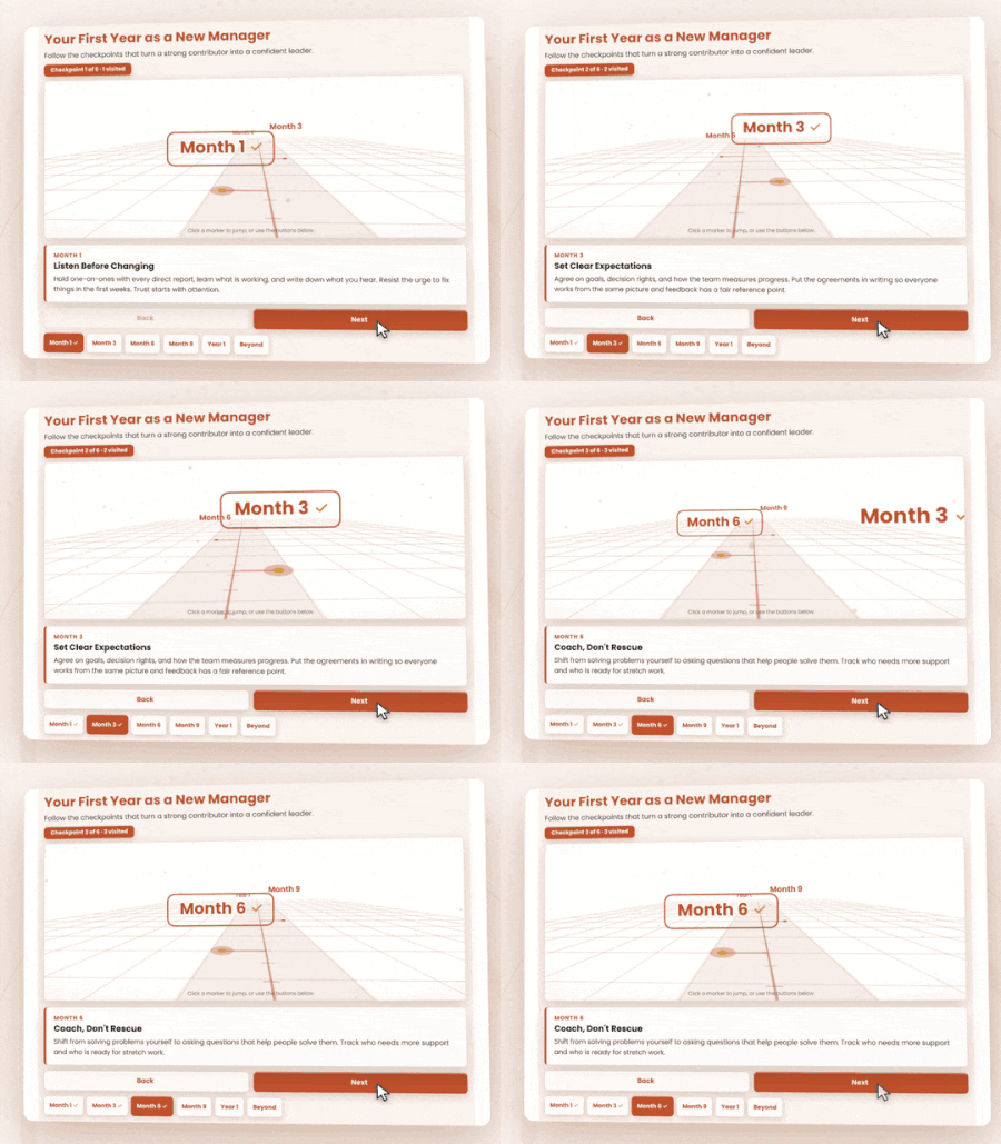
You have six milestones and a deadline. The SME sends a slide with a line, six dots, and a paragraph under each one. Learners skim it and click Next. I wanted to try something different. The 3D Timeline turns each milestone into a stop on a path. Learners move forward one checkpoint at a time, and the details for each stop appear as they arrive. Why This Works for Learning When sequence matters, how we present information makes a difference. Rather than displaying every event at once, this interaction uses segmentation and progressive disclosure to help learners process information one milestone at a time. The 3D path also provides a visual representation of sequence and progression, making it easier to follow how events unfold. At Bloom's Understand level, learners can identify milestones, explain their significance, and recognize chronological relationships. Pairing the timeline with questions about what changed between milestones can encourage deeper analysis. How to Use It in Articulate I built this using my 3D Timeline generator at eLearningDesign.org. It includes Quick Build, which lets you generate milestone content using your preferred AI tool, then paste everything back into the generator at once. Colors, content, and styling are customizable. The completed interaction exports as HTML. Rise 360: Add a Code block and insert the generated HTML, or upload a compatible HTML project ZIP. Storyline 360: Insert the exported HTML as a Web Object. Other platforms: Use the HTML export with authoring tools or learning platforms that support custom HTML. No need to rebuild the interaction with individual layers, triggers, or animations. Explore the Example https://e-learning-tools.vercel.app/3dtimeline.html How It Was Created The interaction was created using the 3D Timeline tool at eLearningDesign.org. https://www.elearningdesign.org/new-generators/3d-timeline158Views5likes5Comments48-Hour Alexandria Weekend Planner – My First LXD Project
Hi everyone! I’m a teacher currently transitioning into LXD, and I recently finished my first larger e-learning project. I created a 48-hour weekend planner for Old Town Alexandria. The idea was to let users explore hotels, restaurants, and attractions while building a realistic weekend itinerary and staying within a budget. I built most of the experience in Rise 360 and also experimented with custom-coded interactions and video editing. This was my first time putting all of these pieces together into one complete project, so I’d really appreciate any feedback on the user experience, interaction design, and overall flow. Here’s the project: https://millie1017.github.io/my-project/ Thanks for taking a look!66Views1like2CommentsI Vibe Coded a Course About Vibe Coding 🤖✨
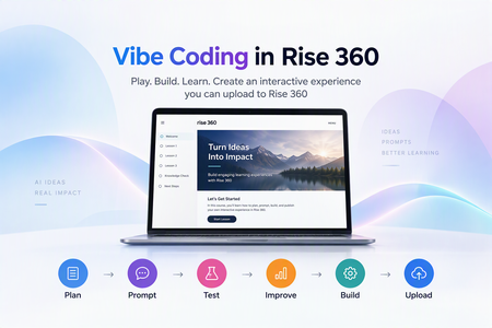
Every week someone in this community asks some version of “Do I need to learn JavaScript to use the Code block?” My answer is no. You need a clear learning goal, a good AI partner, and a willingness to hit Preview about forty times. So I built a short course to show exactly how that works. What is vibe coding, anyway? 🎧 Vibe coding means describing the experience you want, letting AI write the code, and then testing and refining until it works. You stay the designer and AI does the typing. For Rise 360, that means you can build custom practice activities, branching choices, and games that native blocks can’t do (yet). What’s inside 📚 It’s seven short screens, all living in a single Code block: 🔹 A quick practice question so learners feel a custom interaction right away 🔹 When to use Add code and when to use Upload project 🔹 Five flip cards on the things that trip people up 🔹 A prompt builder: pick a topic, an audience, and a behavior, and it writes a full AI prompt for you 🔹 A revision prompt builder that makes you describe what you actually saw (no “it looks weird, fix it” allowed 😄) 🔹 A test checklist, plus quick fixes for the most common Code block headaches Try it 👉 Vibe Coding in Rise 360 And if you want to see where vibe coding can go once you get comfortable, play my Halloween game, Ghosts & Gourds the Haunted Hunt 👻🎃 Your turn 💬 Have you tried vibe coding in Rise yet? What’s the weirdest bug AI has handed you? Drop it below. I promise mine are worse. 🤣197Views2likes1CommentCoded Interactions
I've recently been experimenting with coded interactions in Rise 360 to see how far I can push the interactivity beyond the standard blocks. I've been using GPT to help produce and refine the code, then tweaking and personalising the interactions to meet specific brand guidelines and learning requirements. I'm really happy with the results so far, and it's opened up a lot of possibilities for creating more bespoke learning experiences directly within Rise. There are some limitations I've noticed during testing, particularly around incorporating audio effectively within the interactions and ensuring they remain fully responsive across different screen sizes and mobile devices. I'd be interested to hear from other eLearning developers who are experimenting with coded interactions: What limitations have you come across? How have you approached responsiveness and accessibility? Do you see coded interactions becoming a bigger part of how we build bespoke experiences in Rise? Here's an example I've been working on: https://360.articulate.com/review/content/42e03dcc-6233-4bf0-908e-64d5543c0c7c/review691Views5likes8CommentsSelf Assessment Builder
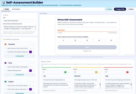
I've built a free self assessment builder tool you can use right inside Rise. You can use this to build your custom self assessments to use in your Rise courses. After completing the assessment users can view, save or print their results. I'll be adding this to my Rise Canvas tool in the next update. Any feedback to add features or improve is welcomed. Self Assessment Builder Tools used: Canva, Gemini and Rise Canvas561Views4likes2CommentsStop Paying for AI Twice: The Chatbot Workaround Your Learners Already Have
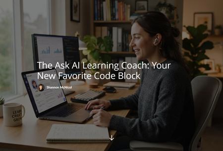
Here's something nobody tells you when you start building AI into your courses: every time a learner uses it, it costs you (or your company) real money. Credits, tokens, API calls, whatever you want to call it, it all adds up. And the more your course gets used, the more it costs. That's a weird incentive for something we're supposed to want learners using more, not less. 💸 So I started asking a different question. What if I didn't build the AI into the course at all? What if I just pointed learners toward the AI they already have? The Realization My learners already have access to ChatGPT, Copilot, or our own internal AI tool. They use these tools every day at work. So instead of wiring up a custom chatbot that racks up a bill with every click, I built something much simpler: a page that hands learners five ready to copy prompts and tells them to paste them into whatever AI assistant they already use. No API key. No per-use cost. No new tool to learn. Just prompts that work with what's already sitting in their browser. Meet the Ask AI Learning Coach It's a Code Block I drop into a lesson (or the end of a course) that gives learners five prompts: Summarize the lesson Explain it simply Give me a real world example Build a study guide Quiz me They copy the one they want, paste it into whichever AI assistant they already use, and get a personalized response on the spot. The trick that makes this actually work: I also give them a PDF of the lesson content to upload first. Without it, the AI is just guessing at what "this lesson" even means. With it, the response is grounded in what you actually taught. That one small step is the difference between a gimmick and something genuinely useful. The Part I Didn't Expect I built this to save money. What I didn't expect is that it also teaches something. Every time a learner uses one of these prompts, they're practicing a real skill: how to hand an AI assistant some context and ask for exactly what they need. That's not a throwaway skill. That's the same skill they need for literally everything else AI touches at work right now. So this one little Code Block ends up doing two jobs at once. It saves the training budget, and it quietly builds AI literacy on the side. I didn't plan for both of those to happen from the same idea, but I'll take it. 🙌 Built to Reuse, Not Rebuild The whole thing is zero code to drop in and reuse. Swap in a new lesson PDF, keep the same HTML file, and it works in a Rise 360 Code Block or a Storyline 360 Web Object. Same five minutes of setup, every single course. One Gotcha Worth Knowing If you build this in Rise, here's one that got me. Rise 360's Code Block runs in a locked down sandbox that blocks file downloads triggered from inside it, even a PDF sitting in the same zip. It worked fine in Storyline's Web Object, just not in Rise, and it took a little digging to figure out why. The fix ended up being simple. Instead of bundling the lesson PDF inside the Code Block, I drop it right below as its own Attachment Block (Rise has one built in, under Multimedia). Learners still grab the file, it just lives next to the block instead of inside it. Small change, but the kind of thing you only find out by testing both platforms yourself. Consider this your shortcut. 😄 I built this one with Claude, from the first draft of the page through working out the PDF grounding trick, the responsive layout, and the little details like equal size cards and a custom video wrapper for the intro. I turned the whole thing into a microlearning course, so everything you need is in one place: the HTML file, a course/lesson template, and step by step instructions. Check it out! 😉 The Ask AI Learning Coach: Your New Favorite Code Block What's your workaround for AI costs in your courses? I'd love to hear what other are doing.305Views2likes2CommentsI Built a Japanese Course So I Can Find a Bathroom in Osaka
My son moved to Japan. We visit in March, and I did not want to be the woman standing in a train station pointing at things and hoping. So I did what we all do with a personal problem. I turned it into a course. 🙃 It is five Code Blocks and forty-five phrases, and I want to be honest about the scope: this is not a Japanese course. You will not be fluent. You will not be having conversations. You will still be pointing at things sometimes. What you get is enough to find a bathroom, get on the right train, order food, and be polite while you do it. Survival Guide to Japanese386Views5likes4CommentsAsk Ada the AI Matchmaker
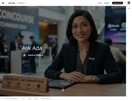
I just published an article about comparing Claude, ChatGPT, Gemini and Copilot for learning design work on which one to reach for depending on whether you're drafting assessments, coding a custom interaction, or wrangling a stakeholder deck by 4pm. After I hit publish, I thought to myself, this would be a great microlearning! So what did I do? Of course I created one. 😄 Meet Ada — an AI concierge who runs a "Matchmaker Desk." Tell her what you're actually working on (drafting assessments, coding a custom interaction, wrangling a stakeholder deck by 4pm) and she matches you to the right tool from the article above, reasoning included. Two of the eight tasks are honest ties between tools, so she says both names instead of faking a clean winner just to keep things simple. And yes, I noticed the irony before you did: the article ranks Claude as the strongest coding partner of the four, and Claude is exactly what I built Ask Ada with. I didn't plan that as a bit, it just turned out to be the most honest way to stress-test my own conclusion. It held up. 🙂 Go ask her something real: Ask Ada420Views9likes6Comments