Forum Discussion
Storyline Update - Submit Button
Hello,
I really like the update. The modern player looks very clean and I would like to use it for all of my courses. I do have one issue with this player though. For quizzes, the "submit" check mark (which replaced the submit button) is not very obvious. If I was a user taking courses for the first time, I would have no idea what to do once I was ready to submit a quiz. I obviously can make a custom shape with triggers that could take care of this for me, but I am just curious if this could be tweaked a little bit to be more clear. I have attached a picture with what I am referring to if anyone was curious.
I'm not really expecting this to change, but I just thought I would bring it others attention so they can hopefully remove any confusion for their users.
Wes Hunter
33 Replies
- PhilMayorSuper Hero
You can adjust the player to include labels
- KathleenFitz118Community Member
can you explain how to do this, adjust the player to show text labels
- KenGregsonCommunity Member
Hi Wes,
Here's a bit more detail on choosing between the classic and modern player.
Hope that helps!
- KenGregsonCommunity Member
Phil and Ashley,
Thank you very much for the quick reply. This fixes my problem. Thank you for your help. This is why I love this community!
Hey Zachary and welcome to E-Learning Heroes :)
Are you having difficulty with submitting?
It looks like Wes shared an image in his original post regarding the check mark in the modern player. It is the submit button in that image.
Let me know if there is something we can help you out with.
- YuyenChang-0930Community Member
Ok I switched my button styles to Text and now my quiz slide submission button does say "Submit" which works better than the checkmark. But now my question is: can I just make this modification on the question slides only, and NOT to the entire project (so the other slides still use arrows as navigation buttons?)
Oh, so glad to see that you found the solution that you needed Yuyen. I just responded to your similar post here.
The player properties are for the entire project.
- BrengreLITTYCommunity Member
I do totally agree. We also like this player better but the submit button is very difficult to spot. We are now hesitating to create a button directly in the slide with a trigger or to add a comment indicating where to click as you did.
We tested with different people and they all find this button hard to find.
Regards,Bérengère LITTY
Hi Bérengère and welcome to E-Learning Heroes :)
The modern player in Storyline 360 now displays that checkmark for the submit button by default.
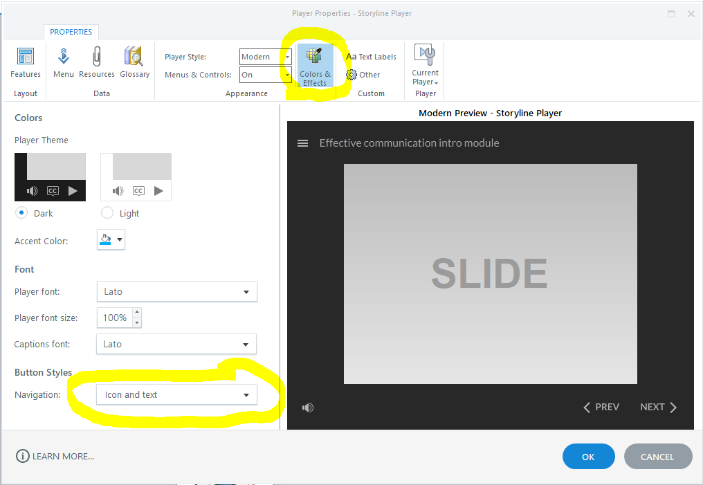
If you'd like to adjust this, you can certainly do so via the Player Properties.
Player Properties > Colors & Effects > Button Styles > Navigation
Hope that helps :)
- BrengreLITTYCommunity Member
Hi Leslie and thank you for you answer. I was already talking about the submit button in format icon+text.
The submit button without text is highly difficult to spot. The submit button with text (icon+text) is only very difficult to spot. I've looking at people experiencing this player for the first time and almost all of them are spending time looking for the button.
Thanks for sharing your thoughts Bérengère. Adding the text seems to be what solves the issue for many.
If you have an idea of what you would like to see or how this could work better, please share with our team here.
Related Content
- 8 months ago
- 10 months ago