Forum Discussion
Mobile Play button Storyline 360 block in Rise
I have a simple, single slide Storyline 360 block inserted into rise.
The Storyline block does not have any media in it (Video/Audio).
On mobile, the Storyline block appears with a play button which must be clicked before the block is initialised.
Why does this play button appear when the Storyline 360 content does not contain any media. I understand the need if there is media to get around the issue of autoplay media for mobile, but the play button is completely redundant in this case.
Is there a JavaScript API I can access in SL to get around this issue. I've been looking through the code, the best I could find was this.onStart(), but I don't think this is a public method.
46 Replies
Hi Sam,
Learners using a mobile device will see a play button on top of any Storyline block. This is expected behavior for mobile viewing. Tapping the play button will initiate the Storyline slide to play in the mobile browser.
- SamHillSuper Hero
Hi Alyssa, thanks for the response.
Are you able to let me know what the purpose of this button is. My Storyline file does not contain any media, and therefore shouldn't need this initial interaction from the user. It just feels like a redundant button?
Also, are your development team able to let us know if there is any way to get around this. Maybe there is a JavaScript method that we can run?
Cheers
Hi Sam. On mobile phones, the Storyline block will expand to full screen for a better viewing experience once you click the play button. On tablets, if there is enough room on the screen, the Storyline block may not expand to full screen, but it will still use the play button.
I'm sorry I can't help with JavaScript execution in output files. If there is someone in the community who has successfully edited the Storyline assets in a Rise 360 output, feel free to share!
- JodiSansoneCommunity Member
Hi Crystal and Alyssa,
Just to be clear, the way I understand this thread is that there is no way to insert a storyline block in Rise without the play button showing up in Mobile devices....and that would be phones or tablets. I see you write that this is "expected" behavior. Is that for every Storyline block type? It's really a shame because seeing that black block show up in the middle of a beautiful course ruins the whole experience for me and makes me not want to use Rise.
- SamHillSuper Hero
Hi Jodi, this appears to be the curent situation. Storyline blocks will always show the play button and black overlay on mobile/tablet. There is not anything you can do about this if inserting the SL files into Rise.
The only way it can be changed, but I'd advise against it as a solution is making a post publish/export edit to the Storyline files. This same edit would have to be made everytime the files are re-published and becomes a maintenance issue.
- JodiSansoneCommunity Member
Thank you Sam...my skills are not sufficient to mess around with anything I publish. :) It's such a letdown to have this issue after two years. I hope you were able to find a workaround.
- Susan37Community Member
Hi Sam. I know, it's been a few years since this was written, but sadly the issue still remains.
I wonder, what exactly do you mean by "making a post publish/export edit"? What kind of edit would that be? I'm curious to try. Thank you.
- SamHillSuper Hero
No worries. No workaround for us. For a recent project, our client chose to live with it. I think the more you can get away with not using Storyline blocks in Rise the better, but there are still some significant holes in Rise's out of the box interactions that we still have to use Storyline to patch those for the time being.
Thanks for talking through that question, Sam and Jodi. We'll be here if you have any other questions!
- SibaPrasadPadhiCommunity Member
Can we at least add a poster frame like feature to a Storyline block, so that that should show in every device. The black colour BG in mobile is destructive and do not have a clear functionality at user end. Also a instruction text block that shows on the screen also be a good option.
Hi Siba!
As a workaround, you can add an instruction block in a text block above the SL Block to help your learners with this.
- SergioRenato047Community Member
Play button also appears on desktop
- EvanBahoric-c2fCommunity Member
If this is expected behavior, can a warning message be inserted when adding a storyline embed? Lots of time and resources were put into making a rise course look more dynamic only to find that you have to click play on every other block. This is extremely disappointing.
- LeahGoldmannCommunity Member
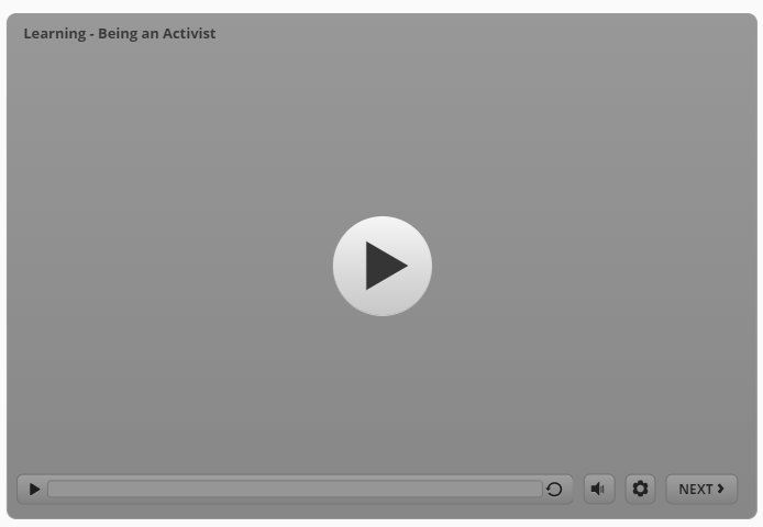
I believe there was a change on desktop devices for the Storyline block, that I would argue is a bug.
In the recent past, Storyline blocks definitely did not show up as a grey box with a play button. I know because we went to a lot of trouble to create a button in Storyline to prevent the video from executing right away. Now, I have both the grey video and play button AND my Storyline play button, which makes my button redundant.
I totally agree that the difference between the grey box and seeing the Storyline in the Rise course is like night and day. See attached.It also means that now we have to go back and REMOVE all those play buttons from ALL my Storyline files, which will be a pain. Plus, if you change this feature, then I'm back to having no Play button.
I would strongly suggest that this is a bug that should be fixed because the behavior has changed significantly. I suggest a setting for the Storyline block that toggles the Play button on or off and that the default be off.
I don't track the updates to Rise closely, but if this was an update, could someone please point me to the description in the release notes?
Hello, Raising Voices! I'd love to get a closer look at the lesson that contains this Storyline block. Would you be willing to share it with us? If that works for you, you can include the Share link in a new reply here, or you can send it privately by opening a case.
Related Content
- 10 months ago
- 11 months ago