Forum Discussion

Rise Canvas
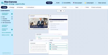

A good batch of work has gone into Rise Canvas since the last update, a couple of proper new features and a run of smaller fixes that smooth off rough edges.
The component sidebar has been reorganised. With twenty-one components in the list it had grown into a long scroll, so they're now grouped into five collapsible categories, Knowledge & Assessment, Scenarios & Decisions, Interactive Content, Data & Highlights, and Media & Layout. Only one group stays open at a time, so clicking into a category tidies the others away.
The Stats & KPI builder can now show its figures as more than just a counting number. There's a new visual-style option with four choices, the original count-up number, a donut ring, a horizontal bar, and a semicircular gauge. Pick one of the visual styles and each card gains a simple fill control, so you can set how full the ring, bar or dial draws, and the fill animates into place on the same scroll-into-view trigger and timing as the numbers, in your brand colour. Long figures used to risk spilling out of the rings, so the numbers now scale themselves down to fit neatly inside whatever shape they sit in.
The top toolbar was tidied so its buttons no longer wrap awkwardly on smaller laptop screens and the clear canvas button was missing its border and now matches the others beside it. And the zoom percentage in the canvas is now clickable, click it and you can type an exact zoom level rather than only stepping up and down with the plus and minus buttons.
That's gonna be it till next week... Enjoy building 😁
Related Content
- 10 months ago
- 1 year ago
- 10 months ago
- 1 year ago