e-learning development
30 TopicsSeeking Feedback on My First Storyline 360 Module
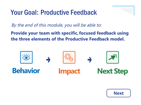
Greetings, everyone! After twenty years as a classroom educator, I'm transitioning into instructional design and learning experience design. I've spent the last four months teaching myself Articulate Storyline 360 while developing my first complete eLearning module, Productive Feedback. The module is designed for charge nurses and introduces a simple, three-element model for providing specific, focused feedback to their staff. I've recently completed the first version and am beginning Alpha testing. I'd greatly appreciate feedback from fellow designers, particularly regarding the clarity of the content, learner experience, navigation, and overall instructional design. I'm especially interested in constructive criticism and suggestions for improvement as I continue refining the module for my portfolio. Review 360 link: https://360.articulate.com/review/content/9a37fa9c-6c32-4352-b0ba-884450b7ff5d/review Thank you so much for taking the time to look at my work. I truly appreciate any insights you're willing to share. Take good care! -KyleSolved102Views1like7CommentsMy New “Missed Questions Only” Quiz Format for Rise 360.
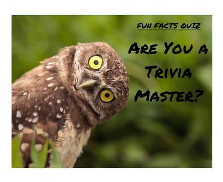
One quiz. Many chances. Zero wasted time Ever wished you could skip the boring parts of a quiz and just focus on what you got wrong? Well, now you can. I’ve created a “Missed Questions Only” quiz — a smarter, faster way to learn. Instead of starting from scratch, you get a second chance only at the questions you missed. No wasted time, no repeating what you already know — just targeted practice that helps you master the tricky stuff and hit that perfect score. It’s like a quiz with a built-in comeback round — your mistakes become your roadmap to success. Ready to turn wrong answers into wins? Give it a try and see how well you know your fun facts. 🔗 Rise Link: https://360.articulate.com/review/content/7126ec89-ff0c-4595-bac3-a0fe5e2c6a26/review 🖥️ Code Block: Copy the code below. 📄 Template: See an example of my template for organizing images, questions, answers, and each JS snippet. <div id="quiz-app"> <div class="quiz-card"> <div class="quiz-header"> <div> <div class="quiz-label">Fun Facts Quiz</div> <h2 id="quiz-title">Quiz</h2> </div> <div class="quiz-status"> <span id="round-badge">Round 1</span> <span id="progress-text">Question 1 of 1</span> </div> </div> <div id="scorebar" class="scorebar"> <div>Correct: <strong id="correct-count">0</strong></div> <div>Incorrect: <strong id="incorrect-count">0</strong></div> <div>Remaining in Round: <strong id="remaining-count">0</strong></div> </div> <div id="question-container"> <img id="question-image" src="" alt="Question Image" style="max-width:100%; border-radius:12px; margin-bottom:16px; display:none;" /> <div id="question-text" class="question-text"></div> <div id="answers" class="answers"></div> <div id="feedback" class="feedback"></div> </div> <div class="quiz-actions"> <button id="next-btn" disabled>Next</button> <button id="retry-btn" style="display:none;">Retry Missed Questions</button> <button id="restart-btn" style="display:none;">Restart Full Quiz</button> </div> </div> </div> <style> /* Same styling as before */ * { box-sizing: border-box; } body { margin: 0; font-family: Arial, Helvetica, sans-serif; background: #f4f7fb; color: #1f2937; } #quiz-app { max-width: 900px; margin: 0 auto; padding: 20px; } .quiz-card { background: #ffffff; border: 1px solid #dbe4f0; border-radius: 16px; padding: 24px; box-shadow: 0 8px 24px rgba(0,0,0,0.06); } .quiz-header { display: flex; justify-content: space-between; align-items: start; gap: 16px; margin-bottom: 18px; } .quiz-label { font-size: 12px; font-weight: 700; letter-spacing: .08em; text-transform: uppercase; color: #2563eb; margin-bottom: 6px; } .quiz-header h2 { margin: 0; font-size: 28px; } .quiz-status { display: flex; flex-direction: column; gap: 8px; align-items: flex-end; font-size: 14px; } .quiz-status span { background: #eef4ff; color: #1d4ed8; padding: 8px 12px; border-radius: 999px; font-weight: 600; } .scorebar { display: flex; flex-wrap: wrap; gap: 12px; margin-bottom: 22px; padding: 12px; background: #f8fafc; border: 1px solid #e5e7eb; border-radius: 12px; font-size: 14px; } #question-image { display: block; /* ensure image is shown */ max-width: 920px; /* maximum width */ max-height: 300px; /* maximum height */ width: 100%; /* scale to container width if smaller */ height: auto; /* maintain aspect ratio */ margin: 0 auto 16px auto; /* center horizontally with bottom margin */ object-fit: contain; /* scale image without cropping */ border-radius: 12px; /* consistent border radius */ background-color: #f3f4f6; /* subtle background color for empty space */ } .question-text { font-size: 22px; font-weight: 700; line-height: 1.35; margin-bottom: 20px; } .answers { display: grid; gap: 12px; } .answer-btn { width: 100%; text-align: left; border: 2px solid #d1d5db; background: #fff; color: #111827; border-radius: 12px; padding: 14px 16px; font-size: 16px; cursor: pointer; transition: .2s ease; } .answer-btn:hover:not(:disabled) { border-color: #93c5fd; background: #f8fbff; } .answer-btn:disabled { cursor: default; opacity: 1; } .answer-btn.correct { border-color: #16a34a; background: #ecfdf3; color: #166534; font-weight: 700; } .answer-btn.incorrect { border-color: #dc2626; background: #fef2f2; color: #991b1b; font-weight: 700; } .feedback { margin-top: 18px; min-height: 28px; font-size: 16px; font-weight: 600; } .feedback.correct { color: #15803d; } .feedback.incorrect { color: #b91c1c; } .quiz-actions { display: flex; gap: 12px; margin-top: 22px; flex-wrap: wrap; } .quiz-actions button { border: none; border-radius: 10px; padding: 12px 18px; font-size: 15px; font-weight: 700; cursor: pointer; } #next-btn { background: #2563eb; color: #fff; } #next-btn:disabled { background: #9ca3af; cursor: not-allowed; } #retry-btn { background: #f59e0b; color: #fff; } #restart-btn { background: #111827; color: #fff; } .final-message { padding: 18px; border-radius: 14px; background: #effaf3; border: 1px solid #86efac; color: #166534; font-size: 18px; line-height: 1.5; } .small-note { margin-top: 10px; font-size: 14px; color: #4b5563; } MeDia (max-width: 640px) { .quiz-header { flex-direction: column; align-items: flex-start; } .quiz-status { align-items: flex-start; } .question-text { font-size: 20px; } } </style> <script> // Questions with imageUrl placeholder (replace URLs with your uploaded Rise 360 images) const fullQuiz = [ { question: "Which animal can sleep standing up?", imageUrl: "https://images.articulate.com/f:jpg,a:retain,b:fff,w:1680,q:90/rise/courses/YLUYT4CI3ckYMonl07a4CHihYXT3CnUJ/z45b6W_xMLJUUJld.jpg", options: ["Horse", "Dog", "Penguin", "Kangaroo"], answer: "Horse" }, { question: "What is the only food that essentially never spoils?", imageUrl: "https://articulateusercontent.com/rise/courses/Kg8aAYIS9RJvSNl0YFM3mOw3o8OQbz5c/MddUJBQTsySlOvqv.jpg", options: ["Rice", "Honey", "Peanut butter", "Chocolate"], answer: "Honey" }, { question: "True or False: Bananas are berries, but strawberries technically aren’t.", imageUrl: "https://articulateusercontent.com/rise/courses/Kg8aAYIS9RJvSNl0YFM3mOw3o8OQbz5c/GSei0ep7BuNe7mfL.png", options: ["True", "False"], answer: "True" }, { question: "What is a group of flamingos called?", imageUrl: "https://articulateusercontent.com/rise/courses/Kg8aAYIS9RJvSNl0YFM3mOw3o8OQbz5c/9bCYyNGee1QQRUWC.jpg", options: ["A flock", "A flamboyance", "A parade", "A bouquet"], answer: "A flamboyance" }, { question: "Which country has more pyramids than any other country in the world?", imageUrl: "https://articulateusercontent.com/rise/courses/Kg8aAYIS9RJvSNl0YFM3mOw3o8OQbz5c/srrP1z5U7J1QaYow.jpeg", options: ["Egypt", "Mexico", "Sudan", "Peru"], answer: "Sudan" }, { question: "Which animal has fingerprints so similar to humans that they can be difficult to tell apart?", imageUrl: "https://articulateusercontent.com/rise/courses/Kg8aAYIS9RJvSNl0YFM3mOw3o8OQbz5c/z32I4pCG_PvYZDUD.jpg", options: ["Chimpanzee", "Koala", "Raccoon", "Sloth"], answer: "Koala" }, { question: "How many hearts does an octopus have?", imageUrl: "https://articulateusercontent.com/rise/courses/YLUYT4CI3ckYMonl07a4CHihYXT3CnUJ/1EOT8Ml6xu2_Lmvd.png", options: ["1", "2", "3", "8"], answer: "3" }, { question: "Which fruit floats in water because about 25% of its volume is air?", imageUrl: "https://articulateusercontent.com/rise/courses/Kg8aAYIS9RJvSNl0YFM3mOw3o8OQbz5c/kRIyy568MhLPiEFd.jpg", options: ["Apple", "Orange", "Grape", "Strawberry"], answer: "Apple" }, { question: "What is the national animal of Scotland?", imageUrl: "https://images.articulate.com/f:jpg,a:retain,b:fff,w:1680,q:90/rise/courses/YLUYT4CI3ckYMonl07a4CHihYXT3CnUJ/Tl89HrMYH0AyvzF2.jpg", options: ["Highland cow", "Golden eagle", "Unicorn", "Red deer"], answer: "Unicorn" }, { question: "True or False: A day on Venus is longer than a year on Venus.", imageUrl: "https://articulateusercontent.com/rise/courses/Kg8aAYIS9RJvSNl0YFM3mOw3o8OQbz5c/WBnprMTKTGmJCPre.jpg", options: ["True", "False"], answer: "True" }, { question: "What is a group of crows called?", imageUrl: "https://articulateusercontent.com/rise/courses/Kg8aAYIS9RJvSNl0YFM3mOw3o8OQbz5c/QhTq5yGSSxZC45ZF.jpg", options: ["A mystery", "A murder", "A mob", "A shadow"], answer: "A murder" }, { question: "What is a group of owls called?", imageUrl: "https://articulateusercontent.com/rise/courses/Kg8aAYIS9RJvSNl0YFM3mOw3o8OQbz5c/d_g79Dx03aWnVP2S.jpg", options: ["A parliament", "A council", "A jury", "A congress"], answer: "A parliament" }, { question: "What is a group of giraffes called?", imageUrl: "https://articulateusercontent.com/rise/courses/YLUYT4CI3ckYMonl07a4CHihYXT3CnUJ/-jRiKJcZZX1mWlfh.jpg", options: ["A tower", "A skyscraper", "A stretch", "A column"], answer: "A tower" }, { question: "What is a group of rhinos called?", imageUrl: "https://articulateusercontent.com/rise/courses/Kg8aAYIS9RJvSNl0YFM3mOw3o8OQbz5c/jilS2EvEMWFQCHLN.jpg", options: ["A crash", "A charge", "A stampede", "A rumble"], answer: "A crash" }, { question: "What is a group of porcupines called?", imageUrl: "https://articulateusercontent.com/rise/courses/Kg8aAYIS9RJvSNl0YFM3mOw3o8OQbz5c/WwtKh0xFKUgG07x1.jpg", options: ["A pricker", "A prickle", "A pincushion", "A spike"], answer: "A prickle" }, { question: "What is a group of zebras called?", imageUrl: "https://articulateusercontent.com/rise/courses/YLUYT4CI3ckYMonl07a4CHihYXT3CnUJ/G-vljexS-nyS4lg3.jpg", options: ["A dazzle", "A stripe", "A blur", "A flash"], answer: "A dazzle" }, { question: "What is a group of hippos called?", imageUrl: "https://articulateusercontent.com/rise/courses/Kg8aAYIS9RJvSNl0YFM3mOw3o8OQbz5c/M-1LbZ5VHqL28Ez4.jpg", options: ["A splash", "A bloat", "A barrel", "A wallow"], answer: "A bloat" }, { question: "What is a group of ferrets called?", imageUrl: "https://articulateusercontent.com/rise/courses/Kg8aAYIS9RJvSNl0YFM3mOw3o8OQbz5c/ob7XOK2dtuA2btB-.jpg", options: ["A mischief", "A trouble", "A business", "A chaos"], answer: "A business" }, { question: "What is a group of ravens called?", imageUrl: "https://articulateusercontent.com/rise/courses/YLUYT4CI3ckYMonl07a4CHihYXT3CnUJ/L6_Yxla0T9t97Qx8.jpg", options: ["An unkindness", "A darkness", "A conspiracy", "A haunting"], answer: "An unkindness" }, { question: "What is a group of bears called?", imageUrl: "https://articulateusercontent.com/rise/courses/Kg8aAYIS9RJvSNl0YFM3mOw3o8OQbz5c/5fA5geB-XbftAeB6.jpg", options: ["A grumble", "A sleuth", "A lumber", "A maul"], answer: "A sleuth" } ]; let currentQuiz = []; let currentIndex = 0; let selectedAnswer = null; let totalCorrect = 0; let totalIncorrect = 0; let roundNumber = 1; let missedQuestions = []; const questionContainer = document.getElementById("question-container"); const questionImage = document.getElementById("question-image"); const questionText = document.getElementById("question-text"); const answersEl = document.getElementById("answers"); const feedbackEl = document.getElementById("feedback"); const nextBtn = document.getElementById("next-btn"); const retryBtn = document.getElementById("retry-btn"); const restartBtn = document.getElementById("restart-btn"); const correctCountEl = document.getElementById("correct-count"); const incorrectCountEl = document.getElementById("incorrect-count"); const remainingCountEl = document.getElementById("remaining-count"); const progressTextEl = document.getElementById("progress-text"); const roundBadgeEl = document.getElementById("round-badge"); function shuffle(array) { const arr = [...array]; for (let i = arr.length - 1; i > 0; i--) { const j = Math.floor(Math.random() * (i + 1)); [arr[i], arr[j]] = [arr[j], arr[i]]; } return arr; } function prepareQuiz(questions) { return shuffle(questions).map(q => ({ ...q, options: shuffle(q.options) })); } function initQuiz() { currentQuiz = prepareQuiz(fullQuiz); currentIndex = 0; selectedAnswer = null; totalCorrect = 0; totalIncorrect = 0; roundNumber = 1; missedQuestions = []; retryBtn.style.display = "none"; restartBtn.style.display = "none"; nextBtn.style.display = "inline-block"; questionContainer.style.display = "block"; renderQuestion(); updateScore(); } function startRetryRound() { currentQuiz = prepareQuiz(missedQuestions); currentIndex = 0; selectedAnswer = null; missedQuestions = []; roundNumber++; retryBtn.style.display = "none"; restartBtn.style.display = "none"; nextBtn.style.display = "inline-block"; questionContainer.style.display = "block"; renderQuestion(); updateScore(); } function renderQuestion() { const q = currentQuiz[currentIndex]; // Show or hide image depending on if imageUrl is set if (q.imageUrl) { questionImage.src = q.imageUrl; questionImage.style.display = "block"; } else { questionImage.style.display = "none"; } feedbackEl.textContent = ""; feedbackEl.className = "feedback"; nextBtn.disabled = true; selectedAnswer = null; roundBadgeEl.textContent = `Round ${roundNumber}`; progressTextEl.textContent = `Question ${currentIndex + 1} of ${currentQuiz.length}`; remainingCountEl.textContent = currentQuiz.length - currentIndex; questionText.textContent = q.question; answersEl.innerHTML = ""; q.options.forEach(option => { const btn = document.createElement("button"); btn.className = "answer-btn"; btn.type = "button"; btn.textContent = option; btn.addEventListener("click", () => handleAnswer(btn, option, q.answer)); answersEl.appendChild(btn); }); } function handleAnswer(button, chosen, correct) { if (selectedAnswer !== null) return; selectedAnswer = chosen; const buttons = document.querySelectorAll(".answer-btn"); buttons.forEach(btn => btn.disabled = true); if (chosen === correct) { button.classList.add("correct"); feedbackEl.textContent = "Correct!"; feedbackEl.className = "feedback correct"; totalCorrect++; } else { button.classList.add("incorrect"); feedbackEl.textContent = "Incorrect."; feedbackEl.className = "feedback incorrect"; totalIncorrect++; missedQuestions.push(currentQuiz[currentIndex]); } updateScore(); nextBtn.disabled = false; } function updateScore() { correctCountEl.textContent = totalCorrect; incorrectCountEl.textContent = totalIncorrect; remainingCountEl.textContent = currentQuiz.length > 0 ? Math.max(currentQuiz.length - currentIndex - (selectedAnswer ? 1 : 0), 0) : 0; } function goNext() { currentIndex++; if (currentIndex < currentQuiz.length) { renderQuestion(); updateScore(); } else { showRoundResults(); } } function showRoundResults() { questionText.textContent = ""; answersEl.innerHTML = ""; feedbackEl.textContent = ""; questionImage.style.display = "none"; nextBtn.style.display = "none"; if (missedQuestions.length > 0) { questionText.innerHTML = ` <div class="final-message" style="background:#fff7ed;border-color:#fdba74;color:#9a3412;"> <strong>Round ${roundNumber} complete.</strong><br> You have <strong>${missedQuestions.length}</strong> question(s) to retry. <div class="small-note">Click the button below to retake only the questions you missed.</div> </div> `; retryBtn.style.display = "inline-block"; restartBtn.style.display = "inline-block"; remainingCountEl.textContent = missedQuestions.length; } else { questionText.innerHTML = ` <div class="final-message"> <strong>Congratulations!</strong><br> You have answered all questions correctly. <div class="small-note"> Final score: ${totalCorrect} correct, ${totalIncorrect} incorrect attempts. </div> </div> `; retryBtn.style.display = "none"; restartBtn.style.display = "inline-block"; remainingCountEl.textContent = 0; } } nextBtn.addEventListener("click", goNext); retryBtn.addEventListener("click", startRetryRound); restartBtn.addEventListener("click", initQuiz); initQuiz(); </script>286Views5likes5CommentsWeekly Challenge Submission: NA Oktoberfest Interactive Festival Game
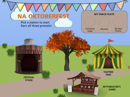
https://360.articulate.com/review/content/8d023902-8305-4052-9e42-f0c12e40ae03/review Cross-posting this from this week's weekly challenge to share more broadly! Enjoy :) -- Hi all! Excited to share my first challenge submission! I'm embarrassed to say that after almost two years at Articulate, although I've done a lot of little mini projects to test new features, I've never actually set out to complete a challenge before. After having a coffee chat with this week and seeing one of his amazing Storyline builds, I got inspired to finally take a swing. I hope you all enjoy my build and am excited to hear what you would do to improve it! The idea I don't drink alcohol, but I do love to enjoy an NA beer, so I wanted to put together a virtual "NA Oktoberfest." I'm a nineties kid who grew up playing Neopets on my family PC, so I'm always inspired by interactive maps and decided to use that as the framing device for build. I decided to put together three stations that each had a different mini learning "game." I wanted there to be an overall gamification to the entire experience, so I added a "snack plate" concept as a way for learners to collect three different pretzels as they completed each game. The tools I used I used Storyline for this build. I built the visuals almost entirely from built in illustrations in the Storyline media library, but added a few separate images from Unsplash where needed (like the wooden wall background in the target game or the brewery background in the tasting tent). The entire thing runs off of a pretty basic branched scenario where the home "map" is a game selector and then each game has a different scene path. I used quite a bit of AI text to speech especially in the festival stage/audience participation game, and a good amount of additional audio and animations for emphasis and to make the whole thing feel more engaging. My target skill: states & variables The big thing I wanted to achieve and master with this build was using states and variables to achieve the logic of earning pretzels on the snack plate as you progress through the games. I needed to find a way to make it so that the learner could earn one pretzel at a time in any order they wanted, and to do that I used variables and states. On the main slide, I added each of the three target pretzels with a default state of hidden. I added three global variables to the project so that each different game could be marked as "done" when the learner claimed each pretzel. At the end of each game, I made it so the learner would click to "collect" the pretzel (which I liked because it has a sort of video game quality to it of picking something up and adding it to your inventory). I set up a trigger on each pretzel that would set the state of the given game to done (from false to true). I also added a trigger on each pretzel claim moment that would bring the learner back to the map page. On the map page, I set each pretzel's state to change from default (hidden) to normal when the given variable changed to true. These triggers took some troubleshooting and tinkering to get right and I'm excited to have finished the project. There's a lot more I would have done if I had more time (fine tuning the visuals, adding more consistent audio throughout, making accessibility improvements, etc). I had an idea I didn't see to fruition where in the target game you "earn a dart" for each correct answer and then use the darts to play multiple times and each dart through is essentially operating off chance, but I didn't have time to puzzle that one out this time. Perfect is the enemy of done, so I wanted to share this with you all as it is! I hope you enjoy it and get inspired to try a new variety of NA beer!54Views1like1Comment48-Hour Alexandria Weekend Planner – My First LXD Project
Hi everyone! I’m a teacher currently transitioning into LXD, and I recently finished my first larger e-learning project. I created a 48-hour weekend planner for Old Town Alexandria. The idea was to let users explore hotels, restaurants, and attractions while building a realistic weekend itinerary and staying within a budget. I built most of the experience in Rise 360 and also experimented with custom-coded interactions and video editing. This was my first time putting all of these pieces together into one complete project, so I’d really appreciate any feedback on the user experience, interaction design, and overall flow. Here’s the project: https://millie1017.github.io/my-project/ Thanks for taking a look!66Views1like2CommentsCAROUSEL in Storyline!
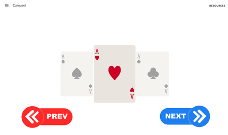
Ok over the last few weeks I've been learning to use JavaScript in Storyline modules and this is another great example of taking some of the functionality out of Rise and using it in Storyline. I've discovered how to create a really slick carousel. https://360.articulate.com/review/content/b2224974-b080-41ad-aa47-f874da152b14/review You can customize the code for size speed and motion. Just need to copy your object IDs into the code and you're good to go. Code should be able to be copied and pasted right into your project. Let me know how you like it!!!! // ------------------------------------ // STORYLINE CARD CAROUSEL // ------------------------------------ const CARD_IDS = [ "CARD_1_OBJECT_ID", "CARD_2_OBJECT_ID", "CARD_3_OBJECT_ID", "CARD_4_OBJECT_ID" ]; const PREVIOUS_BUTTON_ID = "PREVIOUS_BUTTON_OBJECT_ID"; const NEXT_BUTTON_ID = "NEXT_BUTTON_OBJECT_ID"; // ------------------------------------ // CUSTOMIZATION // ------------------------------------ // Horizontal center of the carousel. // Change these to match your slide. const CENTER_X = slideWidth() / 2; const CENTER_Y = slideHeight() / 2; // Distance between card centers. const CARD_SPACING = 330; // Appearance of the centered card. const ACTIVE_SCALE = 1; const ACTIVE_OPACITY = 1; // Appearance of cards beside the centered card. const SIDE_SCALE = 0.78; const SIDE_OPACITY = 0.45; // Cards farther away can be hidden. const HIDDEN_SCALE = 0.65; // Animation responsiveness. // Lower numbers are slower and smoother. const SMOOTHING = 0.14; // Whether Next from the last card returns to the first. const LOOP_CAROUSEL = true; // ------------------------------------ // SETUP // ------------------------------------ const cards = CARD_IDS.map((id, index) => { const item = object(id); item.style.transformOrigin = "center center"; return { item, index, currentX: item.x, currentY: item.y, currentScale: 1, currentOpacity: 1 }; }); const previousButton = object(PREVIOUS_BUTTON_ID); const nextButton = object(NEXT_BUTTON_ID); let activeIndex = 0; // ------------------------------------ // HELPERS // ------------------------------------ function clamp(value, min, max) { return Math.min(max, Math.max(min, value)); } function changeCard(direction) { activeIndex += direction; if (LOOP_CAROUSEL) { if (activeIndex < 0) { activeIndex = cards.length - 1; } if (activeIndex >= cards.length) { activeIndex = 0; } } else { activeIndex = clamp( activeIndex, 0, cards.length - 1 ); } // Optional Storyline number variable. // Create CurrentCarouselCard if you want to use this. // setVar("CurrentCarouselCard", activeIndex + 1); } // ------------------------------------ // BUTTON EVENTS // ------------------------------------ previousButton.click(() => { changeCard(-1); }); nextButton.click(() => { changeCard(1); }); // ------------------------------------ // CARD CLICK EVENTS // ------------------------------------ // Clicking a side card brings it to the center. // Clicking the active card can trigger your // normal Storyline action or open a layer. cards.forEach((card) => { card.item.click(() => { activeIndex = card.index; }); }); // ------------------------------------ // ANIMATION LOOP // ------------------------------------ update(() => { cards.forEach((card) => { const offset = card.index - activeIndex; const absoluteOffset = Math.abs(offset); let targetX; let targetY = CENTER_Y - card.item.height / 2; let targetScale; let targetOpacity; if (absoluteOffset === 0) { // Active center card. targetX = CENTER_X - card.item.width / 2; targetScale = ACTIVE_SCALE; targetOpacity = ACTIVE_OPACITY; card.item.style.pointerEvents = "auto"; } else if (absoluteOffset === 1) { // Immediate side cards. targetX = CENTER_X - card.item.width / 2 + offset * CARD_SPACING; targetScale = SIDE_SCALE; targetOpacity = SIDE_OPACITY; card.item.style.pointerEvents = "auto"; } else { // Cards farther away. targetX = CENTER_X - card.item.width / 2 + offset * CARD_SPACING; targetScale = HIDDEN_SCALE; targetOpacity = 0; card.item.style.pointerEvents = "none"; } // Smoothly ease toward the target values. card.currentX += (targetX - card.currentX) * SMOOTHING; card.currentY += (targetY - card.currentY) * SMOOTHING; card.currentScale += (targetScale - card.currentScale) * SMOOTHING; card.currentOpacity += (targetOpacity - card.currentOpacity) * SMOOTHING; card.item.x = card.currentX; card.item.y = card.currentY; card.item.style.transform = `scale(${card.currentScale})`; card.item.style.opacity = card.currentOpacity; }); });709Views11likes10CommentsCoded Interactions
I've recently been experimenting with coded interactions in Rise 360 to see how far I can push the interactivity beyond the standard blocks. I've been using GPT to help produce and refine the code, then tweaking and personalising the interactions to meet specific brand guidelines and learning requirements. I'm really happy with the results so far, and it's opened up a lot of possibilities for creating more bespoke learning experiences directly within Rise. There are some limitations I've noticed during testing, particularly around incorporating audio effectively within the interactions and ensuring they remain fully responsive across different screen sizes and mobile devices. I'd be interested to hear from other eLearning developers who are experimenting with coded interactions: What limitations have you come across? How have you approached responsiveness and accessibility? Do you see coded interactions becoming a bigger part of how we build bespoke experiences in Rise? Here's an example I've been working on: https://360.articulate.com/review/content/42e03dcc-6233-4bf0-908e-64d5543c0c7c/review691Views5likes8CommentsPersonalized Learning Experience
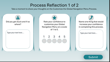
This is just the last three slides in a module. The idea is for the learner to reflect on their experience with the process we just taught and get them thinking about what to do next. https://360.articulate.com/review/content/8610d839-ce0c-429d-8803-241f1e1d4a29/review442Views2likes5CommentsHiring Manager Interview Simulation: A Scenario-Based Final Knowledge Check
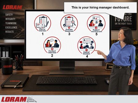
I recently built this scenario-based final knowledge check for the 2nd module in Loram's Talent Acquisition Hiring Manager Training program. Instead of ending the course with a traditional multiple-choice quiz, I wanted learners to apply their knowledge by working through a realistic hiring process from start to finish. In this simulation, the learner takes on the role of a hiring manager at Loram and navigates each stage of the interview lifecycle: - Preparing for the interview using the ICARE Interview Guide - Conducting a behavioral-based interview - Evaluating candidate responses using the STAR method and competency ratings - Participating in an interview debrief discussion - Providing development-focused feedback to an internal candidate The experience is framed as a hiring manager dashboard displayed on a computer screen. Learners interact with different workflow tabs, make decisions throughout the process, and receive coaching from a Talent Acquisition Manager character named Vicki. Incorrect choices trigger consequence-based feedback that demonstrates what can go wrong when interview best practices aren't followed. View this knowledge check here on Review 360: https://360.articulate.com/review/content/831cda88-b5f5-49e3-9567-ce4f38bfb303/review Design Goal My goal was to move beyond knowledge recall and create a practical simulation that mirrors the real hiring decisions Loram managers make throughout the interview process using gamification. I wanted learners to experience the entire interview lifecycle while reinforcing key concepts such as: Structured interviewing Behavioral-based interviewing STAR methodology Objective candidate evaluation Interview debriefs Internal candidate development conversations Consistent and compliant hiring practices Development Notes A few design choices I incorporated: Scenario-based decision making using gamification instead of a traditional quiz Character-driven coaching and feedback Consequence-based remediation for incorrect decisions Progressive workflow that mirrors Loram's actual hiring process Visual dashboard interface to increase immersion Focus on realistic workplace situations rather than obvious right-or-wrong answers Internal and external candidate scenarios to reflect real hiring manager responsibilities Tools Used Articulate Storyline 360 States, layers, variables, and triggers Scenario-based branching Microsoft Copilot AI-generated visual assets Custom dashboard-style interface design What I Learned One of the biggest challenges was balancing realism with brevity. Hiring conversations can be complex, so I focused on creating concise scenarios that still felt authentic in partnership with my subject matter experts and reflected the decisions Loram hiring managers make before, during, and after interviews. I also wanted learners to understand not only what the correct decision was, but why it mattered. The consequence-based feedback allowed me to reinforce concepts like preparation, objective evaluation, documentation, compliance, and employee development in a way that felt more realistic than traditional quiz feedback. I'd love to hear how others approach scenario-based assessments or realistic workplace simulations in their eLearning projects!329Views1like2CommentsSpotlight using JavaScript and Alt Text
I created a spotlight feature, with some help from AI, to focus on specific areas of the screen in e-learning. I didn't create it for spotlight interactive gaming scenarios. I use it for software focal areas. You can add a shape or multiple shapes to your slide and add alt text, and JavaScript on the master slide recognizes the text. It currently works with circles, ovals, rectangles, squares, and rounded-edge shapes. However, I couldn't get triangle or star shapes to work. You can also change other features. For example, you can adjust blur and Mask color and apply them to a button to toggle them on or off. Let me know your thoughts. I provide a step-by-step guide in the downloadable storyline file. Spotlight in Storyline using JavaScript Demo Link193Views2likes2CommentsSelf Assessment Builder
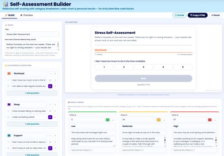
I've built a free self assessment builder tool you can use right inside Rise. You can use this to build your custom self assessments to use in your Rise courses. After completing the assessment users can view, save or print their results. I'll be adding this to my Rise Canvas tool in the next update. Any feedback to add features or improve is welcomed. Self Assessment Builder Tools used: Canva, Gemini and Rise Canvas561Views4likes2Comments