Forum Discussion
Articulate Rise text alignment issue after update
I attached screenshots from before and after the Articulate Rise update. After the update, the paragraph text shifted inward automatically. It is now left-misaligned compared with the other objects. Please let me know if there is a fix.
7 Replies
- ZuzannaWinickaTCommunity Member
We've got the same issue in all presentations, especially when the text (paragraph block) is below the image.
See attached screen. Before the text+image block and the paragraph block were aligned (both to the left). Now the lower text moved to the right and we can't change it.
We're not trying to mitigate it somehow yet, hoping the bug will be fixed, because it happened in all our presentations, and changing it would be... horrible.
Also, we see issues with the "continue" buttons being narrower. - MateuszCzopek-2Community Member
Thanks for bringing this up, Vipin. We have observed the same issue in our courses developed in Rise. I hope this is a temporary bug that will be addressed ASAP. Having to adjust hundreds of courses visually would be an unacceptable setback. I’m counting on Articulate to step up to the plate and release a fix by the end of the week, as we’re scheduled to launch a major project for a key client on Monday.
- KZawadzka_87Community Member
Thank you for pointing this out. I also had an unpleasant surprise this morning: the width of the text blocks, which can't be adjusted to fit others, makes our courses look unsightly. I'm hoping for a quick solution to this problem.
Hi, everyone!
I'm happy to confirm that we released a fix for this issue where the text block's width isn't aligned with other blocks, when the navigation menu is visible. You may need to export your Rise 360 course again if the issue doesn't appear to be resolved.
Please let me know if you have any questions!
- ZuzannaWinickaTCommunity Member
I see from another post that this seems to be a border in CSS issue (new thing in CSS) - similar, though not the same blocks case.
Rise - Block alignment offset | E-Learning Heroes
Probably the best Idea would be to put up a case support issue - the more the better I suppose.
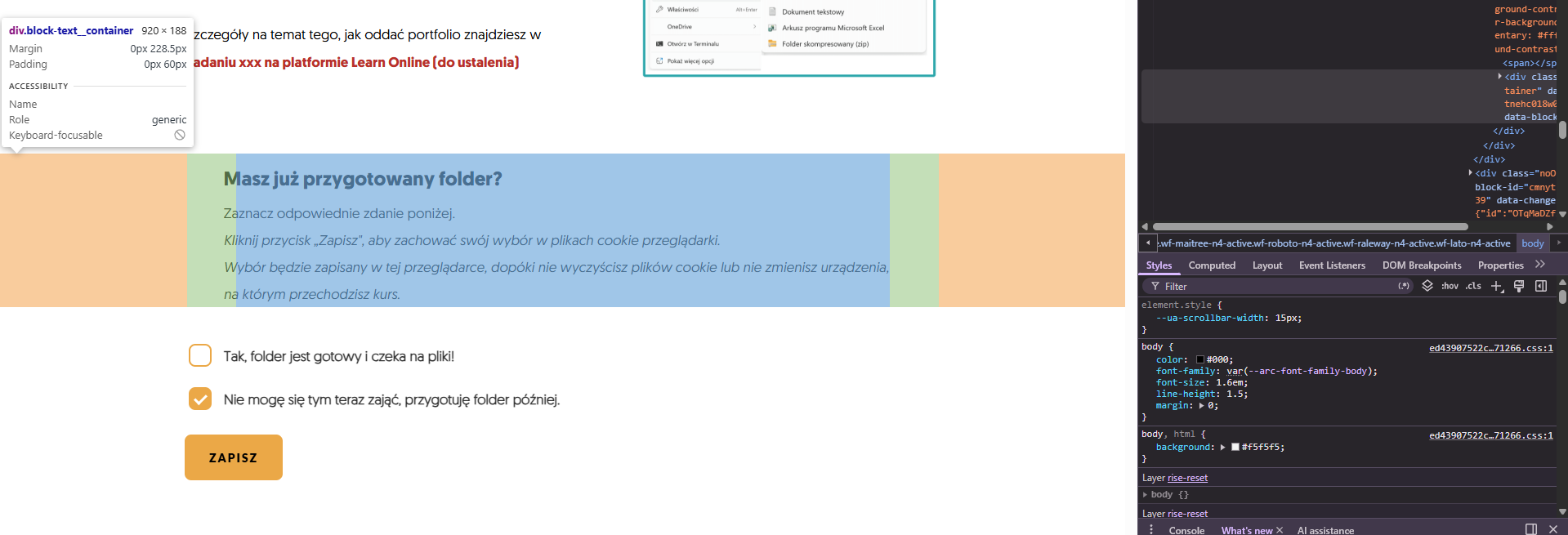
Inspired by other posts I checked, and it seems to be a suddenly bigger margin (see screens attached) as well as the general size of the text block container. - ZuzannaWinickaTCommunity Member
VipinKumar-eef7 Hi, it seems that it is fixed for us now :) I hope that for you too.
- VipinKumar-eef7Community Member
ZuzannaWinickaT It seems to be fixed on my end too.