Forum Discussion
Storyline 360 Chromeless modern player
I have just updated to Stoyline 360 to Build 3.16.15842.0 and am trying to set the new modern player to chromeless optimal size. I cannot see any way to set the browser size to optimal size or less than full screen. The options are grayed out unless you select launch as new window.
I always use set to optimal size as html creates poor quality images when stretched. Is this a limitation of the new modern player ( always full screen correct aspect stretch)?
30 Replies
- Will_FindlayCommunity Member
"The modern player always scales smoothly to completely fill the learner’s browser on every device and screen size." - https://articulate.com/support/article/Storyline-360-Modern-Player
- DougBrownCommunity Member
Thanks Will for the pickup, so Full Screen correct aspect, black in fill only . Pity that the new Menus & Controls option to go chromeless is only available in modern player.
- PeterMoore1Community Member
I also have tried the new modern player settings and was very pleased to see this implemented as a simple way to switch player chrome off for a seamless experience.
However, as Doug has reported, the scaling to browser window size results in that undesirable re-sizing and softening/pixelation of Images. I appreciate that this is a proportional scaling so that is good, I just wish there was the ability to at least make the course open at the size it was designed at to create the best initial impression and quality for the participant.
After that, ok, let it be resized by the user as they like.
guess I might have to revert back to the legacy player to maintain this, although the modern player does seem a good improvement in other ways...it would be great to be able to have control over the setting of that initial view. Regards
- JackieWaskew168Community Member
Is there a way to change the color of the new modern player (outside of selecting Dark or Light)?
- StefanKhlerCommunity Member
Is there a way to change the color?
- Will_FindlayCommunity Member
I love a lot about the new player, but for me, and I'm probably old school, the interface buttons (Prev/Next, play, Submit) seem just a little too subtle and lack adequate affordances. I was happy to see you can turn on text labels, but, how can you tell the buttons are disabled, for example? I guess I'm just not sure about this Modern age.
More on this subject: https://ux.stackexchange.com/questions/56555/does-flat-design-reduce-affordance-of-actionable-objects
- Will_FindlayCommunity Member
Yikes, I appear to be late to this debate: https://ux.stackexchange.com/questions/33197/what-kind-of-design-do-users-like-the-most-at-the-time-of-this-question-flat
- DougBrownCommunity Member
- AlainDumaisCommunity Member
Same thing for the chronometer/countdown timer. I can't find how to fix it (to stay with the player, not with the browser).
- AlainDumaisCommunity Member
Hi,
To avoid the undesirable re-sizing of the Story window and the pixelation of images in the new Modern Player, I did this change in the main.min.css file of the published course (Output Folder > html5 > lib > stylesheets):at the bottom of the file, in the #presentation-container, I replaced the last element height:100% by the optimal height of the player (height:800px; in my case).
I know is'nt the best solution, but event if the browser is open in any size or in a full screen, I'm sure the story window stay always open and centered at the size that I assigned.
Alain
(sorry for my english, I think Google Translate is not my most reliable friend today ;-)- ToddWeber-99c95Community Member
I very much appreciate this effort from years ago, however - the code has changed. I scoured through all the lines of code and could not find this. Do you have a current day solution? Thank you!
Hi Alain!
Sorry to hear the Modern Player is causing resizing and pixilation issues in your course. I'd like to get a better idea of what you're seeing--so you have a link you can share with me?
If something's not right, I definitely want to share it with my team so we can look into fixing it. Any examples you can share with me would be helpful!
- PeterMoore1Community Member
May I chip in here as well Alyssa? Hope you don't mind Alain. As you'll know, when creating a course in storyline, one of the decisions we make is to set a story size. When I do this I then optimise all the graphics that are going in to that piece of work so they are exactly the right size for the space they are being placed in to. If my story size is 1280x720 then, if I'm using a splash screen photo say, that will be sized in the photo processing app I use (e.g. lightroom) to exactly 1280x720 - if that photo occupies half the screen it will be sized to 640x720 etc.
With the Modern player - when a participant opens the course and it is by default displayed at the size the browser is set to, then, if that browser it set to full screen, the course window is scaled up, so those 1280x720 or 640x720 graphics get upscaled and no longer look nice and sharp as they would if the course window was to open at the designed story size. Objects on screen like buttons with multiple states can also sometimes 'pixel shift' when hovered over. This is more apparent when the production is scaling to fit the browser window.
For me its about creating the best first impression I can, so the participant can immediately perceive something like.... "hey, this is a nicely design course, maybe its worth my attention and focus, let me explore this further, I'm motivated to continue".....you get the idea.
Another way of looking at this - do you ever see the graphics on a modern website for a reputable company become soft and pixelated when the browser is being re-sized? Generally, no, because they are designed to be responsive, which storyine is not, its only scaling.
Maybe a workaround to this is to place larger sized (more pixels), say x2 upsized images into the production. However, this would increase the bandwidth required to play the course and we do need to consider mobile use and download performance too, which is why I don't generally do this.
If the modern player retained the option of the classic player and allowed the course to set the browser size to the story size on opening, or max window size if that was smaller than the story size, this would be great! After its open - sure, allow the participant to resize to whatever they like.
Hi Stefan,
With the modern player, we changed some of the color options to make it a lot easier for your course design. Take a look at the specifics here:
The modern player style makes customizing colors super easy. Just select a dark or light theme, then choose an accent color from the color selector (the default accent color choices come from your theme colors).
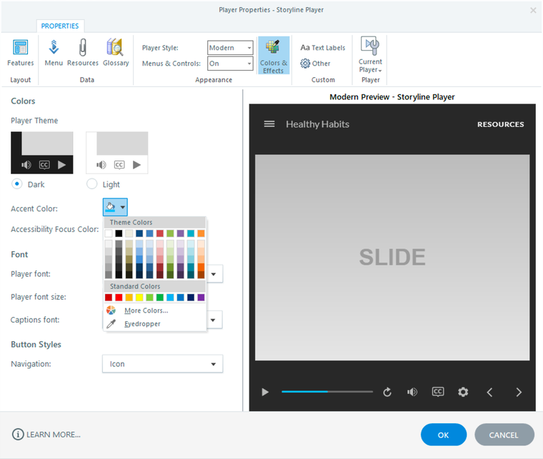
The neutral tones of the dark and light themes allow your content to be the focus of learners’ attention, while the player performs a supporting role in the background. And the accent color is used throughout the modern player to tie it all together. For example, the accent color highlights the current slide in the menu, identifies the selected tab in the sidebar, and shows the progress of the seekbar.