Forum Discussion
Flash cards size
Hi, can you please look into adjust the formatting controls on text in the flash cards. At the moment there is such a small space to write text and most is lost in unseen borders. There are also many occasions where the last line of the text starts to fade out but it is not long enought to activate the scroll bar, so you can never see the words fully.
Can we look at adjusting the size of the box when is flips so there is no scroll bar as this is a pain on such a small space, or adjusting the margins or font formats easier. I realise the idea would be nt tohave too much text but with large margins it's hard to manage.
37 Replies
Hi Matthew,
Did you already look at adjusting the font size while editing your Flashcards? You'll see a quick screen recording of how to do that here:
The text will resize smaller as you keep typing to add to it, and then I could choose to make it smaller than that (down to 12 pts). I'm not seeing the large margins as you mentioned so I'd love to see an example of your Flashcards (either a screenshot or include a Rise share link here).
Also, the last line should not be fading unless it's generating the scrollbar. The scrollbar isn't visible until you start scrolling, did you check that it's not active?
I’ll be happy to pass your thoughts on to our product team, but need a bit more detail as to what you're hoping to see, or you can also feel free to detail them more through a feature request!
- MatthewFrancisCommunity Member
Hi Ashley,
Yes I can adjust the font size but the problem is that the cards are so small on the screen (even PC with 3 wide) that the small text can be too small to read. In reality, the magins inside and outside the card on the phone layout are nearly 50% of the screen width?? At least on the phone layout this could be adjusted, after all it is a program for mobile devices. To help, if the cards could be a little longer by choice to avoid the scroll bar kicking in would be great.
You can also create 1x1 images with text on them. For example, I create a PPT slide that is 10"x10" then add whatever I need on the slide. Then I save the slide as an image. This gives me an image that fits perfectly into the flashcard.
- MatthewFrancisCommunity Member
Hi Tom,
That's a good work around and will use that for bespoke courses but restricts easy editing and translations for duplicate courses. - LibbyMalibiran-Community Member
Hi Tom, this is a good (but time consuming) work around. I was wondering if I need to put an alt text on this image for screen readers?
Hi Libby,
Yes, you can add alt text to the image. Just click on Edit and then Edit alt tag (see screenshot). I hope that helps! :)
- BabitaMundra-d6Community Member
Hi tom, i tried this but it looked pixelated when in Rise flashcard
Hi Matthew,
Just an FYI, It looks like your email signature came through when you replied via email. You can remove that if needed by clicking ‘Edit’ beneath your response. Here’s a quick Peek video if you need help.
Hi Matthew,
Thanks for those images - I'll share them with my team. I know a few other folks have asked for additional editing options within the flash cards and their fonts, so I'll add the piece on sizing and margins.
- MatthewFrancisCommunity Member
Thanks, Matthew for the additional images. For the phone preview, did you attempt to scroll in there? You may not see the scrollbar until you actually begin scrolling.
- MatthewFrancisCommunity Member
Hi Ashley,
Yes on the phone you can slightly move the top card up and down but it doesn' actually stop anywhere different. The second card does not activate any scrolling at all.
It's wierd that there is more space on these cards in mobile format than on the Tablet or PC???
Thanks for those extra visuals, Matthew. They're super helpful, as the more examples the better!
This conversation is tagged to the request's report, so if there's any forward movement on this feature, an email notification will appear in your inbox. 📥
As always, keep those examples and ideas coming!
Hi Matthew!
If it seems like something isn't quite right with your flashcards, would you be willing to send us your "Share" link so we can test it on our side?
If you'd rather not share the whole course, you can copy that lesson to a new blank course and share that one.
- MatthewFrancisCommunity Member
Here you go, this is just a cu down version of the course
https://rise.articulate.com/share/-skeJrc09Bg3M8jOKq2P9Gcn-foBbsb9
Thanks for the link for testing, Matthew. I checked on desktop using Chrome, and then on an Android and iPhone. Here's what I saw:
- Desktop showed scrolling for the second set of flashcards:
- Android showed scrolling when in landscape mode, but no scrolling in portrait mode:
- iPhone showed similar to the Android:
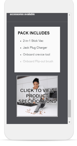
I did notice that the last bullet point in portrait mode on the mobile devices had the fade effect, even though there was no reason to scroll in that view. When I toggled between landscape and portrait, the fade went away. That seems buggy to me, so I'm going to document that behavior for us to have a look at.
The rest of the views are behaving as currently designed, based on the content reflowing to fill the different screen sizes and orientations. I can see how having more vertical room on the desktop view would help flashcards that have just enough text that overflows the card space, which is why we're tracking that request to make some changes to how text is handled spatially!
I'll keep you posted about the "unnecessary" fading in portrait mode on mobile devices.
- Desktop showed scrolling for the second set of flashcards:
Matthew, one more clue so I can reproduce this behavior in a new course: Can you let me know the font sizes you're using on the second set of flashcards? Thanks!
- MatthewFrancisCommunity Member
Sure, headings are all 20 and bullets are 16.
The first set are actually bigger 22 for headings and 20 for text and seem to have more space. Bullets seem to throw it out too much.
Thanks again, Matthew. I've reported the fading and scrollbar inconsistencies to our team to have a closer look.
And just to be clear, we're still tracking the feature request for more formatting options on the Flashcards as well, such as the margin size and using header or body fonts. I'll keep you posted!
Related Content
- 10 months ago
- 4 months ago
- 10 months ago