Forum Discussion
Interface Changes Coming Soon to Rise 360 Block Formatting
We’ve been listening to your experiences using the new block formatting features and we’re making a few minor alterations to the Rise 360 interface to make it even more user-friendly!
When enhanced block customization options were released, we moved formatting and background to two tabs, accessible via the Design icon on the right-hand side of the interface:
We underestimated the impact that moving these options to the right would have on how you use Rise 360. So we're doing two things: moving style and format options back to the left and giving them their own one-click menus. That's right—no extra tabs to click!
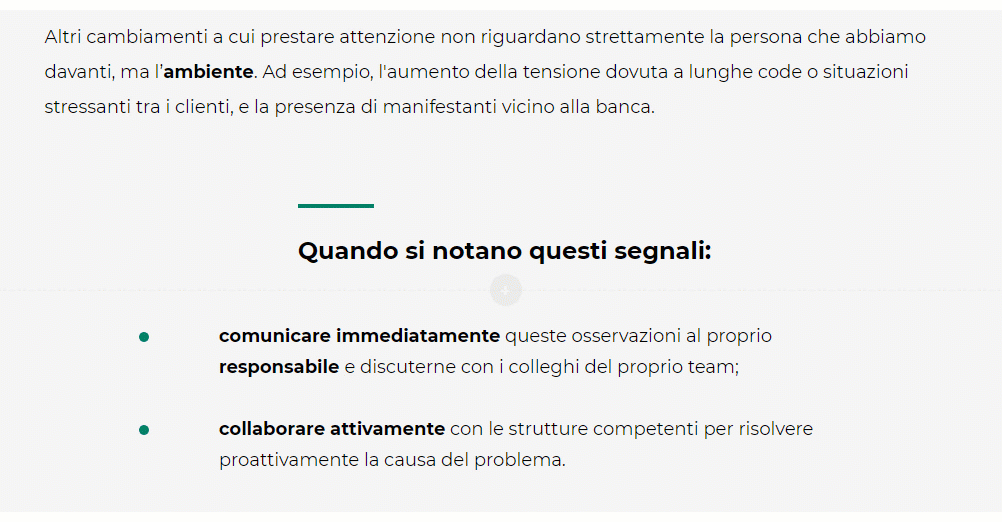
The first icon in the new left-hand toolbar is Content (the pen icon). This replaces the Edit button and is where you'll find all the content editing tools.
Style (the artist's palette icon) is where you'll find block background options.
And Format (the protractor icon) has block padding options.
We hope these changes restore balance to your workflow and make these new features easier to use than ever.
27 Replies
- PhilFossCommunity Member
Gotta say I was finally getting used to the design options over on the right, but agree with the reasoning behind turning heel on that recent ui change. Makes sense to split the 'block options' on the left, and options that are more like 'page options' on the right. Curious does Rise use their 'hero' users to do any user testing? Seems like a valuable asset that might not be part of the design process until complaints are surfaced from the most experienced users in the forum.
Thank you, Phil! One of the parts of developing new features that we're working hard to improve is validating our changes with customers. I'm glad you brought that up!
Our beta feedback links that accompany a new feature have been an invaluable source of user context, adding to the amazing feedback we get right here in the product discussion forums. What we receive is certainly helping us to make more informed heel turns as we try to build the best content creation experience we can.
Thanks for taking the time to comment!
- SteveBlane-e48aCommunity Member
First: Thanks for listening. Going back and forth, left to right was super annoying (especially on a large monitor).
Love having the button on the left, but for the love of everything holy - why is it two buttons now? Don't increase clicks and movements for developers, reduce them! If you want to make them separate direct buttons on the block, create a way to get to both theme and formatting inside those popups. Like it used to be.
And PLEASE just show the padding sliders. 90% of the time if I fiddle with padding its to remove padding, so again it's an extra click to do something that shouldn't be hidden.
- KenFliegerCommunity Member
Now can you add the option to change the coarse name without effect the course title on the start page. Re: the coarses names (just like in Storyline Review). Sucks trying to find out the duplicate coarse which is in another language.
- SueWright-d9746Community Member
After using the new UI changes, is there any chance you can show the default padding so I don't have to click the three dots on every block to set them to my preferred settings? It's adding extra clicks.
- KenFliegerCommunity Member
What I'm I missing here? The edit menus on the left side covers the text so you cannot see the text, making it hard to edit content. (Try moving the edit icons under to the left or vertical stacked on the left).
Next up: The tool tips for the Table controls are below the mouse cursor so when you hover over the table controls you cannot see the tips because the mouse is over top of the tip.
(try placing the hoover tool tips to right of the mouse NOT BELOW!)- KarlMullerCommunity Member
Hi Ken,
Rise positions the icons based on the resolution/dimensions of your monitor.
I use a very wide monitor and this is what I see.
- ErinBuckley-6d4Community Member
Yikes! The format options cover my text in the block. This is really frustrating! Please fix. :)
Hello Erin,
If you need to see the text that's covered by the Format window, you can press "Ctrl" + "- (minus key)" on your keyboard to temporarily zoom the page out and give your text more room to display. Here's a quick recording to demonstrate this behavior. Pressing "Ctrl" + "0" will reset the zoom level to its default value.
Hope this helps!
- ErinBuckley-6d4Community Member
While I appreciate your response, this doesn't really solve the issue, does it? I mean - it is an additional process and breaks the flow of writing. The options are ALWAYS there and covering the first line of a block. It feels like a poor design.
As others have said, this new design is inhibiting.
- Ken Flieger
What I'm I missing here? The edit menus on the left side covers the text so you cannot see the text, making it hard to edit content. (Try moving the edit icons under to the left or vertical stacked on the left).
- Tim_Community Member
So the problem you created by changing up the formatting toolbar that clearly does not fit the screen when viewed on a regular everyday laptop (as opposed to the articulate coders 4k ultrawide monitor) is now a feature request? Why can’t you just put in a breakpoint so that it wraps the buttons when the screen isn’t wide enough? While I appreciate that there are changes flowing through to Rise after years of neglect, many of these features don’t seem to have seen much real-world testing before muscling in amidst our time-poor workflows. I work on a laptop all the time. This gets in the way all the time. This is not a feature request, its a bug.
- ErinBuckley-6d4Community Member
Exactly!
- claudiarizze768Community Member
- KarlMullerCommunity Member
Hi Claudia,
This problem has been fixed https://community.articulate.com/discussions/rise-360/formatting-issue-with-statement-d-block#reply-889682
Thanks for letting us know how we can improve this feature! We've been using your feedback to guide our iterations and have just released some small (but mighty) changes.
First, a few of you mentioned that the new menu created extra clicks in your workflow. We definitely don't want that! Now you can click between the two menus without closing out the menu you're on.
Another benefit of this new menu behavior is better use of the space to the left of your block content. We tested this with many different resolutions, and the menus would cover content on only the smallest of screens. On a standard 1440 x 900 px width screen, your content should be easy to see even when you're changing design and format settings.
Again, thank you for being part of our community and letting us know how we can make your experience better. We look forward to any additional feedback.
- ErinBuckley-6d4Community Member
Oh, let me clarify. I may have responded to the wrong thread. The troublesome issue for me s the formatting menu that covers text. I have seen the reply that it should cover on a wide enough screen. Mine is not wide enough as I wortk on my laptop. This is really a disappointment as I can't see the text.
Hi Erin!
Thanks for the quick reply and extra details!
I've opened a support case on your behalf so you can share a screenshot of the behavior with our support team directly. You're in excellent hands troubleshooting with them and they should be following up with you shortly!
In the meantime, as a workaround, we suggest:
- Press "Ctrl" + "- (minus key)" on the keyboard to temporarily zoom the page out and give the text more room to display.
We can continue the conversation through your case to help keep all information in one spot.
Related Content
- 7 months ago