Forum Discussion
Reducing the Padding above & below Storyline Blocks
Hi
The enormous padding above and below Storyline blocks has always been a bit of a problem for me.
Over the past couple of years I've (obviously) reduced the padding in Rise, removed the Storyline player controls, and tried changing the slide size (I now use 1024 x 576, i.e. 16x9) but nothing does the trick.
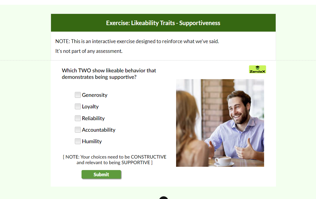
I'm now creating a course with three consecutive Storyline blocks, and the space between them looks terrible (I attach a screenshot to illustrate).
As always, I have search this forum, and Google, but although I hope it's something within Storyline that's causing it, I'm out of ideas.
Can anyone help?
Thanks
Steve
8 Replies
- KarlMullerCommunity Member
Hi Steve,
Not offering a solution.
Just curious why you are using Storyline blocks to create multiple choice questions?
- SteveWarren-304Community Member
Because the formatting and flexibility in Rise are so ... limited.
Storyline has a big drawback that it's not responsive (how could it be, I guess) but the options for making the simplest things look appealing - even for someone with my limited design skills - is phenomenal.
But this problem with giant spaces around the Storyline content is a long-standing one and is intensely irritating for lots of people (read the questions...)
And definitely me.High time it was fixed. I just wondered if anyone has figured out any workarounds by now.
Thanks
Steve - JoanneSuttonCommunity Member
I agree with Steve, reducing the Rise top/bottom Spacing to 0, isn't enough and I've tried adjusting the storyline sizing without much luck too. Is there any fix in the pipeline for this?
- SteveWarren-304Community Member
OK, I gave up with trying to make Storyline blocks look presentable because, frankly, it's not possible.
BUT my solution - which you may like to try - was to export the Storyline to Web (creating HTML files which I host on my own website/server) and then embed in Rise within an iFrame.
The code I use in Rise is of the form:
<iframe width="1024" height="576" src="https://www.mywebsite/story.html"></iframe>I need to tweak the settings within Storyline (use a white background, etc) but I now have a template/routine that works perfectly for me.
Why, I can even reduce borders to zero if I want...
Screenshot attached.My uses are simple (just single-frame exercises) and others may find it unsuitable.
But maybe worth a look? Hope it helps. - JoanneSuttonCommunity Member
Thanks heaps Steve, that sounds like a great workaround (although it would be even better if Articulate sorted it). Will give your solution a whirl. Thanks again :)
- SteveWarren-304Community Member
I just feel that the Articulate team have their minds on things that don't involve making the software easier to use. That's a dangerous policy but it's their train set and they'll play with it as they wish...
I find Rise an amazingly useful tool, so it's worth the effort to create workarounds to fix problems that won't, IMO, ever get fixed.
And I've had some very useful help from the community here, so it's only right that I help out where I can :)
- FernandoSoastiCommunity Member
I also want to join the list to be notified when this issue is fixed. There are other posts mentioning the same problem for over two years. Please prioritize these small changes that help us designers create better designs.
- Michelle_EireCommunity Member
Thank you SteveWarren-304 for your workaround - I used it today and my course looks a lot better now.
Related Content
- 10 months ago
- 11 months ago