Forum Discussion
Misalignment and extra white space in Rise
I've been using Rise for a client. I don't have any outcome data yet, but I'm concerned that Rise has issues that increase cognitive load and therefore impact the quality of instruction. The most concerning issue I have is with image mis-alignment in the various image blocks. Alignment is a foundational design principle, yet the various image blocks are not aligned with other text blocks. They blow out of the margins. Also, the amount of white space between blocks, and the way text renders next to images in the Image & Text block, causes a spacial contiguity issue. Is anyone else experiencing issues with misalignment and excessive white space in Rise?
15 Replies
Hi there Mary Beth,
I really appreciate your feedback, and I'm curious to know more. Can you share a screenshot of the image mis-alignment you're seeing? There may be ways to tweak the padding, so it would be helpful to get an idea of the blocks you're using.
In regards to the white space between blocks, I wanted to share some insight on the default padding settings from Adam here. You're always welcome to change that padding, if you feel it renders too much white space.
- MaryBethFacciolCommunity Member
Hi Alyssa,
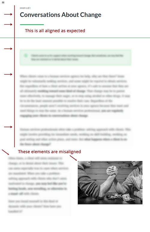
Thanks so much for your response. I will have a look at the padding settings and see if that info can help with some of the issues. The misalignment I'm talking about can be seen in the image attached. I can provide other examples too using other image blocks, but hopefully this will get the point across. I blurred the text but you can still see the alignment issue.
- PhilMayorSuper Hero
I would say that that is by design, I do think it would be neater if the single column blocks spread the same as the double column blocks.
Thanks, Mary Beth. That screenshot is really helpful, and I'm happy to pass it along as part of your feedback! I also wanted to mention the alignment does change as the width of the screen decreases. Here's a demo of what that looks like:
- SibaPrasadPadhiCommunity Member
Why is there are differences in image and text block alignment issue in different devices and browser. This is almost 4 years we are having these issues not fixed. Any solution for this?
- MaryBethFacciolCommunity Member
Hi Alyssa,
Thanks for passing on the feedback, I appreciate it! Images do align much better on smaller screens. I didn't mention this in my original post, but many of this client's learners are viewing the courses on computers, not tablets or smartphones.
Thanks again!
- SaraBreedonCommunity Member
I've also experienced this. For our assets, I've indented the text alignment next to the image to align with the overall text margin. The images are still affected though. Also, white space is an issue. I try to remove the extra padding to help with this. Another issue we've found is that the text centers vertically whereas we would prefer to have the text-align at the top of the image as our images are step by step videos of the text. It makes sense to have the left text which is a text step by step and the gif which is the visual align. Right now it's all manual and can be time-consuming to get it just right and does leave room for error. And, because the format is altered depending on how it's consumed to fit the user's resolution, truly it's never aligned properly 100%.
- JohnnyBustam496Community Member
100% agree with all of the statements above. Very frustrating.
- DebsChurcherCommunity Member
Just adding to this thread and I 100% agree with the above too ;)
- DianaGualda-b85Community Member
Another vote to have the overall width (or left and right margins) of all blocks stay consistent across all devices. (Why is computer the only place this doesn't happen?) The variable block widths lead to a messy look on computer.
- JennTorresCommunity Member
Wanting to echo this.
Right now, it makes it seem like course designers don't understand alignment, when it's actually Rise that won't allow for more options and then that has to be explained to stakeholders.
- AndrewGetzCommunity Member
Has anyone discovered any other "work arounds" that decrease the outside padding/margins for computer screens?
Related Content
- 1 year ago
- 2 years ago