Little bit of guess work here but I think it's down to the way the text is being rendered onto the HTML5 canvas. If you look at this link, it shows how fuzzy text can be on the canvas:
The link below shows someone who's figured out how to improve their text rendering in their HTML5 project. How well it works I don't know or if there's other methods. Hopefully the Storyline engineers will be able to find a solution.
The canvas resolution is doubled internally and then scaled 50% to show in the browser. So in Storyline, I changed the Story Size to 2047 x 1535 and then changed the 'globals.strScale = "show all"' in the published html file so the output scales to the browser size. The rendered text is sharper in both the HTML5 and Flash versions.
I wouldn't recommend doing the above method as Storyline will probably gain better font rendering and you'd end up with oversized Storyline projects. In addition, I'm not sure what the CPU performance hit is yet.
Great to see that this issue is being looked at. Richard, thanks for posting some workarounds. Alas, having looked at this links, they are right over my head!
Before I try and pull them under my head, are these workarounds for HTML5 only? Would the Flash output still suffer from the fuzziness?
Sorry for getting in a bit deep with the techie links ;o) I like to dig into the technical side of things why things aren't working as expected, which lead me to the workaround. You can actually ignore them
So essentially you're making the story size is bigger than you require and getting the browser to scale it down. I gave an extreme example of changing the story size to 2047 x 1535 (I found out that Storyline scales the content up accordingly) but lower story sizes might have the same effect too.
When I've tested the workaround, Flash text did look sharper to me as well. I've also found with experiments that lighter fonts (in terms of thickness) tend to look sharper as well. A caveat is that the HTML5 version was a lot slower, so I expect Flash would take a performance hit too but not as much. A bit of experimenting with story size is definitely recommended along with using lighter fonts.
No need to apologise, Richard. I was actually rather jealous that you could understand all of that. I long for the time I can read blog posts like that and cmake head or tail of them! One day, hopefully ...
Many thanks for providing the additional clarity there. Much appreciated.
Just curious if there has been any update to this issue at all?
We are experiencing the same thing.
Peter Anderson said:
Sorry about that, Mark. I'll keep an eye on the other related cases too, but if you'd like, you can quickly send Sid your file here. Just mention case #00309415 in the appropriate field. He'll be happy to hear from you
Previous test converted to Story Size: 1200 x 900. HTML file set to scale down the content to similar size as previous content. The inbuilt interface looks small but I prefer to use my own interface anyway.
I did a test of my own using a Text Entry question text box versus your typical on screen text box. The image here is of a screen capture from the published file. I've used Articulate 12 for my test as that is what is being used in the Entry box. The text that I typed into the Entry box at run-time is in the upper left and the on screen text is to the right and below that text. I've included the text to the right just to make sure that the anti aliasing was not being influenced by the gradient of the Entry box.
You can clearly see that there is a difference in anti aliasing between the Entry box text against the on screen text.
I'm assuming they're using an ActionScript framework under the Storyline covers and I'm wondering if there is font embedding in the Entry box and not in the on screen text. I've been using Flash for quite a while and am well aware of issues that arise with font quality when you don't embed your fonts.
Any thoughts on this?
Edit: display img in thread...you should click the image to see the original as opposed to the scaled up version here.
Well, I'll have to retract my theory on the text entry text. I started thinking about Windows Clear Type getting involved with the text entry box so I zoomed into the text in Photoshop. Sure enough, it has the telltale signs of Clear Type anti aliasing.
Hey richard - Can you explain what you did to test 2? I understand setting the stage to 1200x900 but not sure where to set the scale?
Can you elaborate just a bit?
Hi Rob,
For the Flash version, open the story.html in notepad and story_html5 for the HTML5 version. Experiment with the settings below.
var g_nWidth = 921;
var g_nHeight = 619;
var g_strScale = "noscale";// noscale | show all
var g_strBrowserSize = "default";// default, fullscreen, optimal
Setting the 'strScale to 'show all', causes Flash to scale to the browser window. Keep it to 'noscale' if you want to define the nWidth and nHeight of the content yourself.
Hope this helps!
Richard
Thanks Richard - I was able to get the story.html to scale - but not able to get the story_html5.html to do it.
No matter what I change the settings to - there appears to be no change.
Thanks Richard - I was able to get the story.html to scale - but not able to get the story_html5.html to do it.
No matter what I change the settings to - there appears to be no change.
Ah, I hadn't realised I hadn't tested that part out. I've done the scale to window option in the html5 file which works fine, but as you say the width and height doesn't have any effect. I'll get back to you on that one...
I haven't tested this extensively yet but it seems a text box which contains a variable becomes much sharper. The downside is that the formatting can go a bit funny and the cursor for selecting text will appear when you hover over the text (in the HTML5 output).
Anyway, just reporting these observations if it helps anyone.
This is the hack fix i have been waiting for . This does the trick beautifully.
The only down side I found is the 'by first level paragraph' animation reverts to bad fuzzy quality. But standard fade seems to work fine.
Now all we have to do is put an invisible variable into all our text boxes haha. Best bet here is to recolour the text to the background. E.G. if the background is white, make the variable text white.
For the less technically gifted of us out there, Is there anyone out there willing to do a step-by-step Screenr showing the step-by-step actions you need to take to get this result?
Essentially all you do is click inside your text box and then go to the top toolbar and select 'insert'. From there find the tab called 'Reference' (its on the right of the 'text box' icon, below 'symbol' and above 'hyperlink').
From here select any variable you wish from the list that appears and bingo, your done .
If at first it doesn't seem to have done anything check your animation assigned to the text box. I had the first level paragraph animation and it stopped it working till i changed it to a standard fade.
137 Replies
Thanks for that, Dan. The issue mainly affects me if I have dark type on a light background.
I have changed my story to light text on a dark background as a temporary workaround just now.
Interestingly, it is Arial that looks by far the worst for me!
Little bit of guess work here but I think it's down to the way the text is being rendered onto the HTML5 canvas. If you look at this link, it shows how fuzzy text can be on the canvas:
http://weblogs.asp.net/dwahlin/archive/2012/06/18/rendering-text-with-the-html5-canvas.aspx
The link below shows someone who's figured out how to improve their text rendering in their HTML5 project. How well it works I don't know or if there's other methods. Hopefully the Storyline engineers will be able to find a solution.
http://joubert.posterous.com/crisp-html-5-canvas-text-on-mobile-phones-and
Richard
Unicorn Training
www.unicorntraining.com
Actually this is probably a more accurate solution to rendering text on canvas:
http://blog.headspin.com/?p=464
The canvas resolution is doubled internally and then scaled 50% to show in the browser. So in Storyline, I changed the Story Size to 2047 x 1535 and then changed the 'globals.strScale = "show all"' in the published html file so the output scales to the browser size. The rendered text is sharper in both the HTML5 and Flash versions.
I wouldn't recommend doing the above method as Storyline will probably gain better font rendering and you'd end up with oversized Storyline projects. In addition, I'm not sure what the CPU performance hit is yet.
Hi Richard,
This is a really clever approach, thanks for sharing. Ill give this a go
Best,
Dan
No problem. Good luck with it and if possible post any caveats you might stumble across
Hi All
Great to see that this issue is being looked at. Richard, thanks for posting some workarounds. Alas, having looked at this links, they are right over my head!
Before I try and pull them under my head, are these workarounds for HTML5 only? Would the Flash output still suffer from the fuzziness?
Hi James,
Sorry for getting in a bit deep with the techie links ;o) I like to dig into the technical side of things why things aren't working as expected, which lead me to the workaround. You can actually ignore them
So essentially you're making the story size is bigger than you require and getting the browser to scale it down. I gave an extreme example of changing the story size to 2047 x 1535 (I found out that Storyline scales the content up accordingly) but lower story sizes might have the same effect too.
When I've tested the workaround, Flash text did look sharper to me as well. I've also found with experiments that lighter fonts (in terms of thickness) tend to look sharper as well. A caveat is that the HTML5 version was a lot slower, so I expect Flash would take a performance hit too but not as much. A bit of experimenting with story size is definitely recommended along with using lighter fonts.
No need to apologise, Richard. I was actually rather jealous that you could understand all of that. I long for the time I can read blog posts like that and cmake head or tail of them! One day, hopefully ...
Many thanks for providing the additional clarity there. Much appreciated.
Hi all,
Just wondering.
Untill Articulate get a good solution for this has anyone any experience in what font use to overcome this issue?
U already read that Arial causes much fuzzy text, but what about verdana or any order font?
Hi Peter,
So far the best font i have found is 'Bookman Old Style'. Its quite thin text which seems to help cure the issue.
The issue with it is that it is a slighly fancy font meaning that readability of the font itself is not as good as Arial or Calibri etc.
Of the core 3 fonts (Arial, Calibri, Verdana) I would rank them from best to worst.
1. Calibri
2. Verdana
3. Arial (by far the worst)
I just thought I'd share with you 2 tests I've done.
Test one
Story Size: 720 x 540
A few standard fonts and thin/light font
https://dl.dropbox.com/u/11930660/TextTest/textTest%20output/story.html
Test two
Previous test converted to Story Size: 1200 x 900. HTML file set to scale down the content to similar size as previous content. The inbuilt interface looks small but I prefer to use my own interface anyway.
https://dl.dropbox.com/u/11930660/TextTest2/textTest%20output/story.html
The text is slightly sharper and improves the higher the story size, but with a hit to performance.
Hey richard - Can you explain what you did to test 2? I understand setting the stage to 1200x900 but not sure where to set the scale?
Can you elaborate just a bit?
All,
I did a test of my own using a Text Entry question text box versus your typical on screen text box. The image here is of a screen capture from the published file. I've used Articulate 12 for my test as that is what is being used in the Entry box. The text that I typed into the Entry box at run-time is in the upper left and the on screen text is to the right and below that text. I've included the text to the right just to make sure that the anti aliasing was not being influenced by the gradient of the Entry box.
You can clearly see that there is a difference in anti aliasing between the Entry box text against the on screen text.
I'm assuming they're using an ActionScript framework under the Storyline covers and I'm wondering if there is font embedding in the Entry box and not in the on screen text. I've been using Flash for quite a while and am well aware of issues that arise with font quality when you don't embed your fonts.
Any thoughts on this?
Edit: display img in thread...you should click the image to see the original as opposed to the scaled up version here.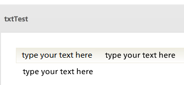
Well, I'll have to retract my theory on the text entry text. I started thinking about Windows Clear Type getting involved with the text entry box so I zoomed into the text in Photoshop. Sure enough, it has the telltale signs of Clear Type anti aliasing.
Here I thought I was on to something...
Hi Rob,
For the Flash version, open the story.html in notepad and story_html5 for the HTML5 version. Experiment with the settings below.
var g_nWidth = 921;
var g_nHeight = 619;
var g_strScale = "noscale"; // noscale | show all
var g_strBrowserSize = "default"; // default, fullscreen, optimal
Setting the 'strScale to 'show all', causes Flash to scale to the browser window. Keep it to 'noscale' if you want to define the nWidth and nHeight of the content yourself.
Hope this helps!
Richard
Thanks Richard - I was able to get the story.html to scale - but not able to get the story_html5.html to do it.
No matter what I change the settings to - there appears to be no change.
Ah, I hadn't realised I hadn't tested that part out. I've done the scale to window option in the html5 file which works fine, but as you say the width and height doesn't have any effect. I'll get back to you on that one...
I haven't tested this extensively yet but it seems a text box which contains a variable becomes much sharper. The downside is that the formatting can go a bit funny and the cursor for selecting text will appear when you hover over the text (in the HTML5 output).
Anyway, just reporting these observations if it helps anyone.
I tried your idea - with interesting results!
One the left side: normal textbox
One the right side: textbox which contains a variable
Flash Demo:
http://demo.community24.eu/story.html
HTML5 Demo:
http://demo.community24.eu/story_html5.html
=> Here the font-family attribute doesn't work
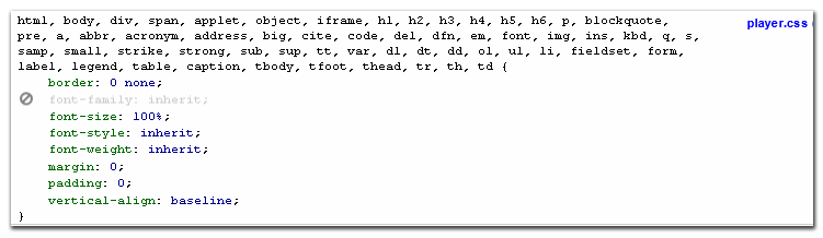
=> Solution: deactivate "font-family: inherit;" in player.css":
Thanks for sharing the results, Martin.
Interestingly, look at the difference in the rendering of the left hand player text in the two examples.
Richard you legend!
This is the hack fix i have been waiting for . This does the trick beautifully.
The only down side I found is the 'by first level paragraph' animation reverts to bad fuzzy quality. But standard fade seems to work fine.
Now all we have to do is put an invisible variable into all our text boxes haha. Best bet here is to recolour the text to the background. E.G. if the background is white, make the variable text white.
Ah, this made my day
Cheers.
Dan
For the less technically gifted of us out there, Is there anyone out there willing to do a step-by-step Screenr showing the step-by-step actions you need to take to get this result?
[Flutters eyelashes!]
To the articulate staff....
Is there any type of time frame on a fix for this bug vs us having to do these "hacks" to make it work?
Certainly,
Essentially all you do is click inside your text box and then go to the top toolbar and select 'insert'. From there find the tab called 'Reference' (its on the right of the 'text box' icon, below 'symbol' and above 'hyperlink').
From here select any variable you wish from the list that appears and bingo, your done .
.
If at first it doesn't seem to have done anything check your animation assigned to the text box. I had the first level paragraph animation and it stopped it working till i changed it to a standard fade.
Best,
Dan
This discussion is closed. You can start a new discussion or contact Articulate Support.