Storyline 2 - character spacing problem
Nov 17, 2014
By
Benoit M
Hi all,
I'm having a problem when publishing a module (it doesn't really show in preview): in some words there seems to be extra spaces between letters. See the words "pumps" & "and" in the screenshot below:

I've tried removing text - copy/paste via notepad without success. I also tried changing character spacing to 1 which didn't work either.
This problem can also be random, ie when changing the text it may solve the problem on one specific word but add another extra space into some other word...
This is a real issue since I cannot replace / retype every single word of the whole module and then check which one has new extra spaces.
Many thanks in advance
249 Replies
Should I upload the whole file to them?
Hi Amanda,
The whole file or a number of representative slides - since you're only seeing it on feedback layers, make sure to include question slides in that set up.
Hey Articulate.. Could you print this.. Blow it up to the size of a wall and pin in up in your QA or development room... Yes that says 2014. This issue has been around since 2014.
Okay, it sure feels like a while since Patch 7 came out and just last week Patch 8 was released. I just had the time now to check out the release notes and to my dismay nothing about character spacing was addressed :(
It was the first thing I looked for as well. Sigh....
Do you suppose there is a number of comments that must be hit before something gets fixed? We're at 79 in this thread alone and more than a year...
Was an update sent out the users or was this an automatic update?
Ill be #81.. Still not fixed.. No not automatic. You download and install.
Hey Articulate.. Are you listening to all of us??
Do they even read this forum? I haven't seen a post from them in here in a long while.
Maybe they put us on ignore.
Hi Bret,
79 huh? I wouldn't of guessed, although, I do see a lot of emails because of this thread. Theres another one here to:
https://community.articulate.com/discussions/articulate-storyline/character-s-p-a-c-i-n-g-problem
Hi Helena,
There was not an email sent out to the users. When your start up Storyline, there should be a pop up notice about new updates. If not, in Storyline go to Help/Check for Updates.
I was hoping for this fix too.
I did get notified of the update by email because I have subscribed to other discussions that were supposed to be addressed in the latest update. (although it turns out they were not fixed!)
Hi all,
We didn't send an email in regards to the latest update, but if you were in a case that was resolved by the update you should have received an email from our Support team, and our forums staff (noted by the red staff badge next to their name on replies) shared the information in the forum threads which were impacted and solved by the latest update, in addition to sharing the information via Twitter/Facebook. Also, if you're connected to the internet when you open Storyline 2 and you've enabled the check for updates - you should see a notice when starting up that an update is available for download.
You can read the entire release notes of the latest update here.
As far as a fix for this issue - I can assure you that we're listening and reading these comments and forum threads. We continue to share it with our QA team who investigates all issues and reported bugs. The number of replies in a forum thread or open cases with our Support Engineers is certainly a piece of data we share in regards to the impact, but the inclusion of a fix or new feature is driven by a number of other factors, and when we have information to share, we'll include it here.
Where is the link to the update? I only see a link to re-install the software.
That is how the update works as well Helena.
Ashley... 2014
Do I have to say more??
In regards to your supposition "a fix or new feature is driven by a number of other factors"
Tell us what those are please. Don't give us the mysterious "factors".
I am sure all of us in this discussion will be happy to find those factors for you.
Hi all,
We’ve been discussing this issue with our QA team as they’ve continued testing and looking at the reported issues in this forum thread and others. It seems if we look back to when the initial reports occurred they were prior to Update 5 of Storyline 2, and since then there have been continued improvements in the font rendering and a noticeable difference in the kerning behavior for the better. I’d want to first remind everyone that you’ll want to be on the latest update of Storyline 2 Update 9 available here.
Our team has also noticed that if the published output is set to scale within the browser it will appear clearer at the larger size than the default size, and you won’t see this clearer behavior in preview as it will never scale up to fill the window. So you’ll want to refer to the published output vs. the slide stage or preview to see an accurate representation of what is expected and final.
As we continue to look at ways to improve the font kerning issue and your experience, I’d ask if you have a current project using the latest update that is still not displaying as you’d like if you could share it with us here or send it along to our Support Engineers referencing this thread so that we can get that into the hands of our QA team. We’ll want to know as much information about where you’re seeing the kerning (font, font size, specific characters used) and how you’re viewing the published output (browser, LMS vs. web, setting the player/browser to scale, etc.) as you can share so that we’re able to replicate and test the set-up to match.
Hi!
I sent a feature request in September 2015 which I think would solve the kerning issues for most users. Have you looked into this? In my opinion it would not be that hard to implement it and would not affect to much of the Storyline code.
/Jonas
===========================
Feature Request Number: 00642372
Request Details:
Hello,
we would like a feature added to the publishing settings-player size "scale down only". The feature would allow the content to be scaled down only.
The benefits of this is for instance:
1. Screen recordings will look great on standard screen size computers, but will also work on tablets and small screen computers.
2. The font kerning problem would not show on standard screen computers, since it will not scale up.
Many of our end-users uses both big screens on their computers (24" size) and tablets. This way we can have a optimized project size that will not scale up on the computer and will look great on computers with big screens, Ipads, android tablets, small screen computers.
Best regards
Jonas
Hi Jonas,
Thanks for sharing that here, and feature requests do go to our product development team for review, but based on what I shared above that if it scales to fill the browser the font seems to appear clearer than the original default size - I'm not sure it's a solution for the issue shared here. I'm certainly not a programmer, so I'll leave that decision and the specifics of understanding all the implications in the hands of our Product and QA team.
Hi Ashley,
I just updated from SL2 Update 8 to Update 9 and the character spacing is still an issue. I'm on a Win 7 machine and viewing it either from a Saba LMS, locally on my desktop or even in the SL Preview mode, the font spacing is not correct.
Here is a sample using SL2 Update 9 and displayed locally with Chrome showing the incorrect character spacing: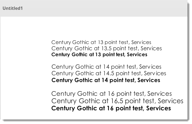
From the earlier discussions, changing it from one size or 1/2 size to another does not help. In the word "Services" the i is to close to the c.
The only thing that seems to help is making it bold.
Here is a sample created in Word 2013, showing that Century Gothic font looks correct for the word "Services":
Thanks Kelly for sharing that information and the images here. I know it may seem redundant and likely something we could create on a file, but if we could get a copy of this .story file into the hands of our team that would assist as well. This way they can compare your file with anything we create and double check for inconsistencies or other behavior that we haven't accounted for. If you want to share it here using the "add attachment" button that will upload it and i can pass it along - or if you want to share it as a part of a support case.
I can confirm this odd behaviour with Century Gothic font.
Thanks Dario - can you tell me what font size, story size, and any other specifics of your project set up so that I can share that with our QA team?
Dario,
Thanks for testing and confirming that Century Gothic font has the wrong spacing.
Ashley,
Can you please try it yourself? Century Gothic font with 13, 14 and 16 point size? You don't even need to compile it to SCORM, just do the Preview Mode and it will be visible on screen.
Lastly, this has been a known issue for a long time. Can you please escalate this within your organization? Whomever the product manager is should come back here and let us know what the engineers will be doing to correct this. Telling us that the QA team knows about it and wants to test more (with the customer's files) does not give me assurance. This should be in engineering hands to fix already.
Thank you for your help and responses in this forum, there are very few companies that have good support.
-kelly
Hi Ashley, font size ranges from 12 to 14 px, story size is 1024x768. Nothing very special about the project, simple text boxes.
Hi Kelly,
Our team has been testing this, and it was recently escalated based on some of the continued comments here and in other forum discussions. In the most recent round of testing, our team observed that since Update 5 (we're now on Update 9 of Storyline 2) the issues with font kerning/spacing have become less noticeable and for some fonts/sizes there isn't a discernible issue. The post I wrote previously was based on direct communication with our QA team and our product managers, but since we have dedicated staff to assist in the forums we're often the ones to share the message here.
As for seeing more files, I have tested Century gothic myself and found some similar results, but having a customers file in hand allows our team to compare different wording, sentences, in addition to the slide properties used for wrapping text, alignment within the box, font sizes used, story size, player/browser scaling, etc. If you're unable to share a file, I certainly understand and our team is continuing to look into what changes can be made for this issue.
Hi all (and Ashley),
I am joining this forum following Ashley's advice. As Update 9 for SL2 has fixed a blurry text issue in the Notes and also some header and body text alignment, I am still having the following problem:
When converting a lesson from SL1 to SL2, the original lesson had a notes font 'Articulate' size 9. The converted lesson's notes also have the same font, however, when the lesson is published you can see a difference in the font appearance. It is more spaced and the letters size is bigger.
A workaround to fix could be a global Notes' font size change for all the lesson. unfortunately, this feature is not available.
Case #00817099 was opened for this issue on 19-June-2016. Response received:
We have reviewed your project files and we were able to duplicate your issue. I have submitted your case to our Quality Assurance team for their review. Unfortunately I was unable to determine a workaround. I cannot offer a time frame for when or if this issue will be resolved. I'll keep you posted on any update on this issue.
Eloisa Garcia
Customer Support Engineer
Appreciate an update if and when this issue is about to be fixed in the next SL2 update. is there a plan t issue update 10?
This discussion is closed. You can start a new discussion or contact Articulate Support.