Visual Design for Beginners: Unlocking the Power of Metaphors

In writing, metaphors are handy for helping to draw comparisons between two unrelated things that share some common traits. For example, you might have heard the expression that someone is “the black sheep of the family.” This, of course, doesn’t mean that your wacky cousin Frank is literally a black, woolly ruminant. Rather, cousin Frank shares a few notable characteristics associated with black sheep—mainly that he looks or acts differently than the rest of the herd (I mean “family”).
What Is a Visual Metaphor?
Most of us would probably put the word “metaphor” in a literary context, but metaphors are actually much more abundant in visual form. Today, visual metaphors are everywhere, used by many different types of designers to help bridge the gap between our understanding of how things work in the real world and how they work in the virtual world.
Let’s explore this idea a bit. First, imagine you need to get up to the twelfth floor of your office building for an appointment. You look around for some way to summon an elevator and what do you see? A shiny, beveled button with an up-facing arrow right next to it that invites interaction in the form of a push. And once you’ve pushed it, a helpful acknowledgment in the form of a little glow that visually chimes, “You’ve pushed me.”
But a button in a course or on a website isn’t exactly the same as that elevator button. A real-life button has tactile qualities that can’t be duplicated in a virtual setting. In a course or on a website, the buttons are just pixels artfully arranged to look like real buttons. The image is a metaphor for a real-world button, designed with some of the same visual characteristics like a distinctive edge or a drop shadow to give it dimension, a hover state that lights up when the learner’s mouse rolls over it, or a selected state that glows when the button’s been clicked. All of these characteristics are reminiscent of real buttons and help our brains recognize them as objects to click or tap.
How Do I Use Visual Metaphors in My E-Learning?
Mimicking real-world conventions is a brilliant little design trick, isn’t it? Not only does it save us from having to read and interpret a lot of onscreen text, but it can also enhance the user experience and bridge gaps in our understanding of new interfaces. Best of all, nearly anyone—even newbie e-learning designers—can use visual metaphors with no graphic design expertise required. All it takes is some design thinking and a little practice. Following are some examples of the roles visual metaphors can play in e-learning, and a few resources to help you get started with uncovering your own.
Color
One of the most powerful visual metaphors is one we tend to take for granted: color. From an early age most of us are taught to make associations with ideas and feelings using color; for instance, red implying danger and green signifying “go.”
These color associations, or mental models, mean that color can play a huge role in design for learning. Take this cool example from Lisa Walker.

Lisa’s visual design makes clear use of the mental model we have of green as a “do” and red as “don’t.” And she further combines this use of color as a visual metaphor with familiar symbols of do and don’t: the checkmark and the X icons.
Pro Tip: It’s thought that a large portion of the population suffers from some degree of red/green color blindness, also known as protanopia. If this is a concern for your audience, it’s a good idea to check your course with a web accessibility checker like wave, which can help spot potential issues with color contrast in your design.
Icons
Icons, another type of visual metaphor, usually take the form of a pictogram, like this:

And when you see a pictogram of a house in the context of website’s navigation, you probably recognize that it symbolizes “home”—usually the main page of the site.
Similarly for e-learning, using an icon is a simple way to display key navigational elements, whether a house to symbolize the main homepage or a checklist to symbolize a menu. The following free download from Nicole Legault demonstrates one way icons can play a role in the visual design of your course.
![]()
Some other ways icons are commonly used in e-learning are to alert learners to the presence of additional information, to give learners playback controls for media like video, or to provide navigational hints.
Here’s an example of some simple arrow icons on an interactive marker. In this case the arrows prompt learners to explore for more information about a product.
![]()
This approach openly invites users to explore. And by positioning arrows to point to the specific product features you want to highlight (e.g., a pour spout or a handle), you can further grab and direct their attention.
Tabs
Probably one of the most well-loved e-learning interface designs is one big ol’ visual metaphor. I’m talking about the tabs layout, like this clever download from Nicole.

Not only is a tabbed interface a clean and easy way to break related content into more easily digested chunks; it’s also familiar to learners who likely already associate the tabbed dividers in their office file cabinet with the concept of grouped, organized content.
Interested in learning how to design your own tabbed interface? Here’s a step-by-step tutorial for that: The Most Straightforward Way to Build a Tabs Interaction for Storyline.
Images
We want our learners to connect with our courses on an emotional level. We want them to be drawn into the learning experience, immersed in an environment that feels familiar and personal. Fundamentally, we want them to be attracted to the course by both its content and its visual design.
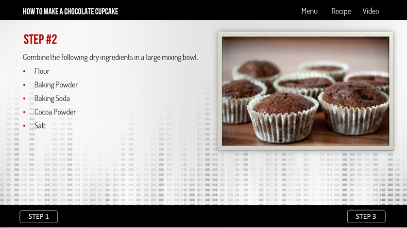
One of the easiest ways to accomplish that is by using background images that serve as a metaphor for the learner’s environment. Let’s take a look at this e-learning example from Amar Kulshreshtha on how to make a chocolate cupcake:

Amar designed his course with a chocolate brown kitchen background—using color as a visual metaphor as well. But by depicting the cupcake-making process in the context of a whimsical virtual kitchen, his course feels inviting, fun, and yet still authentic and suitable for the lighthearted nature of the subject matter.
As a contrast, just imagine how uninspiring it would’ve been to see Amar’s course designed with a business-oriented visual metaphor...
 Not exactly inspiring or appetizing, is it?
More Learning
Visual metaphors are a powerful way to support learners, by linking unfamiliar ideas to familiar concepts. I’ve walked you through just a few basic ways to unlock the power of visual metaphor for your courses, but there’s a whole lot more to learn. Here are a few resources that can help you kick your visual design skills up a notch.
- Practice visual analysis (which involves thinking metaphorically) using David Anderson’s Design Mapping approach.
- Download our free e-book: The Essential Guide to Visual Design.
- Get familiar with these 3 Essential Visual Design Concepts
How are you unlocking the power of metaphor in your e-learning? Share your ideas in the comments.
And while you’re at it, follow us on Twitter and come back to E-Learning Heroes regularly for more helpful advice on everything related to e-learning.
5 Comments