Design Tips for Creating an Engaging Media Panel
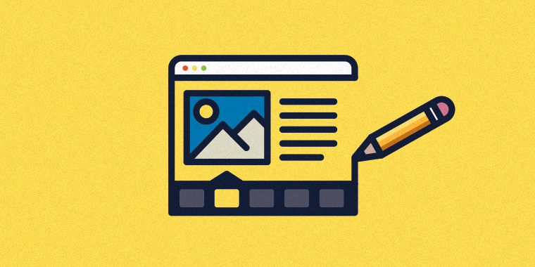
Today, I’d like to focus on this completed Engage interaction, called the Media Panel. It’s a particularly visual way to share image-rich content such as a series of related images or a step-by-step process represented through images.

In this example, I created a tour of Washington, D.C., which guides the learner through some of the capital’s most important landmarks and highlights information about each. When I work with Engage on a piece like this, I use the below mental checklist to help me create user-friendly, visually-appealing layouts.
Consistent Images
Images are SO important. I can’t say this enough! They define the whole look and feel of your interaction. Dark or poor-quality images will really detract from the tone of your project.
When I was selecting my images of landmarks in Washington, D.C., I chose photos that were consistent in composition and of similar quality. In this case, I picked images that all show some bright blue sky in the background, which ties the images together. The vibrant pops of blue also give a nice colorful touch to the presentation. In addition, I resized all the images to be the same large size, so that when you click on the “Zoom” icon to view the larger image, they all fill up the screen nicely and are not cut off.
Easy-to-Read Text
As a general rule, I think it looks neater when there’s less text and no scrolling. I did some heavy editing to avoid having scroll bars on the screen. I got rid of redundant or unnecessary words, and trimmed my text to two short paragraphs per slide. I also selected a few fonts: a thicker, chunky font for the header text and a simple, sans-serif font for the body text, which pairs well with the chunky font and is easy to read.
Simple Color Scheme
Colors draw in the learner’s eye, and in this case I experimented with a few before settling on slate gray. I tried a blue color scheme to tie in with the sky in the imagery, but it ended up being just too much blue and looked like a bag of cotton candy. Gray ended up being a good choice because it goes with almost any color and is easy to use in different shades of the same base hue. You’ll notice in the example, the header and footer are a dark slate gray, and the background is a slightly lighter dark gray. These details bring everything together and give it a polished look.
So there you have it, my three go-to techniques for creating an engaging Media Panel interaction. If you have some time, you might want to also look at these other sample Studio ’13 courses and Engage ’13 interactions for more ideas:
- Studio ’13: Payroll 101
- Studio ’13: Identity Theft
- Engage ’13: Emergency Supplies Checklist
- Engage ’13: Circle Diagram
I hope this helps to inspire your next design. Do you have your own tips for creating visually appealing interactions? If so, leave a comment below!
You can always sign up for a fully functional, free trial of Articulate software. And don’t forget to post your questions and comments in the forums! We’re here to help. For more e-learning tips, examples, and downloads, follow us on Twitter.
3 Comments