Engage '13: How I Built This Labeled Graphic Interaction

When we were getting ready to release Articulate Studio ’13, I was psyched to get up close and personal with the new version of Articulate Engage and all of its awesome interactions. There’s no better way to get to know the ins and outs of a tool than to work with it in creating your own projects.
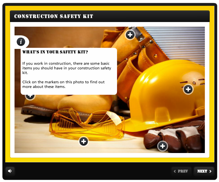
I jumped in and ended up building out every single type of interaction that comes with the software—that’s 20 in all! One of my very favorites is this Construction Safety Kit interaction I created using the Labeled Graphic interaction.
Let me break down the decision-making that went into this interaction; hopefully these tips will help you with your next project.
Color Scheme
Black and yellow are colors associated with construction: safety vests, hard hats, and big yellow signs with thick black writing are just a few visuals that come to mind. That’s why I decided to go with the black and yellow color scheme for this interaction. I used a black player design and a black header, contrasted by a bright yellow background, and I matched my markers to the color scheme by making them black.
Fonts
Just as black and yellow are associated with construction, certain fonts also work better with this topic than others. Would a fancy, cursive script work well here? No way! That’s why I chose a chunky, black font called Stencil. Strong and sturdy, Stencil looks like the typeface you’d see on construction signs. For the rest of the text, I used the default font, Articulate, because it’s clear and easy to read.
Background Image
I picked up this great construction-themed background image on sale from a stock image site (keep an eye out, they do have great sales!). I was drawn to this particular photo because of the strong yellow tones that tie in with the rest of the interaction. I made sure to purchase an image large enough to take up the whole background without becoming stretched or pixelated.
I also opened up the image in a graphic editing application and added a simple white shape, which is where I placed the “Introduction” marker. This little detail gives the marker a designated place, so it doesn’t appear to float in the middle of the image.
Audio
Adding audio is super easy in Engage ’13, and recording the audio for this particular project was a snap. I simply sent the Engage file over to my co-worker Mike, who also has a copy of Engage ’13. He opened up the project and recorded the audio directly in the tool, by reading the on-screen text. Being able to record audio right inside the software further simplifies the whole process.
Imagery
I love visual consistency in my projects, and always advocate using photos that are of similar quality and style in e-learning courses. Here, I chose images that are all isolated items on white backgrounds. The boots, glasses, and toolbelt images are all consistent with one another, which gives the interaction a streamlined look and feel.
These are just some of the decisions I made while creating this construction-themed Engage ’13 interaction. As you can see, some pretty specific thought processes actually inform each step. Hopefully, these insights will help you add finesse your own course designs and Engage interactions.
I’m always looking for ideas for cool Engage interactions to create, so if you have any you’d like to see, leave me a message in the Comments section below. Don’t forget to follow us on Twitter for more tips and e-learning insights!
7 Comments